方法一
通过css3缩放
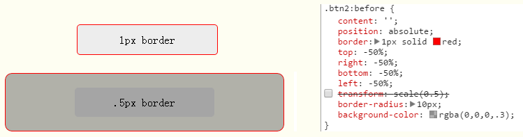
<!DOCTYPE html>
<html>
<head>
<meta charset="utf-8">
<meta name="viewport" content="width=device-width,initial-scale=1,maximum-scale=1.0,user-scalable=no">
<meta name="apple-mobile-web-app-capable" content="yes">
<meta name="apple-mobile-web-app-status-bar-style" content="black">
<meta name="format-detection" content="telephone=no">
<meta name="format-detection" content="email=no">
<title>.5px的实现</title>
<style type="text/css">
body{padding: 50px;-webkit-touch-callout:none;}
[class*="btn"]{margin: 0 auto;}
.btn{
    width: 200px;
    height: 42px;
    line-height: 42px;
    border-radius: 5px;
    text-align: center;
    background-color: #EDEDED;
}
.btn1 {
    border: 1px solid red;
}
.btn2 {
    position: relative;
}
.btn2:before {
    content: '';
    position: absolute;
    border: 1px solid red;
    top: -50%;
    right: -50%;
    bottom: -50%;
    left: -50%;
    transform: scale(0.5);
    border-radius: 10px;
}
</style>
</script>
</head>

<body>
    <div class="btn btn1">1px border</div>
    <br/><br/>
    <div class="btn btn2">.5px border</div>
</body>

</html>
方法二
border: 0.5px solid red;//ios8以上支持,以下显示为0
方法三
渐变模拟:设置 1px 通过 css 实现的背景图片,50%有颜色,50%透明。
.border {
    background-image:linear-gradient(180deg, red, red 50%, transparent 50%), linear-gradient(270deg, red, red 50%, transparent 50%), linear-gradient(0deg, red, red 50%, transparent 50%), linear-gradient(90deg, red, red 50%, transparent 50%);
    background-size: 100% 1px, 1px 100%, 100% 1px, 1px 100%;
    background-repeat: no-repeat;
    background-position: top, right top, bottom, left top;
    padding: 10px;
}
优点:兼容性较好,单边框、多边框可实现,大小、颜色可配置。
缺点:代码量多、无法实现圆角、同时占用了背景样式
方法四
-webkit-box-shadow: 0 1px 1px -1px rgba(0, 0, 0, 0.5);//利用 css 对阴影处理的方式模拟。
优点:兼容性较好,单边框、多边框、圆角可实现,大小、颜色、可配置。
缺点:模拟效果强差人意,颜色不好配置。
方法五
border-image: url() 2 0 stretch;
border- 0 0 1px;
缺点:图片边缘模糊,大小、颜色更改不灵活。