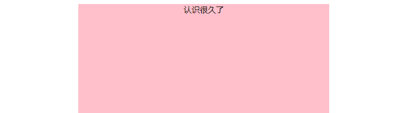
一:盒子居中
1.盒子居中
可以使用auto进行控制盒子居中。
让一个盒子居中的条件:
必须是块级元素
盒子需要指定宽度
2.案例
 1 <!DOCTYPE html>
 2 <html lang="en">
 3 <head>
 4     <meta charset="UTF-8">
 5     <title>Document</title>
 6     <style>
 7         div {
 8             text-align: center;/*让盒子中的内容(文字,行内元素,行内块元素)居中对齐*/
 9             width: 500px;
10             height: 400px;
11             background-color: pink;
12             margin: 0 auto; /*auto可以让盒子水平居中*/
13             /*margin-left: auto; */ /*auto可以让盒子靠右边*/
14         }
15     </style>
16 </head>
17 <body>
18     <div>
19         认识很久了
20     </div>
21 </body>
22 </html>
3.效果
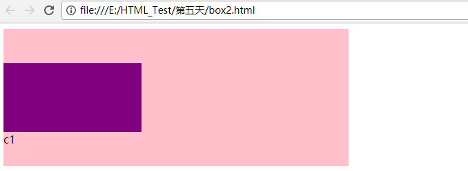
二:外边距合并问题
1.存在的问题
在上下相邻的两个块元素相遇时,如果上面的元素有上线外边距margin-bottom,下面的元素有margin-top,则他们之间的间距不是两个数值之和。
而是选择其中较大的那个。
这种现象较相邻元素垂直外边距的合并。
2.解决方式
避免这种情况。
3.存在的问题
效果图:

案例
 1 <!DOCTYPE html>
 2 <html lang="en">
 3 <head>
 4     <meta charset="UTF-8">
 5     <title>Document</title>
 6     <style>
 7         .c1 {
 8             width: 500px;
 9             height: 200px;
10             background-color: pink;
11             padding-top: 20px;
12         }
13         .c2 {
14             width: 200px;
15             height: 100px;
16             background-color: purple;
17         }
18     </style>
19 </head>
20 <body>
21     <div class="c1">
22         <div class="c2"></div>
23     c1</div>
24 </body>
25 </html>
上面的程序是可以实现的。
但是下面的程序却不能实现,案例如下:
 1 <!DOCTYPE html>
 2 <html lang="en">
 3 <head>
 4     <meta charset="UTF-8">
 5     <title>Document</title>
 6     <style>
 7         .c1 {
 8             width: 500px;
 9             height: 200px;
10             background-color: pink;
11             /*padding-top: 20px;*/
12         }
13         .c2 {
14             width: 200px;
15             height: 100px;
16             background-color: purple;
17             margin-top: 50px;
18         }
19     </style>
20 </head>
21 <body>
22     <div class="c1">
23         <div class="c2"></div>
24     c1</div>
25 </body>
26 </html>
其效果:

4.解决方式
问题:嵌套块元素垂直外边距的合并。
可以为父元素定义1像素的上边框或者上内边距
可以为父元素添加overflow:hidden
 1 <!DOCTYPE html>
 2 <html lang="en">
 3 <head>
 4     <meta charset="UTF-8">
 5     <title>Document</title>
 6     <style>
 7         .c1 {
 8             width: 500px;
 9             height: 200px;
10             background-color: pink;
11             overflow: hidden; /**/
12         }
13         .c2 {
14             width: 200px;
15             height: 100px;
16             background-color: purple;
17             margin-top: 50px;
18         }
19     </style>
20 </head>
21 <body>
22     <div class="c1">
23         <div class="c2"></div>
24     c1</div>
25 </body>
26 </html>
效果:
三:padding的特殊
1.说明
有的时候,在写pading的时候,盒子没有变大。
2.案例
 1 <!DOCTYPE html>
 2 <html lang="en">
 3 <head>
 4     <meta charset="UTF-8">
 5     <title>Document</title>
 6     <style>
 7         .c1 {
 8             width: 500px;
 9             height: 200px;
10             background-color: pink;
11         }
12         .c2 {
13             padding-left: 30px;
14             background-color: purple;
15         }
16     </style>
17 </head>
18 <body>
19     <div class="c1">
20         <div class="c2">123</div>
21     </div>
22 </body>
23 </html>
3.效果
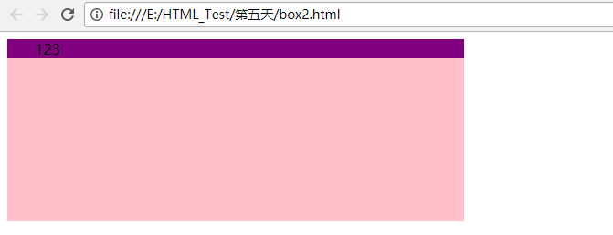
4.原因
子盒子没有给定宽度,用的是默认的,所以不会撑开。
如果这个时候,子盒子给了宽度,则会撑开盒子。
四:圆角边框
1.案例
 1 <!DOCTYPE html>
 2 <html lang="en">
 3 <head>
 4     <meta charset="UTF-8">
 5     <title>Document</title>
 6     <style>
 7         div {
 8             width: 200px;
 9             height: 100px;
10             border: 1px solid red;
11             border-radius: 20px;
12         }
13     </style>
14 </head>
15 <body>
16     <div></div>
17 </body>
18 </html>
2.效果

3.使用百分比
 1 <!DOCTYPE html>
 2 <html lang="en">
 3 <head>
 4     <meta charset="UTF-8">
 5     <title>Document</title>
 6     <style>
 7         div {
 8             width: 200px;
 9             height: 100px;
10             border: 1px solid red;
11             border-radius: 100%;
12         }
13     </style>
14 </head>
15 <body>
16     <div></div>
17 </body>
18 </html>
效果:

4.分别设置四个角
 1 <!DOCTYPE html>
 2 <html lang="en">
 3 <head>
 4     <meta charset="UTF-8">
 5     <title>Document</title>
 6     <style>
 7         div {
 8             width: 200px;
 9             height: 100px;
10             border: 1px solid red;
11             border-radius: 100px 0;
12         }
13     </style>
14 </head>
15 <body>
16     <div></div>
17 </body>
18 </html>
效果:

五:盒子阴影
1.语法
box-shadow:水平阴影,垂直阴影,模糊距离,阴影尺寸,阴影颜色,内外阴影
属性:
h-shadow:水平阴影
v-shadow:垂直阴影
blur:模糊距离
spread:阴影尺寸
color:阴影的颜色
inset:内部阴影
2.案例
 1 <!DOCTYPE html>
 2 <html lang="en">
 3 <head>
 4     <meta charset="UTF-8">
 5     <title>Document</title>
 6     <style>
 7         div {
 8             width: 300px;
 9             height: 200px;
10             box-shadow: 2px 4px 40px 6px rgba(0,0,0,0.4);
11         }
12     </style>
13 </head>
14 <body>
15     <div></div>
16 </body>
17 </html>
3.效果

4.优化
兼容性问题,但是现在可以使用了。
 1 <!DOCTYPE html>
 2 <html lang="en">
 3 <head>
 4     <meta charset="UTF-8">
 5     <title>Document</title>
 6     <style>
 7         div {
 8             width: 300px;
 9             height: 200px;
10         }
11         div:hover {
12             box-shadow: 2px 4px 40px 6px rgba(0,0,0,0.4);
13         }
14
15     </style>
16 </head>
17 <body>
18     <div></div>
19 </body>
20 </html>
六:体会浮动float
1.案例
 1 <!DOCTYPE html>
 2 <html lang="en">
 3 <head>
 4     <meta charset="UTF-8">
 5     <title>Document</title>
 6     <style>
 7         .up {
 8             width: 300px;
 9             height: 200px;
10             background-color: pink;
11             float: left;
12         }
13         .down {
14             width: 330px;
15             height: 230px;
16             background-color: purple;
17         }
18     </style>
19 </head>
20 <body>
21     <div class="up"></div>
22     <div class="down"></div>
23 </body>
24 </html>
2.效果
就像是up浮在down上

3.浮动
可以多个div在一行展示
使用inline-block中间有缝隙
脱离了标准流的控制。
4.案例
 1 <!DOCTYPE html>
 2 <html lang="en">
 3 <head>
 4     <meta charset="UTF-8">
 5     <title>Document</title>
 6     <style>
 7         .up {
 8             width: 300px;
 9             height: 200px;
10             background-color: red;
11             float: left;
12         }
13         .middle {
14             width: 300px;
15             height: 200px;
16             background-color: blue;
17             float: left;
18         }
19         .down {
20             width: 300px;
21             height: 200px;
22             background-color: green;
23             float: left;
24         }
25     </style>
26 </head>
27 <body>
28     <div class="up"></div>
29     <div class="middle"></div>
30     <div class="down"></div>
31 </body>
32 </html>
5.效果

6.特性
只有左右浮动
脱离标准流,不占用位置
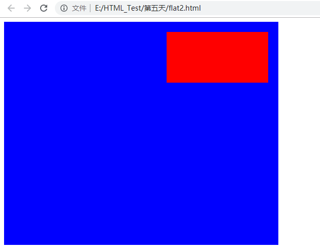
7.使用父盒子,以及padding
因为float会影响很多,这个时候,需要对有float的进行一个父盒子的包装,则可以不影响其他的盒子。
float不会跨过padding。
 1 <!DOCTYPE html>
 2 <html lang="en">
 3 <head>
 4     <meta charset="UTF-8">
 5     <title>Document</title>
 6     <style>
 7         .fir {
 8             width: 500px;
 9             height: 400px;
10             background-color: blue;
11             padding: 20px;
12         }
13         .sec {
14             width: 200px;
15             height: 100px;
16             background-color: red;
17             float: right;
18         }
19     </style>
20 </head>
21 <body>
22     <div class="fir">
23         <div class="sec"></div>
24     </div>
25 </body>
26 </html>
8.效果
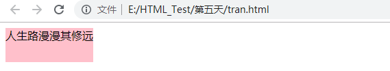
9.可以让元素默认转换为行内块元素
 1 <!DOCTYPE html>
 2 <html lang="en">
 3 <head>
 4     <meta charset="UTF-8">
 5     <title>Document</title>
 6     <style>
 7         div {
 8             height: 50px;
 9             background-color: pink;
10             float: left;
11         }
12     </style>
13 </head>
14 <body>
15     <div>人生路漫漫其修远</div>
16 </body>
17 </html>
10.效果
七:版心与布局流程
1.版心
网站的可视区
常见的宽度960,980,100,1200
2.一列固定宽度且居中
 1 <!DOCTYPE html>
 2 <html lang="en">
 3 <head>
 4     <meta charset="UTF-8">
 5     <title>Document</title>
 6     <style>
 7         .top {
 8             width: 900px;
 9             height: 80px;
10             background-color: #eee;
11             border:1px dashed #ccc;
12             margin: 0 auto;
13         }
14         .banner {
15             width: 900px;
16             height: 220px;
17             background-color: #eee;
18             border:1px dashed #ccc;
19             margin: 5px auto;
20         }
21         .main {
22             width: 900px;
23             height: 220px;
24             background-color: #eee;
25             border:1px dashed #ccc;
26             margin: 5px auto;
27         }
28     </style>
29 </head>
30 <body>
31     <div class="top">top</div>
32     <div class="banner">banner</div>
33     <div class="main"></div>
34     <div class="footer"></div>
35 </body>
36 </html>
效果:

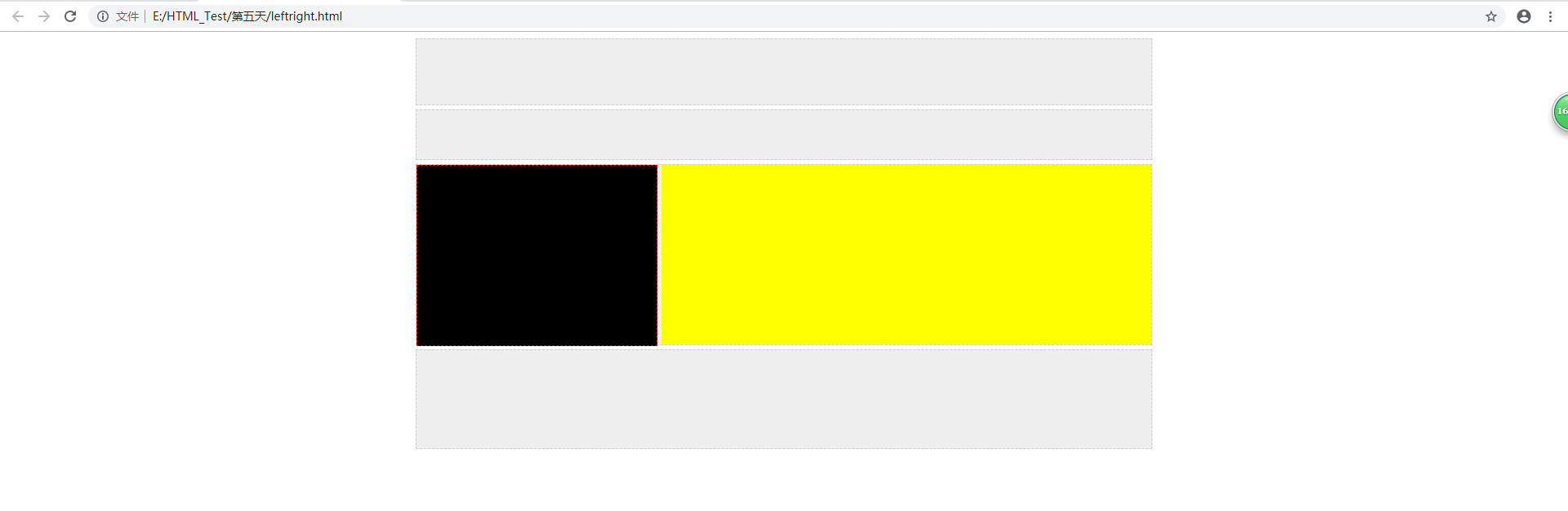
3.左右型结构
 1 <!DOCTYPE html>
 2 <html lang="en">
 3 <head>
 4     <meta charset="UTF-8">
 5     <title>Document</title>
 6     <style>
 7         .top {
 8             width: 900px;
 9             height: 80px;
10             background-color: #eee;
11             border:1px dashed #ccc;
12             margin: 0 auto;
13         }
14         .banner {
15             width: 900px;
16             height: 60px;
17             background-color: #eee;
18             border:1px dashed #ccc;
19             margin: 5px auto;
20         }
21         .main {
22             width: 900px;
23             height: 220px;
24             background-color: #eee;
25             border:1px dashed #ccc;
26             margin: 5px auto;
27         }
28         .left {
29             width: 293px;
30             height: 220px;
31             background-color: black;
32             float: left;
33             margin-right: 5px;
34             border: 1px dashed red;
35         }
36         .right {
37             width: 600px;
38             height: 220px;
39             background-color: yellow;
40             float: left;
41         }
42         .footer {
43             width: 900px;
44             height: 120px;
45             background-color: #eee;
46             border:1px dashed #ccc;
47             margin: 5px auto;
48         }
49     </style>
50 </head>
51 <body>
52     <div class="top"></div>
53     <div class="banner"></div>
54     <div class="main">
55         <div class="left"></div>
56         <div class="right"></div>
57     </div>
58     <div class="footer"></div>
59 </body>
60 </html>
效果:
4.通栏平均分布写法
 1 <!DOCTYPE html>
 2 <html lang="en">
 3 <head>
 4     <meta charset="UTF-8">
 5     <title>Document</title>
 6     <style>
 7         * {
 8             padding: 0;
 9             margin: 0;
10         }
11         .top {
12             height: 80px;
13             background-color: #eee;
14             border:1px dashed #ccc;
15             margin: 0 auto;
16         }
17         .inner {
18             width: 900px;
19             height: 80px;
20             background-color: #eee;
21             border:1px dashed #000;
22             margin: 0 auto;
23         }
24         .banner {
25             width: 900px;
26             height: 60px;
27             background-color: #eee;
28             border:1px dashed #ccc;
29             margin: 5px auto;
30         }
31         .banner li {
32             float: left;
33             width: 222px;
34             height: 60px;
35             margin-right: 4px;
36         }
37         .first {
38             background-color: pink;
39         }
40         .second {
41             background-color: purple;
42         }
43         .three {
44             background-color: blue;
45         }
46         li.four {
47             background-color: green;
48             margin-right: 0px;
49         }
50         .main {
51             width: 900px;
52             height: 220px;
53             border:1px dashed #ccc;
54             margin: 5px auto;
55         }
56         .left {
57             width: 295px;
58             height: 220px;
59             background-color: #eee;
60             float: left;
61             margin-right: 5px;
62         }
63         .right {
64             width: 600px;
65             height: 220px;
66             background-color: yellow;
67             float: left;
68         }
69         .footer {
70             width: 900px;
71             height: 120px;
72             background-color: #eee;
73             border:1px dashed #ccc;
74             margin: 5px auto;
75         }
76     </style>
77 </head>
78 <body>
79     <div class="top">
80         <div class="inner">123</div>
81     </div>
82     <div class="banner">
83         <ul>
84             <li class="first">1</li>
85             <li class="second">2</li>
86             <li class="three">3</li>
87             <li class="four">4</li>
88         </ul>
89     </div>
90     <div class="main">
91         <div class="left"></div>
92         <div class="right"></div>
93     </div>
94     <div class="footer"></div>
95 </body>
96 </html>
效果:

八:实战
1.