transform
向元素应用 2D 或 3D 转换。该属性允许我们对元素进行旋转、缩放、移动或倾斜。
兼容性: Internet Explorer 10、Firefox、Opera 支持 transform 属性。
Internet Explorer 9 支持替代的 -ms-transform 属性(仅适用于 2D 转换)。
Safari 和 Chrome 支持替代的 -webkit-transform 属性(3D 和 2D 转换)。
Opera 只支持 2D 转换。
兼容性写法: -ms-transform:rotate(20deg); /* IE 9 */
-webkit-transform:rotate(20deg); /* Safari and Chrome */
-moz-transform:rotate(20deg); /* firefox */
-o-transform:rotate(20deg);/* Opera */
语法:
//2d旋转
ransform :rotate(angle) | rotataX(angle) | rotateY(angle) | rotateZ(angle)
//3d旋转
transform :rotate(X,Y,z | angle)
//矩阵
transform: matrix(a,b,c,d,e,f)
//倾斜
skew(X,Y)
//缩放
scale(X,Y)
旋转:rotate(angle)
rotate(angle),通过指定的角度对元素进行2D旋转,正值时顺时针旋转,负值时将逆时针旋转。
transform:rotate(-20deg)
<div class="rotate">
        <div><span>我不想旋转</span></div>
</div>
<style>
.rotate div{
            width: 100px;
            height: 100px;
            line-height: 100px;
            background: green;
            color: #fff;
        }
 .rotate:hover div{
            width: 100px;
            height: 100px;
            line-height: 100px;
            background: green;
            color: #fff;
            -webkit-transform: rotate(-20deg);
            -moz-transform: rotate(-20deg);
            transform:rotate(-20deg);
            margin-bottom:20px;
            cursor: pointer;
            transition: 0.5s ease-out;
        }
        .rotate span {
            display:block;
            -webkit-transform: rotate(20deg);
            -moz-transform: rotate(20deg);
            transform:rotate(20deg);
        }
</style>

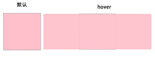
缩放:scale()
缩放scale()具有三种情况:scale(x,y)表示X、Y轴同时放缩(如果只给一个值,x、y轴同时缩放相同倍数,给2个不同得值则根据所给数值进行缩放);scaleX(x)仅向水平方向缩放(x轴);scaleY(y)仅向垂直方向缩放(y轴);但他们的缩放中心点是一样的,中心点就是元素中心的位置,缩放倍数小于1表示缩小X呗,大于1表示放大x倍。
transform:scale(0.8) /*缩小0.8倍*/
<div class="scale">
        <div class="scale1"></div>
</div>
<style>
.scale{
            width: 200px;
            height: 200px;
            border: 1px dashed #000;
        }
.scale1{
            width: 198px;
            height: 198px;
            background: #ffc0cb;
        }
.scale1:hover{
            transition: 0.2s;
            transform: scale(0.8);
            -webkit-transform: scale(0.8);
            -moz-transform: scale(0.8);
            opacity: 0.9;
            cursor: pointer;
        }
</style>

transform:scale(1.5,0.8) /*沿x轴放大1.5倍,沿y轴缩小0.8倍*/
<div class="scale">
        <div class="scale2"></div>
</div>
<style>
.scale{
            width: 200px;
            height: 200px;
            border: 1px dashed #000;
        }
.scale2{
            width: 198px;
            height: 198px;
            background: #ffc0cb;
        }
.scale2:hover{
            transition: 0.2s;
            transform:scale(1.5,0.8);
            -webkit-transform: scale(1.5,0.8);
            -moz-transform: scale(1.5,0.8);
            opacity: 0.9;
            cursor: pointer;
        }
</style>

transform:scaleX(1.5) /*沿x轴放大1.5倍*/
<div class="scale">
        <div class="scale3"></div>
</div>
<style>
.scale{
            width: 200px;
            height: 200px;
            border: 1px dashed #000;
        }
.scale3{
            width: 198px;
            height: 198px;
            background: #ffc0cb;
        }
        .scale3:hover{
            transition: 0.2s;
            transform: scaleX(3);
            -webkit-transform: scaleX(3);
            opacity: 0.9;
            cursor: pointer;
        }
</style>
位移:translate()
位移:translate()也具有三种情况:translate(x,y)水平方向和垂直方向同时移动(x轴y轴同时移动);translateX(x)仅水平方向移动(X轴移动);translateY(y)仅水平方向移动(X轴移动)
translate(20px,10px)
<div class="scale">
        <div class="translate1">translate(20px,10px)</div>
</div>
<style>
.scale{
            width: 200px;
            height: 200px;
            border: 1px dashed #000;
        }
.translate1{
            width: 200px;
            height: 200px;
            background: lime;
            cursor: pointer;
        }
.translate1:hover{

            transform: translate(20px,10px);
            -webkit-transform:translate(20px,10px);
            background: #ffc0cb;
            transition: 1s;
        }
</style>

translateX(100px)
<div class="scale">
        <div class="translate2">translateX(100px)</div>
</div>
<style>
.scale{
            width: 200px;
            height: 200px;
            border: 1px dashed #000;
        }
.scale2{
            width: 198px;
            height: 198px;
            background: #ffc0cb;
        }
.scale2:hover{
            transition: 0.2s;
            transform:scale(1.5,0.8);
            -webkit-transform: scale(1.5,0.8);
            -moz-transform: scale(1.5,0.8);
            opacity: 0.9;
            cursor: pointer;
        }
</style>

translateY(100px)
<div class="scale">
        <div class="translate3">translateY(100px)</div>
</div>
<style>
.scale{
            width: 200px;
            height: 200px;
            border: 1px dashed #000;
        }
.scale3{
            width: 198px;
            height: 198px;
            background: #ffc0cb;
        }
.scale3:hover{
            transition: 0.2s;
            transform: scaleX(3);
            -webkit-transform: scaleX(3);
            opacity: 0.9;
            cursor: pointer;
        }
</style>
扭曲/倾斜:skew()
同样,扭曲:skew()也具有三种情况:skew(x,y)水平方向和垂直方向同时发生扭曲变形(x轴y轴扭曲变形,第二个参数为可选参数,如果不填表示Y轴为0deg);skewX(x)仅水平方向发生扭曲(X轴扭曲),skewY(y)仅水平方向发生扭曲(X轴扭曲)
transform: skew(20deg,30deg)
<div class="skew">
        <div>
            <span>我是文字,我决定不被扭曲</span>
        </div>
</div>
<style>
.skew{
            width:200px;
            height: 200px;
            border: 1px dashed #000;
            margin-left: 200px;
            margin-top: 50px;
        }
.skew div{
            width:200px;
            height: 200px;
            background: orange;
            transform: skew(20deg,30deg);
            -webkit-transform: skew(20deg,30deg);
        -moz-transform: skew(20deg,30deg);
        -o-transform: skew(20deg,30deg);
        -ms-transform: skew(20deg,30deg);
        }
.skew span{
            display: block;
            transform: skew(-20deg,-30deg);
            -webkit-transform: skew(-20deg,-30deg);
        -moz-transform: skew(-20deg,-30deg);
        -o-transform: skew(-20deg,-30deg);
        -ms-transform: skew(-20deg,-30deg);
        }
</style>

transform: skew(20deg)/*等价于:transform: skewX(20deg)*/
<div class="skew1">
        <div>
            <span>不填Y的参数,看效果</span>
        </div>
</div>
<style>
.skew1{
            width:200px;
            height: 200px;
            border: 1px dashed #000;
            margin-left: 200px;
            margin-top: 50px;
        }
 .skew1 div{
            width:200px;
            height: 200px;
            background: orange;
            transform: skew(20deg);
            -webkit-transform: skew(20deg);
        -moz-transform: skew(20deg);
        -o-transform: skew(20deg);
        -ms-transform: skew(20deg);
        }
 .skew1 span{
            display: block;
            transform: skew(-20deg);
            -webkit-transform: skew(-20deg);
        -moz-transform: skew(-20deg);
        -o-transform: skew(-20deg);
        -ms-transform: skew(-20deg);
        }
</style>

transform: skewY(30deg)
<div class="skew2">
       <div>
            <span>Y轴扭曲</span>
        </div>
</div>
<style>
.skew2{
            width:200px;
            height: 200px;
            border: 1px dashed #000;
            margin-left: 200px;
            margin-top: 50px;
            margin-bottom: 100px;
        }
.skew2 div{
            width:200px;
            height: 200px;
            background: orange;
            transform: skewY(30deg);
            -webkit-transform: skewY(30deg);
            -moz-transform: skewY(30deg);
            -o-transform: skewY(30deg);
        -ms-transform: skewY(30deg);
        }
.skew2 span{
            display: block;
            transform: skewY(-30deg);
            -webkit-transform: skewY(-30deg);
        -moz-transform: skewY(-30deg);
        -o-transform: skewY(-30deg);
        -ms-transform: skewY(-30deg);
        }
</style>

矩阵:matrix(a,b,c,d,e,f)
transform:matrix(1,0,0,1,0,0)
/**********************/
/*矩阵:matrix(a,b,c,d,e,f)
*a:水平缩放 1为原始大小 应用:scale()
*b:纵向扭曲(拉伸) 0为不变 应用:skew()
*c:横向扭曲(拉伸) 0为不变
*d:垂直缩放 1为原始大小
*e:水平偏移量 0是初始位置 应用:translate()
*f:垂直偏移量 0是初始位置
*/
/**********************/
transform: matrix(0.8,0,0,0.8,10,10);
/*transform: matrix(水平缩小0.8倍,水平拉伸0,垂直拉伸0,垂直缩小0.8倍,水平偏移10px,垂直偏移10px)*/
<div class="matrix">
    <div></div>
</div>
<style>
.matrix{
width:200px;
height:200px;
border: 1px dashed #000;
}
.matrix div{
            width: 200px;
            height: 200px;
            background: red;
        }
.matrix div:hover{
            cursor: pointer;
            background: #ffff00;
            transform: matrix(0.8,0,0,0.8,10,10);
            -webkit-transform: matrix(0.8,0,0,0.8,10,10);
        -moz-transform:matrix(0.8,0,0,0.8,10,10);
        -o-transform: matrix(0.8,0,0,0.8,10,10);
        -ms-transform: matrix(0.8,0,0,0.8,10,10);
            transition: 0.5s;
        }
</style>
