CSS3shapes
http://www.css3shapes.com/
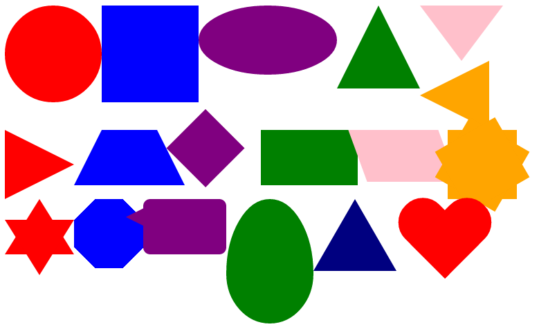
<!DOCTYPE html>
<html lang="zh-CN">
<head>
    <meta charset="utf-8">
    <title></title>
</head>
<body>
    <style type="text/css">
        #circle {
            margin: 50px;
            width: 140px;
            height: 140px;
            background: red;
            -moz-border-radius: 70px;
            -webkit-border-radius: 70px;
            border-radius: 70px;
        }
        #square {
            margin: 50px;
            width: 140px;
            height: 140px;
            background: blue;
        }
        #oval {
            margin: 50px;
            width: 200px;
            height: 100px;
            background: purple;
            -moz-border-radius: 100px / 50px; /* 水平半径 / 垂直半径 */
            -webkit-border-radius: 100px / 50px;
            border-radius: 100px / 50px;
        }
        #up-triangle {
            margin: 50px;
            width: 0;
            height: 0;
            border-bottom: 120px solid green;
            border-left: 60px solid transparent;
            border-right: 60px solid transparent;
        }
        #down-triangle {
            margin: 50px;
            width: 0;
            height: 0;
            border-top: 80px solid pink;
            border-left: 60px solid transparent;
            border-right: 60px solid transparent;
        }
        #left-triangle {
            margin: 50px;
            width: 0;
            height: 0;
            border-right: 100px solid orange;
            border-top: 50px solid transparent;
            border-bottom: 50px solid transparent;
        }
        #right-triangle {
            margin: 50px;
            width: 0;
            height: 0;
            border-left: 100px solid red;
            border-top: 50px solid transparent;
            border-bottom: 50px solid transparent;
        }
        #trapezium {
            margin: 50px;
            height: 0;
            width: 80px;
            border-bottom: 80px solid blue;
            border-left: 40px solid transparent;
            border-right: 40px solid transparent;
        }
        #diamond {
            margin: 50px;
            width: 80px;
            height: 80px;
            background: purple;
            margin: 3px 0 0 30px;
            /* Rotate */
            -webkit-transform: rotate(-45deg);
            -moz-transform: rotate(-45deg);
            -ms-transform: rotate(-45deg);
            -o-transform: rotate(-45deg);
            transform: rotate(-45deg);
            /* Rotate Origin */
            -webkit-transform-origin: 0 100%;
            -moz-transform-origin: 0 100%;
            -ms-transform-origin: 0 100%;
            -o-transform-origin: 0 100%;
            transform-origin: 0 100%;
        }
        #rectangle {
            margin: 50px;
            width: 140px;
            height: 80px;
            background: green;
        }
        #parallelogram {
            margin: 50px;
            width: 130px;
            height: 75px;
            background: pink;
            /* Skew */
            -webkit-transform: skew(20deg);
            -moz-transform: skew(20deg);
            -o-transform: skew(20deg);
            transform: skew(20deg);
        }
        #twelve-point-star {
            margin: 50px;
            height: 100px;
            width: 100px;
            background: orange;
            position: relative;
        }
        #twelve-point-star:before {
            height: 100px;
            width: 100px;
            background: orange;
            content:"";
            position: absolute;
            /* Rotate */
            -moz-transform: rotate(30deg);
            -webkit-transform: rotate(30deg);
            -ms-transform: rotate(30deg);
            -o-transform: rotate(30deg);
            transform: rotate(30deg);
        }
        #twelve-point-star:after {
            height: 100px;
            width: 100px;
            background: orange;
            content:"";
            position: absolute;
            /* Rotate */
            -moz-transform: rotate(-30deg);
            -webkit-transform: rotate(-30deg);
            -ms-transform: rotate(-30deg);
            -o-transform: rotate(-30deg);
            transform: rotate(-30deg);
        }
        #six-point-star {
            margin: 50px;
            position: relative;
            width: 0;
            height: 0;
            border-left: 50px solid transparent;
            border-right: 50px solid transparent;
            border-bottom: 80px solid red;
        }
        #six-point-star:after {
            content:"";
            position: absolute;
            width: 0;
            height: 0;
            border-left: 50px solid transparent;
            border-right: 50px solid transparent;
            border-top: 80px solid red;
            margin: 30px 0 0 -50px;
        }

        #octagon {
            margin: 50px;
            width: 100px;
            height: 100px;
            background: blue;
        }
        #octagon:before {
            height: 0;
            width: 40px;
            content:"";
            position: absolute;
            border-bottom: 30px solid blue;
            border-left: 30px solid white;
            border-right: 30px solid white;
        }
        #octagon:after {
            height: 0;
            width: 40px;
            content:"";
            position: absolute;
            border-top: 30px solid blue;
            border-left: 30px solid white;
            border-right: 30px solid white;
            margin: 70px 0 0 0;
        }
        #speech-bubble {
            margin: 50px;
            width: 120px;
            height: 80px;
            background: purple;
            position: relative;
            -moz-border-radius: 10px;
            -webkit-border-radius: 10px;
            border-radius: 10px;
        }
        #speech-bubble:before {
            content:"";
            position: absolute;
            width: 0;
            height: 0;
            border-top: 13px solid transparent;
            border-right: 26px solid purple;
            border-bottom: 13px solid transparent;
            margin: 13px 0 0 -25px;
        }
        #egg {
            margin: 50px;
            display:block;
            width:126px;
            /* width has to be 70% of height */
            /* could use 70%; in a square container */
            height:180px;
            background-color:green;

            /* beware that Safari needs actual
            px for border radius (bug) */
            -webkit-border-radius:63px 63px 63px 63px/
            108px 108px 72px 72px;
            /* fails in Safari, but overwrites in Chrome */
            border-radius:50% 50% 50% 50%/60% 60% 40% 40%;
        }
        #eq-triangle {
            margin: 50px;
            width: 0;
            height: 0;
            border-bottom: 104px solid navy;
            /* 104 = 120 * 0.866 */
            border-left: 60px solid transparent;
            border-right: 60px solid transparent;
        }
        .pacman {
            margin: 50px;
            width: 0px;
            height: 0px;
            border-right: 60px solid transparent;
            border-top: 60px solid yellow;
            border-left: 60px solid yellow;
            border-bottom: 60px solid yellow;
            border-top-left-radius: 60px;
            border-top-right-radius: 60px;
            border-bottom-left-radius: 60px;
            border-bottom-right-radius: 60px;
        }
        .biohazard {
            margin: 50px;
            width: 0;
            height: 0;
            border-bottom: 60px solid black;
            border-top: 60px solid black;
            border-left: 60px solid yellow;
            border-right: 60px solid yellow;
            -moz-border-radius: 60px;
            -webkit-border-radius: 60px;
            border-radius: 60px;
        }
        #heart {
            margin: 50px;
            position: relative;
        }
        #heart:before, #heart:after {
            position: absolute;
            content: "";
            left: 70px; top: 0;
            width: 70px;
            height: 115px;
            background: red;
            -moz-border-radius: 50px 50px 0 0;
            border-radius: 50px 50px 0 0;
            -webkit-transform: rotate(-45deg);
            -moz-transform: rotate(-45deg);
            -ms-transform: rotate(-45deg);
            -o-transform: rotate(-45deg);
            transform: rotate(-45deg);
            -webkit-transform-origin: 0 100%;
            -moz-transform-origin: 0 100%;
            -ms-transform-origin: 0 100%;
            -o-transform-origin: 0 100%;
            transform-origin: 0 100%;
        }
        #heart:after {
            left: 0;
            -webkit-transform: rotate(45deg);
            -moz-transform: rotate(45deg);
            -ms-transform: rotate(45deg);
            -o-transform: rotate(45deg);
            transform: rotate(45deg);
            -webkit-transform-origin: 100% 100%;
            -moz-transform-origin: 100% 100%;
            -ms-transform-origin: 100% 100%;
            -o-transform-origin: 100% 100%;
            transform-origin :100% 100%;
        }
    </style>
    <div id="circle"></div>
    <div id="square"></div>
    <div id="oval"></div>
    <div id="up-triangle"></div>
    <div id="down-triangle"></div>
    <div id="left-triangle"></div>
    <div id="right-triangle"></div>
    <div id="trapezium"></div>
    <div id="diamond"></div>
    <div id="rectangle"></div>
    <div id="parallelogram"></div>
    <div id="twelve-point-star"></div>
    <div id="six-point-star"></div>
    <div id="octagon"></div>
    <div id="speech-bubble"></div>
    <div id="egg"></div>
    <div id="eq-triangle"></div>
    <div id="pacman"></div>
    <div id="biohazard"></div>
    <div id="heart"></div>
</body>
</html>