首先,准备两个原图:
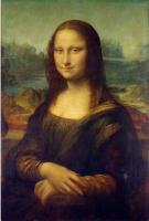
 图一)宽>高,宽为200px
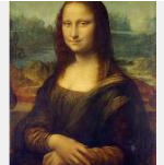
 图二)高>宽,高为200px
需求一)原图居中
 150px*150px
 250px*250px
需求二)等比例缩放,最大边撑满,其余留空

 150px*150px
 250px*250px
需求三)等比例缩放,最小边撑满,不留空

 150px*150px
 250px*250px
解决方案一)使用background
<style type="text/css">
  .box { width: 任意宽; height: 任意高; background: #f0f0f0; }

    /*需求一)原图居中*/
    .box .bg { width: 100%; height: 100%; background: url('xxx.jpg') center center no-repeat; }
    /*需求二)等比例缩放,最大边撑满,其余留空*/
    .box .bg { width: 100%; height: 100%; background: url('xxx.jpg') center center no-repeat; background-size: contain; }
    /*需求三)等比例缩放,最小边撑满,不留空*/
    .box .bg { width: 100%; height: 100%; background: url('xxx.jpg') center center no-repeat; background-size: cover; }
</style>
<div class="box">
  <div class="bg"></div>
</div>
解决方案二)使用img+宽高auto(部分场景无法满足,不推荐)
通过设置img标签的width或height,可以解决需求一:原图居中。
解决需求二,只能满足以下2种情况:1)图片宽或高>=容器 2)已知图片比较宽还是比较高
解决需求三,必须已知图片比较宽还是比较高
<style type="text/css">
  .box { width: 宽; height: 高; background: #f0f0f0;position: relative; overflow: hidden; }

    /*需求一)原图居中*/
    .box img { width: auto; height: auto; position: absolute; top: 50%; left: 50%; -webkit-transform: translate(-50%, -50%); transform: translate(-50%, -50%);  }
    /*需求二)等比例缩小,最大边撑满,其余留空(当图片宽或高>=容器)*/
    .box img { width: auto; height: auto; max-width:100%;max-height:100%; position: absolute; top: 50%; left: 50%; -webkit-transform: translate(-50%, -50%); transform: translate(-50%, -50%);}
    /*需求二)等比例缩放,最大边撑满,其余留空(当图片宽>高)*/
    .box img { width: 100%; height: auto; position: absolute; top: 50%; left: 50%; -webkit-transform: translate(-50%, -50%); transform: translate(-50%, -50%);}
    /*需求二)等比例缩放,最大边撑满,其余留空(当图片高>宽)*/
    .box img { width: auto; height: 100%; position: absolute; top: 50%; left: 50%; -webkit-transform: translate(-50%, -50%); transform: translate(-50%, -50%);}
    /*需求三)等比例缩放,最小边撑满,不留空(当图片宽>高)*/
    .box img { width: auto; height: 100%; position: absolute; top: 50%; left: 50%; -webkit-transform: translate(-50%, -50%); transform: translate(-50%, -50%);}
    /*需求三)等比例缩放,最小边撑满,不留空(当图片高>宽)*/
    .box img { width: 100%; height: auto; position: absolute; top: 50%; left: 50%; -webkit-transform: translate(-50%, -50%); transform: translate(-50%, -50%);}
</style>
<div class="box">
  <img src="xxx.jpg" />
</div>
解决方案三)使用img+object-fit(CSS3)
在css3中提供了一个object-fit,类似于background-size,可参见https://developer.mozilla.org/zh-CN/docs/Web/CSS/object-fit
此方法必须浏览器支持css3或提供兼容。
<style type="text/css">
  .box { width: 宽; height: 高; background: #f0f0f0; }

    /*需求一)原图居中*/
    .box img { width: 100%; height: 100%; object-position: center center; object-fit: none; }
    /*需求二)等比例缩放,最大边撑满,其余留空*/
    .box img { width: 100%; height: 100%; object-position: center center; object-fit: contain;}
    /*需求三)等比例缩放,最小边撑满,不留空*/
    .box img { width: 100%; height: 100%; object-position: center center; object-fit: cover;}
</style>
<div class="box">
  <img src="xxx.jpg" />
</div>