zoukankan      html  css  js  c++  java
  • 使用echarts创建一个特殊的y轴覆盖类型柱状图

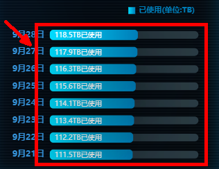
        在项目中遇到这样的需求,就是需要在连续的一段时间里边显示用户某一天的使用量和总量的占比,要很好的体现这样的效果,就需要使用柱状图,通过偏移的方式将显示使用的覆盖到总量的上层,这样讲就能直观的看到比例,效果图如下:


        在option里边的x轴、y轴以及数据series的配置如下:


          xAxis:  {
                type: 'value',
                axisTick : {show: false},
                axisLine: {show: false},
                axisLabel: {show: false},
                splitLine: {show: false},
              },
              yAxis: [ //因为y轴需要显示总数和每日使用的数据,所以这里需要配置两个几乎相同的类目轴
                {
                  type: 'category',
                  axisTick : {show: false},
                  axisLine: {show: false},
                  axisLabel: { //这里只需要配置一次就行,在y轴的显示是一样的
                    show: true,
                    color: '#3aa0ee',
                    fontFamily: 'Microsoft YaHei',
                    fontWeight: 'bold',
                  },
                  data: ['9月21日','9月22日','9月23日','9月24日','9月25日','9月26日','9月27日','9月28日']
                },
                {
                  type: 'category',
                  axisLine: {show:false},
                  axisTick: {show:false},
                  axisLabel: {show:false},
                  splitArea: {show:false},
                  splitLine: {show:false},
                  data: ['9月21日','9月22日','9月23日','9月24日','9月25日','9月26日','9月27日','9月28日']
                },
    
              ],
              series: [
                {
                  name: '总空间',
                  type: 'bar',
                  itemStyle:{
                    normal: {
                      show: true,
                      color: '#293a43',
                      barBorderRadius:50,
                    }
                  },
                  barWidth: '45%',  //柱子的宽度
                  barGap:'5%',  //不同系列的柱间距离
                  silent: true,
                  data: [200, 200, 200, 200, 200, 200, 200, 200],
                },
                {
                  name: '已使用(单位:TB)',
                  type: 'bar',
                  yAxisIndex:1,
                  itemStyle:{
                    show: true,
                    color: new echarts.graphic.LinearGradient(0, 0, 1, 0, [{
                      offset: 0,
                      color: '#00ddff'
                    }, {
                      offset: 1,
                      color: '#007db8'
                    }]),
                    barBorderRadius:5,
                    borderWidth:0,
                    borderColor:'#333',
                    shadowColor: '#000',
                    shadowBlur: 100,
                  },
                  label: {
                    show: true,
                    formatter: '{c}TB已使用',
                    fontSize: 10,
                    color: '#fff',
                    position: 'insideLeft',
                    padding: [2,0,0,2],
                  },
                  barWidth: '60%',
                  barGap:'0%',
                  data: [118.5, 117.9, 116.3,115.6, 114.1, 113.4, 112.2, 111.5].reverse()
                }
              ]
  • 相关阅读:
    ac与ap同步分析
    ipsec原理(转载)
    Sublime Text自定制代码片段(Code Snippets)
    IPsec分析/测试/
    jQuery 学习
    windows pip 安装 转载
    转载 pep8安装
    转载别人的ftp,觉得目录结构不错,学习
    博客园 CSS 代码定制
    AC自动机
  • 原文地址:https://www.cnblogs.com/kdiekdio/p/12166608.html
Copyright © 2011-2022 走看看