前言
Flex 是 CSS 做布局的好帮手. 它出生在 Float 和 Grid 的中间. Flex 基本取代了 Float 的布局方式. Grid 虽然也可以做到大部分 Flex 的效果, 但是并不能完全取代它.
所以学习 Flex 是非常有必要的, 而且学了 Flex 在学 Grid 会简单很多.
Figma 的 Auto Layout 就是用 Flex 实现的, 建议可以先玩玩 Figma 的 Auto Layout. 它做 RWD 布局非常容易.
参考:
Youtube – Flexbox is more complicated than you thought
Youtube – Learn Flexbox in 15 Minutes
Youtube – Learn flexbox the easy way
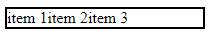
Flex 的 HTML 结构
<div class="container">
  <div class="item">item1</div>
  <div class="item">item2</div>
  <div class="item">item3</div>
  <div class="item">item4</div>
</div>
Flex 有 2 层, container > item
只有 container 内的 first layer element 才是 flex item 哦.
我们给点 CSS(Sass) 看看它的长相
.container {
  border: 1px solid red;
  width: auto;
  height: auto;

  > .item {
    width: auto;
    height: auto;

    &:nth-child(odd) {
      background-color: rgba($color: red, $alpha: 0.2);
    }
    &:nth-child(even) {
      background-color: rgba($color: blue, $alpha: 0.2);
    }
  }
}
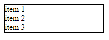
效果
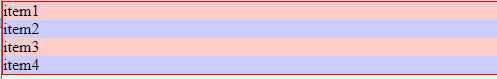
由于 div 默认是 display block 所以 div 1,2,3,4 不会横向并排, 反而是往下发展.
div width auto 默认行为是 fill container (Figma 术语) height auto 则是 hug content (Figma 术语)
Flex 的默认值
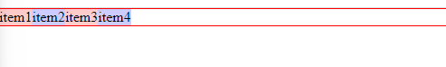
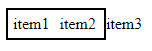
现在我们加入 display: flex 看看它的效果
display: flex;
虽然只给了一个属性, 但是 Flex 有许多默认值. 所以它其实是这样的
.container {
  display: flex;
  flex-direction: row;
  flex-wrap: nowrap;
  justify-content: flex-start;
  align-items: stretch;
  align-content: stretch;
  gap: 0;

  > .item {
    flex-grow: 0;
    flex-shrink: 1;
    flex-basis: auto;
  }
}
效果

和原先的已经完全不一样了.
Flex 属性 (过一轮)
先过一轮每一个属性, 还有它大致上的作用. 有个画面就好, 后面会详细讲解.
flex-direction (container)
flex item 的摆放方向, row 表示 horizontal 横向, column 表示 vertical 直
它有一个特色就是突破 display block, item 虽然是 display block 但是 div 1,2,3,4 依然被强制放到了一排.
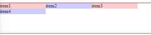
flex-wrap (container)
flex-wrap 表示当 item 超过 container width 时, 应该如何摆放
wrap 表示把 item 放到下一行

nowrap 则表示让 item 超出 container

justify-content (container)
justify 是做 align 的, align 的 direction 和 flex-direction 一致. 比如上面的例子 flex-direction 是 row, 所以 align 的 direction 就是 horizontal.
align-items (container)
align-items 也是做 align 的, align 的 direction 和 flex-direction 相反. 比如上面的例子 flex-direction 是 row, 所以 align 的 direction 就是 vertical.

它有一个特别的属性叫 stretch 拉紧, 意思是 item height fill container
注: container 的 align-items 是可以被 item 的 align-self 覆盖的, 所以也可以理解为, container 设置 align-items 只是一个批量操作, 为了方便而已.
align-content (container)
当设置了 flex-wrap: wrap 那么 container 的 align-items 和 item 的 align-self 都会失效. 取而代之是 container 的 align-content. (无论 item 是否真的超过 container 哦, 只要 set wrap 那么就生效了)
gap (container)
item 之前的间距 (gutter)
 gap: 10px
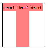
flex-grow (item)
grow 表示当 container 有多余的空位时, 是否自动加大 item, 它的 direction 和 flex-direction 一致, 比如上面的例子 flex-direction 是 row, 那么 flex-grow 的 direction 就是 horizontal.

白色区域就是多出来的空位. grow: 0 表示不会增加, grow: 1 是一个比例. 比如上面这个 .gif 中, item 1,2,3,4 分别的比例是, 1,1,1,7
多出来的空位中, 7 / 10 由 item4 来填补上. 所以最终效果 item4 特别大.
flex-shrink (item)
shrink 和 grow 相反, 它表示当 container 空位不足够时, 是否自动减少 item, 它的 direction 和 flex-direction 一致, 比如上面的例子 flex-direction 是 row, 那么 flex-grow 的 direction 就是 horizontal.
它和 wrap 是冲突的, wrap 优先. 所以一般上要 shirink 就会配上 nowrap.

flex-basis (item)
它的 diction 和 flex-direction 一致, 比如上面的例子 flex-direction 是 row, 那么 flex-basis 是 horizontal 也就是 width.
它的功效就是依据 direction 去替代 width / height 而已. 当 basis = auto 时, 它会直接拿 width / height 的值来用.
小总结
上面过了一轮 flex 的大部分属性和它的基本公用. 有个画面就好. 下面我们来逐一看看它们的细节.
要了解 Flex, 我们脑袋里要时刻有 container, item, 和他们的 dimension (width / height) 最后在配上各种 flex 属性.
Flex 对 width / height: auto 的影响
Flex 的出现会影响 width / heigth: auto 的效果, 只有 auto 哦, 如果是 100px 或 100% 则不会被 flex 影响. 例子说明:
align-self / align-items: stretch 对 height: auto 的影响

&:nth-child(1) { height: 100px; align-self: stretch; }
&:nth-child(2) { height: auto;  align-self: stretch; }
&:nth-child(3) { height: 100%;  align-self: stretch; }
&:nth-child(4) { height: 80px;  align-self: stretch; }
我们来解释一下这图效果.
container height: auto = hug content
item1, height 100px 负责撑大 container
item 2, height: auto 本来应该是 hug content 的效果, 但是被 stretch 影响了, 变成了 fill container (stretch 影响了 auto)
item 3, stretch 只能影响 auto, 所以当 100% 的时候就不被影响了, 然后它的效果是 hug content 是因为 parent 是 hug content, child 就不可以是 fill container (冲突)
item 4, stretch 只能影响 auto, 所以 80px 的时候就不被影响了, 它的效果会变成 flex-start.
小总结
container width/height: auto 不受 flex 影响.
item height:auto 受 align-self: stretch 影响 变成 fill container
item auto 受 flex 影响 (when direction row) 变成 hug content
Flex 属性 (逐个解释)
flex-direction
.flex-container {
  display: flex;
  flex-direction: row;
  width: 200px;
  border: 2px solid black;
}
设置 display: flex 以后, 第一步就是选方向.
默认是 row (horizontal 横向)
效果:
虽然里面的 div 是 display block, 但是经过 flex 处理, 它就往横向走了.
flex-direction: column; 就往下走, 如果 item 是 inline 也会被强制变成往下
flex-wrap
wrap 是设置当 container 装不下 item 的时候要如何处理. 默认值是 nowrap.
假设 container 100px;
item3 跑出去了, 通过设置 flex-wrap: wrap 效果如下:
item3 没有跑出去, 反而是往下掉了. 这个在做 RWD (Responsive Web Design) 超实用的.
flex-flow
flex-flow 是 flex-direction 和 flex-wrap 的 shorthand.
flex-flow: row wrap;
justify-content
justify-content 是用来做 alignment 的. 有点像 Figma 的这个
注: align 的前提是要有空间, 通常 container 的 width, height 不是 hug content, 或者 item 的 width, height 宽度/高度不一致, 不然没有空间, align 毛啊.
justify-content 调整的方向和 direction 的方向是一致的, 比如 direction 是 horizontal, 那么 justify-content 调整的就是左右.
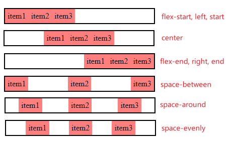
前面 4 个是比较常用到的. 通常是写 flex-start 而不是 left 或 start, 虽然 chrome 都能接受.
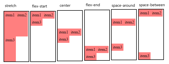
align-items
align-items 的默认值是 stretch 伸缩的意思.
container height 50px, item height auto 的情况下

baseline 通常用于对齐字体, 如果字体一样的话, 它的效果和 flex-start 是一样的.
align-content
align-content 和 align-items, justify-content 差不多玩法,
首先它只能用于 flex-wrap:wrap 的情况下, nowrap 情况下, align-content 是无视的.
当 item 超过 container, item 会被 wrap 成多排, 可以把这 2 排想象成 2 个 item, 所以它也能类似 justify-content 那样做 space-between
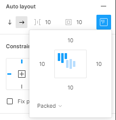
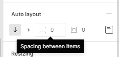
Gap
Flex 也是可以用 gap 的, 和 Grid 一样.
它就是 Figma 的 Spacing between items,
gap vs gutter (垄沟)
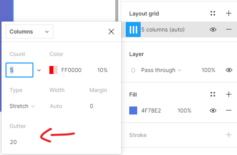
CSS Flex 和 Grid 都是用 gap, gutter 是用在 Figma 的 Grid Layout 虽然它们很相识.
Flex 和 item height 100%
相关参考:
How can I make Flexbox children 100% height of their parent?
height auto 表示 hug content (Figma 术语), 依据内容高.
height 100% 表示 fill container (Figma 术语), 依据 parent 高
在没有 flex 的情况下, 如果 parent height auto, child height 100%
那么这个 parent 会因为 child 100% 也变成 100%, 高度会变大. (多个 item 才会这样哦)
但在 flex 的情况下则不会这样.
container height auto, item 100% = 没任何效果.
 item1 height 100%, container height auto, item2 height 100px
看吧, item1 没有 100% 丫.
如果只是 item1 100%, container, item2,3 auto. 那也是直接无视.
所以要做到 container hug content, item fill container, 那么要用到 stretch.
item1 self-align: stretch 就可以了.
不过如果想搞 height 70% 这种就暂时还不会...
Flex Item
接下来的讲解, 假定 flex-direction 是 row.
Order
顾名思义, 用来修改 element 顺序, 动态排版呢

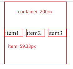
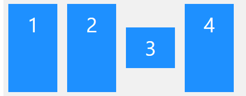
flex-grow
flex 通常用来做 RWD. 所以很多时候都是用比例来做 width 的, flex-grow 就是用来 set 比例的. default value 是 0.
0 表示 item 是 hug content, 其它号码表示 item 对其它 item 的比例.
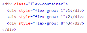
假设 container 1000px
item1 = 1 / (1+1+8) = 10% = 100px (1:10)
item2 = 100px (1:10)
item3 = 800px (8:10)
按比例分配.
注: 它分配的是剩余的空间哦.

假设 item3 是 100px, 那么剩余的空间是 900px
item1 = 1 / (1+1) = 50% = 450px
item2 = 450px
item3 = 100px
flex-shrink
有 3 个 items,
container width 200px,
item width 100px
显然装不下. 如果 container 是 wrap 就往下掉, 如果是 nowrap 那么它首先会 shrink 缩水 item width
 item 没有满足设定的 100px, 而是被硬硬缩水到了 container 里面, 3 个 item 平均分担了不足够的空间.
那如果硬硬要 item 100px 呢?
在 item 设置 flex-shrink: 0 (它默认是 1, 它也是一个比例概念, 类似上面的 flow 1:1:8 的例子, 越大就缩水越厉害)
0 表示不可以 shrink 那么结果会变成这样
 超出去了
超出去了
还有一个点要知道, 只有 avaiable width 可以被缩水, padding, border 是不会被缩小的.
 青色部分是 padding
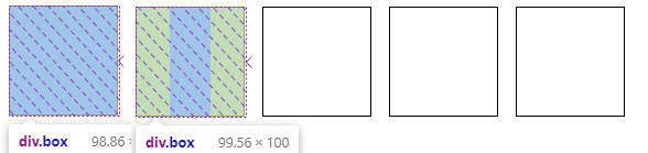
一个例子:

564px 才足够, 但是 container width 只有 559px 少了 5px. 如果 item2 没有 padding. 那么每一个 -1px 就是答案.
比例这么算, total avaiable width can shrink = 100 x 4 + 40 = 440px
item 1 比例是 100 / 440. 总共缺了 5px 所以它需要负责 100 / 440 x 5 = 1.136px (最终剩下 98.864px)
item 2 比例是 40 / 440 它需要负责 40 / 440 x 5 = 0.454px (最终剩下 99.564, 60 是 padding)
flex-basis
参考:
What are the differences between flex-basis and width?
basis 就是 item 的 尺寸. 假设 container 是 flex-direction: row.
flex-basis 指的就是 width. 那么对比起设置 width 有什么区别吗?
黄金法则:

flex-basis 你不设置, 它就是 auto, 然后它会去拿 width. 当你设置后, 它就无视 width 了. (建议使用 flex-basis)
flex-basis 是会被 grow 和 shrink 影响的, 也会被 min/max dimension 影响.
flex
它是 flex-grow, flex-shrink, flex-basis 的 shorthand.
flex: 1 代表什么呢? What does flex: 1 mean?
直觉可能会以为是 flex-grow: 1
但它是 flex: 1 1 0
basis 的默认是 auto, 但是 flex: 1 = flex: 1 1 0, 所以 basic 变成了 0
align-self
container 有 align-items 控制所有 item
但是如果有其中一些 item 想要例外, 那么就可以使用 align-self, 达到这样的效果
container align-items: stretch,
item 3 align-self : center
Display: inline-flex
display: flex 属于 block, 如果 auto 相等于 100% 跟 parent 跑.
如果想让 container hug content width (direction: row) 的话就需要用 inline flex, auto
inline flex 也是可以设置 width 的哦, 这个和 display: inline 不同, flex 也没有 display: inline-block-flex 这种东西.
Layout Grid by Flex
用例子领悟
有个 container, 左边是 title, 右边是图, 各占 50%

HTML
<div class="container">
  <div class="col-left">
    <h1>Hello,</h1>
    <h1>My name is</h1>
    <h1>Arfan</h1>
  </div>
  <div class="col-right">
    <img src="img/img1.jfif" />
  </div>
</div>
CSS
.container {
  display: flex;
  background-color: pink;
}
.container .col-left {
  flex-grow: 1;
  background-color: blue;
}
.container .col-right {
  flex-grow: 1;
  background-color: yellow;
}
通过 flex-grow 1:1 分配 width
效果
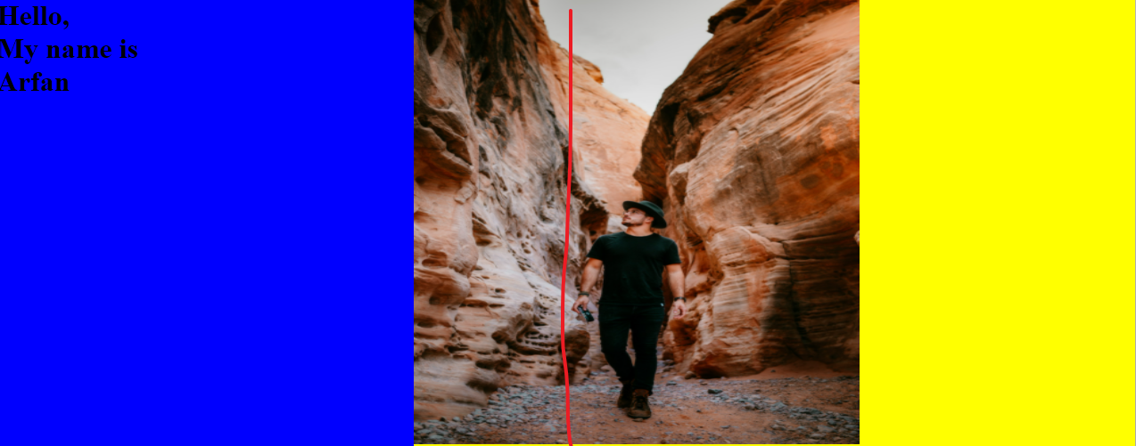
结果发现并没有平均分配, 原因是 grow 是分配剩余的空间, 把 grow 拿掉会看见 col-left, col-right 是不一样 width.

所以正确的做法是用
flex: 1 也等价于 flex: 1 1 0
最后一个 0 就把 basis 变成 0px 了, 这样 col-left, col-right 的 width 就相同了, 然后通过 grow 增长到填满 container, 就实现了 50%
