Chapter 7 - Collaborative Analytics with Plotly
Segment 2 - Creating statistical charts
Setting up to use Plotly within Jupyter
import numpy as np
import pandas as pd

import cufflinks as cf

import chart_studio.plotly as py
import chart_studio.tools as tls
import plotly.graph_objs as go

import sklearn
from sklearn.preprocessing import StandardScaler
tls.set_credentials_file(username='xxxx', api_key='Lx0brxxxxxkKpxYxxxx')
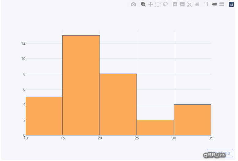
Creating histograms
Make a histogram from a pandas Series object
address = '~/Data/mtcars.csv'

cars = pd.read_csv(address)
cars.columns = ['car_names','mpg','cyl','disp', 'hp', 'drat', 'wt', 'qsec', 'vs', 'am', 'gear', 'carb']

mpg = cars.mpg

mpg.iplot(kind='histogram', filename='simple-histogram-chart')
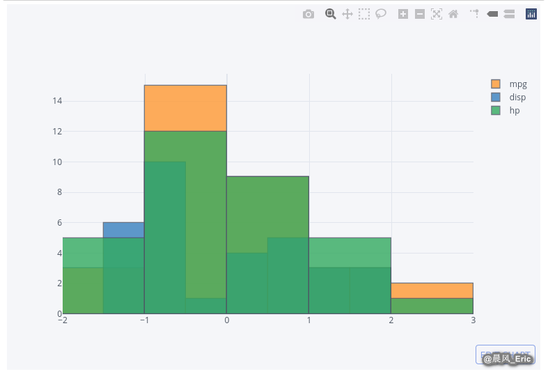
cars_subset = cars[['mpg','disp','hp']]

cars_data_std = StandardScaler().fit_transform(cars_subset)

cars_select = pd.DataFrame(cars_data_std)
cars_select.columns = ['mpg','disp','hp']

cars_select.iplot(kind='histogram', filename = 'multiple-histogram-chart')
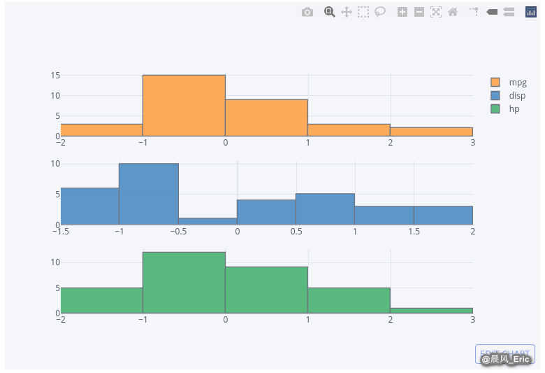
cars_select.iplot(kind='histogram', subplots=True, filename = 'subplot-histograms')
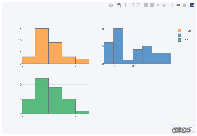
cars_select.iplot(kind='histogram', subplots=True, shape=(3,1), filename = 'subplot-histograms')
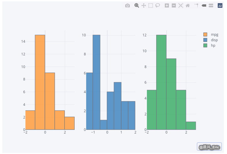
cars_select.iplot(kind='histogram', subplots=True, shape=(1,3), filename = 'subplot-histograms')
Creating box plots
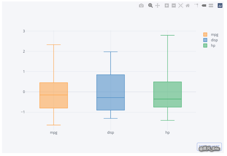
cars_select.iplot(kind='box',filename = 'box-plots')
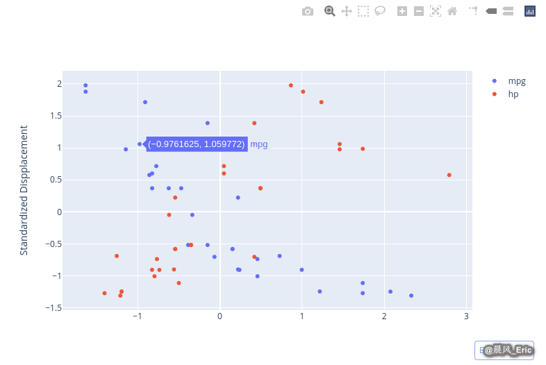
Creating scatter plots
fig = {'data':[{'x':cars_select.mpg, 'y':cars_select.disp,'mode':'markers','name':'mpg'},
              {'x':cars_select.hp,'y':cars_select.disp,'mode':'markers','name':'hp'}],
      'layout':{'xaxis':{'title':''},'yaxis':{'title':'Standardized Dispplacement'}}}
py.iplot(fig, filename='grouped-scatter-plot')