[深入浅出iOS库]之图形库CorePlot
罗朝辉 (http://www.cnblogs.com/kesalin/)
本文遵循“署名-非商业用途-保持一致”创作公用协议
一,前言
Core Plot和s7Graph都是可在iOS平台下使用的开源矢量图形库,s7Graph功能相对比较简单一些,在此就不介绍了。Core Plot 功能强大很多,我们可以利用它很方便地画出复杂的曲线图、柱状图和饼图等等。下面我先来介绍如何在项目中配置使用 Core Plot 库,然后通过一个曲线图示例来演示如何使用它,最后结合示例介绍 Core Plot 的框架结构。
本文源代码:https://github.com/kesalin/iOSSnippet/tree/master/CorePlotDemo
效果图:
二,在iOS工程中配置 Core Plot
1,下载 Core Plot 库
Core Plot 代码仓库托管在 Google Code 上,可通过 https://code.google.com/p/core-plot/ 获取最新的库和源码(目前为1.1),在这里我们只关心 iOS平台:
解压 CorePlot_1.1.zip,其目录结构如下:
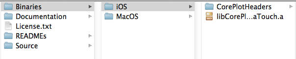
如果通过静态链接方式引用CorePlot库,那么我们只需要关心Binaries/iOS目录即可,但是作为一个喜欢钻研的程序员,Documentation和Source下面想必你也不会视而不见;如果通过引入工程文件方式引用CorePlot库,那么我们需要引用Source/framework/CorePlot-CocoaTouch.xcodeproj。注意:CorePlot同时支持OS X 和 iOS 平台,CorePlot.xcodeproj 是OS X平台工程。此外,Source/examples 下的大量示例代码绝对是不可忽视的第一手参考资料。
顺便吐槽一句,iOS平台的开源库很多,也会强大,但一如 iOS 系统自身,向后兼容性太差,用过Cocos 2D等库的童鞋应该深有体会。CorePlot也不例外,以前用0.4版本的时候,类名前缀市 CP,现在都修改为 CPT(CorePlot-Touch)了。
2,在工程中添加 Core Plot 库
下面,我将介绍如何用静态链接方式引用 CorePlot 库
a),新建 CorePlotDemo SingleView 工程,拷贝 Binaries/iOS 目录到项目目录下,并重命名 iOS 为 CorePlotLib,如图所示:
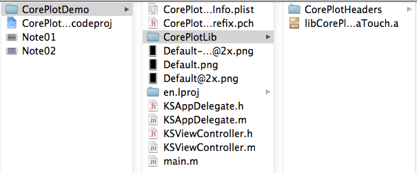
b) 在工程中通过添加已存在文件将 CorePlotHeaders 目录下的文件全部添加,并链接 libCorePlotTouch.a 静态库。如图所示:

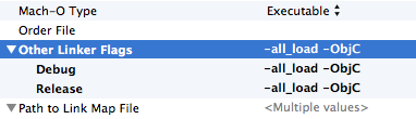
c) 因为CorePlot使用到 QuartzCore 库,所以我们还需要连接 QuartzCore.framework。此外为了让 XCode 装载导入头文件,需要设置编译环境,在 build setting 中查找 other linker flags,添加 '-all_load -ObjC' 标志。至此设置工作完成。
三,使用 Core Plot 描绘曲线图
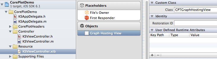
1,Core Plot 要求它进行描绘的所在 view 类型必须为 CPTGraphHostingView 类型,所以在这里,我将设置 ViewController.nib 中 View 的类型为 CPTGraphHostingView。如图所示:
2,修改 KSViewController.h 为:
#import <UIKit/UIKit.h>
#import "CorePlot-CocoaTouch.h"

@interface KSViewController : UIViewController<CPTPlotDataSource, CPTAxisDelegate>

@end
如果你用过 NSTableView,那你应该很熟悉 CPTPlotDataSource 这种形式协议的用法, CPTPlotDataSource 为 CorePlot 提供数据源。在这里我还实现了 CPTAxisDelegate 协议,当我们想要对轴刻度的标签进行一定的定制时,需要实现该协议。在本例中,要用不同的颜色对 y 轴方向大于等于0和小于0的刻度标签进行区分,因此需要实现该协议。
3,声明私有成员和方法
请参考文件:https://github.com/kesalin/iOSSnippet/blob/master/CorePlotDemo/CorePlotDemo/KSViewController.m
@interface KSViewController ()
{
    CPTXYGraph * _graph;
    NSMutableArray * _dataForPlot;
}

- (void)setupCoreplotViews;

-(CPTPlotRange *)CPTPlotRangeFromFloat:(float)location length:(float)length;

@end
在本例中,要描绘基于 xy 轴的图形,因此,声明了 CPTXYGraph 对象 _graph,然后声明一个可变数字 _dataForPlot 为 Core Plot 提供数据。私有方法 setupCoreplotView 是本例的重点,所有的描绘设置都在这个函数中进行。CPTPlotRangeFromFloat:length:是一个辅助类以简化 CPTPlotRange 的创建,其实现如下:
-(CPTPlotRange *)CPTPlotRangeFromFloat:(float)location length:(float)length
{
    return [CPTPlotRange plotRangeWithLocation:CPTDecimalFromFloat(location) length:CPTDecimalFromFloat(length)];
}
为了支持旋转操作,添加如下代码(注意,本文只考虑了 iOS6 的旋转,这又是 iOS 兼容性不太好的一大明证啊!):
#pragma mark -
#pragma mark Rotation

-(BOOL)shouldAutorotateToInterfaceOrientation:(UIInterfaceOrientation)toInterfaceOrientation
{
    return YES;
}

-(BOOL)shouldAutorotate
{
    return YES;
}
4,实现 setupCoreplotViews
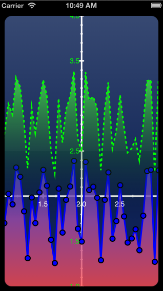
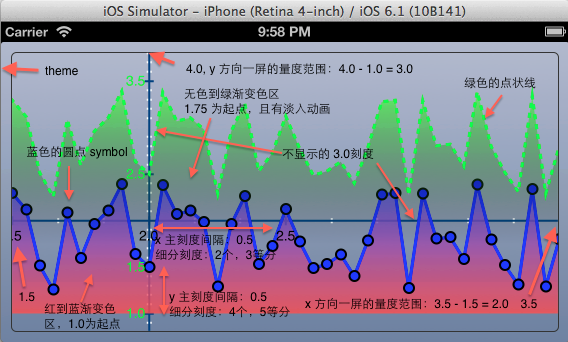
先来看效果说明图,此图非常重要,CorePlot常见的概念都在图中有说明,后文会多次引用到该图。
下面,来介绍重点内容,如何使用 CorePlot 对数据进行描绘。
- (void)setupCoreplotViews
{
    CPTMutableLineStyle *lineStyle = [CPTMutableLineStyle lineStyle];

    // Create graph from theme: 设置主题
    //
    _graph = [[CPTXYGraph alloc] initWithFrame:CGRectZero];
    CPTTheme * theme = [CPTTheme themeNamed:kCPTSlateTheme];
    [_graph applyTheme:theme];

    CPTGraphHostingView * hostingView = (CPTGraphHostingView *)self.view;
    hostingView.collapsesLayers = NO; // Setting to YES reduces GPU memory usage, but can slow drawing/scrolling
    hostingView.hostedGraph = _graph;

    _graph.paddingLeft = _graph.paddingRight = 10.0;
    _graph.paddingTop = _graph.paddingBottom = 10.0;
a)首先,创建了一个可编辑的线条风格 lineStyle,用来描述描绘线条的宽度,颜色和样式等,这个 lineStyle 会被多次用到。
然后,创建基于 xy 轴的图:CPTXYGraph,并设置其主题 CPTTheme,CorePlot 中的主题和日常软件中的换肤概念差不多。目前支持五种主题:kCPTDarkGradientTheme, kCPTPlainBlackTheme, kCPTPlainWhiteTheme, kCPTSlateTheme,kCPTStocksTheme, 最后一种股票主题效果见上面的效果图,而石板色主题 kCPTSlateTheme 效果见下面的效果图。你可以修改此处的代码尝试不同的主题效果,^_^。将 hostingView的 hostedGraph与 _graph 关联起来,也就是说:我们要在 View (CPTGraphHostingView)上画一个基于xy轴的图(CPTXYGraph)。至此,我们接触到CorePlot中的两个概念:宿主view 和图graph。然后我们设置_graph的 padding,这样在图的四周与屏幕边缘之间留有一丝空隙。
    // Setup plot space: 设置一屏内可显示的x,y量度范围
    //
    CPTXYPlotSpace * plotSpace = (CPTXYPlotSpace *)_graph.defaultPlotSpace;
    plotSpace.allowsUserInteraction = YES;
    plotSpace.xRange = [CPTPlotRange plotRangeWithLocation:CPTDecimalFromFloat(1.0) length:CPTDecimalFromFloat(2.0)];
    plotSpace.yRange = [CPTPlotRange plotRangeWithLocation:CPTDecimalFromFloat(1.0) length:CPTDecimalFromFloat(3.0)];
上面的代码设置PlotSpace,这是什么意思呢?x,y二维空间可以无限延伸,但在屏幕上我们可以看到的只是一小部分空间,这部分可视空间就由 Plot Space设置。CPTXYPlotSpace 的 xRange 和 yRange 就设置了一屏内可显示的x,y方向的量度范围。在这里,我们设置x,y轴上的起点都是1.0,然后长度分别为2个和3个单位。请结合上面的说明图理解 PlotSpace 的含义。(注意:说明图中的起点不是1.0,这是因为设置了 allowsUserInteraction 为 YES,我对PlotSpace进行了拖动所导致的)。
    // Axes: 设置x,y轴属性,如原点,量度间隔,标签,刻度,颜色等
    //
    CPTXYAxisSet *axisSet = (CPTXYAxisSet *)_graph.axisSet;

    lineStyle.miterLimit = 1.0f;
    lineStyle.lineWidth = 2.0;
    lineStyle.lineColor = [CPTColor whiteColor];

    CPTXYAxis * x = axisSet.xAxis;
    x.orthogonalCoordinateDecimal = CPTDecimalFromString(@"2"); // 原点的 x 位置
    x.majorIntervalLength = CPTDecimalFromString(@"0.5");   // x轴主刻度:显示数字标签的量度间隔
    x.minorTicksPerInterval = 2;    // x轴细分刻度:每一个主刻度范围内显示细分刻度的个数
    x.minorTickLineStyle = lineStyle;

    // 需要排除的不显示数字的主刻度
    NSArray * exclusionRanges = [NSArray arrayWithObjects:
                                 [self CPTPlotRangeFromFloat:0.99 length:0.02],
                                 [self CPTPlotRangeFromFloat:2.99 length:0.02],
                                 nil];
    x.labelExclusionRanges = exclusionRanges;
b), 有了 xy 轴图对象,我们可以来对 xy 轴的显示属性进行设置了。通过获取 XYGraph 的 axisSet 来获取轴的集合,集合中就包含了 x,y 轴对象 CPTXYAxis。在这里,设置 x 轴的原点为 2,主刻度的量度间隔为 0.5,每一个主刻度内显示细分刻度的个数为 2 个,并用白色宽度为2的线条来描绘 x 轴。如果有一些刻度的标签我们不想让它显示那该如何呢?很简单,设置轴的排除标签范围 labelExclusionRanges 即可。
同样,我们设置 y 轴的显示属性:
    CPTXYAxis * y = axisSet.yAxis;
    y.orthogonalCoordinateDecimal = CPTDecimalFromString(@"2"); // 原点的 y 位置
    y.majorIntervalLength = CPTDecimalFromString(@"0.5");   // y轴主刻度:显示数字标签的量度间隔
    y.minorTicksPerInterval = 4;    // y轴细分刻度:每一个主刻度范围内显示细分刻度的个数
    y.minorTickLineStyle = lineStyle;
    exclusionRanges = [NSArray arrayWithObjects:
                       [self CPTPlotRangeFromFloat:1.99 length:0.02],
                       [self CPTPlotRangeFromFloat:2.99 length:0.02],
                       nil];
    y.labelExclusionRanges = exclusionRanges;
    y.delegate = self;
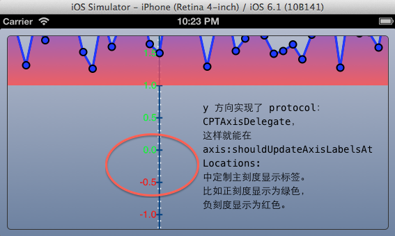
请参考说明图理解上面轴设置的含义。注意,在这里,我设置了 y 轴的 delegate 为自身,这个 delegate 需要实现CPTAxisDelegate 协议,在这里我想要用不同的颜色对 y 轴方向大于等于0和小于0的刻度标签进行区分,因此需要实现该协议方法:axis:shouldUpdateAxisLabelsAtLocations:。
#pragma mark -
#pragma mark Axis Delegate Methods

-(BOOL)axis:(CPTAxis *)axis shouldUpdateAxisLabelsAtLocations:(NSSet *)locations
{
    static CPTTextStyle * positiveStyle = nil;
    static CPTTextStyle * negativeStyle = nil;

    NSNumberFormatter * formatter   = axis.labelFormatter;
    CGFloat labelOffset             = axis.labelOffset;
    NSDecimalNumber * zero          = [NSDecimalNumber zero];

    NSMutableSet * newLabels        = [NSMutableSet set];

    for (NSDecimalNumber * tickLocation in locations) {
        CPTTextStyle *theLabelTextStyle;

        if ([tickLocation isGreaterThanOrEqualTo:zero]) {
            if (!positiveStyle) {
                CPTMutableTextStyle * newStyle = [axis.labelTextStyle mutableCopy];
                newStyle.color = [CPTColor greenColor];
                positiveStyle  = newStyle;
            }

            theLabelTextStyle = positiveStyle;
        }
        else {
            if (!negativeStyle) {
                CPTMutableTextStyle * newStyle = [axis.labelTextStyle mutableCopy];
                newStyle.color = [CPTColor redColor];
                negativeStyle  = newStyle;
            }

            theLabelTextStyle = negativeStyle;
        }

        NSString * labelString      = [formatter stringForObjectValue:tickLocation];
        CPTTextLayer * newLabelLayer= [[CPTTextLayer alloc] initWithText:labelString style:theLabelTextStyle];

        CPTAxisLabel * newLabel     = [[CPTAxisLabel alloc] initWithContentLayer:newLabelLayer];
        newLabel.tickLocation       = tickLocation.decimalValue;
        newLabel.offset             = labelOffset;

        [newLabels addObject:newLabel];
    }

    axis.axisLabels = newLabels;

    return NO;
}
在上面的代码中,对于 y 轴上大于等于0的刻度标签用绿色描绘,而小于0的刻度标签用红色描绘。因为在这里我们自己设置了轴标签的描绘,所以这个方法返回 NO 告诉系统不需要使用系统的标签描绘设置了。其效果如下:
至此,xy轴部分的描绘设置完成。
c) 下面我们向图中添加曲线的描绘:
    // Create a red-blue plot area
    //
    lineStyle.miterLimit        = 1.0f;
    lineStyle.lineWidth         = 3.0f;
    lineStyle.lineColor         = [CPTColor blueColor];

    CPTScatterPlot * boundLinePlot  = [[CPTScatterPlot alloc] init];
    boundLinePlot.dataLineStyle = lineStyle;
    boundLinePlot.identifier    = BLUE_PLOT_IDENTIFIER;
    boundLinePlot.dataSource    = self;

    // Do a red-blue gradient: 渐变色区域
    //
    CPTColor * blueColor        = [CPTColor colorWithComponentRed:0.3 green:0.3 blue:1.0 alpha:0.8];
    CPTColor * redColor         = [CPTColor colorWithComponentRed:1.0 green:0.3 blue:0.3 alpha:0.8];
    CPTGradient * areaGradient1 = [CPTGradient gradientWithBeginningColor:blueColor
                                                              endingColor:redColor];
    areaGradient1.angle = -90.0f;
    CPTFill * areaGradientFill  = [CPTFill fillWithGradient:areaGradient1];
    boundLinePlot.areaFill      = areaGradientFill;
    boundLinePlot.areaBaseValue = [[NSDecimalNumber numberWithFloat:1.0] decimalValue]; // 渐变色的起点位置

    // Add plot symbols: 表示数值的符号的形状
    //
    CPTMutableLineStyle * symbolLineStyle = [CPTMutableLineStyle lineStyle];
    symbolLineStyle.lineColor = [CPTColor blackColor];
    symbolLineStyle.lineWidth = 2.0;

    CPTPlotSymbol * plotSymbol = [CPTPlotSymbol ellipsePlotSymbol];
    plotSymbol.fill          = [CPTFill fillWithColor:[CPTColor blueColor]];
    plotSymbol.lineStyle     = symbolLineStyle;
    plotSymbol.size          = CGSizeMake(10.0, 10.0);
    boundLinePlot.plotSymbol = plotSymbol;

    [_graph addPlot:boundLinePlot];
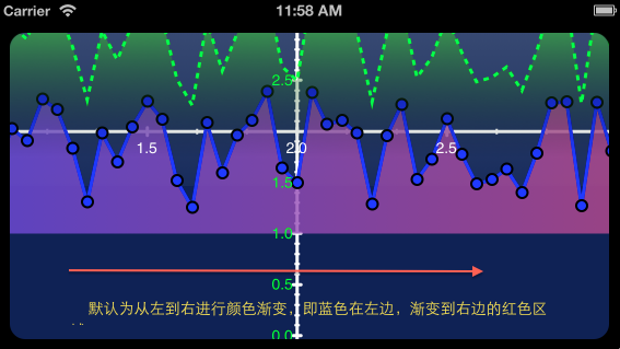
首先,添加一个由红到蓝渐变的曲线图 CPTScatterPlot,设置该曲线图的曲线线条颜色为蓝色,宽度为3,标识为 @"Blue Plot",数据源 datasource 为自身。注意:一个图中可以有多个曲线图,每个曲线图通过其 identifier 进行唯一标识。 数据源将在后面介绍。如果我们不仅仅是描绘曲线,还想描绘曲线覆盖的区域,那么就要设置曲线图的区域填充颜色 areaFill,并设置 areaBaseValue。areaBaseValue就是设置该填充颜色从哪个值开始描述,比如本例是从1.0开始描绘(见上图中红色部分开始的位置为 y=1)。在这里我们设置的填充颜色为从红色变到蓝色的渐变色 CPTGradient,CPTGradient默认的变化开始色从x轴左边变化到右边的结束色,如下图所示:
在本例中,将渐变色旋转-90度(即顺时针方向旋转90度),使得红色在下面,蓝色在上面(见说明图)。 对于曲线上的数值点用什么样的符号来表示呢?这就是CPTPlotSymbol 发挥作用的时候了,在这里是用蓝色的实心圆点来表示具体的数值。
d), 有了蓝红曲线图的介绍,下面再来添加一个破折线风格的绿色曲线图:
// Create a green plot area: 画破折线
    //
    lineStyle                = [CPTMutableLineStyle lineStyle];
    lineStyle.lineWidth      = 3.f;
    lineStyle.lineColor      = [CPTColor greenColor];
    lineStyle.dashPattern    = [NSArray arrayWithObjects:
                                [NSNumber numberWithFloat:5.0f],
                                [NSNumber numberWithFloat:5.0f], nil];

    CPTScatterPlot * dataSourceLinePlot = [[CPTScatterPlot alloc] init];
    dataSourceLinePlot.dataLineStyle = lineStyle;
    dataSourceLinePlot.identifier = GREEN_PLOT_IDENTIFIER;
    dataSourceLinePlot.dataSource = self;

    // Put an area gradient under the plot above
    //
    CPTColor * areaColor            = [CPTColor colorWithComponentRed:0.3 green:1.0 blue:0.3 alpha:0.8];
    CPTGradient * areaGradient      = [CPTGradient gradientWithBeginningColor:areaColor
                                                                  endingColor:[CPTColor clearColor]];
    areaGradient.angle              = -90.0f;
    areaGradientFill                = [CPTFill fillWithGradient:areaGradient];
    dataSourceLinePlot.areaFill     = areaGradientFill;
    dataSourceLinePlot.areaBaseValue= CPTDecimalFromString(@"1.75");

    // Animate in the new plot: 淡入动画
    dataSourceLinePlot.opacity = 0.0f;

    CABasicAnimation *fadeInAnimation = [CABasicAnimation animationWithKeyPath:@"opacity"];
    fadeInAnimation.duration            = 3.0f;
    fadeInAnimation.removedOnCompletion = NO;
    fadeInAnimation.fillMode            = kCAFillModeForwards;
    fadeInAnimation.toValue             = [NSNumber numberWithFloat:1.0];
    [dataSourceLinePlot addAnimation:fadeInAnimation forKey:@"animateOpacity"];

    [_graph addPlot:dataSourceLinePlot];
上面的代码与前面的红蓝渐变曲线图结构大体相同,只不过在这里使用的市破折线风格的线条,并且没有使用特殊符号对数值点进行描绘。在这里,我们添加了一个有意思的淡入动画。
至此,描绘相关设置就完成了。先来回顾一下整个步骤:
a) 在 CPTGraphHostingView 上放置一个 xy 轴图 CPTXYGraph;
b) 然后对 xy 轴图进行设置,设置其主题,可视空间 CPTPlotSpace,以及两个轴 CPTXYAxis;
c) 然后在 xy 轴图上添加红蓝渐变的曲线图CPTScatterPlot;
d) 然后在 xy 轴图上添加绿色破折线曲线图CPTScatterPlot;
e) 最后,我们来初始化一些演示数据,从而结束 setupCoreplotViews 方法的介绍。
    // Add some initial data
    //
    _dataForPlot = [NSMutableArray arrayWithCapacity:100];
    NSUInteger i;
    for ( i = 0; i < 100; i++ ) {
        id x = [NSNumber numberWithFloat:0 + i * 0.05];
        id y = [NSNumber numberWithFloat:1.2 * rand() / (float)RAND_MAX + 1.2];
        [_dataForPlot addObject:[NSMutableDictionary dictionaryWithObjectsAndKeys:x, @"x", y, @"y", nil]];
    }
5,实现数据源协议
#pragma mark -
#pragma mark Plot Data Source Methods

-(NSUInteger)numberOfRecordsForPlot:(CPTPlot *)plot
{
    return [_dataForPlot count];
}

-(NSNumber *)numberForPlot:(CPTPlot *)plot field:(NSUInteger)fieldEnum recordIndex:(NSUInteger)index
{
    NSString * key = (fieldEnum == CPTScatterPlotFieldX ? @"x" : @"y");
    NSNumber * num = [[_dataForPlot objectAtIndex:index] valueForKey:key];

    // Green plot gets shifted above the blue
    if ([(NSString *)plot.identifier isEqualToString:GREEN_PLOT_IDENTIFIER]) {
        if (fieldEnum == CPTScatterPlotFieldY) {
            num = [NSNumber numberWithDouble:[num doubleValue] + 1.0];
        }
    }

    return num;
}
和 NSTableView 相似,我们需要提供数据的个数,以及对应x/y轴的数据。至此,编译允许,你就能看到如期的效果:绿色破折线曲线图淡入,然后整个xy轴图就呈现在你面前,并且该图是允许你拖拽的,不妨多拖拽下,以更好地理解 CorePlot 中各种概念属性的含义。
6,动态修改 CPTPlotSpace 的范围
为了让例子更有趣一点,在 SetupCoreplotViews 的末尾添加如下代码:
[NSTimer scheduledTimerWithTimeInterval:2.0 target:self selector:@selector(changePlotRange) userInfo:nil repeats:YES];
并实现 changePlotRange 方法:
-(void)changePlotRange
{
    // Change plot space
    CPTXYPlotSpace * plotSpace = (CPTXYPlotSpace *)_graph.defaultPlotSpace;

    plotSpace.xRange = [self CPTPlotRangeFromFloat:0.0 length:(3.0 + 2.0 * rand() / RAND_MAX)];
    plotSpace.yRange = [self CPTPlotRangeFromFloat:0.0 length:(3.0 + 2.0 * rand() / RAND_MAX)];
}
四,Core Plot 框架结构分析
CorePlot 的类结构关系如下:
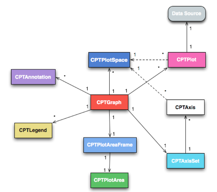
其中最核心的就是 CPTGraph,本示例中的 CPTXYGraph是它的子类;一个图 CPTGraph包含一个轴集 CPTAxiset,每个轴集可包含多个轴;一个图 CPTGraph 可包含多个图空间 CPTPlotSpace;一个图 CPTGraph 可包含多个图形CPTSplot(曲线,饼图,柱状图等);图形CPTSplot 和轴都展现在某个图空间 CPTPlotSpace 中。其余的部分,尚未介绍到,暂且不提。
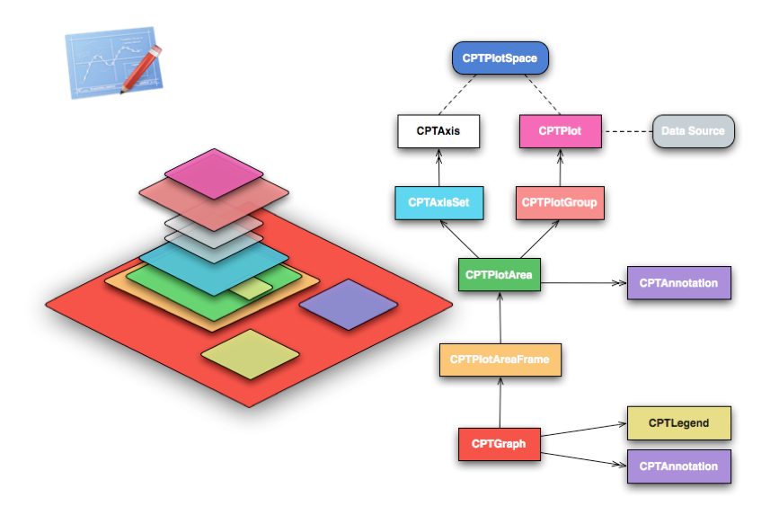
也许下图能更形象地描述出 Core Plot 各种对象之间的关系。
五,结语
Core Plot 的类结构非常清晰,使用起来也很简单,可定制化程度非常高。保守估计国内做矢量图表展示的至少有 90% 以上在用它,曾经做过的一个基金应用就用到它。BTW,吐槽下iOS开发界的浮躁,很多招聘要求都具体到用会用这个库那个库,如加密/解密,解析json/xml,或数据库 sqlite,或图形库Core Plot 或 Three20 什么的。对于有过一定工作经验的程序员来说,学习这些库的使用也不就是一两天的功夫么?当然,对于程序员本身来说,我们不能浮躁地只停留在使用层面上,应该多一点好奇心,钻研下这些库的实现,适用场景,同类库比较等等是大有裨益的。