利用R 来分析用户分享内容的实际观众数与个人估计值的差别
<我的>
library(ggplot2)

pf -> read.csv(pseudo_data.csv)
qplot(x= age, y=friend_count, data=pf)
1 library(ggplot2) #导入包
2
3 pf <- read.csv('pseudo_facebook.tsv', sep = '	') #读取文件并存入pf变量
4
5 qplot(x=age, y=friend_count, data = pf) #以age为x轴,friend_count为y轴,绘制散点图
6 qplot(age, friend_count, data = pf) #可以省略‘x= y=’变量


解决overplot 相关问题:
插入图层变量 '+' xlim() 图层 geom_point() geom_jitter()代替geom_point()增加一些噪音 从而get a clearer picture of the relationship
geom_point(alpha=1/20) alpha=1/20 表示 20个 point组成一个深色的圆圈 (it takes 20 points for a circle to appear completely dark)
<我的>

gplot(aes(x=age, y=friend_count, data=pf))+geom_point(alpha=1/20) + xlim(13,90)+ coord_trans('sqrt')
1 ggplot(aes(x = age, y = friend_count), data = pf) +
2     geom_point(alpha = 1/20) +
3     xlim(13,90) +
4     coord_trans(y = 'sqrt') #注意代码风格,第一行数据,接下来的每一行分别代表一个新图层。
geom_jitter(alpha = 1/10, position = position_jitter(h= 0)) + coord_trans(y = 'sqrt') 修正开根号时可能遇到的负数问题
mark: L4 12小节
实现数据的
dplyr package:
1 # 导入dplyr package 命令
2
3 install.packages('dplyr')
4 library(dplyr)
主要方法: filter() group_by() mutate() arrange()
which provides a set of tools for efficiently manipulating datasets in R
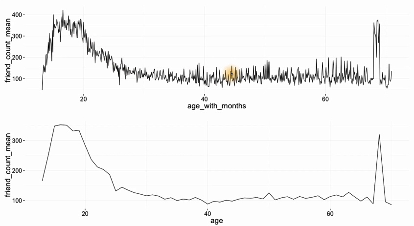
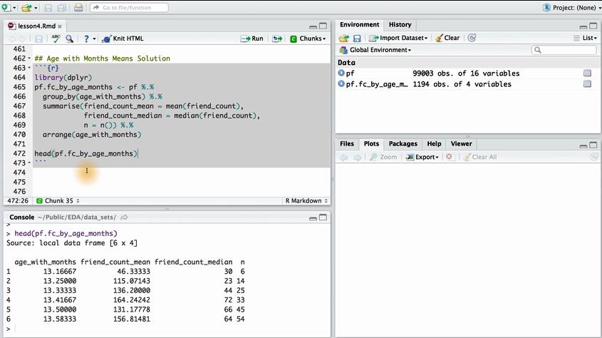
将朋友数量的平均值和中位数作为y 变量,年龄作为x变量绘制一张图表。
#我的代码

age_group = group_by(pf, ages) #按照年龄分组并赋值在一个新的变量age_group中

summarise(age_group,
                    mean_friend_count = mean(friend_count),
                    median_friend_count = median(friend_count),
                    n= n()) # n()为summarise中自带的方法
错误之处: age_group = group_by(pf, ages) 应该变为 age_group <- group_by(pf,age)
mark 15
图像叠加?
图像叠加的相关命令 geom_line()
<我的>

ggplot(aes(x=age, y = friend_count), data = pf) +
        xlim(13,90)+
        geom_jitter (alpha = 0.05, position=,h=0)+
        coord_trans('sqrt')+
        geom_line(,fun.y = mean)
错误之处: geom_point(alpha = 0.05, position = position_jitter(h=0), color = 'orange')
coord_trans(y = 'sqrt')
geom_line(stat = 'summary', fun.y = mean) #stat = 'summary' 是什么意思 stat :The statistical transformation to use on the data for this layer.
为什么要进行图像的叠加:用一张图清晰的展示变量之间的相关关系,进一步的挖掘 实例:四分位值 10%,25%,50%,75%,90% combine the original data with the displaying plot
四分位值: geom_line(stat = 'summary', fun.y = quantilte, probs = .25(.1, .5, .75,.9), linetype=2, color = 'blue')
coord_cartesian(xlim(),ylim()) 同时设定x 轴和 y轴的取值范围。
探究相关性:
Pearson product moment correlation: r
is a measure of the linear dependence (correlation) between two variables X and Y. It has a value between +1 and −1 inclusive, where 1 is total positive linear correlation, 0 is no linear correlation, and −1 is total negative linear correlation
cor.test 查看文档,先看usage 含有几个变量,有几个参数,参数对应的默认值是什么,可供选择的参量是什么
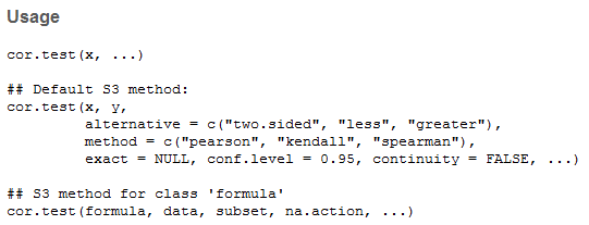
参数有两个 x 和 y method 方法 包括 'pearson', 'kendall', 'spearman',
cor.test(pf$age, pf$friend_count, method = 'pearson') #导入特定列的数据, ‘$’命令
with(pf, cor.test(age, friend_count, methodd = 'pearson')) #等效的命令
with(subset(pf, age <=70), cor.test(age, friend_count)) #对<70岁的数据计算相关系数
r = 0.3 0.5 0.7 作为分界值
xlim(0, quantile(pf$www_likes_received, 0,95)) #根据95%位值来确定坐标轴上限
mark=25
geom_smooth(method = 'lm', color = 'red') #插入一条线性拟合曲线
Noisy Scatterplot 隐含的相关关系不能够直接通过计算相关系数来体现,temperature 和 month 之间的相关系数可能为0.05但实际上隐含着波动周期,需要通过对坐标轴的进一步处理来体现。
重点:1. 让数据in the context 了解数据的来源和相关的背景信息作为分析的依据,2. proportion and scale of your graphics do matter.
+ scale_x_discrete(breaks = seq(0, 203, 12)) #将数据自动按照指定间隔分组
更加finer的分组 month
pf$age_with_months <- pf$age + (12 - pf$dob_month)/12
William Playfair ——the pioneer of the data visualization https://en.wikipedia.org/wiki/William_Playfair
summarise () 到底是什么??

p1 <-
p2 <-

library(gridExtra)
grid.arrange (p2,p1, ncol = 1) #