1.简介
CoordinatorLayout遵循Material 风格,包含在 support Library中,结合AppbarLayout, CollapsingToolbarLayout等 可 产生各种炫酷的折叠悬浮效果。
- 作为最上层的View
- 作为一个 容器与一个或者多个子View进行交互
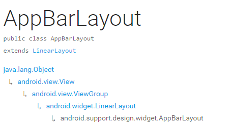
2.AppBarLayout
它是继承与LinearLayout的,默认 的 方向 是Vertical
appbarLayout的滑动flag
类型 说明
int SCROLL_FLAG_ENTER_ALWAYS W((entering) / (scrolling on screen))下拉的时候,这个View也会跟着滑出。
int SCROLL_FLAG_ENTER_ALWAYS_COLLAPSED 另一种enterAlways,但是只显示折叠后的高度。
int SCROLL_FLAG_EXIT_UNTIL_COLLAPSED ((exiting) / (scrolling off screen))上拉的时候,这个View会跟着滑动直到折叠。
int SCROLL_FLAG_SCROLL 这个View将会响应Scroll事件
int SCROLL_FLAG_SNAP 在Scroll滑动事件结束以前 ,如果这个View部分可见,那么这个View会停在最接近当前View的位置
我们可以通过两种 方法设置这个Flag
方法一
setScrollFlags(int)
方法二
app:layout_scrollFlags="scroll|enterAlways"
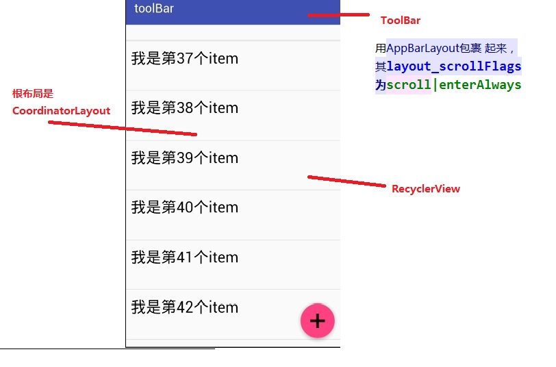
AppBarLayout必须作为CoordinatorLayout的直接子View,否则它的大部分功能将不会生效,如layout_scrollFlags等。
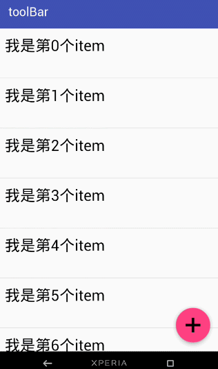
效果图一:
布局:
<android.support.design.widget.CoordinatorLayout
android:id="@+id/main_content"
xmlns:android="http://schemas.android.com/apk/res/android"
xmlns:app="http://schemas.android.com/apk/res-auto"
android:layout_width="match_parent"
android:layout_height="match_parent">
<android.support.design.widget.AppBarLayout
android:id="@+id/appbar"
android:layout_width="match_parent"
android:layout_height="wrap_content"
android:theme="@style/ThemeOverlay.AppCompat.Dark.ActionBar">
<android.support.v7.widget.Toolbar
android:id="@+id/toolbar"
android:layout_width="match_parent"
android:layout_height="?attr/actionBarSize"
android:background="?attr/colorPrimary"
app:layout_scrollFlags="scroll|enterAlways"
app:popupTheme="@style/ThemeOverlay.AppCompat.Light"/>
.
</android.support.design.widget.AppBarLayout>
<android.support.v7.widget.RecyclerView
android:id="@+id/recyclerView"
android:layout_width="match_parent"
android:layout_height="match_parent"
app:layout_behavior="@string/appbar_scrolling_view_behavior"/>
<android.support.design.widget.FloatingActionButton
android:id="@+id/fab"
android:layout_width="wrap_content"
android:layout_height="wrap_content"
android:layout_gravity="end|bottom"
android:layout_margin="15dp"
android:src="@drawable/add_2"/>
</android.support.design.widget.CoordinatorLayout>
思路分析:
那如果当我们的toolBar 等于 app:layout_scrollFlags=”scroll|snap”的时候 ,
layout_scrollFlags=scroll的时候,这个View会 跟着 滚动 事件响应,
layout_scrollFlags=“snap”的时候 在Scroll滑动事件结束以前 ,如果这个View部分可见,那么这个View会停在最接近当前View的位置。
效果如下:
结合ViewPage,布局代码如下:
<android.support.design.widget.CoordinatorLayout
android:id="@+id/main_content"
xmlns:android="http://schemas.android.com/apk/res/android"
xmlns:app="http://schemas.android.com/apk/res-auto"
android:layout_width="match_parent"
android:layout_height="match_parent">
<android.support.design.widget.AppBarLayout
android:layout_width="match_parent"
android:layout_height="250dp">
<ImageView android:layout_width="match_parent"
android:layout_height="200dp"
android:background="?attr/colorPrimary"
android:scaleType="fitXY"
android:src="@drawable/tangyan"
app:layout_scrollFlags="scroll|enterAlways"/>
<android.support.design.widget.TabLayout
android:id="@+id/tabs"
android:layout_width="match_parent"
android:layout_height="wrap_content"
android:layout_alignParentBottom="true"
android:background="?attr/colorPrimary"
app:tabIndicatorColor="@color/colorAccent"
app:tabIndicatorHeight="4dp"
app:tabSelectedTextColor="#000"
app:tabTextColor="#fff"/>
</android.support.design.widget.AppBarLayout>
<android.support.v4.view.ViewPager
android:id="@+id/viewpager"
android:layout_width="match_parent"
android:layout_height="match_parent"
app:layout_behavior="@string/appbar_scrolling_view_behavior"/>
<android.support.design.widget.FloatingActionButton
android:id="@+id/fab"
android:layout_width="wrap_content"
android:layout_height="wrap_content"
android:layout_gravity="end|bottom"
android:layout_margin="15dp"
android:src="@drawable/add_2"/>
</android.support.design.widget.CoordinatorLayout>
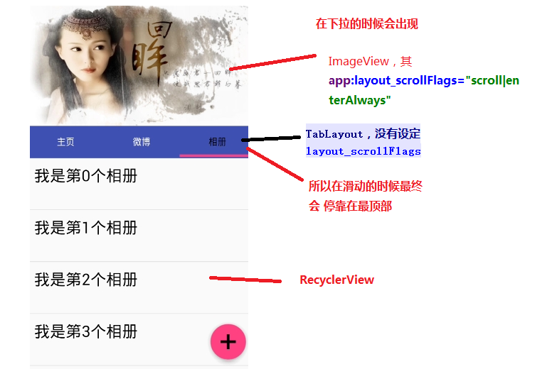
思路分析:
其实相对于前 一个例子,只是把 摆放RecyclerView 的位置替换成ViewPager而已,为了有页面导航器的效果,再使用 TabLayout而已,而TabLayout 在我们滑动的时候最终会停靠在 最顶部,是因为我们没有设置其layout_scrollFlags,即TabLayout是静态的
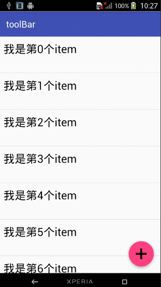
运行以后,即可看到以下的结果
3.CollapsingToolbarLayout
简单来说 ,CollapsingToolbarLayout是工具栏的包装器,它通常作为AppBarLayout的孩子。主要实现以下功能
- Collapsing title(可以折叠 的 标题 )
- Content scrim(内容装饰),当我们滑动的位置 到达一定阀值的时候,内容 装饰将会被显示或者隐藏
- Status bar scrim(状态栏布)
- Parallax scrolling children,滑动的时候孩子呈现视觉特差效果
- Pinned position children,固定位置的 孩子
常量 解释说明
int COLLAPSE_MODE_OFF The view will act as normal with no collapsing behavior.(这个 View将会 呈现正常的结果,不会表现出折叠效果)
int COLLAPSE_MODE_PARALLAX The view will scroll in a parallax fashion. See setParallaxMultiplier(float) to change the multiplier used.(在滑动的时候这个View 会呈现 出 视觉特差效果 )
int COLLAPSE_MODE_PIN The view will pin in place until it reaches the bottom of the CollapsingToolbarLayout.(当这个View到达 CollapsingToolbarLayout的底部的时候,这个View 将会被放置,即代替整个CollapsingToolbarLayout)
我们有两种方法可以设置这个常量,
方法一:在代码中使用这个方法
setCollapseMode(int collapseMode)
方法 二:在布局文件中使用自定义属性
app:layout_collapseMode="pin"
结合ViewPager的视觉特差
布局代码:
<?xml version="1.0" encoding="utf-8"?>
<android.support.design.widget.CoordinatorLayout
xmlns:android="http://schemas.android.com/apk/res/android"
xmlns:app="http://schemas.android.com/apk/res-auto"
android:layout_width="match_parent"
android:layout_height="match_parent"
android:background="@android:color/background_light"
android:fitsSystemWindows="true"
>
<android.support.design.widget.AppBarLayout
android:id="@+id/main.appbar"
android:layout_width="match_parent"
android:layout_height="300dp"
android:fitsSystemWindows="true"
android:theme="@style/ThemeOverlay.AppCompat.Dark.ActionBar"
>
<android.support.design.widget.CollapsingToolbarLayout
android:id="@+id/main.collapsing"
android:layout_width="match_parent"
android:layout_height="250dp"
android:fitsSystemWindows="true"
app:contentScrim="?attr/colorPrimary"
app:expandedTitleMarginEnd="64dp"
app:expandedTitleMarginStart="48dp"
app:layout_scrollFlags="scroll|exitUntilCollapsed"
>
<ImageView
android:id="@+id/main.backdrop"
android:layout_width="match_parent"
android:layout_height="match_parent"
android:fitsSystemWindows="true"
android:scaleType="centerCrop"
android:src="@drawable/tangyan"
app:layout_collapseMode="parallax"
/>
<android.support.v7.widget.Toolbar
android:id="@+id/toolbar"
android:layout_width="match_parent"
android:layout_height="?attr/actionBarSize"
app:layout_collapseMode="pin"
app:popupTheme="@style/ThemeOverlay.AppCompat.Light"
/>
</android.support.design.widget.CollapsingToolbarLayout>
<android.support.design.widget.TabLayout
android:id="@+id/tabs"
android:layout_width="match_parent"
android:layout_height="wrap_content"
android:layout_alignParentBottom="true"
android:background="?attr/colorPrimary"
app:tabIndicatorColor="@color/colorAccent"
app:tabIndicatorHeight="4dp"
app:tabSelectedTextColor="#000"
app:tabTextColor="#fff"/>
</android.support.design.widget.AppBarLayout>
<android.support.v4.view.ViewPager
android:id="@+id/viewpager"
android:layout_width="match_parent"
android:layout_height="match_parent"
app:layout_behavior="@string/appbar_scrolling_view_behavior">
</android.support.v4.view.ViewPager>
<android.support.design.widget.FloatingActionButton
android:id="@+id/fab"
android:layout_width="wrap_content"
android:layout_height="wrap_content"
android:layout_gravity="end|bottom"
android:layout_margin="15dp"
android:src="@drawable/add_2"/>
</android.support.design.widget.CoordinatorLayout>
效果图如下:

思路解析:
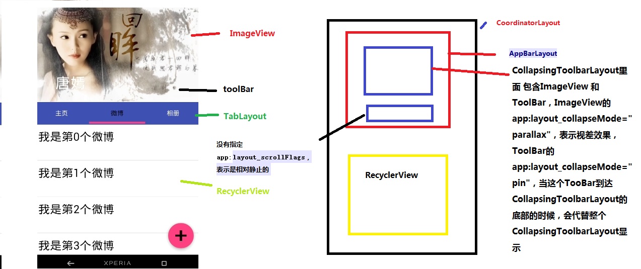
结构图如图片所示,先说明CollapsingToolbarLayout的变化
CollapsingToolbarLayout里面 包含ImageView 和ToolBar,ImageView的app:layout_collapseMode=”parallax”,表示视差效果,ToolBar的 app:layout_collapseMode=”pin”,当这个TooBar到达 CollapsingToolbarLayout的底部的时候,会代替整个CollapsingToolbarLayout显示
接着说明TabLayout的变化
从前面的描述我们已经知道当 没有指定app:layout_scrollFlags的时候,最终TabLayout会静止,不会随着滑动的 时候消失不见
这篇博客主要讲解了CoordinatorLayout,AppBarLayout,CollapsingToolbarLayout的一些相关属性。
- 对于AppBarLayout,我们主要 讲解了这个属性app:layout_scrollFlags,设置不同 的属性我们可以在滚动的时候显示不同 的效果
- 对于CollapsingToolbarLayout,我们主要讲解了app:layout_collapseMode这个属性,设置不同的值,我们可以让其子View呈现不同的 炫酷效果,如parallax和pin等
:https://blog.csdn.net/jxf_access/article/details/79564669