CSS3属性中有关于制作动画的三个属性:Transform,Transition,Animation;
一、Animation定义动画
CSS3的Animation是由“keyframes”这个属性来实现这样的效果,keyframes就是关键帧。下面先来看看Keyframes:
Keyframes语法规则:
@keyframes 动画名 {
     from{开始状态}
      to{结束状态}
  }
  调用
  animation: 动画名称 持续时间 执行次数(infinite无限) alternate(来回) 运动曲线(linear线性) 延迟时间;
定义有两种方式,from......to和百分比。具体方法如下:
 1 <style>
 2         div{
 3             width: 200px;
 4             height: 200px;
 5             background-color: green;
 6             margin: 100px;
 7             /*调用动画:动画名 持续时间 执行次数(数字或无限) alternate(来回) 线性 延迟*/
 8           /*  animation: move 2s infinite alternate linear 1s;*/
 9
10             animation: move2 4s infinite 1s;
11         }
12
13         /*定义动画*/
14        @keyframes move {
15             from{
16                 transform: translateX(100px) rotate(0deg);
17             }
18             to{
19                 transform: translateX(800PX) rotate(360deg);
20             }
21
22         }
23         /*定义多组动画*/
24         @keyframes move2 {
25             0%{
26                 transform: translate(100px,100px);
27                 background-color: green;
28                 border-radius: 0;
29             }
30             25%{
31                 transform: translate(600px,100px);
32                 background-color: yellow;
33             }
34             50%{
35                 transform: translate(600px,600px);
36                 background-color: blue;
37             }
38             75%{
39                 transform: translate(100px,600px);
40                 background-color: orange;
41             }
42             100%{
43                 transform: translate(100px,100px);
44                 background-color: red;
45                 border-radius: 50%;
46             }
47         }
48     </style>
二、动画属性
- animation-name: move;/*动画名称*/
- animation-duration: 2s; /*持续时间*/
- animation-iteration-count:3 ; /*动画执行次数 无数次:infinite*/
- animation-direction: alternate;/*动画方向 normal 正常,alternate 反向*/
- animation-delay: 1s;/*动画延迟*/
- animation-fill-mode: forwards;/*设置动画结束后盒子的状态 forwards:动画结束后的状态 backwards:保持动画开始前的状态*/
- animation-timing-function: steps(3);/*运动曲线 linear线性 ease减速 ease-in 加速 ease-in-out先加速后减速 帧动画 steps()*/
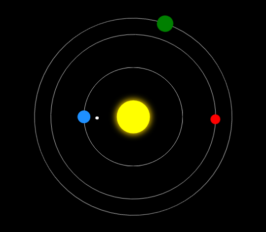
三、案例
  1 <!DOCTYPE html>
  2 <html lang="en">
  3 <head>
  4     <meta charset="UTF-8">
  5     <title>太阳系</title>
  6     <style>
  7         body{
  8             background-color: #000;
  9         }
 10         .sun{
 11             width: 100px;
 12             height: 100px;
 13             position: absolute;
 14             left:50%;
 15             top:50%;
 16             transform: translate(-50%,-50%);
 17             background-color: yellow;
 18             box-shadow: 0 0 30px 3px gold;
 19             border-radius: 50%;
 20         }
 21         .earth{
 22             width: 300px;
 23             height: 300px;
 24             position: absolute;
 25             left:50%;
 26             top:50%;
 27             transform: translate(-50%,-50%);
 28             border: 1px solid #ccc;
 29             border-radius: 50%;
 30         }
 31         .earth::before{
 32             content: '';
 33             width: 40px;
 34             height: 40px;
 35             position: absolute;
 36             left:0;
 37             top:50%;
 38             transform: translate(-50%,-50%);
 39             background-color: dodgerblue;
 40             border-radius: 50%;
 41         }
 42         .moon{
 43             width: 80px;
 44             height: 80px;
 45             position: absolute;
 46             left:0;
 47             top:50%;
 48             transform: translate(-50%,-50%);
 49             border-radius: 50%;
 50             animation: rot 2s infinite linear;
 51         }
 52         .moon::before{
 53             content: '';
 54             width: 10px;
 55             height: 10px;
 56             position: absolute;
 57             left:0;
 58             top:50%;
 59             transform: translate(-50%,-50%);
 60             background-color: #fff;
 61             border-radius: 50%;
 62         }
 63         .venus{
 64             width: 500px;
 65             height: 500px;
 66             position: absolute;
 67             left:50%;
 68             top:50%;
 69             transform: translate(-50%,-50%);
 70             border: 1px solid #ccc;
 71             border-radius: 50%;
 72             animation: rot 6s infinite linear;
 73         }
 74         .venus::before{
 75             content: '';
 76             width: 30px;
 77             height: 30px;
 78             position: absolute;
 79             left:0;
 80             top:50%;
 81             transform: translate(-50%,-50%);
 82             background-color: red;
 83             border-radius: 50%;
 84         }
 85         .mars{
 86             width: 600px;
 87             height: 600px;
 88             position: absolute;
 89             left:50%;
 90             top:50%;
 91             transform: translate(-50%,-50%);
 92             border: 1px solid #ccc;
 93             border-radius: 50%;
 94             animation: rot 10s infinite linear;
 95         }
 96         .mars::before{
 97             content: '';
 98             width: 50px;
 99             height: 50px;
100             position: absolute;
101             left:0;
102             top:50%;
103             transform: translate(-50%,-50%);
104             background-color: green;
105             border-radius: 50%;
106         }
107         @keyframes rot {
108             0%{
109                 transform:translate(-50%,-50%) rotate(0deg);
110             }
111             100%{
112                 transform:translate(-50%,-50%) rotate(360deg);
113             }
114         }
115     </style>
116 </head>
117 <body>
118     <div class="sun"></div>
119     <div class="earth">
120         <div class="moon"></div>
121     </div>
122     <div class="venus"></div>
123     <div class="mars"></div>
124 </body>
125 </html>

运行效果: