Button
Button继承了TextView。它的功能就是提供一个按钮,这个按钮可以供用户点击,当用户对按钮进行操作的时候,触发相应事件,如点击,触摸。
还有一个ImageButton,它继承自Button,可以在ImageButton中显示一个图片展示给用户看,并且对其Text属性设置值的时候是无效的,其它功能与Button一样。
常用事件
一般对于一个按钮而言,用的最多的就是点击事件,Button间接继承自View,而AndroidUI中的所有事件,都是定义在View中的。在本篇博客中,示例讲解的点击事件、触摸事件,其他事件的使用方式与此类似,只是触发的时机不同而已。此处分别需要实现View.OnClickListener、View.OnTouchListener接口的方法。
- View.OnClickListener,需要实现onClick(View v)方法,其中v为当前触发事件的控件。
- View.OnTouchListener,需要实现onTouch(View v , MotionEvent event),其中v为当前触发事件的控件,event包括了触摸时的具体内容,如移动、按下等。
下面使用一个示例讲解一下事件的绑定及触发,在示例中显示两个按钮控件,一个为普通按钮,一个为填充图片的按钮,为它们绑定click事件,当点击事件触发的时候,对其尺寸进行修改,为图片按钮绑定触摸事件,当触摸的时候触发,切换图片显示。
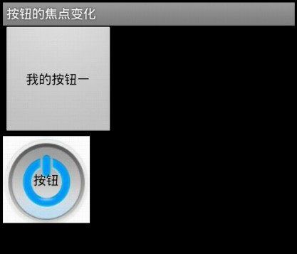
button 按钮的焦点变化


 1 package com.leaf.android;
 2
 3 import android.app.Activity;
 4 import android.os.Bundle;
 5 import android.view.KeyEvent;
 6 import android.view.MotionEvent;
 7 import android.view.View;
 8 import android.view.View.OnClickListener;
 9 import android.view.View.OnFocusChangeListener;
10 import android.view.View.OnKeyListener;
11 import android.view.View.OnTouchListener;
12 import android.widget.Button;
13
14 public class Main extends Activity implements OnClickListener, OnTouchListener,
15         OnFocusChangeListener, OnKeyListener {
16     /** Called when the activity is first created. */
17
18     private int value = 1;// 用于改变按钮的大小
19     private Button commonbutton;
20     private Button imagebutton;
21
22     @Override
23     public void onCreate(Bundle savedInstanceState) {
24         super.onCreate(savedInstanceState);
25         setContentView(R.layout.main);
26         commonbutton = (Button) this.findViewById(R.id.commonbutton);
27         imagebutton = (Button) this.findViewById(R.id.imagebutton);
28         commonbutton.setOnClickListener(this);
29         imagebutton.setOnClickListener(this);
30         imagebutton.setOnTouchListener(this);
31         imagebutton.setOnFocusChangeListener(this);
32         imagebutton.setOnKeyListener(this);
33
34     }
35
36     public void onClick(View v) {
37         // TODO Auto-generated method stub
38         Button button = (Button) v;
39         if (value == 1
40                 && button.getWidth() == getWindowManager().getDefaultDisplay()
41                         .getWidth()) {
42             value = -1;
43         } else if (value == -1 && button.getWidth() < 100) {
44             value = 1;
45         }
46         button.setWidth(button.getWidth() + (int) (button.getWidth() * 0.1)
47                 * value);
48         button.setHeight(button.getWidth() + (int) (button.getHeight() * 0.1)
49                 * value);
50
51     }
52
53     public boolean onKey(View v, int keyCode, KeyEvent event) {
54         // TODO Auto-generated method stub
55         if (KeyEvent.ACTION_DOWN == event.getAction()) {
56             v.setBackgroundResource(R.drawable.button2);
57         }
58         return false;
59
60     }
61
62     public void onFocusChange(View v, boolean hasFocus) {
63         // TODO Auto-generated method stub
64         if (hasFocus) {
65             imagebutton.setBackgroundResource(R.drawable.button2);
66         }
67     }
68
69     public boolean onTouch(View v, MotionEvent event) {
70         // TODO Auto-generated method stub
71         if (event.getAction() == MotionEvent.ACTION_UP) {
72             v.setBackgroundResource(R.drawable.button1);
73
74         }else if (event.getAction() == MotionEvent.ACTION_DOWN) {
75             v.setBackgroundResource(R.drawable.button2);
76         }
77         return false;
78     }
79
80 }
 1 <?xml version="1.0" encoding="utf-8"?>
 2 <LinearLayout xmlns:android="http://schemas.android.com/apk/res/android"
 3     android:layout_width="fill_parent"
 4     android:layout_height="fill_parent"
 5     android:orientation="vertical" >
 6
 7     <Button
 8         android:id="@+id/commonbutton"
 9         android:layout_width="wrap_content"
10         android:layout_height="wrap_content"
11         android:text="我的按钮一" />
12
13     <Button
14         android:id="@+id/imagebutton"
15         android:layout_width="wrap_content"
16         android:layout_height="wrap_content"
17         android:background="@drawable/button1"
18         android:gravity="center"
19         android:text="按钮" />
20
21 </LinearLayout>
Button事件监听器
Button的常用事件监听器有以下一些:
  button.setOnClickListener();//点击事件监听器

  button.setOnTouchListener();//触摸事件监听器

  button.setOnFocusChangeListener();//焦点状态改变事件监听器

  button.setOnKeyListener();//按键事件监听器

  button.setOnLongClickListener();//常压事件监听器
效果:
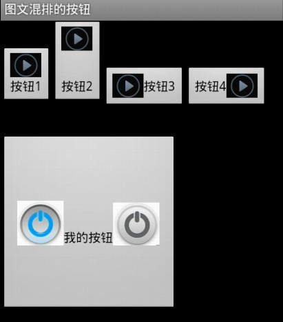
图文混排的按钮
对于在实际项目中,经常会需要设置按钮展示为图文混排的效果,这样可以通过图表更直观的把按钮的功能展示给用户,又可以有简短的文字说明。虽然ImageButton也可以实现图片按钮的效果,但是对于ImageButton而言,设置Text属性是没有作用的,所以这里不讲解ImageButton的使用。对于Button控件,图文混排需要用到一个android:drawableXxx属性(Xxx为图片所在按钮的方向),这个属性配合android:text,就可以实现图文混排的效果。
 1 package com.leaf.android;
 2
 3 import android.app.Activity;
 4 import android.graphics.Bitmap;
 5 import android.graphics.BitmapFactory;
 6 import android.os.Bundle;
 7 import android.text.SpannableString;
 8 import android.text.Spanned;
 9 import android.text.style.DynamicDrawableSpan;
10 import android.text.style.ImageSpan;
11 import android.widget.Button;
12
13 public class Main extends Activity {
14     /** Called when the activity is first created. */
15     @Override
16     public void onCreate(Bundle savedInstanceState) {
17         super.onCreate(savedInstanceState);
18         setContentView(R.layout.main);
19         Button button = (Button) this.findViewById(R.id.button);
20
21         SpannableString spannableStringLeft = new SpannableString("Left");
22         Bitmap bitmapLeft = BitmapFactory.decodeResource(getResources(),
23                 R.drawable.button1);
24         ImageSpan imageSpanLeft = new ImageSpan(bitmapLeft,
25                 DynamicDrawableSpan.ALIGN_BOTTOM);
26         spannableStringLeft.setSpan(imageSpanLeft, 0, 4,
27                 Spanned.SPAN_EXCLUSIVE_EXCLUSIVE);
28
29         SpannableString spannableStringRight = new SpannableString("Right");
30         Bitmap bitmapRight = BitmapFactory.decodeResource(getResources(),
31                 R.drawable.button2);
32         ImageSpan imageSpanRight = new ImageSpan(bitmapRight);
33         spannableStringRight.setSpan(imageSpanRight, 0, 5,
34                 Spanned.SPAN_EXCLUSIVE_EXCLUSIVE);
35
36         button.append(spannableStringLeft);
37         button.append("我的按钮");
38         button.append(spannableStringRight);
39
40     }
41 }
 1 <?xml version="1.0" encoding="utf-8"?>
 2 <LinearLayout xmlns:android="http://schemas.android.com/apk/res/android"
 3     android:layout_width="fill_parent" android:layout_height="fill_parent"
 4     android:orientation="vertical">
 5
 6     <LinearLayout xmlns:android="http://schemas.android.com/apk/res/android"
 7         android:layout_width="fill_parent" android:layout_height="120dp"
 8         android:orientation="horizontal">
 9
10         <Button android:layout_width="wrap_content"
11             android:layout_height="wrap_content" android:drawableTop="@drawable/button3"
12             android:text="按钮1">
13         </Button>
14
15         <Button android:layout_width="wrap_content"
16             android:layout_height="wrap_content" android:drawablePadding="30dp"
17             android:drawableTop="@drawable/button3" android:text="按钮2">
18         </Button>
19
20         <Button android:layout_width="wrap_content"
21             android:layout_height="wrap_content" android:drawableLeft="@drawable/button3"
22             android:text="按钮3">
23         </Button>
24
25         <Button android:layout_width="wrap_content"
26             android:layout_height="wrap_content" android:drawableRight="@drawable/button3"
27             android:text="按钮4">
28         </Button>
29     </LinearLayout>
30
31     <Button android:layout_width="200dp" android:layout_height="200dp"
32         android:id="@+id/button" android:layout_marginTop="10dp">
33     </Button>
34
35 </LinearLayout>