点击看效果demo
对于单选和多选框一般都会用相应的文字进行搭配使用,干活不累。
但是最原始没有任何样式的单选和复选和文字在一起搭配起来并不美观,会因为字体大小存在上下参差。
平时经常踩这个坑,一般设置单选和复选的vertical-align,外加margin辅助达到效果。
现在看了大牛的博客,把他总结的方法予以学习。
单复选框与文字默认以vertical-align:baseline的方式对齐的。
对于不同的字体差距会有些许不同,根据字体调整样式的数值就好了。
radio单选框的默认margin值是:margin:3px 3px 0 5px;checkbox复选框的margin值为margin:3px 3px 3px 4px;而IE浏览器下似乎没有margin值,但是对margin敏感
以下先给出文字字体大小12px的解决方法
方法1:
以vertical-align:text-bottom为基础的
方法2:
以vertical-align:text-top为基础的
方法3:
以vertical-align:bottom为基础的
方法4:
以vertical-align:top为基础的
方法5:
以vertical-align:middle为基础的
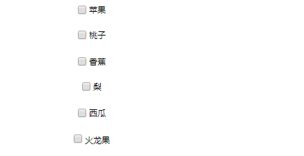
谷歌下5种方法各自对应的效果如下:
IE11下5中方法各自对应的效果如下:
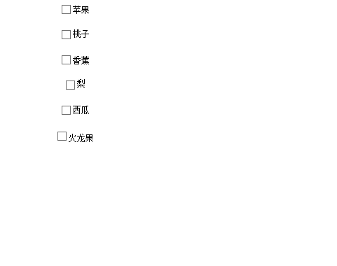
针对两种浏览器来说,方法1 3 5表现良好趋于一致,其中3 5方法是文章底部博客链接作者所推荐的。
附上源代码中的方法源码:
<!DOCTYPE html>
<html lang="en">

<head>
    <meta charset="UTF-8">
    <meta name="viewport" content="width=device-width, initial-scale=1.0">
    <meta http-equiv="X-UA-Compatible" content="ie=edge">
    <title>Document</title>
    <style>
        div {
            font-size: 12px;
            text-align: center;
            margin-bottom: 20px;
        }

        .method1 {
            vertical-align: text-bottom;
            margin-bottom: 1px;
        }

        .method2 {
            height: 13px;
            vertical-align: text-top;
            margin-top: 2px;
        }

        .method3 {
            height: 13px;
            vertical-align: bottom;
            margin-bottom: 1px;
            margin-top: -1px;
        }

        .method4 {
            height: 13px;
            vertical-align: top;
            margin-top: 2px;
        }

        .method5 {
            vertical-align: middle;
            margin-top: -1px;
            margin-bottom: 1px;
        }

        .method6 {
            vertialc-align: -3px
        }
    </style>
</head>

<body>
    <div>
        <input class="method1" name="Fruit" type="checkbox" value="" />
        <span>苹果</span>
    </div>
    <div>
        <input class="method2" name="Fruit" type="checkbox" value="" />
        <span>桃子</span>
    </div>
    <div>
        <input class="method3" name="Fruit" type="checkbox" value="" />
        <span>香蕉</span>
    </div>
    <div>
        <input class="method4" name="Fruit" type="checkbox" value="" />
        <span>梨</span>
    </div>
    <div>
        <input class="method5" name="Fruit" type="checkbox" value="" />
        <span>西瓜</span>
    </div>
    <div>
        <input class="method6" name="Fruit" type="checkbox" value="" />
        <span>火龙果</span>
    </div>
    <div>
        <input class="method1" name="Fruit" type="radio" value="" />
        <span>苹果</span>
    </div>
    <div>
        <input class="method2" name="Fruit" type="radio" value="" />
        <span>桃子</span>
    </div>
    <div>
        <input class="method3" name="Fruit" type="radio" value="" />
        <span>香蕉</span>
    </div>
    <div>
        <input class="method4" name="Fruit" type="radio" value="" />
        <span>梨</span>
    </div>
    <div>
        <input class="method5" name="Fruit" type="radio" value="" />
        <span>西瓜</span>
    </div>
    <div>
        <input class="method6" name="Fruit" type="radio" value="" />
        <span>火龙果</span>
    </div>
</body>

</html>
参考来源http://www.zhangxinxu.com/wordpress/2009/08/%E5%A4%8D%E9%80%89%E6%A1%86%E6%88%96%E5%8D%95%E9%80%89%E6%A1%86%E4%B8%8E%E6%96%87%E5%AD%97%E5%AF%B9%E9%BD%90%E7%9A%84%E9%97%AE%E9%A2%98%E7%9A%84%E6%B7%B1%E5%85%A5%E7%A0%94%E7%A9%B6%E4%B8%8E%E4%B8%80/