<!DOCTYPE html>
<html>
    <head>
        <meta charset="utf-8">
        <title></title>
        <style type="text/css">
            /* 宽度适配 */
            html,
            body {
                width: 100%;
                overflow-x: hidden;/* 外层盒子设置最小宽度的话看不到横向滚动条 */
            }

            /*1. pc端适配的需求:目前我们pc项目的设计稿尺寸是宽度1920,高度最小是1080。
            2.放大或者缩小屏幕,网页可以正常显示 */
            /* 一、两列布局 */
            /* 1.左定宽 右边自适应 或者 右边定宽左边自适应 */
            .content{
                width: 1200px; /* 主容器 */
                min-width: 960px;
                margin: 0 auto;
                background: #fff;
            }
            .left {
                float: left;
                width: 200px;/* 定宽 */
                background: #ccc;
                height: 800px;/* 测试设了一个高度和背景(为了更好看效果) */
            }

            .right {
                margin-left: 100px;
                background: #999;
                height: 800px;/* 测试设了一个高度和背景(为了更好看效果) */
            }
        </style>
    </head>
    <body>
        <div class="content">
            <div class="left">左边</div>
            <div class="right">右边</div>
        </div>
    </body>
</html>

<!DOCTYPE html>
<html>
    <head>
        <meta charset="utf-8">
        <title></title>
        <style type="text/css">
            /* 宽度适配 */
            html,
            body {
                width: 100%;
                overflow-x: hidden;
                /* 外层盒子设置最小宽度的话看不到横向滚动条 */
            }
            /* 一、三列布局 */
            /* 1.左右定宽中间自适应 */
            .content {
                width: 1200px;
                /* 主容器 */
                min-width: 960px;
                margin: 0 auto;
                background: firebrick;/* 测试设了一个背景(为了更好看效果) */
                display: table;
            }

            .left {
                width: 100px;
                /* 定宽 */
                background: #ccc;
                height: 800px;
                /* 测试设了一个高度和背景(为了更好看效果) */
            }
            .right {
                width: 100px;
                /* 定宽 */
                background: fuchsia;
                height: 800px;
                /* 测试设了一个高度和背景(为了更好看效果) */
            }

            .left,
            .right,
            .center {
                display: table-cell;
            }
        </style>
    </head>
    <body>
        <div class="content">
            <div class="left">左边</div>
            <div class="center">中间</div>
            <div class="right">右边</div>
        </div>
    </body>
</html>

<!DOCTYPE html>
<html>
    <head>
        <meta charset="utf-8">
        <title>实现三栏水平布局之双飞翼布局</title>
        <style type="text/css">
            .container {
                width: 1200px;
                /* 主容器 */
                min-width: 960px;
                margin: 0 auto;
                background: #ccc;
                /* 测试设了一个背景(为了更好看效果) */
            }

            .left,
            .center,
            .right {
                float: left;
                min-height: 400px;
                /* 测试更好观看效果 统一高度*/
                text-align: center;
            }

            .left {
                margin-left: -100%;
                background: #0000FF;
                width: 200px;
                /* 定宽 */
            }

            .right {
                margin-left: -300px;
                background-color: #FF0000;
                width: 300px;
                /* 定宽 */
            }

            .center {
                background-color: #f2f1f1;
                width: 100%;
            }

            .content {
                margin: 0 300px 0 200px;
            }
        </style>
    </head>
    <body>
        <div class="container">
              <div class="center">
                  <div class="content">中间自适应</div>
               </div>
              <div class="left">左边</div>
              <div class="right">右边</div>
        </div>
    </body>
</html>
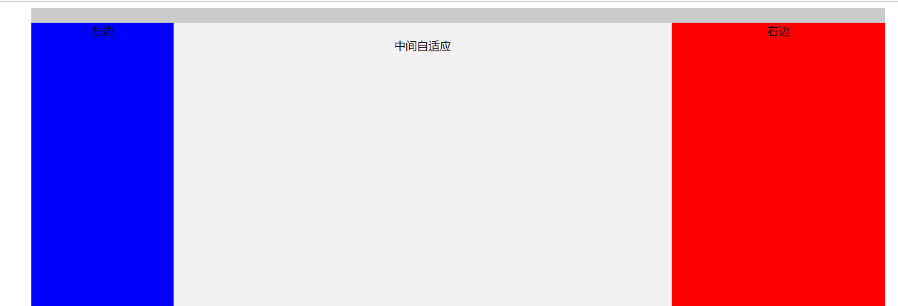
<!DOCTYPE html>
<html>
    <head>
        <meta charset="utf-8">
        <title>实现三栏水平布局之圣杯布局</title>
        <style type="text/css">
            .container {
                width: 1200px;
                /* 主容器 */
                min-width: 960px;
                margin: 0 auto;
                background: #ccc;/* 测试设了一个背景(为了更好看效果) */
                padding: 0 300px 0 200px;
            }

            .left,
            .center,
            .right {
                position: relative;
                min-height: 200px;
                float: left;
            }

            .left {
                left: -200px;
                margin-left: -100%;
                background: green;/* 测试设了一个背景(为了更好看效果) */
                width: 200px;
            }

            .right {
                right: -300px;
                margin-left: -300px;
                background: red;/* 测试设了一个背景(为了更好看效果) */
                width: 300px;
            }

            .center {
                background: blue;/* 测试设了一个背景(为了更好看效果) */
                width: 100%;
            }
        </style>
    </head>
    <body>
        <div class="container">
              <div class="center">center</div>
              <div class="left">left</div>
              <div class="right">right</div>
        </div>
        <div class="tip_expand">双飞翼布局比圣杯布局多创建了一个div,但不用相对布局了</div>
    </body>
</html>

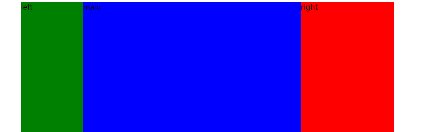
<!DOCTYPE html>
<html>
    <head>
        <meta charset="utf-8">
        <title>实现三栏水平布局-Flex布局</title>
        <style type="text/css">
            .container {
                display: flex;
                width: 1200px;
                /* 主容器 */
                min-width: 960px;
                margin: 0 auto;
                background: #ccc;
                /* 测试设了一个背景(为了更好看效果) */
                min-height: 800px;
                font-size: 0; /* 间隙处理 */
            }

            .main {
                flex-grow: 1;
                background-color: blue;
                font-size: 24px;
            }

            .left {
                order: -1;/* 对于order属性:定义项目的排列顺序,越小越靠前,默认为0。 */
                flex-basis: 200px;/* 通过项目属性flex-basis 设置left和right的固定宽度 */
                background-color: green;
                font-size: 24px;
            }

            .right {
                flex-basis: 300px;/* 通过项目属性flex-basis 设置left和right的固定宽度 */
                background-color: red;
                font-size: 24px;
            }
        </style>
    </head>
    <body>
        <div class="container">
              <div class="main">main</div>
              <div class="left">left</div>
              <div class="right">right</div>
        </div>
    </body>
</html>