1.伪类解决margin-top塌陷:
如果两个不浮动的盒子相互嵌套,对内部的盒子设置margin-top会导致属性被自动转移到外部的盒子上,导致内部盒子的margin-top设置失败最靠谱的解决方式是为父元素添加一个伪类:
*****/*伪类解决margin-top塌陷*/.clearfix:before{ content:""; display: table;}
解决margin-top塌陷
<!DOCTYPE html><html lang="en"><head> <meta charset="UTF-8"> <title>margin-top塌陷</title> <style> body, a, p{
margin:0;
padding:0; }
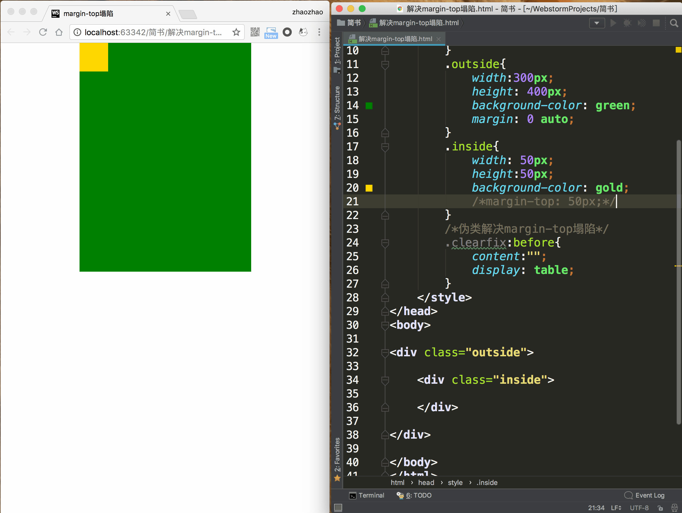
.outside{
width:300px;
height: 400px;
background-color: green;
margin: 0 auto; }
.inside{
width: 50px;
height:50px;
background-color: gold;
margin-top: 50px; } /*伪类解决margin-top塌陷*/ .clearfix:before{
content:"";
display: table; }
</style>
</head>
<body>
<div class="outside clearfix"> <div class="inside"> </div></div>
</body>
</html>
2.浮动子元素动态改变父元素宽度:
在设计网页布局时,为了便于快速布局,会将子元素设为浮动元素,父元素宽度设为固定,高度不设置,这样随着子元素的添加,父元素的高度就会动态变化,但尴尬的是,浮动子元素并不能"撑开父元素的高度",于是为父元素增加伪类便成了解决这种尴尬局面最好的方式;
.clearfix:after{ content: ""; display: table; clear:both;}
子元素动态改变父元素尺寸

<!DOCTYPE html><html lang="en"><head>
    <meta charset="UTF-8">
    <title>浮动子元素宽度</title>

    <style>

        .outside{
             width: 200px;
             border: 2px solid red;
        }
        .inside{
            float: left;
            width: 200px;
            height: 100px;
            margin: 20px 0 20px;
            border: 1px solid green;
        }
        .clearfix:after{
            content: "";
            display: table;
            clear:both;
        }
</style>
</head>
<body>
    <div class="outside clearfix">
    <div class="inside">
    </div>
    <div class="inside">
    </div></div>
</body>
</html>
小结:
以上两种情况极其常见,解决方式也很类似,所以可对两种方式做一个封装:
.clearfix:before, .clearfix:after{
    content: "";
    display: table;
}
.clearfix:after{
    clear:both;
}/*适配非主流浏览器(IE浏览器)*/
.clearfix{
    zoom:1;
}
以后遇到上面两种问题,只要将 小结 中的源码引入到对应的css(层叠样式表),最后在父元素class属性中 中引入clearfix即可
<div class="outside clearfix">
    <div class="inside">
    </div>
    <div class="inside">
    </div></div>
reset.css
h1,h2,h3,h4,h5,h6,p,body,ul,ol,dl,dd,dt,input{    /*去掉默认样式*/
    margin: 0;    padding: 0;
}ul,ol{    /*去掉左边的点或者数字*/
    list-style: none;
}a{    /*去掉下划线*/
    text-decoration: none;
}em,i{    /*去掉斜体*/
    font-style: normal;
}b,strong{    /*去掉加粗*/
    font-weight: normal;
}/*清除浮动影响 和清除margintop塌陷 合在一起的写法*/.clearfix:before,.clearfix:after{    content: "";    display: table;
}.clearfix:after{    clear: both;
}.clearfix{    /*兼容ie*/
    zoom:1;
}
———————————————————————————— 分割线 ————————————————————————————————————————
问题描述:
一个父包含框包含一个子元素。给正常流的子元素一个垂直外边距margin-top就会使得父元素跟着往下走,而子元素和父元素的边距则没有发生变化。
html结构:
<div class="box1"><div class="box1_1"></div></div>
css样式:
.box1{height:400px;background:#fad;}
.box1_1{height:100px;margin-top:50px;background:#ade;}
<div class="box1"><div class="box1_1"></div></div>
css样式:
.box1{height:400px;background:#fad;}
.box1_1{height:100px;margin-top:50px;background:#ade;}
解决办法:
1.修改父元素的高度,增添padding-top样式模拟(常用);
2.为父元素添加overflow:hidden;样式即可(完美);
5.为父元素或者子元素声明浮动(可用);
3.为父元素添加border(可用);
4.添加额外的元素放在子元素最前面,设置高度为1px,overflow:hidden(若为行内元素,需要声明为块元素)(啰嗦);
6.为父元素或者子元素声明绝对定位(……)。
1.修改父元素的高度,增添padding-top样式模拟(常用);
2.为父元素添加overflow:hidden;样式即可(完美);
5.为父元素或者子元素声明浮动(可用);
3.为父元素添加border(可用);
4.添加额外的元素放在子元素最前面,设置高度为1px,overflow:hidden(若为行内元素,需要声明为块元素)(啰嗦);
6.为父元素或者子元素声明绝对定位(……)。
原理
一个盒子如果没有上补白(padding-top)和上边框(border-top),那么这个盒子的上边距会和其内部文档流中的第一个子元素的上边距重叠。
这就是原因了。“嵌套”的盒元素也算“毗邻”,也会 Collapsing Margins。这个合并Margin其实很常见,就是文章段落元素<p/>,并列很多个的时候,每一个都有上下1em的margin,但相邻的<p/>之间只会显示1em的间隔而不是相加的2em。这个很好理解,我就是奇怪为什么W3C要让嵌套的元素也共享Margin,想不出来在什么情况下需要这样的表现。 这个问题的避免方法很多,只要破坏它出现的条件就行。给Outer Div 加上 padding/border,或者给 Outer Div / Inner Div 设置为 float/position:absolute(CSS2.1规定浮动元素和绝对定位元素不参与Margin折叠)。
在 IE/Win 中如果这个盒子有 layout 那么这种现象就不会发生了:似乎拥有 layout 会阻止其孩子的边距伸出包含容器之外。此外当 hasLayout = true 时,不论包含容器还是孩子元素,都会有边距计算错误的问题出现。
链接: https://www.imooc.com/article/42216
https://www.cnblogs.com/lovesilence/p/5853618.html