CSS 新属性 clip-path,意味裁剪路径的意思,让我们可以很便捷的生成各种几何图形。
clip-path 通过定义特殊的路径,实现我们想要的图形。而这个路径,正是 SVG 中的 path 。
1、 简介
初始值:none
适用元素:所有元素;在SVG中,不适用于defs(动画)元素和所有的graphics(画图)元素。
继承性:无
计算值:指定值,url需要绝对值
动画性:指定的基础图形才有 --> inset(), circle(), ellipse(), polygon()
★更多详细的信息请移步这里》》
2、语法
/* Keyword values */
clip-path: none;

/* Image values */
clip-path: url(resources.svg#c1);

/* Box values
clip-path: fill-box;
clip-path: stroke-box;
clip-path: view-box;
clip-path: margin-box;
clip-path: border-box;
clip-path: padding-box;
clip-path: content-box;

/* Geometry values */
clip-path: inset(100px 50px);
clip-path: circle(50px at 0 100px);
clip-path: polygon(50% 0%, 100% 50%, 50% 100%, 0% 50%);

/* Box and geometry values combined */
clip-path: padding-box circle(50px at 0 100px);

/* Global values */
clip-path: inherit;
clip-path: initial;
clip-path: unset;
3、兼容性
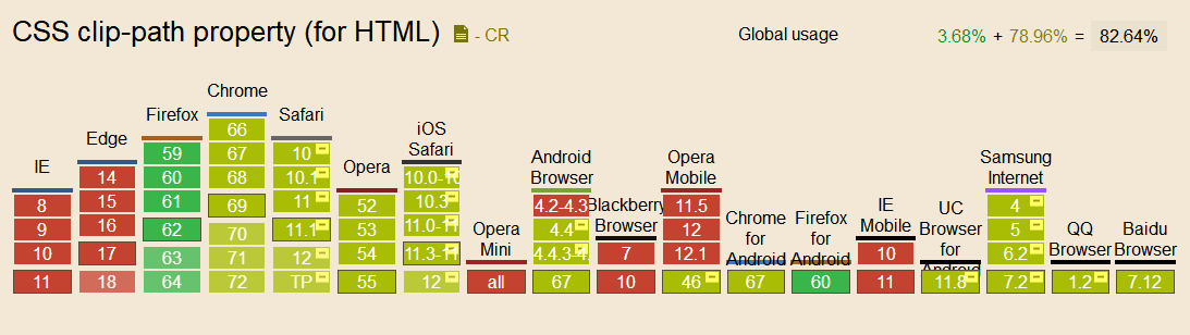
在特定的浏览器下需要添加前缀 -webkit- 。
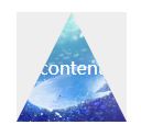
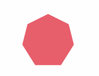
4、例子--绘制三角形
 -webkit-clip-path: polygon(50% 0,0 100%, 100% 100%);
 clip-path: polygon(50% 0,0 100%, 100% 100%);
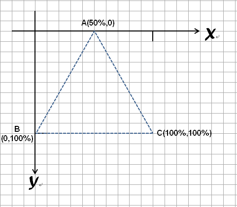
在这里先抛出一个例子方便理解,利用clip-path绘制一个三角形,每个点用逗号分开,数值(50%,0)可以理解为坐标(x,y)
三个点形成一个闭合区域,这也是页面所显示出来的区域,形成遮罩的效果
三角形绘制的大概的坐标模型,起点为元素的左上角,所以形成的是一个向下发展的坐标系
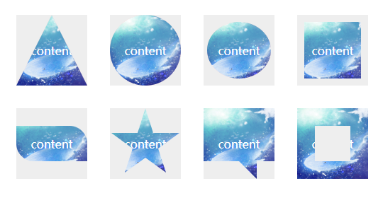
像我这种对坐标头大的同学,可以利用在线生成器,来制作一些常用的图形,可以说是非常方便了~


.clip1{
        -webkit-clip-path: polygon(50% 0,0 100%, 100% 100%);
        clip-path: polygon(50% 0,0 100%, 100% 100%);
    }
    .clip2{
        -webkit-clip-path: circle(50% at 50% 50%);
       clip-path: circle(50% at 50% 50%);
    }
    .clip3{
        -weblit-clip-path:ellipse(25% 40% at 50% 50%);
        clip-path:ellipse(45% 40% at 50% 50%);
    }
    .clip4{
        -webkit-clip-path:inset(10% 10% 10% 10%);
        clip-path:inset(10% 10% 10% 10%);
    }
    .clip5{
        -webkit-clip-path: inset(25% 0 25% 0 round 0 25% 0 25%);
        clip-path: inset(25% 0 25% 0 round 0 25% 0 25%);
    }
    .clip6{
        -webkit-clip-path: polygon(50% 0%, 61% 35%, 98% 35%, 68% 57%, 79% 91%, 50% 70%, 21% 91%, 32% 57%, 2% 35%, 39% 35%);
        clip-path: polygon(50% 0%, 61% 35%, 98% 35%, 68% 57%, 79% 91%, 50% 70%, 21% 91%, 32% 57%, 2% 35%, 39% 35%);
    }
    .clip7{
        -webkit-clip-path: polygon(0% 0%, 100% 0%, 100% 75%, 75% 75%, 75% 100%, 50% 75%, 0% 75%);
        clip-path: polygon(0% 0%, 100% 0%, 100% 75%, 75% 75%, 75% 100%, 50% 75%, 0% 75%);
    }
    .clip8{
        -webkit-clip-path: polygon(0% 0%, 0% 100%, 25% 100%, 25% 25%, 75% 25%, 75% 75%, 25% 75%, 25% 100%, 100% 100%, 100% 0%);
        clip-path: polygon(0% 0%, 0% 100%, 25% 100%, 25% 25%, 75% 25%, 75% 75%, 25% 75%, 25% 100%, 100% 100%, 100% 0%);
    }
5、clip-path过渡动画
clip-path 另外一个强大之处在于可以进行 CSS transtion 与 CSS animation,也就是过渡和动画。
多边形图形过渡
<!doctype html>
<html lang="en">
<head>
    <meta charset="UTF-8">
    <title>clip-path动画-多边形</title>
    <style>
    .polygon-animate {
    position: absolute;
    width: 200px;
    height: 200px;
    top: 50%;
    left: 50%;
    transform: translate(-50%, -50%);
    background-color: crimson;
    transition: .3s;
    clip-path: polygon(
        50% 0%,
        0% 100%,
        100% 100%,
        100% 100%,
        100% 100%,
        100% 100%,
        100% 100%,
        100% 100%,
        100% 100%
    );
    animation: polygon-ani 5s linear infinite;
}
@keyframes polygon-ani {
    20% {
        background-color: darkorange;
        clip-path: polygon(
            50% 0%,
            100% 50%,
            50% 100%,
            0% 50%,
            0% 50%,
            0% 50%,
            0% 50%,
            0% 50%,
            0% 50%
        );
    }
    40% {
        clip-path: polygon(
            50% 0%,
            100% 38%,
            82% 100%,
            18% 100%,
            0% 38%,
            0% 38%,
            0% 38%,
            0% 38%,
            0% 38%
        );
    }
    60% {
        background-color: lemonchiffon;
        clip-path: polygon(
            50% 0%,
            100% 25%,
            100% 75%,
            50% 100%,
            0% 75%,
            0% 25%,
            0% 25%,
            0% 25%,
            0% 25%
        );
    }
    80%,100% {
        clip-path: polygon(
            50% 0%,
            90% 20%,
            100% 60%,
            75% 100%,
            25% 100%,
            0% 60%,
            10% 20%,
            10% 20%,
            10% 20%
        );
    }
}

    </style>
</head>
<body>
    <div class="polygon-animate"></div>
</body>
</html>
图形变换动画
<!doctype html>
<html lang="en">
<head>
    <meta charset="UTF-8">
    <title>clip-path</title>
    <style type="text/css">
    .triangle2rect {
    position: absolute;
    width: 100px;
    height: 100px;
    top: 50%;
    left: 50%;
    transform: translate(-50%, -50%);
    animation: aniContainer 2s infinite alternate;
}
.triangle2rect div {
    position: absolute;
    top: 0;
    left: 0;
    width: 100%;
    height: 100%;
}
.a {
    background: #99cccc;
    clip-path: polygon(0% 0%, 0% 100%, 50% 50%);
    animation: a 2s infinite alternate;
}
.b {
    background: #99cccc;
    clip-path: polygon(0% 0%, 100% 0%, 50% 50%);
    animation: b 2s infinite alternate;
}
.c {
    background: #99cccc;
    clip-path: polygon(100% 0%, 100% 100%, 50% 50%);
    animation: c 2s infinite alternate;
}
.d {
    background: #99cccc;
    clip-path: polygon(100% 100%, 0% 100%, 50% 50%);
    animation: d 2s infinite alternate;
}
@keyframes a {
    0%, 10% {
        background: #99cccc;
        clip-path: polygon(0% 0%, 0% 100%, 50% 50%);
    }
    90%, 100% {
        background: #000;
        clip-path: polygon(0% 100%, 25% 100%, 12.5% 0%);
    }
}
@keyframes b {
    0%, 10% {
        background: #99cccc;
        clip-path: polygon(0% 0%, 100% 0%, 50% 50%);
    }
    90%, 100% {
        background: #000;
        clip-path: polygon(25% 0%, 50% 0%, 37.5% 100%);
    }
}
@keyframes c {
    0%, 10% {
        background: #99cccc;
        clip-path: polygon(100% 0%, 100% 100%, 50% 50%);
    }
    90%, 100% {
        background: #000;
        clip-path: polygon(62.5% 0%, 75% 100%, 50% 100%);
    }
}
@keyframes d {
    0%, 10% {
        background: #99cccc;
        clip-path: polygon(100% 100%, 0% 100%, 50% 50%);
    }
    90%, 100% {
        background: #000;
        clip-path: polygon(100% 0%, 87.5% 100%, 75% 0%);
    }
}
@keyframes aniContainer {
    0%, 10% {
        width: 100px;
        height: 100px;
    }
    90%, 100% {
        width: 250px;
        height: 60px;
    }
}
</style>
</head>
<body>
    <hgroup class="triangle2rect">
    <div class="a"></div>
    <div class="b"></div>
    <div class="c"></div>
    <div class="d"></div>
</hgroup>
</body>
</html>
6、clip-path 动画的局限
clip-path 动画虽然美好,但是存在一定的局限性,那就是进行过渡的两个状态,坐标顶点的数量必须一致。
也就是如果我希望从三角形过渡到矩形。假设三角形和矩形的 clip-path 分别为:
三角形:clip-path: polygon(50% 0, 0 100%, 100% 0)
矩形: clip-path: polygon(0 0, 100% 0, 100% 100%, 0 100%)
进行过渡动画时候,直接从 polygon(50% 0, 0 100%, 100% 0) --> polygon(0 0, 100% 0, 100% 100%, 0 100%) 是不行的,因为是从 3 个坐标点变换到 4 个坐标点。
因此这里需要这用一个讨巧的办法,在三角形的表示方法中,使用四个坐标点表示,其中两个坐标点进行重合即可。也就是:
三角形:clip-path: polygon(50% 0, 0 100%, 100% 0) -> clip-path: polygon(50% 0, 50% 0, 0 100%, 100% 0)