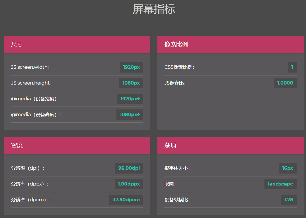
1、判断横竖屏
/* 横屏 */
@media all and (orientation :landscape) {

}

/* 竖屏 */
@media all and (orientation :portrait) {

}
2、判断设备宽高
* 设备宽度大于 320px 小于 640px */
@media all and (min-320px) and (max-640px) {

}
3、判断设备像素比
/* 设备像素比为 1 */
@media only screen and (-webkit-min-device-pixel-ratio: 1), only screen and (min-device-pixel-ratio: 1) {

}

/* 设备像素比为 1.5 */
@media only screen and (-webkit-min-device-pixel-ratio: 1.5), only screen and (min-device-pixel-ratio: 1.5) {

}

/* 设备像素比为 2 */
@media only screen and (-webkit-min-device-pixel-ratio: 2), only screen and (min-device-pixel-ratio: 2) {

}
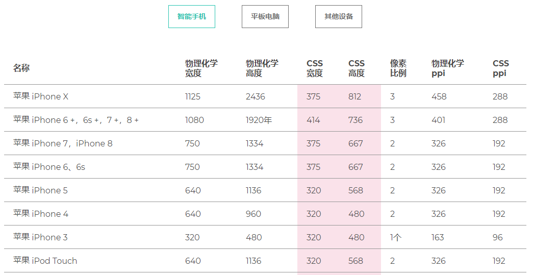
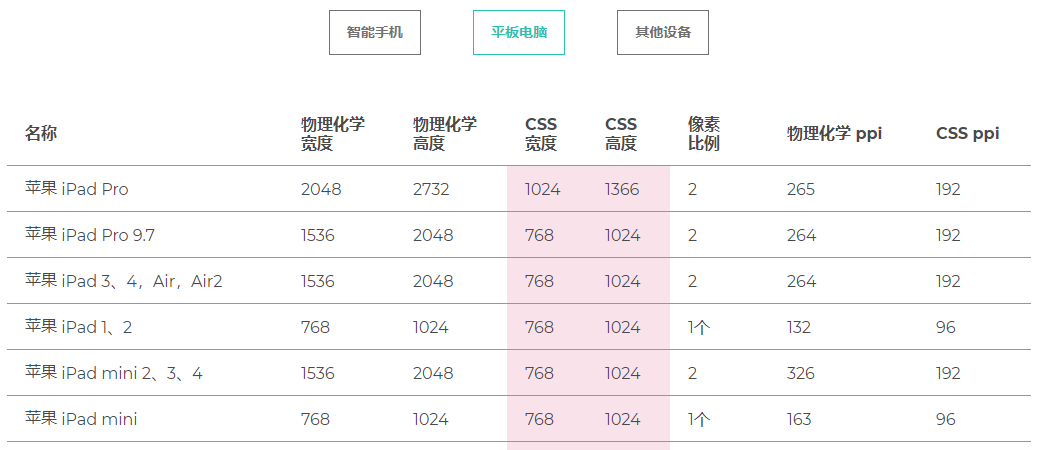
4、常用设备尺寸
苹果手机参考:
pad参考:
5、设备尺寸设置示例:
/* ----------- iPhone 4 and 4S ----------- */

/* Portrait and Landscape */
@media only screen
  and (min-device- 320px)
  and (max-device- 480px)
  and (-webkit-min-device-pixel-ratio: 2) {

}

/* Portrait */
@media only screen
  and (min-device- 320px)
  and (max-device- 480px)
  and (-webkit-min-device-pixel-ratio: 2)
  and (orientation: portrait) {
}

/* Landscape */
@media only screen
  and (min-device- 320px)
  and (max-device- 480px)
  and (-webkit-min-device-pixel-ratio: 2)
  and (orientation: landscape) {

}

/* ----------- iPhone 5 and 5S ----------- */

/* Portrait and Landscape */
@media only screen
  and (min-device- 320px)
  and (max-device- 568px)
  and (-webkit-min-device-pixel-ratio: 2) {

}

/* Portrait */
@media only screen
  and (min-device- 320px)
  and (max-device- 568px)
  and (-webkit-min-device-pixel-ratio: 2)
  and (orientation: portrait) {
}

/* Landscape */
@media only screen
  and (min-device- 320px)
  and (max-device- 568px)
  and (-webkit-min-device-pixel-ratio: 2)
  and (orientation: landscape) {

}

/* ----------- iPhone 6 ----------- */

/* Portrait and Landscape */
@media only screen
  and (min-device- 375px)
  and (max-device- 667px)
  and (-webkit-min-device-pixel-ratio: 2) {

}

/* Portrait */
@media only screen
  and (min-device- 375px)
  and (max-device- 667px)
  and (-webkit-min-device-pixel-ratio: 2)
  and (orientation: portrait) {

}

/* Landscape */
@media only screen
  and (min-device- 375px)
  and (max-device- 667px)
  and (-webkit-min-device-pixel-ratio: 2)
  and (orientation: landscape) {

}

/* ----------- iPhone 6+ ----------- */

/* Portrait and Landscape */
@media only screen
  and (min-device- 414px)
  and (max-device- 736px)
  and (-webkit-min-device-pixel-ratio: 3) {

}

/* Portrait */
@media only screen
  and (min-device- 414px)
  and (max-device- 736px)
  and (-webkit-min-device-pixel-ratio: 3)
  and (orientation: portrait) {

}

/* Landscape */
@media only screen
  and (min-device- 414px)
  and (max-device- 736px)
  and (-webkit-min-device-pixel-ratio: 3)
  and (orientation: landscape) {

}


/* ----------- iPad mini ----------- */

/* Portrait and Landscape */
@media only screen
  and (min-device- 768px)
  and (max-device- 1024px)
  and (-webkit-min-device-pixel-ratio: 1) {

}

/* Portrait */
@media only screen
  and (min-device- 768px)
  and (max-device- 1024px)
  and (orientation: portrait)
  and (-webkit-min-device-pixel-ratio: 1) {

}

/* Landscape */
@media only screen
  and (min-device- 768px)
  and (max-device- 1024px)
  and (orientation: landscape)
  and (-webkit-min-device-pixel-ratio: 1) {

}

/* ----------- iPad 1 and 2 ----------- */

/* Portrait and Landscape */
@media only screen
  and (min-device- 768px)
  and (max-device- 1024px)
  and (-webkit-min-device-pixel-ratio: 1) {

}

/* Portrait */
@media only screen
  and (min-device- 768px)
  and (max-device- 1024px)
  and (orientation: portrait)
  and (-webkit-min-device-pixel-ratio: 1) {

}

/* Landscape */
@media only screen
  and (min-device- 768px)
  and (max-device- 1024px)
  and (orientation: landscape)
  and (-webkit-min-device-pixel-ratio: 1) {

}

/* ----------- iPad 3 and 4 ----------- */

/* Portrait and Landscape */
@media only screen
  and (min-device- 768px)
  and (max-device- 1024px)
  and (-webkit-min-device-pixel-ratio: 2) {

}

/* Portrait */
@media only screen
  and (min-device- 768px)
  and (max-device- 1024px)
  and (orientation: portrait)
  and (-webkit-min-device-pixel-ratio: 2) {

}

/* Landscape */
@media only screen
  and (min-device- 768px)
  and (max-device- 1024px)
  and (orientation: landscape)
  and (-webkit-min-device-pixel-ratio: 2) {

}