1.两列定宽定高布局
两列布局主要是通过浮动实现两列并排显示,从而实现两列布局


<html xmlns="http://www.w3.org/1999/xhtml">
<head runat="server">
    <title>两列定宽布局</title>
    <style type="text/css" >

        *
        {
            padding :0;
            margin :0;
        }

        .header,.footer
        {
            width :960px;
            height:30px;
            background-color:#E8E8E8;
        }

        .container
        {
            width:960px;
            height:250px;
            margin:10px 0;
        }
        .content
        {
            float:left;
            width:680px;
            height:250px;
            color:#FFF;
            background-color:#333;
        }

        .sidebox
        {
            width:270px;
            height:250px;
            float:right;
            color:#FFF;
            background-color:#999
        }

    </style>
</head>
<body>
    <form id="form1" runat="server">
    <div>
        <div class ="header">头部信息</div>
        <div class ="container">
            <div class ="content">主要内容</div>
            <div class ="sidebox">侧边栏</div>
        </div>
        <div class ="footer">底部信息</div>
    </div>
    </form>
</body>
</html>
2.两列定宽高度自适应
为了实现高度自适应,需要把.container,.content,.sidebox高度去掉,并在footer清除浮动
.container
        {
            width:960px;
            margin:10px 0;
        }
        .content
        {
            float:left;
            width:680px;
            color:#FFF;
            background-color:#333;
        }

        .sidebox
        {
            width:270px;
            float:right;
            color:#FFF;
            background-color:#999
        }

        .clearfloat
        {
            clear:both;
        }
这样做只有发现container和底部信息直接的外边距没有了,审查元素发现container这个div高度为0,这是由于内部元素浮动导致父元素的高度没有撑开,从而导致外间距也没有了
要恢复主要内容区域的底部信息之间的外间距就要换一种清除浮动的方式,用after 伪元素清除浮动
        .container:after
        {
            content:"";
            display:block;/*必须设置display:block否则无效*/
            visibility:hidden;/*隐藏元素但依然占据空间*/
            height:0;/*设置height、line-height、font-size的目的是为了伪元素占据的空间尽可能最小*/
            line-height:0;
            font-size:0;
            clear :both;
        }
完整代码
<html xmlns="http://www.w3.org/1999/xhtml">
<head runat="server">
    <title>两列定宽布局</title>
    <style type="text/css" >

        *
        {
            padding :0;
            margin :0;
        }

        .header,.footer
        {
            width :960px;
            height:30px;
            background-color:#E8E8E8;
        }

        .container
        {
            width:960px;
            margin:10px 0;
        }
        .content
        {
            float:left;
            width:680px;
            color:#FFF;
            background-color:#333;
        }

        .sidebox
        {
            width:270px;
            float:right;
            color:#FFF;
            background-color:#999
        }

        .container:after
        {
            content:"";
            display:block;/*必须设置display:block否则无效*/
            visibility:hidden;/*隐藏元素但依然占据空间*/
            height:0;/*设置height、line-height、font-size的目的是为了伪元素占据的空间尽可能最小*/
            line-height:0;
            font-size:0;
            clear :both;
        }

    </style>
</head>
<body>
    <form id="form1" runat="server">
    <div>
        <div class ="header">头部信息</div>
        <div class ="container ">
            <div class ="content ">
            主要内容<br />
            主要内容<br />
            主要内容<br />
            主要内容<br />
            主要内容<br />
            主要内容<br />
            主要内容<br />
            主要内容<br />
            主要内容<br />
            主要内容<br />
            主要内容<br />
            </div>
            <div class ="sidebox">侧边栏</div>
        </div>
        <div class ="footer clearfloat">底部信息</div>
    </div>
    </form>
</body>
</html>
最终效果

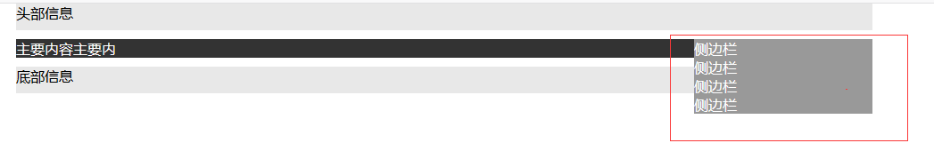
3.负边距的作用
外边距设置容器之间的距离,当外间距为正时使两个容器拉开,外边距为负时使两个容器拉近。
当浮动元素的总宽度大于父元素的宽度时会产生错误,可以用复变距解决错误
        .container
        {
            960px;
            margin:10px 0;
        }
        .content
        {
            float:left;
            780px;
            color:#FFF;
            background-color:#333;
        }

        .sidebox
        {
            270px;
            float:right;
            color:#FFF;
            background-color:#999;
            margin-left :-100px;
        }

4.两列自适应布局
两列自适应布局主要是将主要内容和侧边栏的宽度以百分比计算
<html xmlns="http://www.w3.org/1999/xhtml">
<head runat="server">
    <title>两列定宽布局</title>
    <style type="text/css" >

        *
        {
            padding :0;
            margin :0;
        }

        .header,.footer
        {
            height:30px;
            background-color:#E8E8E8;
        }

        .container
        {
            margin:10px 0;
        }
        .content
        {
            float:left;
            width:70%;
            color:#FFF;
            background-color:#333;
        }

        .sidebox
        {
            width:30%;
            float:right;
            color:#FFF;
            background-color:#999;
            margin-left :-100px;
        }

        .container:after
        {
            content:"";
            display:block;/*必须设置display:block否则无效*/
            visibility:hidden;/*隐藏元素但依然占据空间*/
            height:0;/*设置height、line-height、font-size的目的是为了伪元素占据的空间尽可能最小*/
            line-height:0;
            font-size:0;
            clear :both;
        }

    </style>
</head>
<body>
    <form id="form1" runat="server">
    <div>
        <div class ="header">头部信息</div>
        <div class ="container ">
            <div class ="content ">
            主要内容<br />
            主要内容<br />
            主要内容<br />
            主要内容<br />
            主要内容<br />
            主要内容<br />
            主要内容<br />
            主要内容<br />
            主要内容<br />
            主要内容<br />
            主要内容<br />
            </div>
            <div class ="sidebox">侧边栏</div>
        </div>
        <div class ="footer clearfloat">底部信息</div>
    </div>
    </form>
</body>
</html>
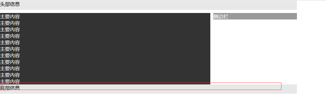
5.单列定宽单列自适应布局
最开始的想法是自适应列宽度设置为自动,但是这样做有个问题:因为浮动时如果div没有设置宽度或者宽度为自动,那么div的宽度会跟随内容的大小变化,导致布局很难看,而且自动变化的列宽度太大还会导致错误问题
<html xmlns="http://www.w3.org/1999/xhtml">
<head runat="server">
    <title>两列定宽布局</title>
    <style type="text/css" >

        *
        {
            padding :0;
            margin :0;
        }

        .header,.footer
        {
            width:960px;
            height:30px;
            background-color:#E8E8E8;
            margin:0 auto;
        }

        .container
        {
            width:960px;
            margin:10px auto;
        }
        .content
        {
            float:left;

            color:#FFF;
            background-color:#333;
        }

        .sidebox
        {
            width:200px;
            float:right;
            color:#FFF;
            background-color:#999;
        }

        .container:after
        {
            content:"";
            display:block;/*必须设置display:block否则无效*/
            visibility:hidden;/*隐藏元素但依然占据空间*/
            height:0;/*设置height、line-height、font-size的目的是为了伪元素占据的空间尽可能最小*/
            line-height:0;
            font-size:0;
            clear :both;
        }

    </style>
</head>
<body>
    <form id="form1" runat="server">
    <div>
        <div class ="header">头部信息</div>
        <div class ="container ">
            <div class ="content ">
            主要内容主要内容主要内容主要内容主要内容主要内容主要内容主要内容主要内容主要内容主要内容主要内容主要内容<br />
            主要内容<br />
            主要内容<br />
            主要内容<br />
            主要内容<br />
            主要内容<br />
            主要内容<br />
            主要内容<br />
            主要内容<br />
            主要内容<br />
            主要内容<br />
            </div>
            <div class ="sidebox">侧边栏</div>
        </div>
        <div class ="footer clearfloat">底部信息</div>
    </div>
    </form>
</body>
</html>
内容少时中间有一大块空白:

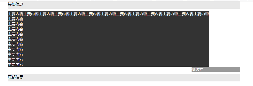
错位:
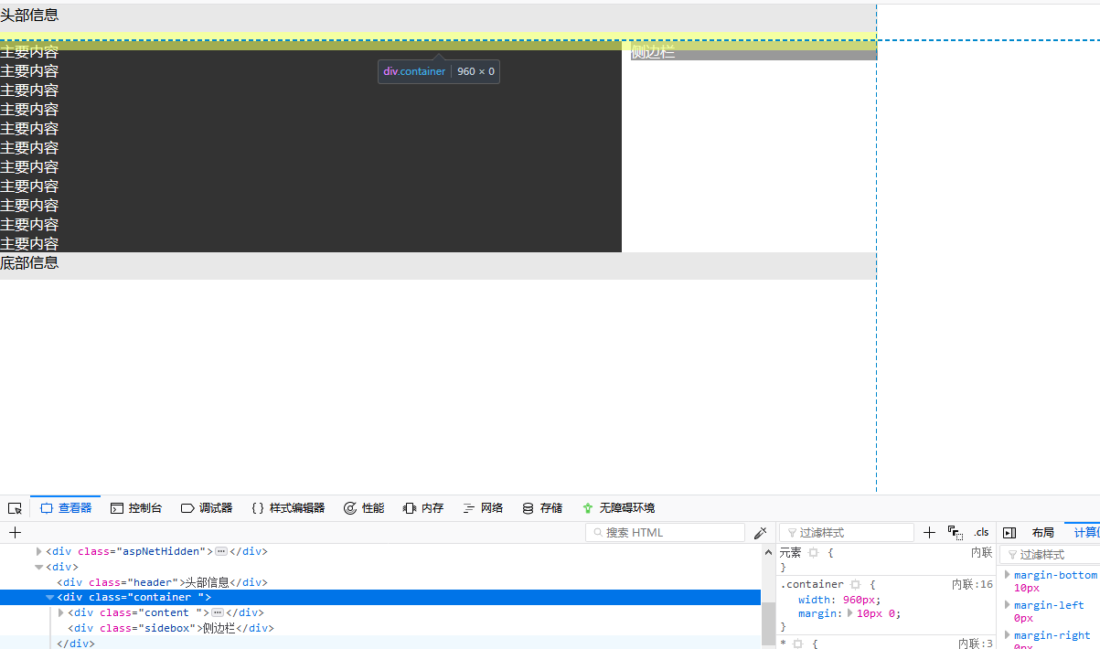
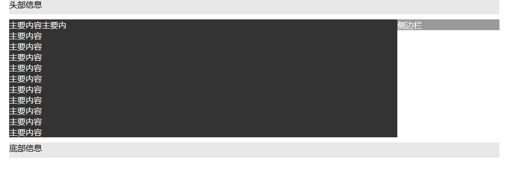
改用定位方式:
定位方式的关键在于设置了margin-right:200px; 留出位置给侧边栏,而侧边栏设置margin-left:-200px;从而使侧边栏靠近主要内容,另外主要内容没有设置宽度div的宽度自动占满父容器的宽度
<html xmlns="http://www.w3.org/1999/xhtml">
<head runat="server">
    <title>两列定宽布局</title>
    <style type="text/css" >

        *
        {
            padding :0;
            margin :0;
        }

        .header,.footer
        {
            width:960px;
            height:30px;
            background-color:#E8E8E8;
            margin:0 auto;
        }

        .container
        {
            width:960px;
            margin:10px auto;
            position:relative;
        }
        .content
        {
            margin-right:200px;
            color:#FFF;
            background-color:#333;
        }

        .sidebox
        {
            width:200px;
            position:absolute;
            top:0;
            right:0;
            color:#FFF;
            background-color:#999;
            margin-left:-200px;
        }


    </style>
</head>
<body>
    <form id="form1" runat="server">
    <div>
        <div class ="header">头部信息</div>
        <div class ="container ">
            <div class ="content ">
            主要内容主要内<br />
            主要内容<br />
            主要内容<br />
            主要内容<br />
            主要内容<br />
            主要内容<br />
            主要内容<br />
            主要内容<br />
            主要内容<br />
            主要内容<br />
            主要内容<br />
            </div>
            <div class ="sidebox">侧边栏</div>
        </div>
        <div class ="footer clearfloat">底部信息</div>
    </div>
    </form>
</body>
</html>
效果
使用绝对定位有也是缺陷:当侧边栏内容太多时无法撑开父容器的高度,而且有可能遮挡其他元素