Modern Fluent UI controls in Power Apps (preview)
We’re proud to announce the preview of new modern controls based on Fluent UI for Power Apps. Modern controls enable makers to create apps which more closely align with modern Microsoft patterns and styles.
Learn more about Fluent UI here
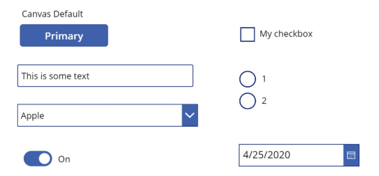
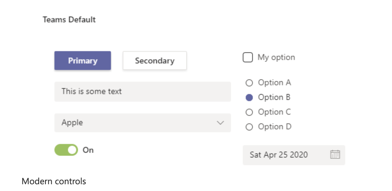
Comparing Classic vs Modern Control
Classic controls

Theming
We’ve rolled out modern Fluent UI controls as part of our Power Apps in Teams preview. The Fluent UI controls utilize a unique new theming system which will better enable makers to style apps as their embedded scenarios, the first scenario using this system is for our Teams integration. Previously to achieve the same look, heavy customization for each control placed on the page would be required or many heavily customized components. As such, these new themes simplified the properties needed to make apps look great and have been removed from the properties panel. In the future, we’ll introduce more customization for each control as well as support more themes unlocking many more scenarios for makers.
Aligning to Fluent UI properties
The classic controls often had what seemed like strange property names and we’ve taken the opportunity to make the properties more closely align with the control. These properties span data and style properties.
i.e. Classic Toggle checked property named “Default”, Modern Toggle checked property named “Checked”
Full list of new properties listed here
Gallery and Form Updates
 New App Template with Modern Controls