0.写在前面的话
近来被HTML+CSS的布局折腾的死去活来,眼巴巴的看着CSS3中的flex,grid等更便捷更高效的的布局方式无法在项目中应用,心里那叫一个窝火啊,去你妹的兼容性,,,
最近体验下Android开发,第一件事就是翻翻看安卓提供的布局方式方便不,因为笔者现在是做WP的,于是乎有了这篇比较两个平台提供的一些基础的布局方式的博文。
另外,安装完Android Studio后,在Android的SDK的目录下有一个docs的文件夹,这里面提供的有离线的官方文档。
Android应用在当前元素上的布局属性均以layout_开头,大家可以结合离线的官方文档(布局属性的介绍在sdkdocs eferenceandroidwidget***.LayoutParams.html文件有详细说明)在IDE中多多尝试各种的以layout_开头的属性。
1.两平台布局方式概览
Android常用的基本布局元素:LinearLayout,FrameLayout,AbsoluteLayout,RelativeLayout,TableLayout,GridLayout。
Windows Phone常用的基本布局元素:StackPanel、Canvas、Grid,WrapPanel;
罗列完毕,下面根据相似的布局一一对比。
2.LinearLayout VS StackPanel
别看这两位名字差异很大,堆积面板也好,线性布局也好,其实都是干的一件事,水平或者垂直排列子元素。
- Android-LinearLayout:使用android:orientation属性来控制子元素排列方向,子元素还以使用android:layout_weight属性来控制自身的拉伸权重。
- WinPhone-StackPanel:使用Orientation属性控制子元素的排列方向。
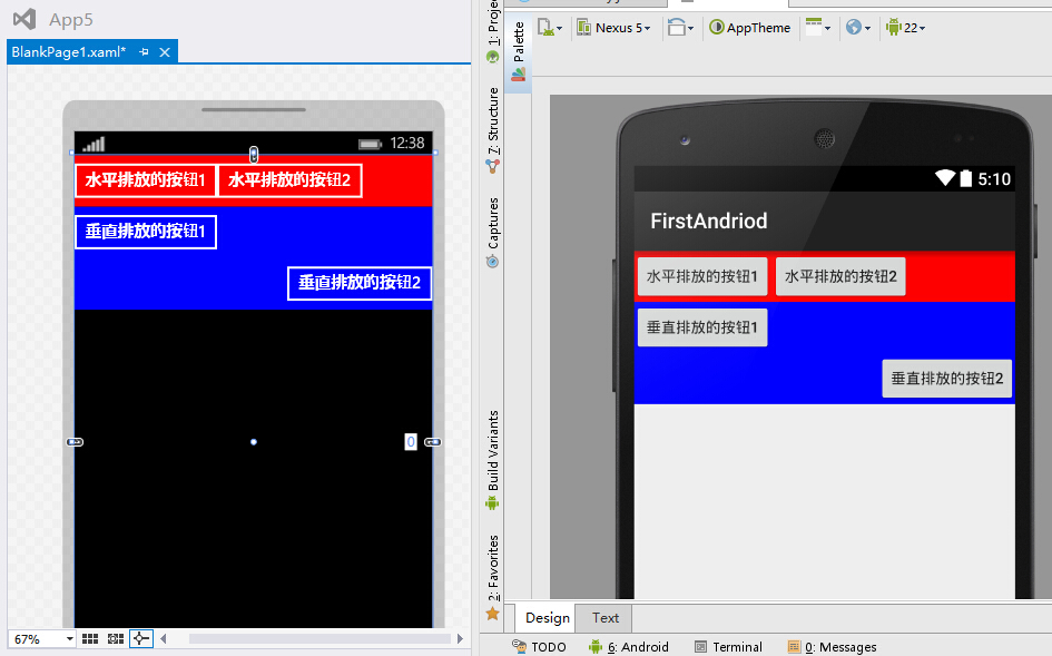
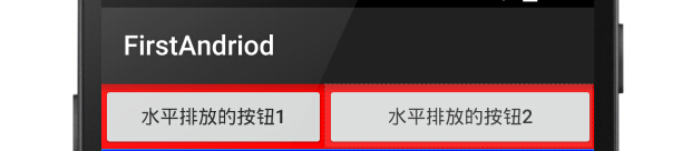
先来一个StackPanel的DEMO:
 1 <StackPanel  Orientation="Horizontal"
 2                 Background="#f00">
 3     <Button Content="水平排放的按钮1" />
 4     <Button Content="水平排放的按钮2" />
 5 </StackPanel>
 6
 7 <StackPanel  Orientation="Vertical"
 8                 Background="#00f">
 9     <Button Content="垂直排放的按钮1" />
10     <Button Content="垂直排放的按钮2"
11             HorizontalAlignment="Right" />
12 </StackPanel>
再来一个LinearLayout的DEMO(顺带了解到一个格式化代码的快捷键"Ctrl+Alt+L"):
 1 <LinearLayout
 2     android:layout_width="match_parent"
 3     android:layout_height="wrap_content"
 4     android:background="#ff0000"
 5     android:orientation="horizontal">
 6
 7     <Button
 8         android:layout_width="wrap_content"
 9         android:layout_height="wrap_content"
10         android:text="水平排放的按钮1" />
11
12     <Button
13         android:layout_width="wrap_content"
14         android:layout_height="wrap_content"
15         android:text="水平排放的按钮2" />
16
17 </LinearLayout>
18
19 <LinearLayout
20     android:layout_width="match_parent"
21     android:layout_height="wrap_content"
22     android:background="#0000ff"
23     android:orientation="vertical">
24
25     <Button
26         android:layout_width="wrap_content"
27         android:layout_height="wrap_content"
28         android:text="垂直排放的按钮1" />
29
30     <Button
31         android:layout_width="wrap_content"
32         android:layout_height="wrap_content"
33         android:layout_gravity="bottom|right"
34         android:text="垂直排放的按钮2" />
35 </LinearLayout>
代码虽然不同,但是效果是一样一样的(左边WP右边安卓)...
看看LinearLayout的子元素应用android:layout_weight属性后是怎样的表现:
 1 <LinearLayout
 2     android:layout_width="match_parent"
 3     android:layout_height="wrap_content"
 4     android:background="#ff0000"
 5     android:orientation="horizontal">
 6     <Button
 7         android:layout_width="wrap_content"
 8         android:layout_height="wrap_content"
 9         android:layout_weight="1"
10         android:text="水平排放的按钮1" />
11     <Button
12         android:layout_width="wrap_content"
13         android:layout_height="wrap_content"
14         android:layout_weight="2"
15         android:text="水平排放的按钮2" />
16 </LinearLayout>
效果如下(起初我以为是按照1+2等于3,第一个元素占1/3,第二个元素占2/3,结果却并非如此。其中缘由读者自行品味“权重”二字吧):
3.FrameLayout&AbsoluteLayout VS Canvas
在官方文档布局介绍文档中已经不见FrameLayout和AbsoluteLayout这两位了,估计是在安卓如此丰富的设备分辨率下以及很少有场景能用到这两种布局方式了。
- Android-FrameLayout:以FrameLayout的左上角为基准起始位置,第一个子元素在第一层,第二个子元素在第二层,,,依次类推,就像千层饼一样。
- Android-AbsoluteLayout:以AbsoluteLayout的左上角为基准起始位置([0,0]点),子元素利用二维坐标系android:layout_x和android:layout_y(距离[0,0]点的偏移量)进行布局;如果后面的子元素区域和前面的子元素区域重合,则也会像FrameLayout的子元素一样遮盖住前面的子元素。
- WinPhone-Canvas:布局行为上等同于FrameLayout和AbsoluteLayout的结合体,为子元素提供Canvas.Left,Canvas.Top和Canvas.ZIndex三个附加属性来控制子元素在当前Canvas中的绝对位置和层级。
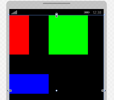
先上一个Canvas的DEMO:
 1 <Canvas>
 2     <Border Canvas.Left="60"
 3             Canvas.Top="60"
 4             Canvas.ZIndex="1"
 5             Height="80"
 6             Width="80"
 7             Background="#FFF" />
 8     <Border Height="200"
 9             Width="200"
10             Background="#F00" />
11     <Border Canvas.Left="20"
12             Canvas.Top="20"
13             Height="160"
14             Width="160"
15             Background="#0F0" />
16     <Border Canvas.Left="40"
17             Canvas.Top="40"
18             Height="120"
19             Width="120"
20             Background="#00F" />
21 </Canvas>
在来一个FrameLayout和AbsoluteLayout的DEMO:
 1 <FrameLayout
 2     android:layout_width="wrap_content"
 3     android:layout_height="wrap_content">
 4     <LinearLayout
 5         android:layout_width="200dp"
 6         android:layout_height="200dp"
 7         android:background="#ff0000" />
 8     <LinearLayout
 9         android:layout_width="160dp"
10         android:layout_height="160dp"
11         android:layout_gravity="center"
12         android:background="#00ff00" />
13     <LinearLayout
14         android:layout_width="120dp"
15         android:layout_height="120dp"
16         android:layout_gravity="center"
17         android:background="#0000ff" />
18     <LinearLayout
19         android:layout_width="80dp"
20         android:layout_height="80dp"
21         android:layout_gravity="center"
22         android:background="#ffffff" />
23 </FrameLayout>
24 <AbsoluteLayout
25     android:layout_width="wrap_content"
26     android:layout_height="wrap_content">
27     <LinearLayout
28         android:layout_width="200dp"
29         android:layout_height="200dp"
30         android:background="#ff0000" />
31     <LinearLayout
32         android:layout_width="160dp"
33         android:layout_height="160dp"
34         android:layout_gravity="center"
35         android:layout_x="20dp"
36         android:layout_y="20dp"
37         android:background="#00ff00" />
38     <LinearLayout
39         android:layout_width="120dp"
40         android:layout_height="120dp"
41         android:layout_gravity="center"
42         android:layout_x="40dp"
43         android:layout_y="40dp"
44         android:background="#0000ff" />
45     <LinearLayout
46         android:layout_width="80dp"
47         android:layout_height="80dp"
48         android:layout_gravity="center"
49         android:layout_x="60dp"
50         android:layout_y="60dp"
51         android:background="#ffffff" />
52 </AbsoluteLayout>
看看效果图吧(左WP,右上FrameLayout,右下AbsoluteLayout),也是一样一样的...

4.RelativeLayout VS WrapPanel
- Android-RelativeLayout:相对布局可以让子元素控制与父容器(RelativeLayout)的相对位置、控制与其他兄弟子元素的相对位置,常用的Layout属性为(均应用在子元素身上):
- android:layout_centerHrizontal ture|false :在父容器中水平居中
- android:layout_centerVertical ture|false:在父容器中垂直居中
- android:layout_centerInparent ture|false:在父容器中水平且垂直完全居中
- 上述3个属性控制子元素的居中问题。
- android:layout_alignParentBottom ture|false:停靠在父容器的底部
- android:layout_alignParentLeft ture|false:停靠在父容器的左部
- android:layout_alignParentRight ture|false:停靠在父容器的右部
- android:layout_alignParentTop ture|false:停靠在父容器的顶部
- 以上4个属性控制子元素是在父容器的上下左右方向上的对齐问题。
- android:layout_below @+id/xxid:在指定兄弟元素的下边
- android:layout_above @+id/xxid:在指定兄弟元素的的上边
- android:layout_toLeftOf @+id/xxid:在指定兄弟元素的左边
- android:layout_toRightOf @+id/xxid:在指定兄弟元素的右边
- 以上4个属性控制子元素相对与指定兄弟元素的位置。
- android:layout_alignTop @+id/xxid:与指定兄弟元素的上边对齐
- android:layout_alignLeft @+id/xxid:与指定兄弟元素的左边对齐
- android:layout_alignBottom @+id/xxid:与指定兄弟元素的下边对齐
- android:layout_alignRight @+id/xxid:与指定兄弟元素的右边对齐
- 以上4个属性控制子元素相对与指定兄弟元素的对齐方式。
- android:layout_marginBottom xxdp:距离某元素的下边距
- android:layout_marginLeft xxdp:距离某元素左边距
- android:layout_marginRight xxdp:距离某元素右边距
- android:layout_marginTop xxdp:距离某元素上边距
- 以上4个属性控制子元素相对于其他元素的相对外边距,注意:如果当前元素没有指定其相对的兄弟元素,则相对于父容器RelativeLayout。
- WinPhone-WrapPanel:我把WinPhone中这个布局容器称为可换行的StackPanel,也具有Orientation属性来控制子元素的排列方向,同时增加了ItemHeight和ItemWidth属性来控制元素的有效宽高,如果不设置这两个属性则以子元素的实际宽高来排序。和Android的RelativeLayout没什么相似之处(WrapPanel功能也弱了好多),和LinerLayout倒是有点相似。
先看一看WrapPanel的DEMO吧:
 1 <toolkit:WrapPanel Orientation="Horizontal"
 2                     ItemHeight="200"
 3                     ItemWidth="200">
 4     <Rectangle Width="100"
 5                 Height="200"
 6                 Fill="#F00"
 7                 HorizontalAlignment="Left" />
 8     <Rectangle Width="200"
 9                 Height="200"
10                 Fill="#0F0" />
11     <Rectangle Width="200"
12                 Height="100"
13                 Fill="#00F"
14                 VerticalAlignment="Bottom" />
15 </toolkit:WrapPanel>
效果如下(如果不设置ItemHeight和ItemWidth,则3个元素会紧挨着,蓝色的还是在第二行,因为第一行装不下,这就是Wrap提供的功能):
看下强大灵活的RelativeLayout的DEMO:
 1 <RelativeLayout
 2     android:layout_width="match_parent"
 3     android:layout_height="140dp"
 4     android:background="#F00"
 5     android:layout_marginBottom="2dp">
 6     <Button
 7         android:layout_width="wrap_content"
 8         android:layout_height="40dp"
 9         android:background="#00F"
10         android:text="水平居中"
11         android:layout_centerHorizontal="true" />
12     <Button
13         android:layout_width="wrap_content"
14         android:layout_height="40dp"
15         android:background="#00F"
16         android:text="垂直居中"
17         android:layout_centerVertical="true" />
18     <Button
19         android:layout_width="wrap_content"
20         android:layout_height="40dp"
21         android:background="#00F"
22         android:text="水平且垂直居中"
23         android:layout_centerInParent="true" />
24 </RelativeLayout>
25
26 <RelativeLayout
27     android:layout_width="match_parent"
28     android:layout_height="140dp"
29     android:background="#F00"
30     android:layout_marginBottom="2dp">
31     <Button
32         android:layout_width="wrap_content"
33         android:layout_height="40dp"
34         android:background="#00F"
35         android:text="停靠在父容器左上角"
36         android:layout_alignParentLeft="true"
37         android:layout_alignParentTop="true"/>
38     <Button
39         android:layout_width="wrap_content"
40         android:layout_height="40dp"
41         android:background="#00F"
42         android:text="停靠在父容器右上角"
43         android:layout_alignParentRight="true"
44         android:layout_alignParentTop="true"/>
45     <Button
46         android:layout_width="wrap_content"
47         android:layout_height="40dp"
48         android:background="#00F"
49         android:text="停靠在父容器右下角"
50         android:layout_alignParentRight="true"
51         android:layout_alignParentBottom="true" />
52     <Button
53         android:layout_width="wrap_content"
54         android:layout_height="40dp"
55         android:background="#00F"
56         android:text="停靠在父容器左下角"
57         android:layout_alignParentLeft="true"
58         android:layout_alignParentBottom="true" />
59 </RelativeLayout>
60
61 <RelativeLayout
62     android:layout_width="match_parent"
63     android:layout_height="wrap_content"
64     android:background="#F00"
65     android:layout_marginBottom="2dp">
66     <Button
67         android:id="@+id/btn1"
68         android:layout_width="120dp"
69         android:layout_height="120dp"
70         android:background="#00F"
71         android:text="第一个元素"
72         android:layout_centerInParent="true" />
73     <TextView
74         android:layout_height="wrap_content"
75         android:layout_width="match_parent"
76         android:text="在第一个元素右边且和起一个元素上边对齐"
77         android:layout_toRightOf="@+id/btn1"
78         android:layout_alignTop="@+id/btn1"/>
79     <TextView
80         android:layout_height="wrap_content"
81         android:layout_width="match_parent"
82         android:text="在第一个元素左边且和起一个元素下边对齐"
83         android:layout_toLeftOf="@+id/btn1"
84         android:layout_alignBottom="@+id/btn1"/>
85 </RelativeLayout>
效果图如下(其实RealtiveLayout还允许子元素设置更多的属性来控制相对布局,我在上面列的只是几个比较常见的,有兴趣的可以翻阅一下官方的文档(sdk/docs/reference/android/widget/RelativeLayout.LayoutParams.html)或者在IDE中实验一下其他的布局属性):

5.TableLayout&GridLayout VS Grid
TableLayout也不再官方的推荐之列了,取而代之的是API Level14(Android4.0)中新增的GridLayout布局。
- Android-TableLayout:表哥布局,行:一行一个TableRow对象或者一个View对象;列:一个子元素为一列;TableLayout通过android:collapseColumns控制隐藏的列、通过android:stretchColumns控制列的拉伸、通过android:shrinkColumns控制列的收缩,但是无法设置固定的行数和列数(行数和列数按行列上出现的最大子元素数量为准);子元素可以通过android:layout_colum属性控制自己排在第几列、通过android:layout_span控制自己可以横跨几列,但是无法实现跨行显示。
- Android-GridLayout:针对上述的TableLayout存在的问题,Google在API Level14(Android4.0)中引入可新的布局容器GridLayout。GridLayout通过android:orientation设置子元素是水平还是垂直排序,通过android:rowCount控制行数,通过android:columnCount控制列数;子元素可以通android:layout_row设置所在行、 通过android:layout_column设置所在列、通过android:layout_rowSpan设置跨几行、 通过android:layout_columnSpan设置跨几列。
- WinPhone-Grid:Grid是WinPhone开发中最常用的布局容器,可以通过设置行数、列数以及行列的宽高(可以是固定值或者比例值或者自动根据子元素来确定),子元素通过附加属性Grid.Row、Grid.Column、Grid.RowSpan和Grid.ColumnSpan设置子元素的所在的行、列、跨的行数和跨的列数。
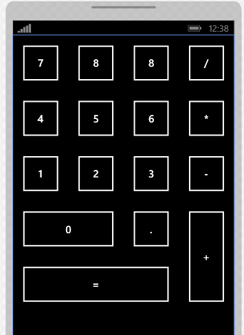
看一下Gird的DEMO:
 1 <Grid>
 2     <Grid.RowDefinitions>
 3         <RowDefinition Height="120" />
 4         <RowDefinition Height="120" />
 5         <RowDefinition Height="120" />
 6         <RowDefinition Height="120" />
 7         <RowDefinition Height="120" />
 8     </Grid.RowDefinitions>
 9     <Grid.ColumnDefinitions>
10         <ColumnDefinition Width="1*" />
11         <ColumnDefinition Width="1*" />
12         <ColumnDefinition Width="1*" />
13         <ColumnDefinition Width="1*" />
14     </Grid.ColumnDefinitions>
15     <Button Content="7"
16             Width="100"
17             Height="100"
18             Margin="0" />
19     <Button  Grid.Column="1"
20                 Content="8"
21                 Width="100"
22                 Height="100" />
23     <Button  Grid.Column="2"
24                 Content="8"
25                 Width="100"
26                 Height="100" />
27     <Button  Grid.Column="3"
28                 Content="/"
29                 Width="100"
30                 Height="100" />
31     <Button Grid.Row="1"
32             Content="4"
33             Width="100"
34             Height="100"
35             Margin="0" />
36     <Button Grid.Row="1"
37             Grid.Column="1"
38             Content="5"
39             Width="100"
40             Height="100" />
41     <Button Grid.Row="1"
42             Grid.Column="2"
43             Content="6"
44             Width="100"
45             Height="100" />
46     <Button Grid.Row="1"
47             Grid.Column="3"
48             Content="*"
49             Width="100"
50             Height="100" />
51     <Button Grid.Row="2"
52             Content="1"
53             Width="100"
54             Height="100"
55             Margin="0" />
56     <Button Grid.Row="2"
57             Grid.Column="1"
58             Content="2"
59             Width="100"
60             Height="100" />
61     <Button Grid.Row="2"
62             Grid.Column="2"
63             Content="3"
64             Width="100"
65             Height="100" />
66     <Button Grid.Row="2"
67             Grid.Column="3"
68             Content="-"
69             Width="100"
70             Height="100" />
71     <Button Grid.Row="3"
72             Grid.ColumnSpan="2"
73             Content="0"
74             Width="220"
75             Height="100"
76             Margin="0" />
77     <Button Grid.Row="3"
78             Grid.Column="2"
79             Content="."
80             Width="100"
81             Height="100" />
82     <Button Grid.Row="3"
83             Grid.Column="3"
84             Grid.RowSpan="2"
85             Content="+"
86             Width="100"
87             Height="220" />
88     <Button Grid.Row="4"
89             Grid.ColumnSpan="3"
90             Content="="
91             Width="340"
92             Height="100" />
93 </Grid>
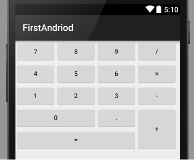
效果如下:
在看一个GridLayout的DEMO:
 1 <GridLayout
 2     android:layout_width="wrap_content"
 3     android:layout_height="wrap_content"
 4     android:columnCount="4"
 5     android:orientation="horizontal"
 6     android:rowCount="5">
 7     <Button android:text="7" />
 8     <Button android:text="8" />
 9     <Button android:text="9" />
10     <Button android:text="/" />
11     <Button android:text="4" />
12     <Button android:text="5" />
13     <Button android:text="6" />
14     <Button android:text="×" />
15     <Button android:text="1" />
16     <Button android:text="2" />
17     <Button android:text="3" />
18     <Button android:text="-" />
19     <Button
20         android:layout_columnSpan="2"
21         android:layout_gravity="fill"
22         android:text="0" />
23     <Button android:text="." />
24     <Button
25         android:layout_gravity="fill"
26         android:layout_rowSpan="2"
27         android:text="+" />
28     <Button
29         android:layout_columnSpan="3"
30         android:layout_gravity="fill"
31         android:text="=" />
32 </GridLayout>
效果图如下(和WP的Grid效果一样,但是GridLayout的子元素的行列可以不显示指定,GridLayout会根据行列数的设置和子元素所在的顺序自动确定它的行列,xml编码比较简洁):
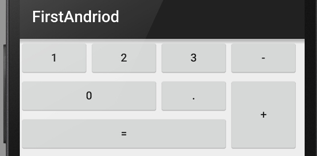
由于TableLayout不能跨行,则布局上述的界面就要结合其他的布局容器才能完成了(而且用上了一些固定的宽高值,不推荐这样做):
 1 <TableLayout
 2     android:layout_width="wrap_content"
 3     android:layout_height="wrap_content">
 4     <TableRow>
 5         <Button android:text="1" />
 6         <Button android:text="2" />
 7         <Button android:text="3" />
 8         <Button android:text="-" />
 9     </TableRow>
10     <TableRow>
11         <LinearLayout
12             android:layout_span="4"
13             android:orientation="horizontal">
14             <LinearLayout
15                 android:layout_width="wrap_content"
16                 android:layout_height="wrap_content"
17                 android:orientation="vertical">
18                 <LinearLayout
19                     android:layout_width="wrap_content"
20                     android:layout_height="wrap_content"
21                     android:orientation="horizontal">
22                     <Button
23                         android:layout_width="176dp"
24                         android:layout_height="wrap_content"
25                         android:text="0" />
26                     <Button
27                         android:layout_width="wrap_content"
28                         android:layout_height="wrap_content"
29                         android:text="." />
30                 </LinearLayout>
31                 <LinearLayout
32                     android:layout_width="wrap_content"
33                     android:layout_height="wrap_content">
34                     <Button
35                         android:layout_width="264dp"
36                         android:layout_height="wrap_content"
37                         android:text="=" />
38                 </LinearLayout>
39             </LinearLayout>
40             <Button
41                 android:layout_width="wrap_content"
42                 android:layout_height="96dp"
43                 android:text="+" />
44         </LinearLayout>
45     </TableRow>
46 </TableLayout>
效果如下:
6.总结
Android的布局容器设计明显偏重于提供自适应的能力,即使是需要设置固定宽高的地方也已dp代替px为单位,或许是安卓众多的设备分辨率所逼迫的吧;
WinPhone的布局容器是从WPF再到Silverlight一路阉割来的,提供的布局方便性灵活性弱了不少,另外它也是不以px为布局单位的,xaml的手写体验比Android的布局xml要好一些。
IOS开发了解一些,它的布局是另外一个极端,严重依赖于像素,设备少嘛,就那几个分辨率,也完全不可能去手写xib文件,,,以前研究IOS开发的时候简直头疼的要死,很多情况还要用OC代码来做布局,呵呵哒;
总的来说,Android提供的布局容器比WinPhone要方便许多,功能和灵活性也能多一些,手写布局xml也完全可行(得益于Android Studio的智能提示做的还挺不错)。
由于笔者刚刚接触Android,文中难免会有不当或者错误之处,欢迎看官们指正。