表单样式
一、基础表单
<form >
    <div class="form-group">
      <label>邮箱:</label>
      <input type="email" class="form-control" placeholder="请输入您的邮箱地址">
    </div>
    <div class="form-group">
      <label >密码</label>
      <input type="password" class="form-control" placeholder="请输入您的邮箱密码">
    </div>
    <div class="checkbox">
      <label>
        <input type="checkbox"> 记住密码
      </label>
    </div>
    <button type="submit" class="btn btn-default">进入邮箱</button>
  </form>

表单除了这几个元素之外,还有input、select、textarea等元素,在Bootstrap框架中,通过定制了一个类名`form-control`,也就是说,如果这几个元素使用了类名“form-control”,将会实现一些设计上的定制效果。
1、宽度变成了100%
2、设置了一个浅灰色(#ccc)的边框
3、具有4px的圆角
4、设置阴影效果,并且元素得到焦点之时,阴影和边框效果会有所变化
5、设置了placeholder的颜色为#999
二、水平表单
Bootstrap框架默认的表单是垂直显示风格,但很多时候我们需要的水平表单风格(标签居左,表单控件居右)。
   <form class="form-horizontal" role="form">
    <div class="form-group">
      <label for="inputEmail3" class="col-sm-2 control-label">邮箱:</label>
      <div class="col-sm-4">
        <input type="email" class="form-control" id="inputEmail3" placeholder="请输入您的邮箱地址">
      </div>
    </div>
    <div class="form-group">
      <label for="inputPassword3" class="col-sm-2 control-label">密码:</label>
      <div class="col-sm-4">
        <input type="password" class="form-control" id="inputPassword3" placeholder="请输入您的邮箱密码">
      </div>
    </div>
  </form>

在Bootstrap框架中要实现水平表单效果,必须满足以下两个条件:
1、在<form>元素是使用类名“.form-horizontal”。
2、配合Bootstrap框架的网格系统。
在<form>元素上使用类名“.form-horizontal”主要有以下几个作用:
1、设置表单控件padding和margin值。
2、改变“form-group”的表现形式,类似于网格系统的“row”。
三、内联表单
有时候我们需要将表单的控件都在一行内显示
<form class="form-inline" role="form">
    <div class="form-group">
      <label class="sr-only" for="exampleInputEmail2">邮箱</label>
      <input type="email" class="form-control" id="exampleInputEmail2" placeholder="请输入你的邮箱地址">
    </div>
    <div class="form-group">
      <label class="sr-only" for="exampleInputPassword2">密码</label>
      <input type="password" class="form-control" id="exampleInputPassword2" placeholder="请输入你的邮箱密码">
    </div>
    <button type="submit" class="btn btn-default">进入邮箱</button>
  </form>

在Bootstrap框架中实现这样的表单效果是轻而易举的,你只需要在<form>元素中添加类名“.form-inline”即可。
如果你要在input前面添加一个label标签时,会导致input换行显示。如果你必须添加这样的一个label标签,并且不想让input换行,你需要将label标签也放在容器“form-group”中。
表单控件
一、输入框input
单行输入框,常见的文本输入框,也就是input的type属性值为text。
在Bootstrap中使用input时也必须添加type类型,如果没有指定type类型,将无法得到正确的样式,因为Bootstrap框架都是通过input[type=“?”]
(其中?号代表type类型,比如说text类型,对应的是input[type=“text”])的形式来定义样式的。
为了让控件在各种表单风格中样式不出错,需要添加类名“.form-control”。
<form role="form">
  <div class="form-group">
    <input type="email" class="form-control" placeholder="Enter email">
  </div>
</form>

二、下拉选择框select
Bootstrap框架中的下拉选择框使用和原始的一致,多行选择设置multiple属性的值为multiple。
<form role="form">
<div class="form-group">
  <select class="form-control">
    <option>1</option>
    <option>2</option>
    <option>3</option>
    <option>4</option>
    <option>5</option>
  </select>
  </div>
  <div class="form-group">
  <select multiple class="form-control">
    <option>1</option>
    <option>2</option>
    <option>3</option>
    <option>4</option>
    <option>5</option>
  </select>
</div>
</form>

三、文本域textarea
文本域和原始使用方法一样,设置rows可定义其高度,设置cols可以设置其宽度。
但如果textarea元素中添加了类名“.form-control”类名,则无需设置cols属性。
因为Bootstrap框架中的“form-control”样式的表单控件宽度为100%或auto。
  <form role="form">
    <div class="form-group">
      <textarea class="form-control" rows="3"></textarea>
    </div>
  </form>

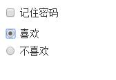
四、复选框checkbox和单选择按钮radio
1、不管是checkbox还是radio都使用label包起来了
2、checkbox连同label标签放置在一个名为“.checkbox”的容器内
3、radio连同label标签放置在一个名为“.radio”的容器内
<form role="form">
 <div class="checkbox">
  <label>
   <input type="checkbox" value="">
   记住密码
  </label>
 </div>
<div class="radio">
 <label>
  <input type="radio" name="optionsRadios" id="optionsRadios1" value="love" checked>
  喜欢
 </label>
</div>
<div class="radio">
 <label>
  <input type="radio" name="optionsRadios" id="optionsRadios2" value="hate">
  不喜欢
 </label>
</div>
</form>
五、复选框和单选按钮水平排列
1、如果checkbox需要水平排列,只需要在label标签上添加类名“.checkbox-inline”
2、如果radio需要水平排列,只需要在label标签上添加类名“.radio-inline”
<form role="form">
  <div class="form-group">
    <label class="checkbox-inline">
      <input type="checkbox"  value="option1">游戏
    </label>
    <label class="checkbox-inline">
      <input type="checkbox"  value="option2">摄影
    </label>
    <label class="checkbox-inline">
    <input type="checkbox"  value="option3">旅游
    </label>
  </div>
  <div class="form-group">
    <label class="radio-inline">
      <input type="radio"  value="option1" name="sex">男性
    </label>
    <label class="radio-inline">
      <input type="radio"  value="option2" name="sex">女性
    </label>
    <label class="radio-inline">
      <input type="radio"  value="option3" name="sex">中性
    </label>
  </div>
</form>

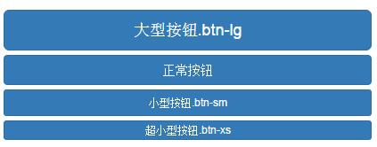
六、表单控件大小
Bootstrap框架还提供了两个不同的类名,用来控制表单控件的高度。这两个类名是:
1、input-sm:让控件比正常大小更小
2、input-lg:让控件比正常大小更大
这两个类适用于表单中的input,textarea和select控件。
<input class="form-control input-lg" type="text" placeholder="添加.input-lg,控件变大">
<input class="form-control" type="text" placeholder="正常大小">
<input class="form-control input-sm" type="text" placeholder="添加.input-sm,控件变小">

表单控件状态
一、焦点状态
焦点状态是通过伪类“:focus”来实现。Bootstrap框架中表单控件的焦点状态删除了outline的默认样式,重新添加阴影效果。
<form role="form" class="form-horizontal">
  <div class="form-group">
    <div class="col-xs-6">
      <input class="form-control input-lg" type="text" placeholder="不是焦点状态下效果">
    </div>
    <div class="col-xs-6">
      <input class="form-control input-lg" type="text" placeholder="焦点点状态下效果">
    </div>
  </div>
</form>

二、禁用状态
Bootstrap框架的表单控件的禁用状态和普通的表单禁用状态实现方法是一样的,在相应的表单控件上添加属性“disabled”。
<form role="form">
  <input class="form-control input-lg" id="disabledInput" type="text" placeholder="表单已被禁用,不可输入" disabled>
  <fieldset disabled>
    <div class="form-group">
      <label for="disabledTextInput">禁用的输入框</label>
      <input type="text" id="disabledTextInput" class="form-control" placeholder="禁止输入">
    </div>
    <div class="form-group">
      <label for="disabledSelect">禁用的下拉框</label>
      <select id="disabledSelect" class="form-control">
        <option>不可选择</option>
      </select>
    </div>
    <div class="checkbox">
      <label>
        <input type="checkbox"> 无法选择
      </label>
    </div>
    <button type="submit" class="btn btn-primary">提交</button>
  </fieldset>
</form>

三、验证状态
在制作表单时,不免要做表单验证。同样也需要提供验证状态样式,在Bootstrap框架中同样提供这几种效果。
1、.has-warning:警告状态(黄色)
2、.has-error:错误状态(红色)
3、.has-success:成功状态(绿色)
使用的时候只需要在form-group容器上对应添加状态类名
<form role="form">
  <div class="form-group has-success">
    <label class="control-label" for="inputSuccess1">成功状态</label>
    <input type="text" class="form-control" id="inputSuccess1" placeholder="成功状态" >
  </div>
  <div class="form-group has-warning">
    <label class="control-label" for="inputWarning1">警告状态</label>
    <input type="text" class="form-control" id="inputWarning1" placeholder="警告状态">
  </div>
  <div class="form-group has-error">
    <label class="control-label" for="inputError1">错误状态</label>
    <input type="text" class="form-control" id="inputError1" placeholder="错误状态">
  </div>
</form>

表单提示信息
平常在制作表单验证时,要提供不同的提示信息。在Bootstrap框架中也提供了这样的效果。使用了一个"help-block"样式,将提示信息以块状显示,并且显示在控件底部。
<form role="form">
  <div class="form-group has-success has-feedback">
    <label class="control-label" for="inputSuccess1">成功状态</label>
    <input type="text" class="form-control" id="inputSuccess1" placeholder="成功状态" >
    <span class="help-block">你输入的信息是正确的</span>
    <span class="glyphicon glyphicon-ok form-control-feedback"></span>
  </div>
  <div class="form-group has-warning has-feedback">
    <label class="control-label" for="inputWarning1">警告状态</label>
    <input type="text" class="form-control" id="inputWarning1" placeholder="警告状态">
    <span class="help-block">请输入正确信息</span>
    <span class="glyphicon glyphicon-warning-sign form-control-feedback"></span>
  </div>
  <div class="form-group has-error has-feedback">
    <label class="control-label" for="inputError1">错误状态</label>
    <input type="text" class="form-control" id="inputError1" placeholder="错误状态">

    <span class="glyphicon glyphicon-remove form-control-feedback"></span>
  </div>
</form>

按钮
一、多标签支持
一般制作按钮除了使用<button>标签元素之外,还可以使用<input type="submit">和<a>标签等。
同样,在Bootstrap框架中制作按钮时,除了刚才所说的这些标签元素之外,还可以使用在其他的标签元素上,唯一需要注意的是,要在制作按钮的标签元素上添加类名“.btn”。
<button class="btn btn-default" type="button">button标签按钮</button>
<input type="submit" class="btn btn-default" value="input标签按钮"/>
<a href="##" class="btn btn-default">a标签按钮</a>
<span class="btn btn-default">span标签按钮</span>
<div class="btn btn-default">div标签按钮</div>

二、定制风格
在Bootstrap框架中不同的按钮风格都是通过不同的类名来实现。
<button class="btn" type="button">基础按钮.btn</button>
<button class="btn btn-default" type="button">默认按钮.btn-default</button>
<button class="btn btn-primary" type="button">主要按钮.btn-primary</button>
<button class="btn btn-success" type="button">成功按钮.btn-success</button>
<button class="btn btn-warning" type="button">警告按钮.btn-warning</button>
<button class="btn btn-danger" type="button">危险按钮.btn-danger</button>
<button class="btn btn-link" type="button">链接按钮.btn-link</button>


三、按钮大小
在Bootstrap框架中,对于按钮的大小,也是可以定制的。
在Bootstrap框架中提供了三个类名来控制按钮大小:

<button class="btn btn-primary btn-lg" type="button">大型按钮.btn-lg</button>
<button class="btn btn-primary" type="button">正常按钮</button>
<button class="btn btn-primary btn-sm" type="button">小型按钮.btn-sm</button>

四、块状按钮
Bootstrap框架中提供了一个类名“.btn-block”。按钮使用这个类名就可以让按钮充满整个容器,并且这个按钮不会有任何的padding和margin值。在实际当中,常把这种按钮称为块状按钮。
<button class="btn btn-primary btn-lg btn-block" type="button">大型按钮.btn-lg</button>
<button class="btn btn-primary btn-block" type="button">正常按钮</button>
<button class="btn btn-primary btn-sm btn-block" type="button">小型按钮.btn-sm</button>
<button class="btn btn-primary btn-xs btn-block" type="button">超小型按钮.btn-xs</button>
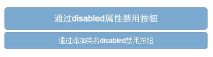
五、按钮禁用状态
在Bootstrap框架中,要禁用按钮有两种实现方式:
方法1:在标签中添加disabled属性
方法2:在元素标签中添加类名“disabled”
两者的主要区别是:
“.disabled”样式不会禁止按钮的默认行为,比如说提交和重置行为等.
在元素标签中添加“disabled”属性的方法是可以禁止元素的默认行为的。
<button class="btn btn-primary btn-lg btn-block" type="button" disabled="disabled">通过disabled属性禁用按钮</button>
<button class="btn btn-primary btn-block disabled" type="button">通过添加类名disabled禁用按钮</button>
图像
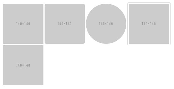
在Bootstrap框架中对于图像的样式风格提供以下几种风格:
1、img-responsive:响应式图片,主要针对于响应式设计
2、img-rounded:圆角图片
3、img-circle:圆形图片
4、img-thumbnail:缩略图片
使用方法非常简单,只需要在<img>标签上添加对应的类名。
<img  alt="140x140" src="http://placehold.it/140x140">
<img  class="img-rounded" alt="140x140" src="http://placehold.it/140x140">
<img  class="img-circle" alt="140x140" src="http://placehold.it/140x140">
<img  class="img-thumbnail" alt="140x140" src="http://placehold.it/140x140">
<img  class="img-responsive" alt="140x140" src="http://placehold.it/140x140">
图标
在Bootstrap框架中是通过给元素添加“glyphicon”类名来实现,然后通过伪元素“:before”的“content”属性调取对应的icon编码:
<span class="glyphicon glyphicon-search"></span>
<span class="glyphicon glyphicon-asterisk"></span>
<span class="glyphicon glyphicon-plus"></span>
<span class="glyphicon glyphicon-cloud"></span>
在网页中使用图标也非常的简单,在任何内联元素上应用所对应的样式即可:


