CSS3 基础入门(二)
2d变换
在css3中,可以通过2d相关的属性实现元素的2d变换,包括:
- 位移
- 旋转
- 缩放
- 倾斜
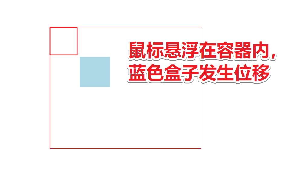
位移
可以通过将transform的值设置为translate 来让元素进行位移,translate的语法如下:
transform: translate(x, y)
- x 沿着x轴位移的距离
- y 沿着y轴位移的距离
transform: translateX(length)
- length x轴位移的距离
transform: translateY(length)
- length Y轴位移的距离
示例代码:
html代码:
<div class="content">
    <div class="d1"></div>
</div>

css代码:
<style>
    .content {
         500px;
        height: 400px;
        border: 1px solid red;
        margin: 100px auto;
    }

    .content .d1 {
         100px;
        height: 100px;
        background-color: lightblue;
        transition: 3s;
    }

    .content:hover .d1 {
        transform: translate(100px,100px);
    }
</style>
实际效果:
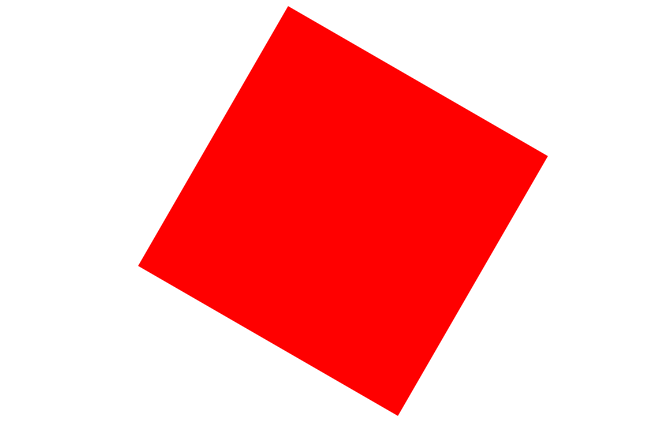
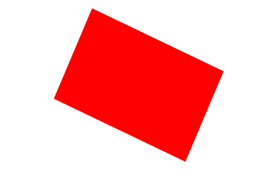
旋转
2d的旋转可以通过将transform属性设置为rotate并且设置旋转的角度。
语法格式如下:
transform: rotate(deg)
- deg 角度
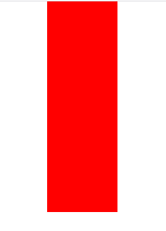
示例代码:
html代码:
<div class="content"></div>

css代码:
<style>
    .content {
         300px;
        height: 300px;
        margin: 100px auto;
        background-color: red;
        transform: rotate(120deg);
    }
</style>
实际效果:
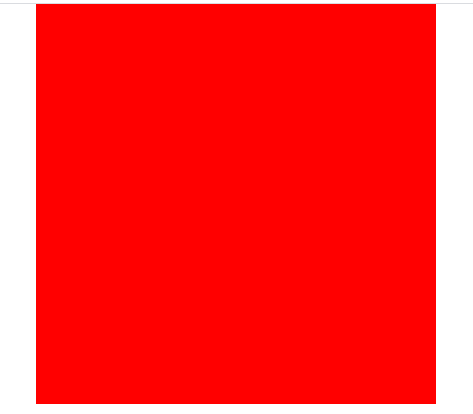
缩放
通过将transform设置为scale可以实现元素的缩放效果。
语法格式如下:
transform: scale(x,y)
- 将元素的宽度更改为原来的x倍
- 将元素的高度更改为原来的y倍
transform: scaleX(n)
- n 将元素的宽度变为原来的n倍
transform: scaleY(n)
- n 将元素的高度变为原来的n倍
示例代码:
html代码:
<div class="content"></div>

css代码:
<style>
    .content {
         200px;
        height: 200px;
        background-color: red;
        margin: 100px auto;
        transform: scale(2,2);
    }
</style>
实际效果:
倾斜
通过将transform属性设置为skew可以进行倾斜操作。
语法格式如下:
transform: skew(x, y)
- x 元素沿着水平方向倾斜的角度
- y 元素沿着垂直方向倾斜的角度
transform: skewX(deg)
- 元素沿着水平方向倾斜的角度
transform: skewY(deg)
元素沿着垂直方向倾斜的角度
skew(x, y) 如果第二个参数没有提供,则值为0。也就是y轴方向上无倾斜。
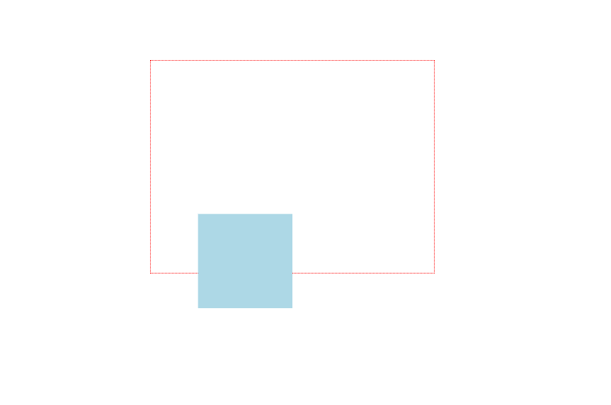
示例代码:
html代码:
<div class="content">
    <div class="d1"></div>
</div>

css代码:
<style>
    .content {
         300px;
        height: 200px;
        margin: 100px auto;
        border: 1px dotted #222;
    }
    .d1 {
         300px;
        height: 200px;
        background-color: lightblue;
        transform: skewX(30deg);
    }
</style>
实际效果:
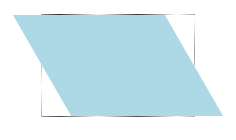
只要不是倾斜的角度是180度,skewX()元素会保持着本身的高度,在保持本身高度的基础上进行拉长自身产生倾斜。
skewY() 元素会保持本身的宽度,沿着Y轴倾斜。
skew(x,y)方法会先按照skewX()方法倾斜,然后按照skewY()方法倾斜
2d中心原点
在2d中,可以通过transform-origin属性设置中心原点。默认情况下,元素的中心原点位于X轴和Y轴的50%处。
默认情况下,CSS3变形进行的位移、缩放、旋转、倾斜都是以元素的中心原点进行变形。
语法格式:
transform-origin: <length-percentage> | keywords
- length-percentage 长度值一般使用百分比作为单位,很少使用px、em等作为单位。
- keywords 关键字
transform-origin属性取值
| 关键字 | 百分比 | 说明 |
|---|---|---|
| top left | 0 0 | 左上 |
| top center | 50% 0 | 靠上居中 |
| top right | 100% 0 | 右上 |
| left center | 0 50% | 靠左居中 |
| center center | 50% 50% | 正中 |
| right center | 100% 50% | 靠右居中 |
| bottom left | 0 100% | 左下 |
| bottom center | 50% 100% | 靠下居中 |
| bottom right | 100% 100% | 右下 |
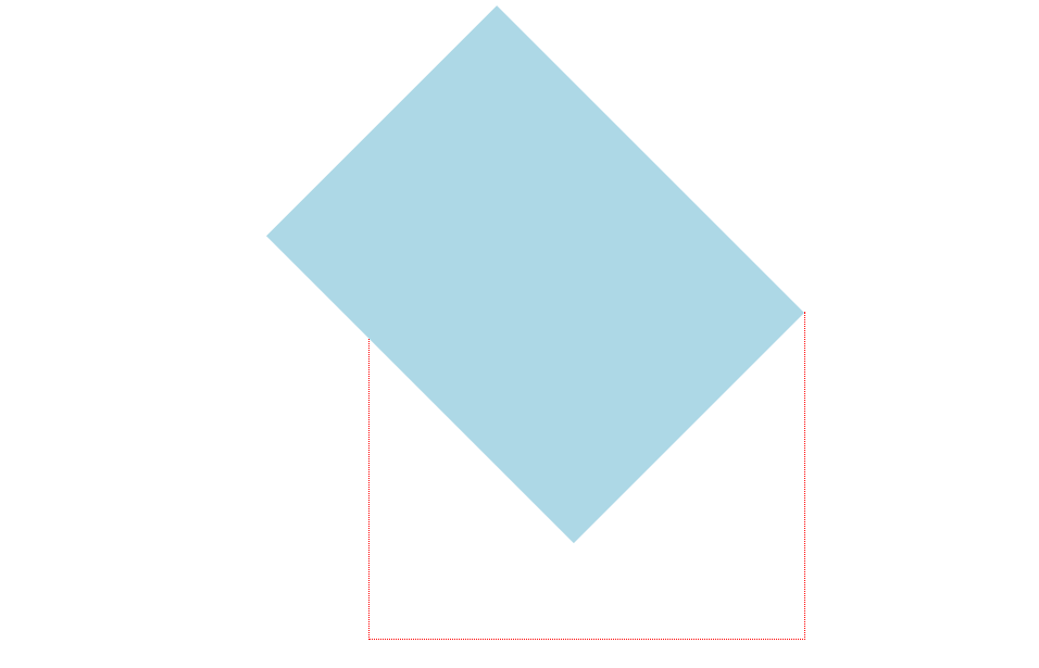
示例代码:
html代码:
<div class="content">
    <div class="d1"></div>
</div>

css代码:
<style>
    .content {
         400px;
        height: 300px;
        border: 1px dotted red;
        margin: 300px auto;
    }
    .d1 {
         400px;
        height: 300px;
        background-color: lightblue;
        transform: rotate(45deg);
        transform-origin: right top;
    }
</style>
实际效果:
3d变换
首先需要知道的是,css3中的3d只是伪3d,其次,相对于2d来说,3d的变换多了一个z轴。

3d中的属性:
- translate3d(x,y,z) / translateX translateY translateZ
- scale3d(x,y,z) / scaleX scaleY scaleZ
- rotate3d(x,y,angle) / rotateX(angle) rotateY(angle) rotateZ(angle)
- transform-style: flat | preserve-3d [开启3d空间]
- perspective[给父元素设置] 和 perspective() [给当前元素设置]
- backface-visibibility 背面隐藏
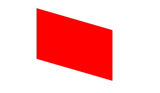
3d 位移
想要实现3d位移,可以通过下面的几个属性来实现:
- translateX 沿着x轴位移
- translateY 沿着y轴位移
- translateZ 沿着z轴位移
- translate3d(x,y,z) x轴、y轴、z轴位移
示例代码:
html代码:
<div class="content">
    <div class="d1"></div>
</div>

css代码:
<style>
    .content {
         400px;
        height: 300px;
        border: 1px dotted red;
        margin: 100px auto;
        perspective: 1200px;
    }
    .d1 {
         100px;
        height: 100px;
        background-color: lightblue;
        transition: 3s;
    }
    .content:hover .d1 {
        transform:translate3d(100px, 200px, 300px);
    }
</style>
实际效果:
3d 缩放
想要使用3d 缩放,可以通过下面的几个属性来实现:
- scaleX(n) 宽度变为n倍
- scaleY(n) 高度变为n倍
- scaleZ(n) 沿着z轴进行缩放
- scale3d(sx,sy,sz) 3d缩放函数
示例代码:
- scaleX(n)
html代码:
<div class="content"></div>

css代码:
<style>
    body {
        perspective: 1200px;
    }
    .content {
         100px;
        height: 100px;
        background-color: red;
        margin: 100px auto;
        transform: scaleX(3);
    }
</style>
实际效果:

- scaleY(n)
html代码:
<div class="content"></div>

css代码:
<style>
    body {
        perspective: 1200px;
    }
    .content {
         100px;
        height: 100px;
        background-color: red;
        margin: 100px auto;
        transform: scaleY(3);
    }
</style>
实际效果:
- scaleZ(n)
html代码:
<div class="content"></div>

css代码:
<style>
    body {
        perspective: 1200px;
    }
    .content {
         100px;
        height: 100px;
        background-color: red;
        margin: 100px auto;
        transform: scaleZ(25) rotateX(30deg);
    }
</style>
实际效果:
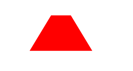
如果单独的演示scaleZ是看不到效果的,必须开启视距以及配合其他的变形属性。
- scale3d()
html代码:
<div class="content"></div>

css代码:
<style>
    body {
        perspective: 1200px;
    }
    .content {
         100px;
        height: 100px;
        background-color: red;
        margin: 100px auto;
        transform: scale3d(2,2,20) rotateX(30deg);
    }
</style>
3d旋转
想要使用3d旋转,可以通过下面的属性来实现:
- rotate3d(x,y,angle)
- rotateX(angle)
- rotateY(angle)
- rotateZ(angle)
示例代码:
- rotate3d(x,y,angle)
html代码:
<div class="content"></div>

css代码:
<style>
    .content {
         300px;
        height: 200px;
        background-color: red;
        margin: 100px auto;
        transform: rotate3d(1,2,3,30deg) perspective(1200px);
    }
</style>
实际效果:
- rotateX(angle) 和 rotateY(angle)
html代码:
<div class="content"></div>

css代码:
<style>
    .content {
         300px;
        height: 200px;
        background-color: red;
        margin: 100px auto;
        transform: rotateX(30deg) rotateY(30deg) perspective(1200px);
        transform-style: preserve-3d;
    }
</style>
实际效果:
- rotateZ(angle)
html代码:
<div class="content"></div>

css代码:
<style>
    .content {
         300px;
        height: 200px;
        background-color: red;
        margin: 100px auto;
        transform: rotateZ(120deg);
        transform-style: preserve-3d;
    }
</style>
实际效果:
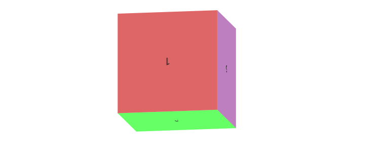
正方体案例
示例代码:
html代码:
<ul>
    <li>1</li>
    <li>2</li>
    <li>3</li>
    <li>4</li>
    <li>5</li>
    <li>6</li>
</ul>

css代码:
<style>
    * {
        margin: 0;
        padding: 0;
    }

    ul {
         200px;
        height: 200px;
        margin: 100px auto;
        position: relative;
        transition: 6s;
        list-style: none;
        transform-style: preserve-3d;
    }
    ul li {
         100%;
        height: 100%;
        text-align: center;
        line-height: 200px;
        color: #222;
        font-size: 20px;
        position: absolute;
        backface-visibility: hidden;
    }
    ul li:nth-child(1) {
        transform: rotateX(0deg) translateZ(100px);
        background-color: rgba(200,0,0,.6);
    }
    ul li:nth-child(2) {
        transform: rotateX(90deg) translateZ(100px);
        background-color: rgba(0,255,0,.6);
    }
    ul li:nth-child(3) {
        transform: rotateX(180deg) translateZ(100px);
        background-color: rgba(0,0,200,.6);
    }
    ul li:nth-child(4) {
        transform: rotateX(270deg) translateZ(100px);
        background-color: rgba(200,100,0,.6);
    }
    ul li:nth-child(5) {
        transform: rotateY(90deg) translateZ(100px);
        background-color: rgba(62, 111, 175, 0.6);
    }
    ul li:nth-child(6) {
        transform: rotateY(-90deg) translateZ(100px);
        background-color: rgba(146, 41, 150, 0.6);
    }

    ul:hover {
        transform: rotateX(360deg) rotateY(360deg);
    }
</style>
实际效果:
动画
在css3中,实现动画需要通过下面的属性来实现:
- animation-name 调用关键帧
- animation-duration 动画完成时间
- animation-timing-function 动画的速度曲线
- animation-delay 延迟
- animation-iteration-count 动画播放的次数
- n 具体次数
- infinite 无限次播放
- animation-direction 动画是否轮流反向播放动画
- normal 正常
- alterate 轮流反向播放
- animation-play-state 暂停/运行
- paused 暂停
- running 运行
- animation-fill-mode 规定动画在播放前或者之后,动画效果是否可见
- none 不改变默认
- forwards 当动画完成后保持最后一个属性值
- backwards 在animation-delay指定的一段时间之内,在动画显示之前,应用开始属性值
简写语法:
animation: name duration timing-function delay iteration -count direction
关键帧的创建
keyframes:
keyframes 关键帧名 {

	0% {}

    10% {}

    ...

    100% {}

}
示例:
html代码:
<div class="chest">
<div class="heart left side top"></div>
<div class="heart center">♥</div>
<div class="heart right side"></div>
</div>
css代码:
<style>
html, body {
height: 100%;
}
body {
margin: 0;
padding: 0;
background: #ffa5a5;
background: linear-gradient(to bottom, #ffa5a5 0%,#ffd3d3 100%);
}
.chest {
500px;
height: 500px;
margin: 0 auto;
position: relative;
}
.heart {
position: absolute;
z-index: 2;
background: linear-gradient(-90deg, #F50A45 0%, #d5093c 40%);
animation: beat 0.7s ease 0s infinite normal;
}
.heart.center {
background: linear-gradient(-45deg, #B80734 0%, #d5093c 40%);
}
.heart.top {
z-index: 3;
}
.side {
top: 100px;
220px;
height: 220px;
border-radius: 220px;
}
.center {
210px;
height: 210px;
bottom: 100px;
left: 145px;
font-size: 0;
text-indent: -9999px;
}
.left {
left: 62px;
}
.right {
right: 62px;
}
@keyframes beat {
0% {
transform: scale(1) rotate(225deg);
box-shadow:0 0 40px #d5093c;
}
50% {
transform: scale(1.1) rotate(225deg);
box-shadow:0 0 70px #d5093c;
}
100% {
transform: scale(1) rotate(225deg);
box-shadow:0 0 40px #d5093c;
}
}
</style>
实际效果: