一、浏览器画图方式有两种
- canvas :点阵图,缩放失真,适合图形数量非常大的图表
- svg:矢量图,缩放不失真,适合图形数量较少的图表
二、echarts 的绘图步骤
- 建立dom 容器
- 引入 ECharts
- 实例化echarts
- 建立图表配置项
- 显示图表
<!DOCTYPE html>
<html lang="en">
<head>
<meta charset="UTF-8">
<title>快速上手</title>
<style>
#main{
height: 500px;
}
</style>
</head>
<body>
<!--建立dom 容器-->
<div id="main"></div>
<!--引入echarts-->
<script src="../js/echarts.min.js"></script>
<script>
/*基于准备好的dom,初始化echarts实例
* echarts.init(dom)
* */
const myChart=echarts.init(document.getElementById('main'));
/*指定图表的option 配置项和数据
* title 标题 {}
* text 主标题
* xAxis x轴 {}
* data 类目数据
* yAxis y轴 {}
* series 系列列表 [系列,...]
* 系列
* type 图表类型
* data 数据,与xAxis.data 相对应
* */
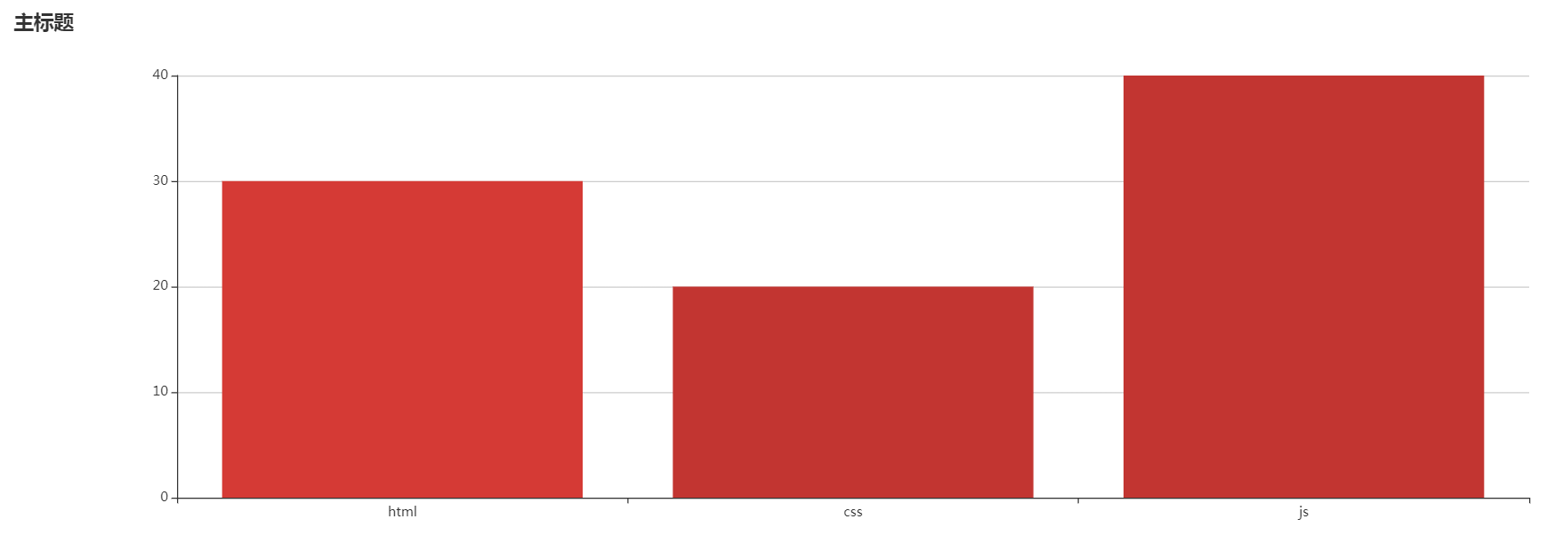
const option={
title:{
text:'主标题'
},
xAxis: {
data:['html','css','js']
},
yAxis: {},
series:{
type:'bar',
data:[30,20,40]
}
};
/*使用刚指定的配置项和数据显示图表
* setOption(option)
* */
myChart.setOption(option);
</script>
</body>
</html>
三、常用组件
- 标题 title
- 主标题 text
- 副标题 subtext
- 位置 left
- 主标题样式 textStyle
- 副标题样式 subtextStyle
- 可见性 show
-
图例 legend
- 图例legend 适用于不同系列的数据过滤,它需要与series 搭配使用。
-
工具栏 toolbox
-
保存图片 saveAsImage
-
配置项还原 restore
-
数据视图工具 dataView
-
数据区域缩放 dataZoom
-
动态类型切换 magicType
-
提示框 tooltip
提示框触发方式 trigger:
- item 图形触发,主要在散点图,饼图等无类目轴的图表中使用。
- axis 坐标轴触发,主要在柱状图,折线图等会使用类目轴的图表
- none 什么都不触发
-
坐标轴 xAxis yAxis
- name 坐标轴名称
- data 类目数据
y 轴的分割设置:
- splitNumber 分割段数
- interval 强制设置坐标轴分割间隔
- minInterval 坐标轴最小间隔
- maxInterval 坐标轴最大间隔
-
系列列表 series
- 列表类型 type
- 系列名 name :用于提示tooltip,图例legend 筛选,数据更新
- 数据 data
- 标记点 markPoint
- 标记线 markLine
-
标记点 markPoint
-
标记线 markLine
<!DOCTYPE html>
<html lang="en">
<head>
<meta charset="UTF-8">
<title>组件</title>
<style>
#main{
margin: 20px;
700px;
height: 500px;
}
</style>
</head>
<body>
<!--建立dom 容器-->
<div id="main"></div>
<!--引入echarts-->
<script src="../js/echarts.min.js"></script>
<script>
/*基于准备好的dom,初始化echarts实例*/
const myChart = echarts.init(document.getElementById('main'));
/*指定图表的配置项和数据*/
const option = {
/*标题 title {}
* 主标题 text
* 副标题 subtext
* 位置 left
* left 左对齐
* right 右对齐
* center 矩阵
* 主标题样式 textStyle
* color
* fontSize
* 副标题样式 subtextStyle
* color
* fontSize
* show 可见性
* true 可见,默认
* false 不可见
* */
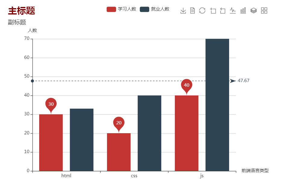
title:{
text:'主标题',
subtext:'副标题',
left:'left',
textStyle:{
color:'maroon',
fontSize:24
},
subtextStyle:{
color:'#333',
fontSize:16
},
},
/*绘图区 grid
* left right bottom right 绘图区在容器内的边距
* */
grid:{
top:90,
right:90
},
/*图例 legend
* data[] 图例的数据,每一项代表一个系列的 name
* */
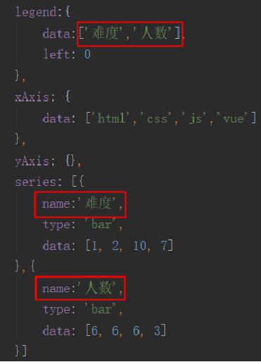
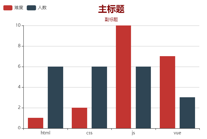
legend:{
data:['学习人数','就业人数']
},
/*工具栏 toolbox
* feature{} 工具配置项
* saveAsImage{} 保存为图片
* dataView{} 数据视图工具
* restore{} 配置项还原
* dataZoom{} 数据区域缩放
* magicType{} 动态类型切换
* type[] 动态类型
* line 折线图
* bar 柱状图
* stack 堆叠
* tiled 平铺
* */
toolbox:{
feature:{
saveAsImage: {type:'jpg'},
dataView:{},
restore:{},
dataZoom:{},
magicType:{
type:[
'line',
'bar',
'stack',
'tiled'
]
}
},
},
/*提示框 tooltip
* trigger 提示框触发方式
* item 图形触发,主要在散点图,饼图等无类目轴的图表中使用。
* axis 坐标轴触发,主要在柱状图,折线图等会使用类目轴的图表
* none 什么都不触发
* */
tooltip:{
trigger:'axis'
},
/*x 轴
* name 坐标轴名称
* data 类目数据 []
* */
xAxis:{
name:'前端语言类型',
data:['html','css','js']
},
/*y 轴
* name 坐标轴名称
* splitNumber 分割段数
* interval 强制设置坐标轴分割间隔
* minInterval 坐标轴最小间隔
* maxInterval 坐标轴最大间隔
* */
yAxis:{
name:'人数',
// splitNumber:9,
// interval:5,
// minInterval: 20,
// maxInterval: 5,
},
/*系列列表 series
* 列表类型 type
* 系列名 name :用于提示tooltip,图例legend 筛选,数据更新
* 数据 data []
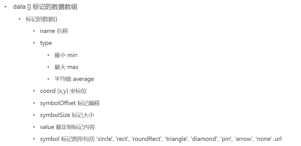
* 标记点 markPoint {}
* data [] 标记的数据数组
* {type:'max'} 最大值
* {type:'min'} 最小值
* {value:'值',coord:[x,y]} 坐标位
* 标记线 markLine
* data 标记的数据数组
* */
series:[
{
name:'学习人数',
type:'bar',
data:[30,20,40],
markPoint:{
data:[
{type:'max'},
{type:'min'},
{coord:[0,30],value:30},
]
}
},
{
name:'就业人数',
type:'bar',
data:[33,40,70],
markLine:{
data:[
{name:'平均线',type:'average'}
]
}
}
]
};
// 使用刚指定的配置项和数据显示图表。
myChart.setOption(option);
</script>
</body>
</html>
注:课程来自开课吧