一、视觉映射
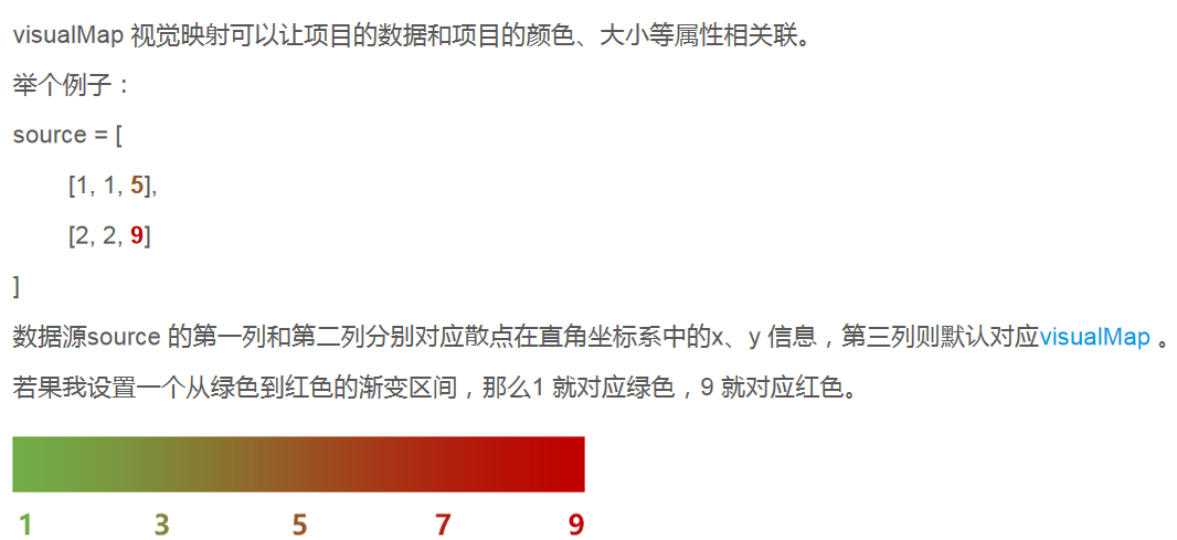
注:visualMap 以前叫dataRange,如果你看到了比较老的教程或博客,里面有dataRange,要知道那就是视觉映射 visualMap
<!DOCTYPE html>
<html lang="en">
<head>
<meta charset="UTF-8">
<title>视觉映射</title>
<style>
#main{
margin: 20px;
800px;
height: 500px;
}
</style>
</head>
<body>
<!--建立dom 容器-->
<div id="main"></div>
<!--引入echarts-->
<script src="./js/echarts.min.js"></script>
<script>
// 基于准备好的dom,初始化echarts实例
const myChart = echarts.init(document.getElementById('main'));
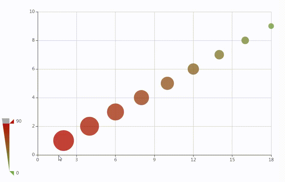
//数据源
const source = [
//x y z w
[2, 1, 10, 90],
[4, 2, 20, 80],
[6, 3, 30, 70],
[8, 4, 40, 60],
[10, 5, 50, 50],
[12, 6, 60, 40],
[14, 7, 70, 30],
[16, 8, 80, 20],
[18, 9, 90, 10],
];
//颜色范围
const color=['#70ad47', '#c00000'];
// 指定图表的配置项和数据
const option = {
tooltip: {},
/*绘图区*/
grid:{
left:100
},
/*x 轴*/
xAxis: {},
/*y 轴*/
yAxis: {},
/*数据集*/
dataset:{source},
/*
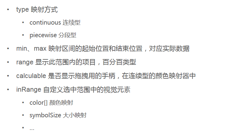
* visualMap 视觉映射 {}
* type 映射方式
* continuous 连续型
* piecewise 分段型
* min 映射区间的起始位置,如0
* max 映射区间的结束位置,如90
* range [] 显示此范围内的项目(在连续型中有效),百分百类型,如[0,100]
* calculable 是否显示拖拽用的手柄
* inRange 自定义映射范围
* color[] 颜色映射
* symbolSize[] 大小映射
*
* */
visualMap:{
type:'continuous',
// type:'piecewise',
min:0,
max:100,
range:[0,90],
calculable: true,
inRange:{
color,
symbolSize:[10,60],
},
// dimension:2,
dimension:3
},
/*系列列表*/
series: [
{
name: '视觉映射',
type: 'scatter',
encode:{
tooltip:[0,1,2]
}
},
]
};
// 使用刚指定的配置项和数据显示图表。
myChart.setOption(option);
</script>
</body>
</html>
二、事件
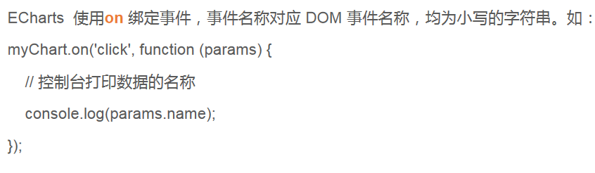
ECharts 如何监听事件
<!DOCTYPE html>
<html lang="en">
<head>
<meta charset="UTF-8">
<title>事件</title>
<style>
#main{
margin: 20px;
700px;
height: 500px;
}
</style>
</head>
<body>
<!--建立dom 容器-->
<div id="main"></div>
<!--引入echarts-->
<script src="./js/echarts.min.js"></script>
<script>
// 基于准备好的dom,初始化echarts实例
const myChart = echarts.init(document.getElementById('main'));
// 指定图表的配置项和数据
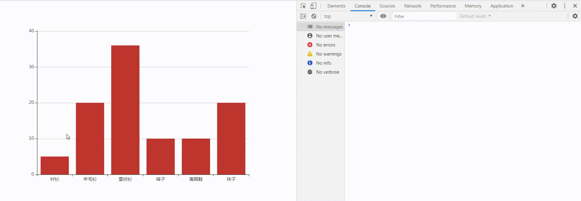
const option = {
xAxis: {
data: ["衬衫","羊毛衫","雪纺衫","裤子","高跟鞋","袜子"]
},
yAxis: {},
series: [{
name: '销量',
type: 'bar',
data: [5, 20, 36, 10, 10, 20]
}]
};
// 使用刚指定的配置项和数据显示图表。
myChart.setOption(option);
/*
* 使用on 方法绑定click点击事件
* */
myChart.on('click',function(param){
console.log(param)
})
</script>
</body>
</html>
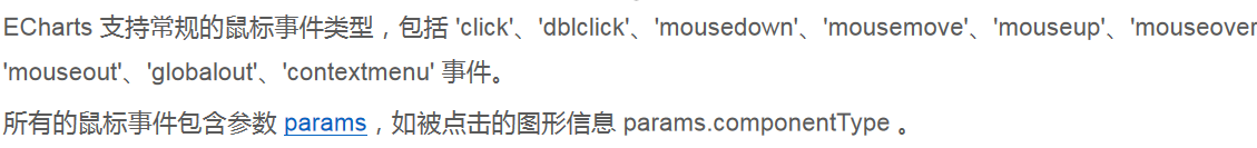
鼠标事件有哪些
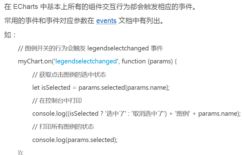
组件交互事件的监听
<!DOCTYPE html>
<html lang="en">
<head>
<meta charset="UTF-8">
<title>事件</title>
<style>
#main{
margin: 20px;
700px;
height: 500px;
}
</style>
</head>
<body>
<!--建立dom 容器-->
<div id="main"></div>
<!--引入echarts-->
<script src="./js/echarts.min.js"></script>
<script>
// 基于准备好的dom,初始化echarts实例
const myChart = echarts.init(document.getElementById('main'));
// 指定图表的配置项和数据
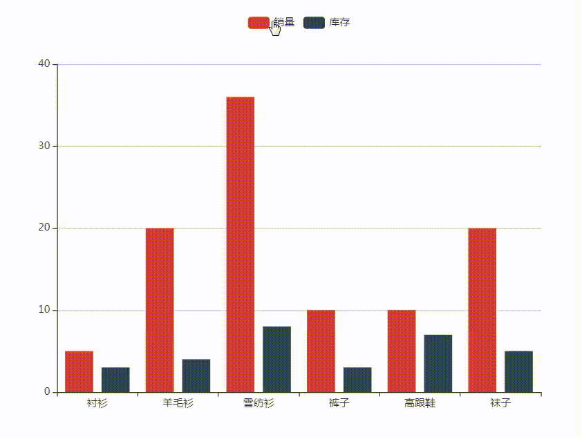
const option = {
legend:{
data:['销量','库存']
},
xAxis: {
data: ["衬衫","羊毛衫","雪纺衫","裤子","高跟鞋","袜子"]
},
yAxis: {},
series: [{
name: '销量',
type: 'bar',
data: [5, 20, 36, 10, 10, 20]
},{
name: '库存',
type: 'bar',
data: [3, 4, 8, 3, 7, 5]
}]
};
// 使用刚指定的配置项和数据显示图表。
myChart.setOption(option);
/*
* 使用on 方法绑定legendselectchanged 图例开关点击事件
* */
myChart.on('legendselectchanged',function(param){
console.log(param)
})
</script>
</body>
</html>
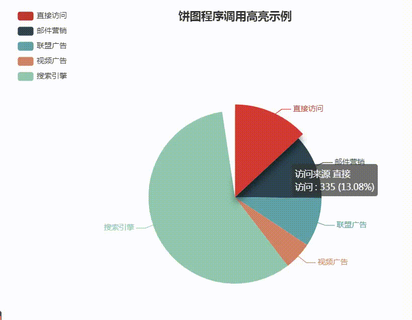
代码触发 ECharts 中组件的行为
<!DOCTYPE html>
<html lang="en">
<head>
    <meta charset="UTF-8">
    <title>事件</title>
    <style>
        #main{
            margin: 20px;
             700px;
            height: 500px;
        }
    </style>
</head>
<body>
<!--建立dom 容器-->
<div id="main"></div>
<!--引入echarts-->
<script src="./js/echarts.min.js"></script>
<script>
    // 基于准备好的dom,初始化echarts实例
    const myChart = echarts.init(document.getElementById('main'));

    // 指定图表的配置项和数据
    const option = {
        title: {
            text: '饼图程序调用高亮示例',
            left: 'center'
        },
        tooltip: {
            trigger: 'item',
            formatter: '{a} <br/>{b} : {c} ({d}%)'
        },
        legend: {
            orient: 'vertical',
            left: 'left',
            data: ['直接访问', '邮件营销', '联盟广告', '视频广告', '搜索引擎']
        },
        series: {
            name: '访问来源',
            type: 'pie',
            radius: '55%',
            center: ['50%', '60%'],
            data: [
                {value: 335, name: '直接访问'},
                {value: 310, name: '邮件营销'},
                {value: 234, name: '联盟广告'},
                {value: 135, name: '视频广告'},
                {value: 1548, name: '搜索引擎'}
            ],
            /*鼠标划上的状态*/
            emphasis: {
                itemStyle: {
                    shadowBlur: 10,
                    shadowOffsetX: 0,
                    shadowOffsetY: 10,
                    shadowColor: 'rgba(0, 0, 0, 0.5)'
                }
            }
        }
    };
    // 使用刚指定的配置项和数据显示图表。
    myChart.setOption(option);

    /*当前索引*/
    let ind=0;

    /*获取系列数据的长度*/
    let len =5;

    /*使用dispatchAction 方法高亮并提示一个扇形
    *   type 触发的行为类型
    *       highlight 高亮
    *       showTip 显示提示
    *       downplay 取消高亮
    *       hideTip 取消提示
    *   seriesIndex 系列索引,用于寻找系列列表中的某个系列
    *   dataIndex 数据所有,用于寻找系列中的某个元素
    * */
    myChart.dispatchAction({
        type:'highlight',
        seriesIndex:0,
        dataIndex:ind
    });
    myChart.dispatchAction({
        type:'showTip',
        seriesIndex:0,
        dataIndex:ind
    });


    /*建立时间监听器*/
    setInterval(function(){
        myChart.dispatchAction({
            type:'hideTip',
            seriesIndex:0,
            dataIndex:ind
        });
        myChart.dispatchAction({
            type:'downplay',
            seriesIndex:0,
            dataIndex:ind
        });

        ind++;
        if(ind===len){ind=0}
        myChart.dispatchAction({
            type:'highlight',
            seriesIndex:0,
            dataIndex:ind
        });
        myChart.dispatchAction({
            type:'showTip',
            seriesIndex:0,
            dataIndex:ind
        });

    },1000)


</script>
</body>
</html>
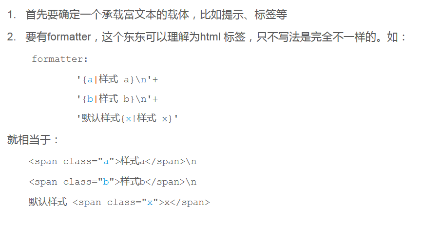
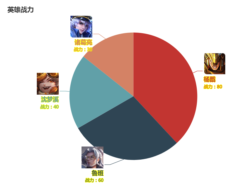
三、富文本标签
富文本标签,就是内容丰富的文本标签。
在许多地方(如图、轴的标签等)都可以使用富文本标签。例如:
文本块和文本片段
- 文本块(Text Block):文本标签块整体。
- 文本片段(Text fragment):文本标签块中的部分文本。
文本标签的属性可以参考label:https://www.echartsjs.com/zh/option.html#series-bar.label
富文本的属性:https://www.echartsjs.com/zh/option.html#series-bar.label.rich.%3Cstyle_name%3E
富文本的实现步骤

<!DOCTYPE html>
<html lang="en">
<head>
    <meta charset="UTF-8">
    <title>富文本</title>
    <style>
        #main{
            margin: 20px;
             700px;
            height: 500px;
        }
    </style>
</head>
<body>
<!--建立dom 容器-->
<div id="main"></div>
<!--引入echarts-->
<script src="./js/echarts.min.js"></script>
<script>
    // 基于准备好的dom,初始化echarts实例
    const myChart = echarts.init(document.getElementById('main'));

    // 数据
    const data=[
        {name:'杨戬',value:80,img:'./images/yj.jpg'},
        {name:'鲁班',value:60,img:'./images/lb.jpg'},
        {name:'沈梦溪',value:40,img:'./images/smx.jpg'},
        {name:'诸葛亮',value:30,img:'./images/zgl.jpg'}
    ];

    //获取hero的数据
    let hero=data[0];

    /*自定义标签 label
    *   formatter 文本块
    *       '{样式名|文字内容}
 换行'
    *   文本块的样式
    *       textBorderColor 文本描边颜色
    *       textBorderWidth 文本描边宽度
    *       ...
    *   rich 富文本,在其中写入样式
    *       width 宽
    *       height 高
    *       backgroundColor 背景色
    *           image 背景图
    *       fontSize 文字大小
    *       lineHeight 行高
    *       fontWeight 文本加粗
    *       ...
    * */
    data.forEach((hero,ind)=>{
        hero.label={
            formatter:'{img|}
{name|'+hero.name+'}
{val|战力:'+hero.value+'}',
            textBorderColor:'yellow',
            textBorderWidth:2,
            rich:{
                img:{
                    60,
                    height:60,
                    backgroundColor:{
                        image:hero.img
                    }
                },
                name:{
                    fontSize:16,
                    lineHeight:28,
                    fontWeight:'bold'
                },
                val:{}
            }
        };
    });


    /*配置项*/
    const option = {
        title:{text:'英雄战力'},
        series: {
            type: 'pie',
            data,
            radius:'70%',
        }
    };
    myChart.setOption(option);
</script>
</body>
</html>
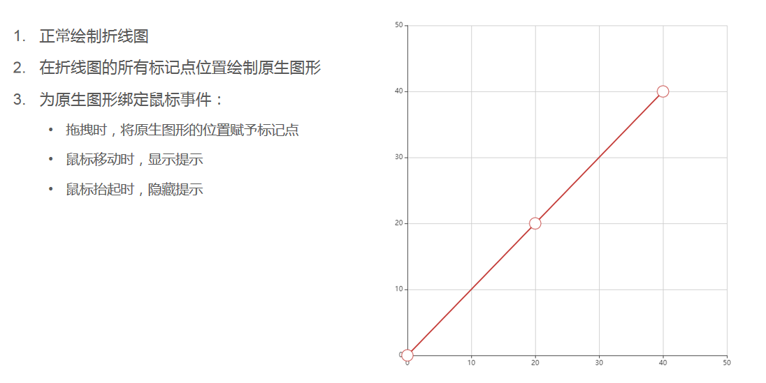
四、原生图形组件
原生图形组件就是可以自定义图形的组件。
原生图形组件里绘制的图形,可以绑定鼠标事件、拖拽事件等。
echarts 有两种点位:坐标位,像素位。
坐标位有直角坐标位、地理坐标位等。
原生图形的位置就是基于像素位定位的。
echarts 实例对象提供了坐标位和像素位的转换方法:
- convertToPixel(坐标系,[x,y]) 坐标位转像素位
- convertFromPixel(坐标系,[x,y]) 像素位转坐标位
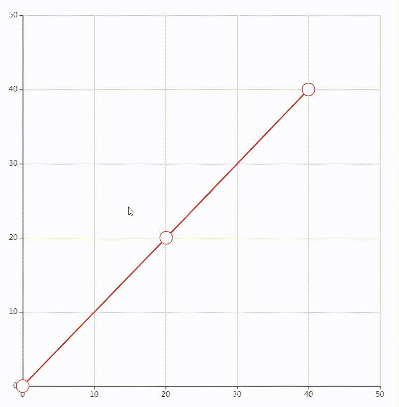
案例 – 折线图标记点的拖拽
<!DOCTYPE html>
<html lang="en">
<head>
    <meta charset="UTF-8">
    <title>拖拽</title>
    <style>
        #main{
            margin: 20px;
             700px;
            height: 700px;
        }
    </style>
</head>
<body>
<!--建立dom 容器-->
<div id="main"></div>
<!--引入echarts-->
<script src="./js/echarts.min.js"></script>
<script>
    /*尺寸*/
    const symbolSize = 20;
    /*点位*/
    const data = [[0,0], [20, 20], [40,40]];
    /*实例化echarts*/
    const myChart = echarts.init(document.getElementById('main'));

    /*1.线绘制折线图*/
    myChart.setOption({
        /*tooltip 提示
        *   triggerOn 提示的触发方式
        *       mousemove 鼠标移动时触发
        *       click 鼠标点击时触发
        *       mousemove|click 移动点击皆可触发
        *       none 不被鼠标移动、点击所触发。可再以后手动触发。
        *   formatter 格式化提示内容
        * */
        tooltip: {
            triggerOn: 'none',
            formatter: function (params) {
                return Math.round(params.data[0]) + ' , ' + Math.round(params.data[1]);
            }
        },
        /*x轴
        *   min,max 刻度区间
        *   type 坐标轴的类型
        *       value 数值轴
        * */
        xAxis: {
            min: 0,
            max: 50,
            type: 'value',
        },
        /*y 轴
        *   属性同x
        * */
        yAxis: {
            min: 0,
            max: 50,
            type: 'value',
        },
        /*系列 series
        *   id 用于在 option 或者 API 中引用组件
        *   type 类型
        *   smooth 圆弧
        *   symbolSize 标记点尺寸
        *   data 数据
        * */
        series: [
            {
                id: 'a',
                type: 'line',
                smooth: true,
                symbolSize: symbolSize,
                data: data,
                /*itemStyle:{
                    opacity:0
                }*/
            }
        ],
    });
    /*2.为标记点添加拖拽功能*/
    /*graphic 原生图形组件
    *   type 图形类型,image, text, circle, sector, ring...
    *   position 位置
    *   shape 相关于图形的属性,不同类型的图形,其中的属性不同
    *   onclick 点击事件
    *   onmousemove 鼠标移动
    * */
    /*myChart.convertToPixel 将直角坐标系上的点转换为像素*/
    /*echarts.util.curry(函数,参数) 函数的柯里化,来自zrender
    * 函数中,this 便是event.target
    * */
    const graphic=data.map((ele,ind)=>{
        return {
            type: 'circle',
            position: myChart.convertToPixel('grid', ele),
            shape: {
                r: symbolSize / 2
            },
            invisible: true,
            draggable: true,
            ondrag: echarts.util.curry(onPointDragging, ind),
            onmousemove: echarts.util.curry(showTooltip, ind),
            onmouseout: echarts.util.curry(hideTooltip, ind),
            z: 100
        };
    });
    myChart.setOption({graphic});

    /*鼠标拖拽时,让折线中的点位随拖拽点变化
    *   convertFromPixel(grid,pos)将拖拽点的像素位解析为直角坐标系的位置
    *   setOption() 更新数据
    * */
    function onPointDragging(dataIndex) {
        data[dataIndex] = myChart.convertFromPixel('grid', this.position);
        myChart.setOption({
            series: [{
                id: 'a',
                data: data
            }]
        });
    }
    /*鼠标在标记点上移动时,触发显示提示事件
    *   type 事件类型,如showTip
    *   seriesIndex 系列在系列集合中的索引位置
    *   dataIndex 标记点在系列中的索引位置
    * */
    function showTooltip(dataIndex) {
        myChart.dispatchAction({
            type: 'showTip',
            seriesIndex: 0,
            dataIndex: dataIndex
        });
    }

    /*鼠标在标记点上移动时,触发隐藏提示事件*/
    function hideTooltip(dataIndex) {
        myChart.dispatchAction({
            type: 'hideTip'
        });
    }
</script>
</body>
</html>
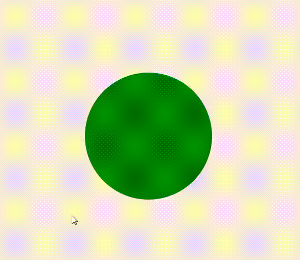
原生图形
<!DOCTYPE html>
<html lang="en">
<head>
    <meta charset="UTF-8">
    <title>原生图形</title>
    <style>
        #main{
            margin: 20px;
             800px;
            height: 700px;
            background: antiquewhite;
        }
    </style>
</head>
<body>
<!--建立dom 容器-->
<div id="main"></div>
<!--引入echarts-->
<script src="./js/echarts.min.js"></script>
<script>
    /*实例化echarts*/
    const myChart = echarts.init(document.getElementById('main'));
    /*配置项*/
    let option={
        /*graphic 原生图形组件
        *   type 图形类型,image, text, circle, sector, ring...
        *   position 位置
        *   shape 相关于图形的属性
        *   style 图形样式
        *   draggable 可否拖拽
        *   onmouseover 鼠标划上
        *   onmouseup 鼠标抬起
        *   onmouseout 鼠标划出
        * */
        graphic:{
            id:'c',
            type:'circle',
            shape:{
                r:100
            },
            position:[300,300],
            style:{
                fill:'green'
            },
            draggable:true,
            onmouseover:overFn,
            onmouseout:outFn
        }

    };
    /*绘图*/
    myChart.setOption(option);

    /*事件*/
    function overFn(){
        myChart.setOption({
            graphic:{
                id:'c',
                style:{
                    fill:'yellow'
                },
            }
        });
    }
    function outFn(){
        myChart.setOption({
            graphic:{
                id:'c',
                style:{
                    fill:'green'
                },
            }
        });
    }

</script>
</body>
</html>
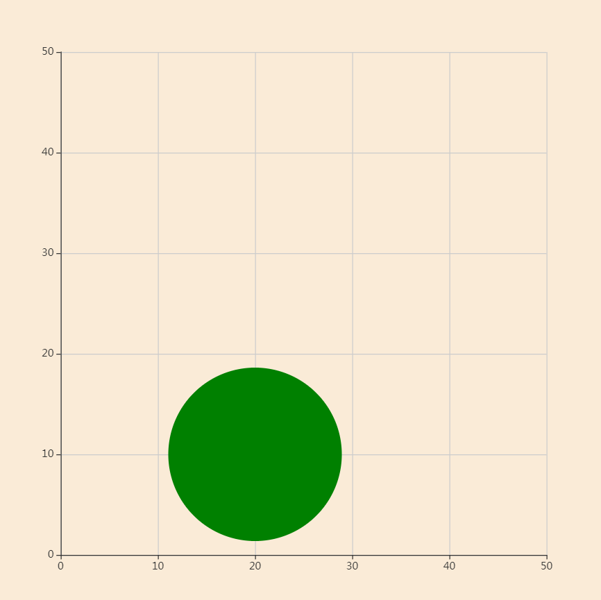
原生图形的位置
<!DOCTYPE html>
<html lang="en">
<head>
    <meta charset="UTF-8">
    <title>原生图形</title>
    <style>
        #main{
            margin: 20px;
             700px;
            height: 700px;
            background: antiquewhite;
        }
    </style>
</head>
<body>
<!--建立dom 容器-->
<div id="main"></div>
<!--引入echarts-->
<script src="./js/echarts.min.js"></script>
<script>
    /*实例化echarts*/
    const myChart = echarts.init(document.getElementById('main'));

    /*绘制坐标系*/
    myChart.setOption({
        /*x轴
        *   min,max 刻度区间
        *   type 坐标轴的类型
        *       value 数值轴
        * */
        xAxis:{
            min:0,
            max:50,
        },

        /*y 轴
        *   属性同x
        * */
        yAxis:{
            min:0,
            max:50,
        }
    });

    /*绘制原生图形*/
    myChart.setOption({
        graphic:{
            id:'c',
            type:'circle',
            shape:{
                r:100
            },
            // position:[10,10],
            position:myChart.convertToPixel('grid',[20,10]),
            style:{
                fill:'green'
            },
        }
    });

</script>
</body>
</html>
五、响应式布局
在html 中使用css 中的flex 可以轻松实现响应式布局。
在echarts 里,如何适配不同尺寸的屏幕呢?
- 简单点的可以通过为尺寸、位置等属性设置百分比来实现。
- 复杂些的就需要自定义响应规则。
自定义响应规则的方法
- 建立基础配置项 baseOption
- 建立规则配置列表 media
- 建立query
- 建立此规则下的配置信息option
- echarts 实例基于baseOption 和media 绘制图表
<!DOCTYPE html>
<html lang="en">
<head>
    <meta charset="UTF-8">
    <title>响应式布局</title>
    <style>
        html,body{margin: 0;height: 100%}
        #main{
            height: 100%;
            background: antiquewhite;
        }
    </style>
</head>
<body>
<!--建立dom 容器-->
<div id="main"></div>
<!--引入echarts-->
<script src="./js/echarts.min.js"></script>
<script>
    /*实例化echarts*/
    const myChart = echarts.init(document.getElementById('main'));

    /*基础配置项 baseOption,建立两个绘图区
    *   grid 绘图区
    *   xAxis yAxis
    *       min 最小刻度值
    *       max 最大刻度值
    *       gridIndex 绘图区的索引位置
    *
    * */
    const baseOption={
        grid:[
            {left:'10%',right:'55%',top:'10%',bottom:'10%'},
            {left:'55%',right:'10%',top:'10%',bottom:'10%'},
        ],
        xAxis:[
            {min:0,max:50,gridIndex:0},
            {min:0,max:50,gridIndex:1},
        ],
        yAxis:[
            {min:0,max:50,gridIndex:0},
            {min:0,max:50,gridIndex:1},
        ],
    };


    /*media 规则配置列表
    *   query 规则,如maxWidth: 768
    *   option 配置项
    * */
    const media=[
        {
            option:{
                grid:[
                    {left:'10%',right:'55%',top:'10%',bottom:'10%'},
                    {left:'55%',right:'10%',top:'10%',bottom:'10%'},
                ],
            }
        },
        {
            query:{
                maxWidth:768
            },
            option:{
                grid:[
                    {left:'10%',right:'10%',top:'10%',bottom:'55%'},
                    {left:'10%',right:'10%',top:'55%',bottom:'10%'},
                ],
            }
        }

    ];

    /*绘图*/
    myChart.setOption({baseOption,media});


    /*窗口尺寸发生变化resize 时,echarts 实例使用resize() 方法重置尺寸*/
    window.addEventListener('resize',function(){
        myChart.resize();
    })

</script>
</body>
</html>

注:课程来自开课吧