23.实现两列布局与三列布局的方法
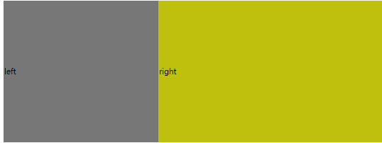
1.通过table布局
<head>
    <style>
table{
    width: 800px;
    height: 300px;
    border-collapse: collapse;
}
.left{
    background-color: #777777;
}
.right{
    background-color: #bfbf0d;
}
    </style>
</head>
<body>
<table>
    <tr>
       <td class="left">left</td>
        <td class="right">right</td>
    </tr>
</table>
</body>
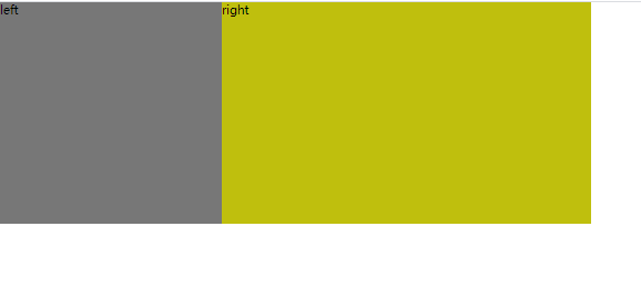
2.类似表格的布局
<head>
    <style>
.table{
    width: 800px;
    height: 300px;
    display: table;
}
.table-row{
    display:table-row;
}
.table-cell{
    display:table-cell;
    vertical-align: middle;
}
.left{
    background-color: #777777;
}
.right{
    background-color: #bfbf0d;
}
    </style>
</head>
<body>
<div class="table">
    <div class="table-row">
        <div class="left table-cell">left</div>
        <div class="right table-cell">right</div>
    </div>
</div>
<!--table-cell指让标签元素以表格单元格的形式呈现,使元素类似于td标签。-->
<!--table-row会作为一个表格行显示-->
</body>
3.flex布局
<head>
    <style>
        *{
            margin: 0;
            padding: 0;
        }
.father {
    width: 800px;
    height: 300px;
    display: flex;
}
.left{
    width: 300px;
    height: 100%;
    background-color: #777777;
}
.right{
    flex: 1;
    height: 100%;
    background-color: #bfbf0d;
}
    </style>
</head>
<body>
<div class="father">
        <div class="left">left</div>
        <div class="right">right</div>
</div>
</body>
4.float布局
<head>
    <style>
        *{
            margin: 0;
            padding: 0;
        }
.father {
    width: 800px;
    height: 300px;
}

.left{
    width: 300px;
    height: 100%;
    float: left;
    background-color: #777777;
}
.right{
    flex: 1;
    height: 100%;
    background-color: #bfbf0d;
    margin-left: 300px;
}
    </style>
</head>
<body>
<div class="father">
        <div class="left">left</div>
        <div class="right">right</div>
</div>

</body>
5.inline-block布局
<head>
    <style>

.father {
    font-size: 0;
    width: 800px;
    height: 300px;
}

.left{
    width: 300px;
    height: 100%;
    font-size:14px;
    display: inline-block;
    background-color: #777777;
}
.right{
    font-size: 14px;
    width: 500px;
    height: 100%;
    background-color: #bfbf0d;
   display: inline-block;
}
    </style>
</head>
<body>
<div class="father">
        <div class="left">left</div>
        <div class="right">right</div>
</div>

</body>
注意,若想要父级元素的宽度等于两个元素宽度之和,需要设置父级元素的font-size为0,否则两个子元素不会在一行进行展示,同时,需设置两个子元素的font-size,否则子元素内的字不会展示.
三列布局:
1.flex布局
<head>
    <style>
*{margin:0;
padding:0;}
.father {
    display: flex;
    width: 800px;
    height: 300px;
}

.left{
    width: 300px;
    height: 100%;
    background-color: #777777;
}
.middle{
    width: 200px;
    background-color: #878720;
    height: 100%;
}
.right{
    flex: 1;
    height: 100%;
    background-color: #bfbf0d;
}
    </style>
</head>
<body>
<div class="father">
        <div class="left">left</div>
    <div class="middle">middle</div>
        <div class="right">right</div>
</div>

</body>
2.float布局:
<head>
    <style>
*{margin:0;
padding:0;}
.father {
    width: 800px;
    height: 300px;
}

.left{
    width: 300px;
    height: 100%;
    background-color: #777777;
    float: left;}

.right{
    height: 100%;
    width: 200px;
    float: right;
    background-color: #bfbf0d;
}
.middle{
    margin-left: 300px;
    background-color: #878720;
    height: 100%;
}
    </style>
</head>
<body>
<div class="father">
        <div class="left">left</div>
    <div class="right">middle</div>
        <div class="middle">right</div>
</div>

</body>
注意:float特点:尽量靠上,尽量靠左(右),所以右侧浮动div要先写,中间div后写
24.inline-block间距产生的原因,去除inline-block间距的方法
1.修改书写方式,inline-block元素写在同一行(不靠谱)
2.改变font-size
3.利用margin负值
4.使用letter-spacing或word-spacing
25.CSS预处理以及后处理
CSS预处理器是一种专门的编程语言,进行web页面样式设计,然后再编译成正常的CSS.
CSS后处理器是对CSS进行处理,并最终生成了CSS的预处理器,属于广义上的CSS预处理器.
26.层叠上下文
z-index:
1.只对指定了position属性的元素有效
2.当未指定z-index时,所有元素都会被渲染在默认层(0层)
3.当多个元素的z-index属性相同时(在同一层里),则按照正常文档流的顺序出现.
层叠上下文,即我们假定用户正面向视窗或网页,而HTML元素沿着其相对于用户的一条虚构的z轴排开,层叠上下文就是对这些HTML元素的一个三维构想.
每个层叠上下文即一个小世界,每个小世界的z-index就与外界无关了,只有处于一个小世界的z-index才可以比较.
只有部分元素可创造层叠上下文:
1.文档根元素(<html>)
2.position值为absolute,relative且z-index不为auto的元素
3.position值为fixed或sticky
4.flex容器中的子元素,且z-index不为auto
5.opacity属性值小于1
27.src与href的区别
1.请求资源类型不同
href是hypertext refrence的缩写,表示超文本引用.用来建立当前的元素与文档之间的链接,常用的有link与a.
在请求src资源时,会将其指向的资源下载并应用到文档中,常用的有srcipt,img,iframe.
2.作用结果不同
href常用于在当前文档与引用资源之间确认关系
src用于替换当前内容
3.浏览器解析不同
若在文档中添加href,浏览器会识别该文档为css文件,就会并行下载资源且不会停止对当前文档的处理.
当浏览器解析到src的时候,会暂停浏览器的渲染,直到该资源加载完毕,这也是js脚本放在底部而不是头部的原因.
28.为什么要初始化css样式
1.浏览器差异
不同浏览器对有些标签的默认值是不同的,如果没对css初始化,会出现浏览器之间的页面显示差异.
2.提高编码质量
如果不初始化,整个页面做完会很糟糕,重复的css样式很多.
29.viewport的适配
visual viewport是我们可以直观看到的,不严谨的说,就是差不多等于手机屏幕的大小,偏向一种物理概念.
layout viewport是一个虚拟的窗口,其大小比手机屏幕大,加载网页时,直接把HTML渲染在这个虚拟的窗口中,这样就不会样式错乱了.做个比喻,layout viewport就是一张大白纸,HTML的内容就写在这个大白纸上,visual viewport就是一个放大镜,上下左右移动,可以显示其中的一部分.
ideal viewport是为了能将电脑上的网页正确的显示在手机上,当浏览器拿到一个网页时,首先会渲染到这个layout viewport里面.可是现在很多网页会针对手机做专门的设计,比如一些H5活动页.
实际而言,layout viewport用来承载HTML的渲染,visual viewport是查看渲染结果的窗口,而ideal viewport可以理解成一种尺寸,其大小等于visual viewport,调整layout viewport的大小,让其在visual viewport的查看下有最佳效果,就是我们想要的移动端适配.用meta标签就可以调整layout viewport的大小了.
<meta name="viewport" content="width=device-width, user-scalable=no, initial-scale=1.0, maximum-scale=1.0, minimum-scale=1.0">
一个个来看,这个width即设置layout viewport的宽度的,我们设置其宽度为device-width,就是设置成设备的实际宽度.user-scalable就是是否允许用户进行缩放,上述代码中是表明不允许;initial-scale是设置页面的初始缩放值,这里设置成1.0,即表示layout viewport的大小与ideal viewport相等.这里的maximum-scale与minimum-scale均设置为1的意思就是不允许缩放.如果我们不禁用缩放,那么layout的viewport的大小在缩放时,还是会变.因此,用viewport的目的,是为了设置layout viewport的大小,从而保证能在移动端设备上合适的显示出来.