column列布局
新增的column属性用来进行多列布局。注意新增属性需要些兼容前缀,如-moz-和-webkit- ,最大兼容到IE10
-
column-count 把当前div中的文本/元素划分为三列
-moz-column-count:3; /* Firefox */ -webkit-column-count:3; /* Safari 和 Chrome */ column-count:3; -
column-gap 规定列间的间隔像素
column-gap:40px; -
column-rule 规定列之间的宽度、样式和颜色
column-rule:3px solid #ff00ff; -
column-span 允许一个元素的宽度跨越多列
column-span: all; /*取值all 或 none*/ -
column-width 每列的宽度
column-100px;
除了上述的几个常用的属性之外,还有
column-fill属性,此属性用于标识分列的高度是否统一。不过兼容性特别差,只支持Firefox。break-before、break-after、break-inside属性,这三个属性是用于标识分列之间的行为的(是否中断列,默认允许)
瀑布流布局
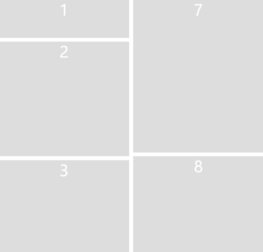
<!DOCTYPE html>
<html>

<head>
  <meta charset="utf-8">
  <style>
    body {
      margin: 0;
    }

    .waterfall-container {
      /*分几列*/
      column-count: 2;
       100%;
      /* 列间距 */
      column-gap: 10px;
    }

    .waterfall-item {
      /* 避免列出现中断 */
      break-inside: avoid;
       100%;
      height: 100px;
      margin-bottom: 10px;
      background: #ddd;
      column-gap: 0;
      text-align: center;
      color: #fff;
      font-size: 40px;
    }
  </style>
</head>

<body>
  <div class="waterfall-container">
    <div class="waterfall-item" style="height: 100px">1</div>
    <div class="waterfall-item" style="height: 300px">2</div>
    <div class="waterfall-item" style="height: 400px">3</div>
    <div class="waterfall-item" style="height: 100px;">4</div>
    <div class="waterfall-item" style="height: 300px">5</div>
    <div class="waterfall-item" style="height: 600px">6</div>
    <div class="waterfall-item" style="height: 400px">7</div>
    <div class="waterfall-item" style="height: 300px">8</div>
    <div class="waterfall-item" style="height: 700px">9</div>
    <div class="waterfall-item" style="height: 100px">10</div>
  </div>
</body>

</html>