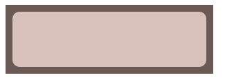
边框内圆角效果
方法一:div嵌套法
<!DOCTYPE html>
<html>
<head>
    <meta charset="utf-8">
    <meta http-equiv="X-UA-Compatible" content="IE=edge">
    <title>边框内圆角</title>
    <link rel="stylesheet" href="">
    <style>
        .box {
            width: 300px;
            height: 100px;
            background: rgb(107,89,86);
            position: relative;
        }
        .inner-box {
            background: rgb(216,193,187);
            position: absolute;
            top: 10px;
            bottom: 10px;
            right: 10px;
            left: 10px;
            border-radius: 10px;
        }
    </style>
</head>
<body>
    <div class="box">
        <div class="inner-box"></div>
    </div>
</body>
</html>
方法二:ouline与box-shadow
<!DOCTYPE html>
<html>
<head>
    <meta charset="utf-8">
    <meta http-equiv="X-UA-Compatible" content="IE=edge">
    <title>边框内圆角</title>
    <link rel="stylesheet" href="">
    <style>
        .box {
            width: 300px;
            height: 100px;
            margin: 20px;
            background: tan;
            outline: 10px solid #655;
            border-radius: 10px;
            box-shadow: 0 0 0 10px #655;
        }
    </style>
</head>
<body>
    <div class="box"></div>
</body>
</html>
方法三:伪元素法
<!DOCTYPE html>
<html>
<head>
    <meta charset="utf-8">
    <meta http-equiv="X-UA-Compatible" content="IE=edge">
    <title>边框内圆角</title>
    <link rel="stylesheet" href="">
    <style>
        .box {
            width: 300px;
            height: 100px;
            background: rgb(216,193,187);
            border-radius: 20px;
            padding: 10px;
            background-clip: content-box;
            position: relative;
        }
        .box::before {
            content: '';
            position: absolute;
            top: 0;
            right: 0;
            bottom: 0;
            left: 0;
            background: rgb(107,89,86);
            z-index: -1;
        }
    </style>
</head>
<body>
    <div class="box"></div>
</body>
</html>