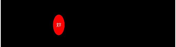
1,左右移动,自我翻转的圆
<!DOCTYPE html>
<html>
<head>
    <meta charset="UTF-8">
    <title>移动的圆</title>
    <style type="text/css">
        html, body {
            margin: 0;
            padding: 0;
            background: #ffffff;
            outline: none;
            letter-spacing: 0
        }
        .box {
            margin: 120px auto 0 auto;
            padding: 100px 0 0 0;
            width: 680px;
            height: 400px;
            background: #000000;
        }
        /* 指定偏移过程中的 */
        @keyframes myAnimation {
            0%     { transform: rotate3d(0, 1, 0,   0deg); margin-left: 0 }
            16.67% { transform: rotate3d(0, 1, 0,  60deg); margin-left: 200px }
            33.34% { transform: rotate3d(0, 1, 0, 120deg); margin-left: 400px }
            50.01% { transform: rotate3d(0, 1, 0, 180deg); margin-left: 600px }
            66.68% { transform: rotate3d(0, 1, 0, 240deg); margin-left: 400px }
            83.35% { transform: rotate3d(0, 1, 0, 300deg); margin-left: 200px }
            100%   { transform: rotate3d(0, 1, 0, 360deg); margin-left: 0 }
        }
        .test {
            width: 80px;
            height: 80px;
            font-size: 16px;
            font-weight: bold;
            line-height: 80px;
            text-align: center;
            background: red;
            border-radius: 50%;
            color: #ffffff;
            animation-name: myAnimation;         /* 使用的动画名称 */
            animation-duration: 2s;              /* 一次动画持续时间 */
            animation-timing-function: linear;   /* 动画变化快慢方式 */
            animation-iteration-count: infinite; /* 动画循环的次数,infinite 无限循环 */
        }
    </style>
</head>
<body>
<div class="box">
    <div class="test">文字</div>
</div>
</body>
</html>
效果如下
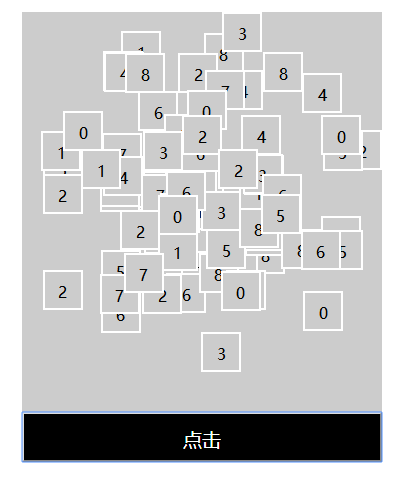
2,洗牌
<!DOCTYPE html>
<html>
<head>
    <meta charset="UTF-8">
    <title>洗牌</title>
    <script src="https://cdn.bootcss.com/jquery/3.3.0/jquery.min.js"></script>
    <script src="https://cdn.bootcss.com/vue/2.6.8/vue.min.js"></script>
</head>
<style type="text/css">
    #box {
        position: relative;
        width: 360px;
        background: #CCCCCC;
        margin: 200px auto 0 auto;
    }
    .content {
        position: absolute;
        width: 40px;
        height: 40px;
        line-height: 40px;
        text-align: center;
        font-size: 16px;
        border: 2px solid white;
        box-sizing: border-box;
        background: #CCCCCC;

        transition-property: top, left;  /* 这里指动画会接管 top 和 left 属性,一般需要能计量的属性 */
        transition-duration: 2s, 2s;     /* 这里指当被接管的属性发生变化时,动画过度的完成时间 */
    }
    .button {
        width: 360px;
        height: 50px;
        line-height: 50px;
        text-align: center;
        font-size: 19px;
        color: white;
        background: black;
        margin: 400px 0 0 0;
    }
</style>
<body>
    <div id="box">
        <div v-for="(num, index) in numArr"
             class="content"
             :style="{'top': num.top, 'left': num.left}"
        >
            {{num.content}}
        </div>
        <input type="button" value="点击" class="button" @click="shuffle()" />
    </div>
</body>
<script type="text/javascript">

    // 组装初始化数组
    var numArr = [];
    for (var i = 0; i < 9; i++) {
        for(var j = 0; j < 9; j++){
            var num = {};
            num.top = i * 40 + 'px';
            num.left = j * 40 + 'px';
            num.content = (numArr.length + 1) % 9;
            numArr.push(num);
        }
    }

    // 数组验重
    function havaObjArr(obj, arr){
        for(var i = 0; i < arr.length; i++){
            if(obj.left == arr[i].left && obj.top == arr[i].top){
                return true;
            }
        }
        return false;
    }

    // 用 VUE 绑定数据
    var vm = new Vue({
        data: {
            numArr: numArr
        },
        methods: {
            // 重组数组
            shuffle() {
                var numArr = [];
                while (numArr.length < 81) {
                    var num = {};
                    num.left = parseInt(Math.random() * 9) * 40 + 'px';
                    num.top = parseInt(Math.random() * 9) * 40 + 'px';
                    if (!havaObjArr(num, numArr)) {
                        num.content = (numArr.length + 1) % 9;
                        numArr.push(num);
                    }
                }
                this.numArr = numArr;
            }
        }
    }).$mount('#box');
</script>
</html>
效果如下