转载至https://www.cnblogs.com/zyrblog/p/11142624.html
一、前言
最初还是在抖音上看到可以使用简单地代码实现炫酷的网页效果的,但是想要找到可以运行的代码还是比较困难的,最近突然想起就在网上汇总了一些这样的代码。
二、3D效果代码
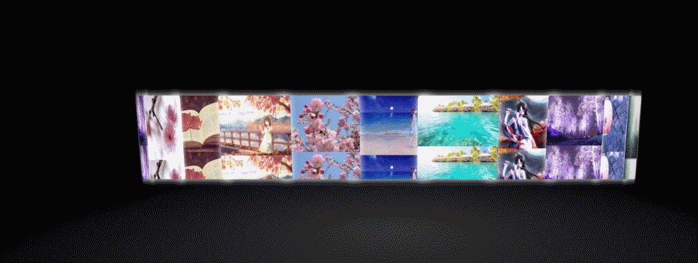
2.1 旋转相册


  1 <!doctype html>
  2 <html lang="en">
  3 <head>
  4 <meta charset="UTF-8">
  5 <title>旋转相册</title>
  6 <style type="text/css">
  7 body,div,p,ul,ol,li,dl,dt,dd,table,tr,td,form,hr,fieldset,h1,h2,h3,h4,h5,h6,img,input{
  8     margin:0;
  9     padding:0;
 10 }
 11 body{
 12     background: black;
 13 }
 14 .content{
 15     width: 200px;
 16     height: 150px;
 17     position: relative;
 18     margin:200px auto 0;
 19     perspective: 1500px;
 20 }
 21 .box{
 22     width: 200px;
 23     height: 150px;
 24     transform-style: preserve-3d;
 25     transform:rotateX(-30deg);
 26     animation:photo 15s linear infinite;
 27 }
 28 .box:hover{
 29     animation:photo 15s linear infinite paused;
 30 }
 31 .box img{
 32     width: 200px;
 33     height: 150px;
 34     position: absolute;
 35     left: 0;
 36     top: 0;
 37     transform-style: preserve-3d;
 38     transition: all 1s;
 39 }
 40 .box img:nth-child(1){
 41     transform:translateZ(280px);
 42 }
 43 .box img:nth-child(2){
 44     transform:rotateY(40deg) translateZ(280px);
 45 }
 46 .box img:nth-child(3){
 47     transform:rotateY(80deg) translateZ(280px);
 48 }
 49 .box img:nth-child(4){
 50     transform:rotateY(120deg) translateZ(280px);
 51 }
 52 .box img:nth-child(5){
 53     transform:rotateY(160deg) translateZ(280px);
 54 }
 55 .box img:nth-child(6){
 56     transform:rotateY(200deg) translateZ(280px);
 57 }
 58 .box img:nth-child(7){
 59     transform:rotateY(240deg) translateZ(280px);
 60 }
 61 .box img:nth-child(8){
 62     transform:rotateY(280deg) translateZ(280px);
 63 }
 64 .box img:nth-child(9){
 65     transform:rotateY(320deg) translateZ(280px);
 66 }
 67
 68 .box img:nth-child(1):hover{
 69     transform:translateZ(280px) scale(1.2);
 70 }
 71 .box img:nth-child(2):hover{
 72     transform:rotateY(40deg) translateZ(280px) scale(1.2);
 73 }
 74 .box img:nth-child(3):hover{
 75     transform:rotateY(80deg) translateZ(280px) scale(1.2);
 76 }
 77 .box img:nth-child(4):hover{
 78     transform:rotateY(120deg) translateZ(280px) scale(1.2);
 79 }
 80 .box img:nth-child(5):hover{
 81     transform:rotateY(160deg) translateZ(280px) scale(1.2);
 82 }
 83 .box img:nth-child(6):hover{
 84     transform:rotateY(200deg) translateZ(280px) scale(1.2);
 85 }
 86 .box img:nth-child(7):hover{
 87     transform:rotateY(240deg) translateZ(280px) scale(1.2);
 88 }
 89 .box img:nth-child(8):hover{
 90     transform:rotateY(280deg) translateZ(280px) scale(1.2);
 91 }
 92 .box img:nth-child(9):hover{
 93     transform:rotateY(320deg) translateZ(280px) scale(1.2);
 94 }
 95
 96 @keyframes photo{
 97     0%{
 98         transform:rotateX(-30deg) rotateY(0deg);
 99     }
100     100%{
101         transform:rotateX(-30deg) rotateY(360deg);
102     }
103 }
104 </style>
105 </head>
106 <body>
107 <div class="content">
108     <div class="box">
109         <img src="images/1.png" alt=""/>
110         <img src="images/2.png" alt=""/>
111         <img src="images/3.png" alt=""/>
112         <img src="images/4.png" alt=""/>
113         <img src="images/5.png" alt=""/>
114         <img src="images/6.png" alt=""/>
115         <img src="images/7.png" alt=""/>
116         <img src="images/8.png" alt=""/>
117         <img src="images/9.png" alt=""/>
118     </div>
119 </div>
120 </body>
121 </html>
2.2 旋转魔方
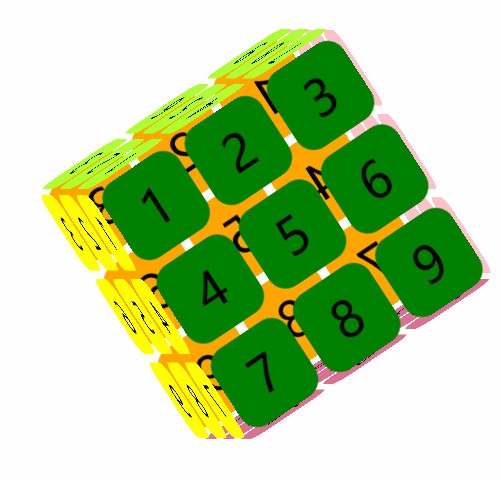
  1 <!DOCTYPE html>
  2 <html>
  3 <head>
  4     <meta charset="utf-8" />
  5     <meta http-equiv="X-UA-Compatible" content="IE=edge">
  6     <title>Page Title</title>
  7     <meta name="viewport" content="width=device-width, initial-scale=1">
  8     <style>
  9         ul{
 10             list-style-type: none;
 11             margin: 0;
 12             padding: 0;
 13         }
 14         .box{
 15             width: 300px;
 16             height: 300px;
 17             margin: 150px auto;
 18             position: relative;
 19             font-size: 50px;
 20             transform-style: preserve-3d;
 21             /*动画效果*/
 22             animation: rotate 10s linear infinite;
 23         }
 24         .box>div{
 25             width: 300px;
 26             height: 300px;
 27             position: absolute;
 28         }
 29         li{
 30             float: left;
 31             width: 90px;
 32             height: 90px;
 33             margin: 5px;
 34             border-radius: 20px;
 35             line-height: 90px;
 36             text-align: center;
 37         }
 38         .dv1 li{
 39
 40             transform: skewZ(60deg);
 41         }
 42         .dv1{
 43             background-color: transparent;
 44             transform: rotateY(90deg) translateZ(150px);
 45         }
 46         .dv2{
 47             background-color: transparent;
 48             transform: rotateY(-90deg) translateZ(150px);
 49         }
 50         .dv3{
 51             background-color: transparent;
 52             transform: rotateX(90deg) translateZ(150px);
 53         }
 54         .dv4{
 55             background-color: transparent;
 56             transform: rotateX(-90deg) translateZ(150px);
 57         }
 58         .dv5{
 59             background-color: transparent;
 60             transform:translateZ(150px);
 61         }
 62         .dv6{
 63             background-color: transparent;
 64             transform:translateZ(-150px);
 65         }
 66
 67         .dv2 li{
 68             background-color: green;
 69         }
 70         .dv3 li{
 71             background-color: greenyellow;
 72         }
 73         .dv4 li{
 74             background-color: palevioletred;
 75         }
 76         .dv5 li{
 77             background-color: pink;
 78         }
 79         .dv6 li{
 80             background-color: yellow;
 81         }
 82         @keyframes rotate{
 83             0%{
 84                 transform: rotateY(0deg) rotateX(0deg);
 85             }
 86             100%{
 87                 transform: rotateY(135deg) rotateX(45deg);
 88             }
 89         }
 90     </style>
 91 </head>
 92 <body>
 93     <div class="box">
 94         <div class="dv1"><ul>
 95             <li>1</li>
 96             <li>2</li>
 97             <li>3</li>
 98             <li>4</li>
 99             <li>5</li>
100             <li>6</li>
101             <li>7</li>
102             <li>8</li>
103             <li>9</li>
104         </ul></div>
105         <div class="dv2"><ul>
106                 <li>1</li>
107                 <li>2</li>
108                 <li>3</li>
109                 <li>4</li>
110                 <li>5</li>
111                 <li>6</li>
112                 <li>7</li>
113                 <li>8</li>
114                 <li>9</li>
115             </ul></div>
116         <div class="dv3"><ul>
117                 <li>1</li>
118                 <li>2</li>
119                 <li>3</li>
120                 <li>4</li>
121                 <li>5</li>
122                 <li>6</li>
123                 <li>7</li>
124                 <li>8</li>
125                 <li>9</li>
126             </ul></div>
127         <div class="dv4"><ul>
128                 <li>1</li>
129                 <li>2</li>
130                 <li>3</li>
131                 <li>4</li>
132                 <li>5</li>
133                 <li>6</li>
134                 <li>7</li>
135                 <li>8</li>
136                 <li>9</li>
137             </ul></div>
138         <div class="dv5"><ul>
139                 <li>1</li>
140                 <li>2</li>
141                 <li>3</li>
142                 <li>4</li>
143                 <li>5</li>
144                 <li>6</li>
145                 <li>7</li>
146                 <li>8</li>
147                 <li>9</li>
148             </ul></div>
149         <div class="dv6"><ul>
150                 <li>1</li>
151                 <li>2</li>
152                 <li>3</li>
153                 <li>4</li>
154                 <li>5</li>
155                 <li>6</li>
156                 <li>7</li>
157                 <li>8</li>
158                 <li>9</li>
159             </ul></div>
160     </div>
161 </body>
162 </html>
2.3 旋转立方体相册
 1 <!DOCTYPE html>
 2 <html>
 3 <head lang="en">
 4     <meta charset="UTF-8">
 5     <link type="text/css"  href="./css/3.css" rel="stylesheet ">
 6     <title>旋转立方体相册</title>
 7 </head>
 8 <body>
 9 <div id="react">
10     <div class="out_front">
11         <img src="./images/1.png" class="out_pic">
12     </div>
13     <div class="out_back">
14         <img src="./images/2.png" class="out_pic">
15     </div>
16     <div class="out_left">
17         <img src="./images/3.png" class="out_pic">
18     </div>
19     <div class="out_right">
20         <img src="./images/4.png" class="out_pic">
21     </div>
22     <div class="out_top">
23         <img src="./images/5.png" class="out_pic">
24     </div>
25     <div class="out_bottom">
26         <img src="./images/6.png" class="out_pic">
27     </div>
28     <span class="in_front">
29         <img src="./images/7.png" class="in_pic">
30     </span>
31     <span class="in_back">
32         <img src="./images/8.png" class="in_pic">
33     </span>
34     <span class="in_left">
35         <img src="./images/9.png" class="in_pic">
36     </span>
37     <span class="in_right">
38         <img src="./images/10.png" class="in_pic">
39     </span>
40     <span class="in_top">
41         <img src="./images/11.png" class="in_pic">
42     </span>
43     <span class="in_bottom">
44         <img src="./images/12.png" class="in_pic">
45     </span>
46 </div>
47 </body>
48 </html>
css文件:
  1 <pre name="code" class="css">*{
  2     padding:0;
  3     margin:0;
  4 }
  5 body{
  6     width:100%;
  7     height:100%;
  8     background:linear-gradient(darkred 0%,black 100%);
  9 }
 10 #react{
 11     width: 200px;
 12     height:200px;
 13     margin: 200px auto;
 14     transform-style:preserve-3d;
 15     animation:rotate 20s infinite;
 16     animation-timing-function: linear;
 17 }
 18 #react div{
 19     position:absolute;
 20     transition: all .4s;
 21 }
 22 div .out_pic{
 23     width:200px;
 24     height:200px;
 25     opacity:0.9;
 26 }
 27 div .in_pic{
 28     width:100px;
 29     height:100px;
 30 }
 31 #react span{
 32     display:block;
 33     position:absolute;
 34     width:100px;
 35     height:100px;
 36     top:50px;
 37     left:50px;
 38 }
 39 @keyframes rotate{
 40     from{transform: rotateX(0deg) rotateY(0deg);}
 41     to{transform: rotateX(360deg) rotateY(360deg);}
 42 }
 43
 44
 45 .out_front{
 46     transform:translateZ(100px);
 47 }
 48 .out_back{
 49     transform:translateZ(-100px);
 50 }
 51 .out_left{
 52     transform:rotateY(90deg) translateZ(100px);
 53 }
 54 .out_right{
 55     transform: rotateY(-90deg) translateZ(100px);
 56 }
 57 .out_top{
 58     transform:rotateX(90deg) translateZ(100px);
 59 }
 60 .out_bottom{
 61     transform: rotateX(-90deg) translateZ(100px);
 62 }
 63 .in_front{
 64     transform:translateZ(50px);
 65 }
 66 .in_back{
 67     transform:translateZ(-50px);
 68 }
 69 .in_left{
 70     transform:rotateY(90deg) translateZ(50px);
 71 }
 72 .in_right{
 73     transform: rotateY(-90deg) translateZ(50px);
 74 }
 75 .in_top{
 76     transform:rotateX(90deg) translateZ(50px);
 77 }
 78 .in_bottom{
 79     transform: rotateX(-90deg) translateZ(50px);
 80 }
 81
 82 /*外面的图片散开*/
 83 #react:hover .out_front{
 84     transform:translateZ(200px);
 85 }
 86 #react:hover .out_back{
 87     transform:translateZ(-200px);
 88 }
 89 #react:hover .out_left{
 90     transform:rotateY(90deg) translateZ(200px);
 91 }
 92 #react:hover .out_right{
 93     transform: rotateY(-90deg) translateZ(200px);
 94 }
 95 #react:hover .out_top{
 96     transform:rotateX(90deg) translateZ(200px);
 97 }
 98 #react:hover .out_bottom{
 99     transform: rotateX(-90deg) translateZ(200px);
100 }
101
102
103 /*里面的图片散开*/
104 #react:hover .in_front{
105     transform:translateZ(100px);
106 }
107 #react:hover .in_back{
108     transform:translateZ(-100px);
109 }
110 #react:hover .in_left{
111     transform:rotateY(90deg) translateZ(100px);
112 }
113 #react:hover .in_right{
114     transform: rotateY(-90deg) translateZ(100px);
115 }
116 #react:hover .in_top{
117     transform:rotateX(90deg) translateZ(100px);
118 }
119 #react:hover .in_bottom{
120     transform: rotateX(-90deg) translateZ(100px);
121 }
122
123 @charset "utf-8";
124 /* CSS Document */
2.4 动态魔方
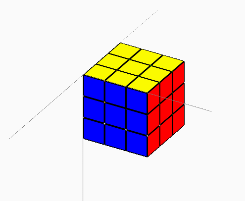
  1 <!DOCTYPE html>
  2 <html>
  3 <head>
  4     <meta charset="utf-8" />
  5     <title>CSS3 魔方</title>
  6     <!-- 样式部分全写这里 -->
  7     <style>
  8     .wrap {
  9         transform-style: preserve-3d;
 10         width: 300px;  height: 300px;
 11         position: relative;  /* 定位起点元素 */
 12         border-top:solid 1px gray;  /* x 轴 */
 13         border-left:solid 1px gray;  /* y 轴 */
 14         /* 倾斜一点方能见立体效果 */
 15         transform: rotateX(-30deg) rotateY(-30deg);
 16     }
 17
 18     /* z 轴正方向 */
 19     .zaxis_p {
 20         position:absolute;
 21         width : 300px;
 22         height:1px;
 23         border-top:solid 1px gray;
 24         /* xy面上,90度立起来就是 z */
 25         transform: rotateY(-90deg);
 26         /* 立起来的旋转点 */
 27         transform-origin:0 0 0;
 28     }
 29
 30     /* z 轴负方向 */
 31     .zaxis_n {
 32         position:absolute;
 33         width : 300px;
 34         height:1px;
 35         border-top:dashed 1px gray; /*(虚线)*/
 36         transform: rotateY(90deg);
 37         transform-origin:0 0 0;
 38     }
 39
 40     .block {
 41         position: absolute;
 42         margin: 0 auto;
 43         border:solid 2px black;
 44         border-radius:3px;
 45         /* 宽高包含边框 */
 46         box-sizing:border-box;
 47         transform-origin:0 0 0;
 48     }
 49
 50     .cube {
 51         position: absolute;
 52         /* 子元素版面是需要三维空间的 */
 53         transform-style: preserve-3d;
 54     }
 55
 56     .magicBox {
 57         position: absolute;
 58         transform-style: preserve-3d;
 59     }
 60
 61     </style>
 62
 63 <script>
 64 /** 版面 block 类
 65  * direct 方向
 66  * color  颜色
 67  * size   边长大小
 68 **/
 69 function Block(direct, color, size){
 70     this.direct = direct;
 71     this.color = color;
 72     this.size = size;
 73     // 绘制过的 UI 元素对象
 74     this.Element = null;
 75
 76     // 在父容器中绘制
 77     this.DrawIn = function(cubeElement){
 78         var e = this.Element || document.createElement('div');
 79         e.style.width = this.size + "px";
 80         e.style.height = this.size + "px";
 81
 82         var top = (this.direct == 'down' ? this.size : 0);
 83         var left = (this.direct == 'right' ? this.size : 0);
 84
 85         e.style.top = top + "px";
 86         e.style.left = left + "px";
 87         e.style.backgroundColor = this.color;
 88
 89         var rx = (this.direct == 'up' || this.direct == 'down' ? -90 : 0);
 90         var ry = (this.direct == 'left' || this.direct == 'right' ? 90 : 0);;
 91         var tz = (this.direct == 'back' ? this.size : 0);
 92
 93         e.style["transform"] = "rotateX(" + rx + "deg) rotateY(" + ry + "deg) translateZ(-" + tz + "px)";
 94         e.className = "block";
 95         this.Element = e;
 96         cubeElement.appendChild(e);
 97     };
 98 }
 99
100 /** 魔方格 Cube 类
101  * blockSize 为魔方格的边长代表大小
102  * directColorArray 为指定方向与颜色的数组
103  *                  形式为 [direct,color,direct,color,...]
104  * x,y,z 为在魔方中的坐标,未指定时默认为0,0,0
105 **/
106 function Cube(blockSize, directColorArray, x, y, z){
107     this.x = x | 0;
108     this.y = y | 0;
109     this.z = z | 0;
110     this.blockSize = blockSize;
111     this.blocks = [];
112     /* 根据参数建立 Block 对象 */
113     for(var i=0; i < directColorArray.length / 2; i++){
114         this.blocks.push(new Block(directColorArray[ i*2 ], directColorArray[ i*2 + 1 ], this.blockSize));
115     }
116
117     // 绘制过的 UI 元素对象
118     this.Element = null;
119
120     // 在父容器中绘制
121     this.DrawIn = function(boxElement, x, y, z){
122         this.x = x | this.x;
123         this.y = y | this.y;
124         this.z = z | this.z;
125         var e = this.Element || document.createElement('div');
126         e.style.width = this.blockSize + "px";
127         e.style.height = this.blockSize + "px";
128         e.style["transform"] = this.FormatTransform();
129         e.className = "cube";
130
131         for(var i=0; i < this.blocks.length; i++) {
132             this.blocks[i].DrawIn(e);
133         }
134
135         this.Element = e;
136
137         boxElement.appendChild(e);
138     };
139
140     this.Rotate = function(axis, turn, dimension){
141         if(!this.Element) return;
142         // 重绘魔方格
143         this.ReDrawBlocks(axis, turn);
144         // 转换坐标
145         this.TransCoordinate(axis, turn, dimension);
146
147         // 先停止动画效果,逆向 90 度,此时外观跟旋转前一致
148         this.Element.style["transition"] = "";
149         var rotateDegs = new Object();
150         rotateDegs[axis] = (turn == 'left' ? -90 : 90);
151         this.Element.style["transform"] = this.FormatTransform(rotateDegs);
152         // 旋转原点旋转的层都需要以魔方的中心点旋转
153         // 旋转原点是以元素自身来计算的,因所有魔方格都是从(0,0,0)平衡的,因此计算结果都一样
154         var centerX = this.blockSize * dimension / 2;
155         var centerY = this.blockSize * dimension / 2;
156         var centerZ = -this.blockSize * dimension / 2;
157         this.Element.style["transformOrigin"] = centerX + "px " + centerY + "px " + centerZ + "px";
158
159         // 这样才能触发动画
160         setTimeout(function(obj){
161             return function(){
162                 obj.Element.style["transform"] = obj.FormatTransform();
163                 obj.Element.style["transition"] = "transform 0.5s";  // 0.3 秒
164             };
165         }(this), 1);
166     }
167
168     /** 坐标转换
169      * axis 轴向
170      * turn 转向
171      * dimension 阶数
172      **/
173     this.TransCoordinate = function(axis, turn, dimension){
174         if(axis == 'x'){
175             if( turn == 'left' ){
176                 var oriy = this.y;
177                 this.y = this.z;
178                 this.z = dimension - 1 - oriy;
179             } else {
180                 var oriz = this.z;
181                 this.z = this.y;
182                 this.y = dimension - 1 - oriz;
183             }
184         } else if(axis == 'y'){
185             if( turn == 'right' ){
186                 var orix = this.x;
187                 this.x = this.z;
188                 this.z = dimension - 1 - orix;
189             } else {
190                 var oriz = this.z;
191                 this.z = this.x;
192                 this.x = dimension - 1 - oriz;
193             }
194         } else if(axis == 'z'){
195             if( turn == 'right' ){
196                 var orix = this.x;
197                 this.x = this.y;
198                 this.y = dimension - 1 - orix;
199             } else {
200                 var oriy = this.y;
201                 this.y = this.x;
202                 this.x = dimension - 1 - oriy;
203             }
204         }
205     }
206
207    /** 将各 block 调整位置,重绘魔方格
208     * axis 轴向
209     * turn 转向
210     **/
211     this.ReDrawBlocks = function(axis, turn){
212         var xyzDirects = [];
213         xyzDirects['x'] = ["front", "up", "back", "down"];
214         xyzDirects['y'] = ["front", "right", "back", "left"];
215         xyzDirects['z'] = ["up", "right", "down", "left"];
216         var curDirects = xyzDirects[axis];
217
218         for(var i=0; i < this.blocks.length; i++) {
219             var index = curDirects.indexOf( this.blocks[i].direct );
220             if(index > -1){
221                 var newIndex = turn == 'left' ? (index + 1) % 4 : (index + 4 - 1) % 4;
222                 this.blocks[i].direct = curDirects[newIndex];
223                 this.blocks[i].DrawIn(this.Element);
224             }
225         }
226     }
227
228
229     // 格式仳 transform 属性
230     // css3 把旋转与平移混一起(真不好用)
231     this.FormatTransform = function (rotateDegs){
232         var rotatePart = "rotateX(0deg) rotateY(0deg) rotateZ(0deg)";
233         if(rotateDegs){
234             rotatePart = "rotateX(" + (rotateDegs.x | 0) + "deg) rotateY(" + (rotateDegs.y | 0) + "deg) rotateZ(" + (rotateDegs.z | 0) + "deg)";
235         }
236
237         return rotatePart + " translate3d(" + (this.x * this.blockSize) + "px," + (this.y * this.blockSize) + "px,-" + (this.z * this.blockSize) + "px) ";
238     }
239 }
240
241 /** 魔方 MagicBox 类
242  * dimension 阶数
243  * blockSize 每小格大小
244  **/
245 function MagicBox(dimension, blockSize){
246     this.dimension = dimension;
247     this.blockSize = blockSize;
248     this.cubes = [];
249
250     this.MakeDefaultCubes = function(){
251         this.cubes = [];
252         for(var x=0; x < this.dimension; x++){
253             for(var y=0; y < this.dimension; y++){
254                 for(var z=0; z < this.dimension; z++){
255                     var cube = this.MakeDefaultCube(x, y, z);
256                     if(cube){
257                       this.cubes.push(cube);
258                     }
259                 }
260             }
261         }
262     };
263
264     /* 根据魔方格在阶数中的位置生成魔方格,魔方内部的格子忽略 */
265     this.MakeDefaultCube = function(x, y, z){
266         var max = this.dimension - 1;
267         var dc = [];
268         if(x == 0) dc.push("left", "orange"); else if(x == max) dc.push("right", "red");
269         if(y == 0) dc.push("up", "yellow"); else if(y == max) dc.push("down", "white");
270         if(z == 0) dc.push("front", "blue"); else if(z == max) dc.push("back", "green");
271         if(dc.length == 0) return null;
272         var cube = new Cube(this.blockSize, dc, x, y, z);
273         return cube;
274     }
275
276     // 构造时自动产生初始魔方格
277     this.MakeDefaultCubes();
278     // 绘制过的 UI 元素对象
279     this.Element = null;
280     // 在父容器中绘制
281     this.DrawIn = function(domElement){
282         var e = this.Element || document.createElement('div');
283         e.style.width = (this.dimension * this.blockSize) + "px";
284         e.style.height = (this.dimension * this.blockSize) + "px";
285         e.className = "magicBox";
286
287         for(var i=0; i < this.cubes.length; i++) {
288             this.cubes[i].DrawIn(e);
289         }
290         this.Element = e;
291         domElement.appendChild(e);
292     };
293
294     /** MagicBox.Rotate 旋转
295       * axis 轴向
296       * level 层
297       * turn 转向
298      **/
299     this.Rotate = function(axis, level, turn){
300         for(var i=0; i < this.cubes.length; i++) {
301             if(this.cubes[i][axis] == level) {    // 该轴该层的才旋转
302                 this.cubes[i].Rotate(axis, turn, this.dimension);
303             }
304         }
305     };
306 }
307
308 function onload(){
309
310     //* 魔方绘制示例
311     var magicBox = new MagicBox(3, 50);
312     magicBox.DrawIn( document.querySelector(".wrap") );
313
314     var rotates = GenRotateActions(3, 5);
315     for(var i=0; i<rotates.length; i++){
316         setTimeout(function(magicBox, rotate){
317             return function(){
318                 magicBox.Rotate(rotate.axis, rotate.level, rotate.turn);
319             };
320         }(magicBox, rotates[i]), 3000 + 800 * i);
321     }
322
323     for(var i=0; i<rotates.length; i++){
324         setTimeout(function(magicBox, rotate){
325             return function(){
326                 magicBox.Rotate(rotate.axis, rotate.level, (rotate.turn == 'left' ? 'right' : 'left'));
327             };
328         }(magicBox, rotates[rotates.length -1 - i]), 1000 + 8800 + 800 * i);
329     }
330 }
331
332 /** 产生一个指定数量的旋转序列数组
333  * dimension 魔方阶数
334  * count 序列数量
335  **/
336 function GenRotateActions(dimension, count){
337     var result = [];
338     for(var i=0; i<count; i++){
339         result[i] = {
340             axis  : ['x','y','z'][Math.floor(Math.random() * 3)],
341             level : Math.floor(Math.random() * dimension),
342             turn  : ['left','right'][Math.floor(Math.random() * 2)]
343         };
344     }
345     return result;
346 }
347 </script>
348 </head>
349
350 <body style="padding:300px;" onload="onload()">
351   <div class="wrap">
352     <div class="zaxis_p"></div>
353     <div class="zaxis_n"></div>
354   </div>
355 </body>
356
357 </html>
2.5 二十面体
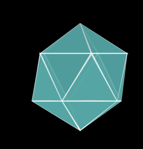
  1 <html>
  2 <head>
  3 <title>二十面体</title>
  4 <style type="text/css">
  5 html, body {
  6 height: 100%;
  7 margin: 0;
  8 background: rgba(0, 0, 0,1);
  9 }
 10 .sharp {
 11 animation: ani 4s linear infinite;
 12 }
 13 div {
 14 transform-style: preserve-3d;
 15 transform: translate(-50%, -50%) rotate3d(0, 1, 0, 72deg);
 16 position: absolute;
 17 left: 50%;
 18 top: 50%;
 19 }
 20 span { /*利用边框做一个三角形*/
 21 border-color: transparent transparent rgba(255, 255, 255, 0.5) transparent;/*每个span下方设置颜色,其余边透明*/
 22 border-width: 173.2px 100px;
 23 border-style: solid;
 24 width: 0;
 25 height: 0;
 26 position: absolute;
 27 left: 50%;
 28 margin-left: -100px;
 29 top: 50%;
 30 margin-top: -346.4px;
 31 }
 32
 33 span:before { /*利用边框在span中做一个三角形,实现嵌套,让span变成边框,span:before变成要显示的东西*/
 34 content: '';
 35 border-color: transparent transparent rgba(0, 123, 123, 0.5) transparent;/*设置每面的颜色*/
 36 border-width: 165.2px 92px;
 37 border-style: solid;
 38 width: 0;
 39 height: 0;
 40 position: absolute;
 41 left: 50%;
 42 top: 50%;
 43 transform: translate(-50%, -50%);
 44 margin-top: 4px;
 45 }
 46
 47 div span:nth-child(1) {
 48 transform: rotate3d(0, 1, 0, 72deg) rotate3d(1, 0, 0, 51.5deg);
 49 }
 50
 51 div span:nth-child(2) {
 52 transform: rotate3d(0, 1, 0, 144deg) rotate3d(1, 0, 0, 51.5deg);
 53 }
 54
 55 div span:nth-child(3) {
 56 transform: rotate3d(0, 1, 0, 216deg) rotate3d(1, 0, 0, 51.5deg);
 57 }
 58
 59 div span:nth-child(4) {
 60 transform: rotate3d(0, 1, 0, 288deg) rotate3d(1, 0, 0, 51.5deg);
 61 }
 62
 63 div span:nth-child(5) {
 64 transform: rotate3d(0, 1, 0, 360deg) rotate3d(1, 0, 0, 51.5deg);
 65 }
 66
 67 .sharp div:nth-child(1) {
 68 transform: translateY(51px) rotateY(108deg) rotateX(116deg) translateZ(31px);
 69 }
 70
 71 .sharp div:nth-child(2) {
 72 transform: translateY(51px) rotateY(180deg) rotateX(116deg) translateZ(31px);
 73 }
 74
 75 .sharp div:nth-child(3) {
 76 transform: translateY(51px) rotateY(252deg) rotateX(116deg) translateZ(31px);
 77 }
 78
 79 .sharp div:nth-child(4) {
 80 transform: translateY(51px) rotateY(324deg) rotateX(116deg) translateZ(31px);
 81 }
 82
 83 .sharp div:nth-child(5) {
 84 transform: translateY(51px) rotateY(396deg) rotateX(116deg) translateZ(31px);
 85 }
 86
 87 @keyframes ani {
 88 100% {
 89 transform: rotateY(360deg);
 90 }
 91 }
 92 </style>
 93 </head>
 94 <body>
 95 <div class="sharp">
 96 <div>
 97 <span></span>
 98 <span></span>
 99 <span></span>
100 <span></span>
101 <span></span>
102 </div>
103 <div>
104 <span></span>
105 <span></span>
106 <span></span>
107 <span></span>
108 <span></span>
109 </div>
110 <div>
111 <span></span>
112 <span></span>
113 <span></span>
114 <span></span>
115 <span></span>
116 </div>
117 <div>
118 <span></span>
119 <span></span>
120 <span></span>
121 <span></span>
122 <span></span>
123 </div>
124 <div>
125 <span></span>
126 <span></span>
127 <span></span>
128 <span></span>
129 <span></span>
130 </div>
131 <div>
132 <span></span>
133 <span></span>
134 <span></span>
135 <span></span>
136 <span></span>
137 </div>
138 </div>
139 </body>
140 </html>
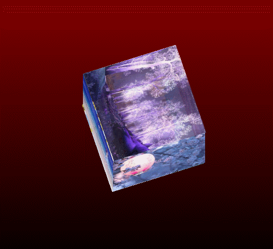
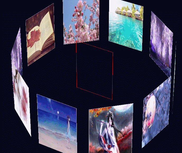
2.6 3D相册拖拽动画
  1 <!DOCTYPE HTML>
  2 <html onselectstart='return false'>
  3     <head>
  4         <meta http-equiv="Content-Type" content="text/html;charset=utf-8" />
  5         <meta name="keywords" content="" />
  6         <meta name="description" content="" />
  7         <title>3D相册拖拽动画</title>
  8         <style type="text/css">
  9             *{ margin:0; padding:0;}
 10             body{ background:#000; width:100%; height:100%; overflow:hidden}
 11             #wrap{ width:133px; height:200px; margin:25% auto 0;
 12                 position:relative;
 13                 top:-100px;
 14                 transform-style:preserve-3d;
 15                 transform:perspective(800px) rotateX(-10deg) rotateY(0deg);
 16                 }
 17             #wrap ul li{
 18                 list-style:none;
 19                 width:120px;
 20                 height:120px;
 21                 position:absolute;
 22                 top:0;left:0;
 23                 border-radius:3px;
 24                 box-shadow:0 0 10px #fff;
 25                 background-size:100%;
 26
 27                 transform:rotateY(0deg) translateZ(0px);
 28                 -webkit-box-reflect:below 10px -webkit-linear-gradient(top,rgba(0,0,0,0) 40%,rgba(0,0,0,.5) 100%);
 29             }
 30             #wrap p{ width:1200px; height:1200px; position:absolute; border-radius:100%;
 31                 left:50%; top:100%; margin-left:-600px; margin-top:-600px;
 32                 background:-webkit-radial-gradient(center center,600px 600px,rgba(50,50,50,1),rgba(0,0,0,0));
 33                 transform:rotateX(90deg);}
 34         </style>
 35
 36     </head>
 37     <body>
 38         <div id="wrap">
 39             <ul>
 40                 <li style="background-image:url(images/1.png);"></li>
 41                 <li style="background-image:url(images/2.png);"></li>
 42                 <li style="background-image:url(images/3.png);"></li>
 43                 <li style="background-image:url(images/4.png);"></li>
 44                 <li style="background-image:url(images/5.png);"></li>
 45                 <li style="background-image:url(images/6.png);"></li>
 46                 <li style="background-image:url(images/7.png);"></li>
 47                 <li style="background-image:url(images/8.png);"></li>
 48                 <li style="background-image:url(images/9.png);"></li>
 49                 <li style="background-image:url(images/10.png);"></li>
 50                 <li style="background-image:url(images/11.png);"></li>
 51             </ul>
 52             <p></p>
 53         </div>
 54
 55         <strong><script src="./js/jquery-1.8.3.js"></script></strong>
 56         <script>
 57         $(function(){
 58             var oL = $('#wrap ul li').size();
 59             var Deg = 360/oL;
 60             var xDeg = 0,yDeg = -10,xs,ys,p=null;
 61
 62             for (var i=oL-1;i>=0;i--)
 63             {
 64
 65                 $('#wrap ul li').eq(i).css({
 66                     transition:"1s "+(oL-i)*0.15+"s transform,.5s "+(1+oL*0.15)+"s opacity",
 67                     'transform':'rotateY('+Deg*i+'deg) translateZ(350px)'
 68                 });
 69             }
 70
 71
 72             $(document).mousedown(function(e){
 73                 clearInterval(p);
 74                 var x1 = e.clientX;
 75                 var y1 = e.clientY;
 76                 $(this).bind('mousemove',function(e){
 77                     xs = e.clientX - x1;
 78                     ys = e.clientY - y1;
 79                     x1 = e.clientX;
 80                     y1 = e.clientY;
 81                     xDeg += xs*0.3;
 82                     yDeg -= ys*0.1;
 83                     $('#wrap').css('transform',"perspective(800px) rotateX("+yDeg+"deg) rotateY("+xDeg+"deg)");
 84                 });
 85             }).mouseup(function(){
 86                 $(this).unbind('mousemove');
 87                 p = setInterval(function(){
 88                     if(Math.abs(xs)<0.5&&Math.abs(ys)<0.5){clearInterval(p)};
 89                     xs = xs*0.95;
 90                     ys = ys*0.95
 91                     xDeg += xs*0.3;
 92                     yDeg -= ys*0.1;
 93                     $('#wrap').css('transform',"perspective(800px) rotateX("+yDeg+"deg) rotateY("+xDeg+"deg)");
 94                 },30);
 95             });
 96
 97         });
 98         </script>
 99     </body>
100 </html>
2.7 旋转相册
  1 <!DOCTYPE html>
  2 <html>
  3      <head>
  4            <meta charset="UTF-8">
  5            <title></title>
  6            <style type="text/css">
  7                 body{background: #06081B;
  8                      perspective: 5000px;
  9                 }
 10                 .show{perspective: 5000px;
 11                      -webkit-transform: rotateX(-45deg);
 12                      -moz-transform: rotateX(-45deg);
 13                      transform: rotateX(-45deg);
 14                      transform-style: preserve-3d;
 15
 16                 }
 17                 .box{
 18
 19                      position: relative;width: 150px;height: 250px;border: 1px solid red;
 20                      margin: 300px auto;
 21                      transform-style: preserve-3d;
 22
 23                       -webkit-animation: rotate1 10s linear infinite;
 24                      -moz-animation: rotate1 10s linear infinite;
 25                      animation: rotate1 10s linear infinite;
 26
 27                 }
 28                 .box img{width: 150px;height: 250px;border: 1px solid #ccc;position: absolute;
 29                      left: 0;top: 0;
 30
 31
 32                      -webkit-box-reflect: below 20px -webkit-linear-gradient(top,rgba(250,250,250,0),rgba(250,250,250,0) 30%,rgba(250,250,250,0.5));
 33
 34                 }
 35
 36                 .img1{
 37                      -webkit-transform: translateZ(300px);
 38                      -moz-transform: translateZ(300px);
 39                      transform: translateZ(300px);
 40                 }
 41
 42                 .img2{
 43                      -webkit-transform:rotateY(36deg) translateZ(300px) ;
 44                      -moz-transform:rotateY(36deg) translateZ(300px) ;
 45                      transform:rotateY(36deg) translateZ(300px) ;
 46                 }
 47                 .img3{
 48                      -webkit-transform:rotateY(72deg) translateZ(300px);
 49                      -moz-transform:rotateY(72deg)g) translateZ(300px) ;
 50                      transform:rotateY(72deg) (300px) ;
 51                 }
 52                 .img4{
 53                      -webkit-transform: rotateY(108deg) translateZ(300px);
 54                      -moz-transform:rotateY(108deg) translateZ(300px) ;
 55                      transform:rotateY(108deg) translateZ(300px) ;
 56                 }
 57
 58                 .img5{
 59                      -webkit-transform: rotateY(144deg) translateZ(300px);
 60                      -moz-transform:rotateY(144deg) translateZ(300px) ;
 61                      transform:rotateY(144deg) translateZ(300px) ;
 62                 }
 63                 .img6{
 64                      -webkit-transform:rotateY(180deg) translateZ(300px) ;
 65                      -moz-transform:rotateY(180deg) translateZ(300px) ;
 66                      transform:rotateY(180deg) translateZ(300px) ;
 67                 }
 68
 69                 .img7{
 70                      -webkit-transform:rotateY(216deg) translateZ(300px) ;
 71                      -moz-transform:rotateY(216deg) translateZ(300px) ;
 72                      transform: rotateY(216deg) translateZ(300px);
 73                 }
 74
 75                 .img8{
 76                      -webkit-transform:rotateY(252deg) translateZ(300px) ;
 77                      -moz-transform:rotateY(252deg) translateZ(300px) ;
 78                      transform:rotateY(252deg) translateZ(300px) ;
 79                 }
 80
 81                 .img9{
 82                      -webkit-transform:rotateY(288deg) translateZ(300px) ;
 83                      -moz-transform:rotateY(288deg) translateZ(300px) ;
 84                      transform:rotateY(288deg) translateZ(300px) ;
 85                 }
 86
 87                 .img10{
 88                      -webkit-transform:rotateY(324deg) translateZ(300px) ;
 89                      -moz-transform:rotateY(324deg) translateZ(300px) ;
 90                      transform:rotateY(324deg) translateZ(300px) ;
 91                 }
 92
 93
 94                 @-moz-keyframes rotate1{
 95                      0%{
 96                            -webkit-transform: rotateY(0deg);
 97                            -moz-transform: rotateY(0deg);
 98                            transform: rotateY(0deg);
 99                      }
100                      100%{
101                            -webkit-transform: rotateY(360deg);
102                            -moz-transform: rotateY(360deg);
103                            transform: rotateY(360deg);
104                      }
105                 }
106                 @-webkit-keyframes rotate1{
107                      0%{
108                            -webkit-transform: rotateY(0deg);
109                            -moz-transform: rotateY(0deg);
110                            transform: rotateY(0deg);
111                      }
112                      100%{
113                            -webkit-transform: rotateY(360deg);
114                            -moz-transform: rotateY(360deg);
115                            transform: rotateY(360deg);
116                      }
117                 }
118            </style>
119      </head>
120      <body>
121            <div class="show">
122                 <div class="box">
123                      <img src="images/1.png" class="img1"/>
124                      <img src="images/2.png" class="img2"/>
125                      <img src="images/3.png" class="img3" />
126                      <img src="images/4.png" class="img4" />
127                      <img src="images/5.png" class="img5"/>
128                      <img src="images/6.png" class="img6"/>
129                      <img src="images/7.png" class="img7" />
130                      <img src="images/8.png" class="img8" />
131                      <img src="images/9.png" class="img9" />
132                      <img src="images/10.png" class="img10" />
133
134                 </div>
135            </div>
136      </body>
137 </html>
2.8 旋转相册
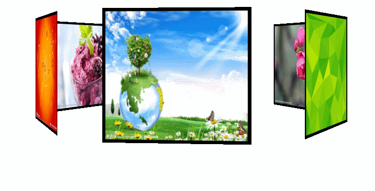
  1 <!DOCTYPE HTML PUBLIC "-//W3C//DTD HTML 4.0 Transitional//EN">
  2 <HTML>
  3 <HEAD>
  4 <TITLE> New Document </TITLE>
  5 <html>
  6 <head lang="en">
  7     <meta charset="UTF-8">
  8     <title></title>
  9     <style>
 10     p{ color:red; }
 11      *{
 12             padding: 0;
 13             margin: 0;
 14             border: none;
 15             outline: none;
 16             box-sizing: border-box;
 17         }
 18         *:before,*:after{
 19             box-sizing: border-box;
 20         }
 21         html,body{
 22             min-height: 100%;
 23         }
 24         body{ background:#99FF00
 25             background-image: radial-gradient(mintcream 0%, lightgray 100%);;
 26         }
 27         .Container{
 28             margin: 4% auto;
 29             width: 210px;
 30             height: 140px;
 31             position: relative;
 32             perspective: 1000px;
 33         }
 34         #carousel{
 35             width: 100%;
 36             height: 100%;
 37             position: absolute;
 38             transform-style:preserve-3d;
 39             animation: rotation 20s infinite linear;
 40         }
 41         #carousel:hover{
 42             animation-play-state: paused;
 43         }
 44         #carousel figure{
 45           display: block;
 46             position: absolute;
 47             width: 220px;
 48             height: 200px;
 49             left: 10px;
 50             top: 10px;
 51             background: black;
 52             overflow: hidden;
 53             border: solid 5px black;
 54         }
 55         img{
 56             filter: grayscale(0);
 57             cursor: pointer;
 58             transition:all 0.3s ease 0s;
 59             width: 100%;
 60             height: 100%;
 61         }
 62         img:hover{
 63             filter: grayscale(1);
 64             transform: scale(1.2,1.2);
 65         }
 66         #carousel figure:nth-child(1){transform: rotateY(0deg) translateZ(288px);}
 67         #carousel figure:nth-child(2) { transform: rotateY(60deg) translateZ(288px);}
 68         #carousel figure:nth-child(3) { transform: rotateY(120deg) translateZ(288px);}
 69         #carousel figure:nth-child(4) { transform: rotateY(180deg) translateZ(288px);}
 70         #carousel figure:nth-child(5) { transform: rotateY(240deg) translateZ(288px);}
 71         #carousel figure:nth-child(6) { transform: rotateY(300deg) translateZ(288px);}
 72
 73         @keyframes rotation{
 74             from{
 75                 transform: rotateY(0deg);
 76             }
 77             to{
 78                 transform: rotateY(360deg);
 79             }
 80         }
 81     </style>
 82     <script>
 83         window.onload=function(){
 84             var story = document.getElementById('word');
 85             var s = document.getElementById('show');
 86             var i = 0;
 87             timer=setInterval(function(){
 88                 s.innerHTML=story.innerHTML.substring(0,i);
 89                 i++;
 90                 if(s.innerHTML==story.innerHTML){
 91                     clearInterval(timer);
 92                 }
 93             },200);
 94         }
 95     </script>
 96 </head>
 97 <body >
 98     <p id="word" style="display:none;"><strong>***************
 99     <br>@@@@@@@@@@@@@@@@@@@@@@@@@<br>
100     %%%%%%%%%%%%%%%%%%%%%%%%%%%</p>
101     <p id="show"></p>
102      <div class="Container">
103         <div id="carousel">
104             <figure><img src="images/1.jpg" ></figure>
105             <figure><img src="images/2.jpg"></figure>
106             <figure><img src="images/3.jpg" ></figure>
107             <figure><img src="images/4.jpg" ></figure>
108             <figure><img src="images/5.jpg"></figure>
109             <figure><img src="images/6.jpg" ></figure>
110         </div>
111     </div>
112 </body>
113 </html>
2.9 旋转立方体相册
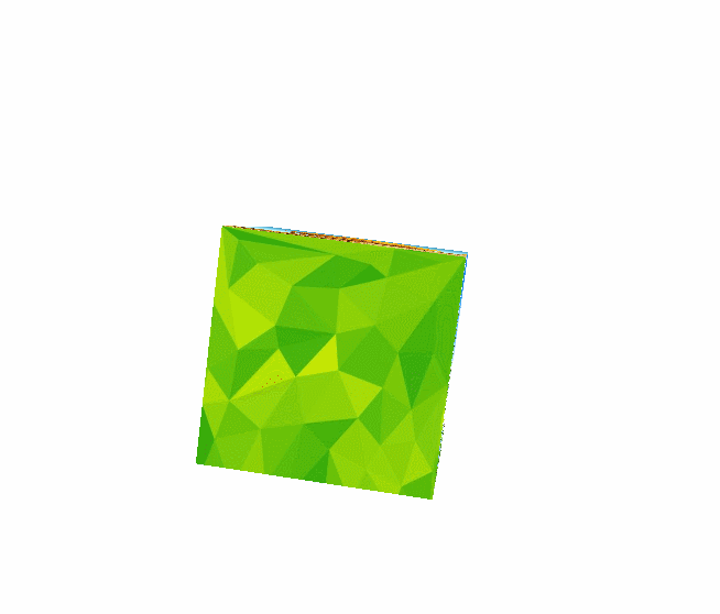
  1 <!doctype html>
  2 <html>
  3 <head>
  4 <meta charset="utf-8"/>
  5 <title></title>
  6 <style type="text/css">
  7 .eyes{
  8 perspective: 1000px;
  9 }
 10 .box{
 11 /*设置3D效果*/
 12 transform-style: preserve-3d;
 13 /*盒子的大小*/
 14 width: 200px;
 15 height: 200px;
 16 background: red;
 17 /*设置盒子的位置,便于观察*/
 18 margin: 400px auto;
 19 /*复合方式设置动画 三者分别为:动画名 执行一次时间 执行方式*/
 20 animation: zhuan 3s ease;
 21 /*令动画无限执行下去*/
 22 animation-iteration-count: infinite;
 23 animation-timing-function: linear;
 24 }
 25 .box div{
 26 width: 200px;
 27 height: 200px;
 28 opacity: 1;
 29 /*设置过渡*/
 30 transition: all 1s ease 0s;
 31 position: absolute;
 32 }
 33 /*调整位置,制作成一个六边形*/
 34 .box .div1{
 35 background: green;
 36 transform: translateZ(100px);
 37 }
 38 .box .div2{
 39 background: green;
 40 transform: translateZ(-100px);
 41 }
 42 .box .div3{
 43 background: green;
 44 transform: rotateX(90deg) translateZ(100px);
 45 }
 46 .box .div4{
 47 background: green;
 48 transform: rotateX(270deg) translateZ(100px);
 49 }
 50 .box .div5{
 51 background: green;
 52 transform: rotateY(-90deg) translateZ(100px);
 53 }
 54 .box .div6{
 55 background: green;
 56 transform: rotateY(90deg) translateZ(100px);
 57 }
 58 /*添加3D旋转效果 让其绕X、Y轴同时旋转90度*/
 59 @keyframes zhuan{
 60 from{
 61 transform: rotateX(0deg) rotateZ(0deg) rotateY(0deg);
 62 }
 63 to{
 64 transform: rotateX(360deg) rotateZ(360deg) rotateY(360deg);
 65 }
 66 }
 67 /*给正方体添加一个hover效果*/
 68 .box:hover .div1{
 69 transform: translateZ(200px);
 70 }
 71 .box:hover .div2{
 72 transform: translateZ(-200px);
 73 }
 74 .box:hover .div3{
 75 transform: rotateX(90deg) translateZ(200px);
 76 }
 77 .box:hover .div4{
 78 transform: rotateX(270deg) translateZ(200px);
 79 }
 80 .box:hover .div5{
 81 transform: rotateY(-90deg) translateZ(200px);
 82 }
 83 .box:hover .div6{
 84 transform: rotateY(90deg) translateZ(200px)
 85 }
 86 </style>
 87 </head>
 88 <body>
 89 <div class="eyes">
 90 <div class="box">
 91 <div class="div1"><img src="images/1.jpg" width="100%" height="100%"></div>
 92 <div class="div2"><img src="images/2.jpg" width="100%" height="100%"></div>
 93 <div class="div3"><img src="images/3.jpg" width="100%" height="100%"></div>
 94 <div class="div4"><img src="images/4.jpg" width="100%" height="100%"></div>
 95 <div class="div5"><img src="images/5.jpg" width="100%" height="100%" ></div>
 96 <div class="div6"><img src="images/6.jpg" width="100%" height="100%" ></div>
 97 </div>
 98 </div>
 99 </body>
100 </html>
三、总结
由此可以看出基本上所有的动画都需要依靠一些库函数已经浏览器的渲染能力来实现。
补充
旋转魔方效果相册(测试有部分问题,还未解决)
css代码
@charset"utf-8";
*{
    margin: 0;
    padding: 0;
}
body{
    /*background:url
    (../img/preview.png);*/
    max-width: 100%;
    min-width: 100%;
    height: 100%;
    background-size: cover;
    background-repeat: no-repeat;
    background-attachment: fixed;
    background-size: 100% 100%;
    position: absolute;
    margin-left: auto;
    margin-right: auto;
}
li{
    list-style: none;
}
.box{
    width: 200px;
    height: 200px;
    background-size: cover;
    background-repeat: no-repeat;
    background-attachment: fixed;
    background-size: 100% 100%;
    position: absolute;
    margin-left: 42%;
    margin-right: 22%;
    -webkit-transform-style:preserve-3d;
    -webkit-transform:rotateX(13deg);
    -webkit-animation:move 10s linear infinite;
}
.minbox{
    width: 100px;
    height: 100px;
    position: absolute;
    left: 50px;
    top: 30px;
    -webkit-transform-style:preserve-3d;
}
.minbox li{
    width: 100px;
    height: 100px;
    position: absolute;
    left:0;
    top:0;
}
.minbox li:nth-child(1){
    background: url(../img/01.png) no-repeat 0 0;
    -webkit-transform:translateZ(50px);
}
.minbox li:nth-child(2){
    background: url(../img/02.png) no-repeat 0 0;
    -webkit-transform:rotateX(180deg)translateZ(50px);
}
.minbox li:nth-child(3){
    background: url(../img/03.png) no-repeat 0 0;
    -webkit-transform:rotateX(-90deg)translateZ(50px);
}
.minbox li:nth-child(4){
    background: url(../img/04.png) no-repeat 0 0;
    -webkit-transform:rotateX(90deg)translateZ(50px);
}
.minbox li:nth-child(5){
    background: url(../img/05.png) no-repeat 0 0;
    -webkit-transform:rotateY(-90deg)translateZ(50px);
}
.minbox li:nth-child(6){
    background: url(../img/06.png) no-repeat 0 0;
    -webkit-transform:rotateY(90deg)translateZ(50px);
}


.maxbox li:nth-child(1){
    background: url(../img/1.png) no-repeat 0 0;
    -webkit-transform:translateZ(50px);
}
.maxbox li:nth-child(2){
    background: url(../img/2.png) no-repeat 0 0;
    -webkit-transform:translateZ(50px);
}
.maxbox li:nth-child(3){
    background: url(../img/3.png) no-repeat 0 0;
    -webkit-transform:rotateX(-90deg)translateZ(50px);
}
.maxbox li:nth-child(4){
    background: url(../img/4.png) no-repeat 0 0;
    -webkit-transform:rotateX(90deg)translateZ(50px);
}
.maxbox li:nth-child(5){
    background: url(../img/5.png) no-repeat 0 0;
    -webkit-transform:rotateY(-90deg)translateZ(50px);
}
.maxbox li:nth-child(6){
    background: url(../img/6.png) no-repeat 0 0;
    -webkit-transform:rotateY(90deg)translateZ(50px);
}

.maxbox{
    width: 800px;
    height:400px;
    position: absolute;
    left:0;
    top:-20px;
    -webkit-transfrom-style:preserve-3d;
}
.maxbox li{
    width: 200px;
    height: 200px;
    background: #fff;
    border: 1px solid #ccc;
    position: absolute;
    left: 0;
    top: 0;
    opacity: 0.2;
    -webkit-transition:all 1s ease;
}
.maxbox li:nth-child(1){
    -webkit-transform:translateZ(100px);
}
.maxbox li:nth-child(2){
    -webkit-transform:rotateX(180deg)translateZ(100px);
}
.maxbox li:nth-child(3){
    -webkit-transform:rotateX(-90deg)translateZ(100px);
}
.maxbox li:nth-child(4){
    -webkit-transform:rotateX(90deg)translateZ(100px);
}
.maxbox li:nth-child(5){
    -webkit-transform:rotateY(-90deg)translateZ(100px);
}
.maxbox li:nth-child(6){
    -webkit-transform:rotateY(90deg)translateZ(100px);
}

.box:hover ol li:nth-child(1){
    -webkit-transform:translateZ(300px);
    width: 400px;
    height: 400px;
    opacity: 0.8;
    left: -100px;
    top: -100px;
}
.box:hover ol li:nth-child(2){
    -webkit-transform:rotateX(180deg)translateZ(300px);
    width: 400px;
    height: 400px;
    opacity: 0.8;
    left: -100px;
    top: -100px;
}
.box:hover ol li:nth-child(3){
    -webkit-transform:rotateX(-90deg)translateZ(300px);
    width: 400px;
    height: 400px;
    opacity: 0.8;
    left: -100px;
    top: -100px;
}
.box:hover ol li:nth-child(4){
    -webkit-transform:rotateX(90deg)translateZ(300px);
    width: 400px;
    height: 400px;
    opacity: 0.8;
    left: -100px;
    top: -100px;
}
.box:hover ol li:nth-child(5){
    -webkit-transform:rotateY(-90deg)translateZ(300px);
    width: 400px;
    height: 400px;
    opacity: 0.8;
    left: -100px;
    top: -100px;
}
.box:hover ol li:nth-child(6){
    -webkit-transform:rotateY(90deg)translateZ(300px);
    width: 400px;
    height: 400px;
    opacity: 0.8;
    left: -100px;
    top: -100px;
}

@keyframes move{
    0%{
        -webkit-transform:rotateX(13deg)rotateY(0deg);
    }
    100%{
        -webkit-transform:rotateX(13deg)rotateY(360deg);
    }
}
html代码
<!DOCTYPE html>
<html lang="en">
<head>
    <meta charset="UTF-8">
    <title>送给女朋友的相册</title>

    <link type="text/css" href="css/style.css"
    rel="stylesheet"/>
</head>
<body>
    <div class="box">
        <ul class="minbox">
            <li></li>
            <li></li>
            <li></li>
            <li></li>
            <li></li>
            <li></li>
        </ul>
        <ol class="maxbox">
            <li></li>
            <li></li>
            <li></li>
            <li></li>
            <li></li>
            <li></li>
        </ol>
    </div>

</body>
</html>