之前尝试过Google Chart来实现数据可视化(可以查看我之前的博客Google Chart 之 Area Chart案例),但是很遗憾,Google Chart是无法集成到Salesforce Lightning中的,理由嘛,Google JavaScript会跟Google通信,而且具有脚本的外部引用,但是Sales force的安全策略是不允许这样做的,据我所知,到目前为止是没有解决方法的,所以我们来学习下Chart.JS,这个开源的第三方JS库提供了交互式可视化组件,关键是,它是可以在Sales force Lightning组件中使用的
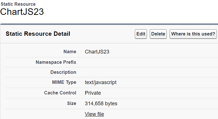
下载Chart.JS,导入到Salesforce静态资源
接下来我们创建一个Lighntning的组件:ChartDemo
<aura:component controller="GraphController"
                implements="flexipage:availableForAllPageTypes"
                access="global">
    <ltng:require scripts="{!$Resource.ChartJS23}" afterScriptsLoaded="{!c.ctr}"/>
    <div class="slds-col slds-size--1-of-1 slds-small-size--1-of-2 slds-medium-size--3-of-4">
        <canvas aura:id="lineChart" id="lineChart"/>
    </div>
</aura:component>
其对应的JS Controller如下:
({
    ctr : function(cmp, event, helper) {
        var temp = [];
        var action = cmp.get("c.getLineChartMap");
        action.setCallback(this, function(response){
            if(response.getState() === 'SUCCESS' && response.getReturnValue()){
                temp = JSON.parse(response.getReturnValue());
                helper.createLineGraph(cmp, temp);
            }
        });
       $A.enqueueAction(action);
    }
})
其对应的Helper Controller如下:
({
    createLineGraph : function(cmp, temp) {
        var label = [];
        var firstValue = [];
        var secondValue = [];
        for(var a=0; a< temp.length; a++){
            console.debug(temp[a]["label"]);
            label.push(temp[a]["label"]);
            firstValue.push(temp[a]["firstValue"]);
            secondValue.push(temp[a]["secondValue"]);
        }
        var el = cmp.find('lineChart').getElement();
        var ctx = el.getContext('2d');

        new Chart(ctx, {
            type: 'line',
            data: {
                labels: label,
                datasets: [{
                    label: 'USD Sent',
                    data: firstValue,
                    backgroundColor: "rgba(153,255,51,0.4)"
                }, {
                    label: 'USD Recieved',
                    data: secondValue,
                    backgroundColor: "rgba(255,153,0,0.4)"
                }]
            }
        });

    }
})
最后是对应的Apex Controller:GraphController源码,我使用Map模拟了后台查询数据的部分,方便演示效果
public class GraphController {

    @auraEnabled
    public List<LineChartVar> myLineChartVarList;

    public class LineChartVar {
        string label;
        integer firstValue;
        integer secondValue;

        public LineChartVar(string a, integer b, integer c){
            label = a;
            firstValue = b;
            secondValue = c;
        }
    }
    @auraEnabled
    public static string getLineChartMap(){
        List<LineChartVar> myLineChartVarList = new List<LineChartVar>();
        myLineChartVarList.add(new LineChartVar('2014', 100, 120));
        myLineChartVarList.add(new LineChartVar('2015', 150, 190));
        myLineChartVarList.add(new LineChartVar('2016', 170, 200));
        myLineChartVarList.add(new LineChartVar('2017', 260, 210));
        myLineChartVarList.add(new LineChartVar('2018', 110, 300));
        myLineChartVarList.add(new LineChartVar('2019', 370, 150));
        myLineChartVarList.add(new LineChartVar('2020', 450, 500));
        return JSON.Serialize(myLineChartVarList);
    }
}
最后为了查看这个Lightning组件的,我创建了一个测试有的Application,将这个组件嵌入其中,源码如下:
<aura:application >
    <c:ChartDemo/>
</aura:application>
点击Review来查看在这个Application的效果
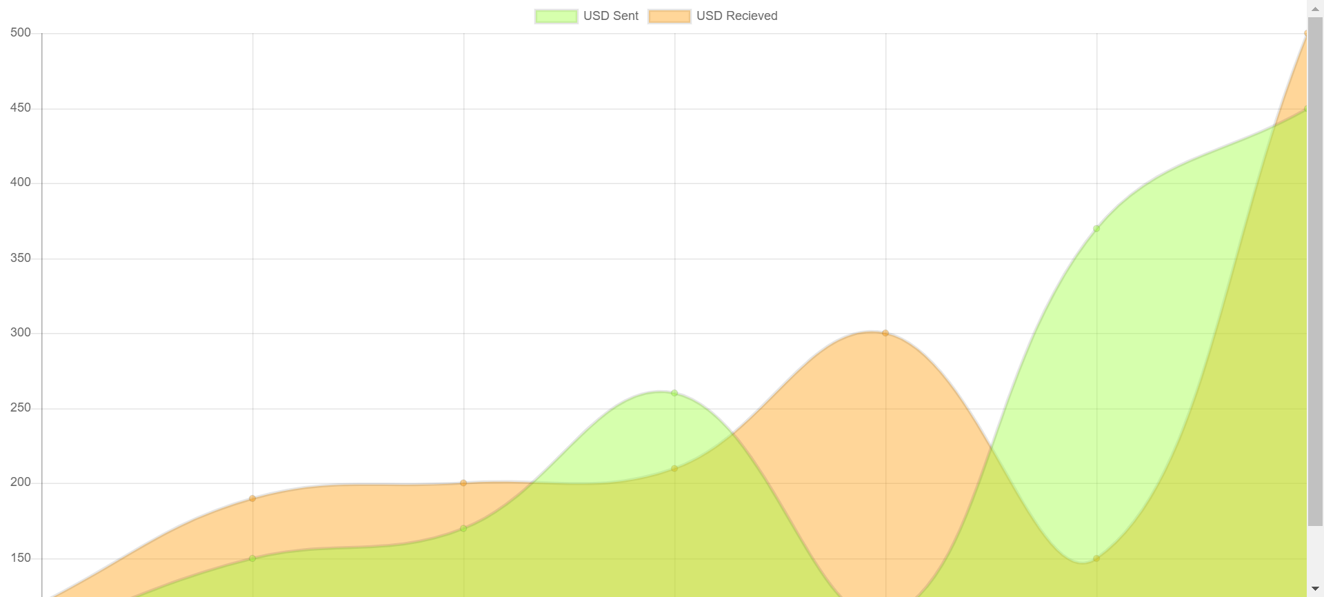
可以看到,这样生成的一张表的效果究其本质是通过JS画了一个图片出来,那么你会发现,这个图片铺满了整个页面还似乎没法显示完全,那么该如何控制这个图的各种元素的显示呢?通过查看Chart.js的文档,简单的对这个图表的元素显示做一个演练
仔细阅读上面的源码,你会发现对图标的渲染主要发生在Helper Controller中,那么同样,对图标元素显示效果的渲染也主要是在Helper Controller中进行
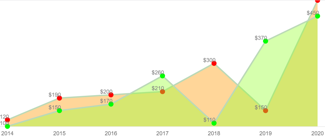
new Chart(ctx, {
    type: 'line',
    data: {
        labels: label,
        datasets: [{
            label: 'USD Sent',
            data: firstValue,
            backgroundColor: "rgba(153,255,51,0.4)",// 填充的颜色
            pointRadius:5,
            pointStyle:'circle',
            borderColor:'#bbd9b7',// 折线的颜色设置
            pointBorderColor:'#00ff00', // 顶点圈圈的颜色
            pointBackgroundColor:'#00ff00' // 顶点的颜色
        }, {
            label: 'USD Recieved',
            data: secondValue,
            backgroundColor: "rgba(255,153,0,0.4)",// 填充的颜色
            pointRadius:5,
            pointStyle:'circle',
            borderColor:'#bbd9b7',// 折线的颜色设置
            pointBorderColor:'#ff0000', // 顶点圈圈的颜色
            pointBackgroundColor:'#ff0000' // 顶点的颜色
        }]
    },
    options: {
        elements: {
            line: {tension: 0} // 设置折线图
        },
        legend: {display: false}, // 设置不显示图例
        responsive: false, // responsive和maintainAspectRatio设置为false才可以调整图标的宽高
        maintainAspectRatio: false,
        scales: {
            xAxes: [{
                gridLines: {display:false} // 隐藏网格线
            }],
            yAxes: [{
                gridLines: {display:false},
                display: false // 隐藏Y轴
            }]
        },
        // 设置显示数据的顶点
        hover:{animationDuration:0},//防止鼠标移动到顶点时的闪烁效果
        animation:{
            "duration":1, // //防止鼠标移动到顶点时的闪烁效果
            "onComplete": function() {
                var chartInstance = this.chart,
                  ctx = chartInstance.ctx;
                ctx.fillStyle = 'grey';
                ctx.textAlign = 'center';
                ctx.textBaseline = 'bottom';
                this.data.datasets.forEach(function(dataset, i) {
                  var meta = chartInstance.controller.getDatasetMeta(i);
                    meta.data.forEach(function(bar, index) {
                        var data = '$' + dataset.data[index];
                        // data:顶点显示的数据,bar._model.x -10:X轴偏移量;bar._model.y:Y轴偏移量
                        ctx.fillText(data, bar._model.x -10, bar._model.y);
                    });
                });
          }
       }
    }
});
如果部署了上面的JS,预览的组件效果则会是下面的效果,看着非常袖珍的一张图

那么该如何设置这个图的宽高呢?在Helper中可以直接进行渲染
// 方式一:在Helper中直接渲染
var el = cmp.find('lineChart').getElement();
var ctx = el.getContext('2d');
ctx.canvas.width = '700';
ctx.canvas.height = '300';

// 方式二:在cmp中,直接设定宽高
<canvas aura:id="lineChart" id="lineChart" width="600" height="300"/>
Tips: 注意设置Chart的宽高需要将 responsive 和 maintainAspectRatio 设置为False.
这样渲染出来的图片效果就会合适很多
以上是对Chart.JS该如何应用到Salesforce Lightning中的一个简单演示,如有错漏可以留言交流