机器学习三剑客:numpy、pandas、matplotlib
NumPy系统是Python的一种开源的数值计算扩展。这种工具可用来存储和处理大型矩阵。
pandas 是基于numpy的一种工具,该工具是为了解决数据分析任务而创建的。
Matplotlib 是一个 Python 的 2D绘图库,它以各种硬拷贝格式和跨平台的交互式环境生成出版质量级别的图形。
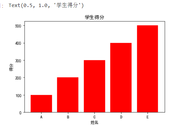
柱状图bar
from matplotlib import pyplot as plt
import matplotlib
 # 显示图表,仅限于jupyter使用
%matplotlib inline
#指定默认字体
matplotlib.rcParams['font.sans-serif'] = ['SimHei']
# 第一个参数:索引
# 第二个参数:高度    参数必须对应否则报错
plt.bar(range(5),[100,200,300,400,500],color='red')
plt.xticks(range(5),['A','B','C','D','E'])
plt.xlabel('姓名')
plt.ylabel('得分')
plt.title('学生得分')
# 或显示图标Plt.show()
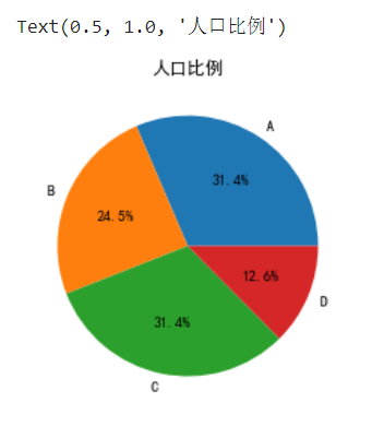
饼图pie
labels = ['A','B','C','D']
# autopct='%1.1f%%'显示比列,格式化显示一位小数,固定写法
plt.pie([50,39,50,20],labels=labels,autopct='%1.1f%%')
plt.title('人口比例')
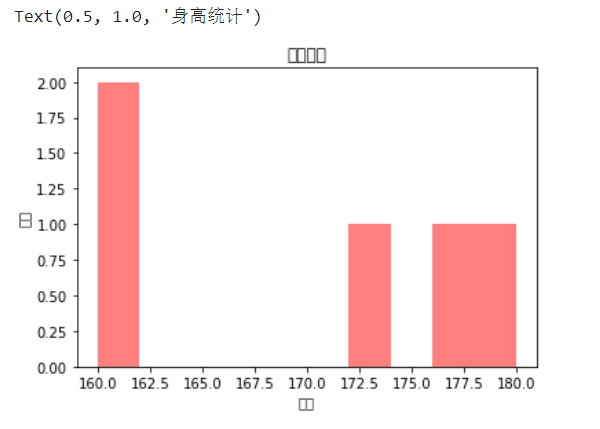
直方图hist
from matplotlib import pyplot as plt
import matplotlib

heights = [180,160,172,177,160]
plt.hist(heights,color='red',alpha=0.5)
# 横轴heights,纵轴当前值的个数
plt.xlabel('身高')
plt.ylabel('人数')
plt.title('身高统计')
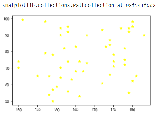
散点图scatter
# 5、绘制一个散点图
# 用random模块获取两组数据,分别代表横纵坐标。一组数据里有50个数,
# 用随机种子的方法固定住random模块获取得到的数据
# 并将散点图里的符号变为'*'
import numpy as np
np.random.seed(10)  # 随机种子,将随机数固定住
heights = []
weights = []
heights.append(np.random.randint(150,185,size=50))
# weights.append(np.random.normal(loc=50,scale=100,size))  # 生成正太分布,也称高斯分布
weights.append(np.random.randint(50,100,size=50))
plt.scatter(heights,weights,marker='*',color='yellow')   #默认是圆点,marker='*'
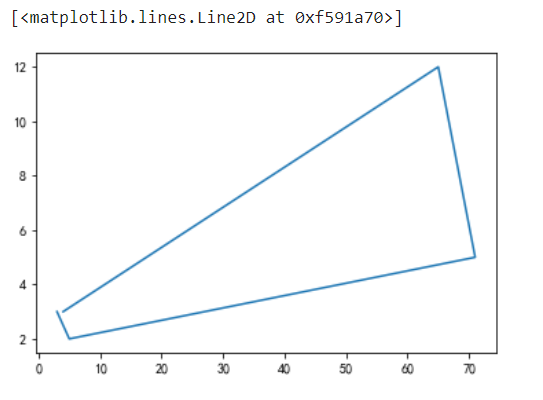
折线图plot
x = [4,65,71,5,3]
y = [3,12,5,2,3]
plt.plot(x,y)
# plt.savefig('a.jpg') # 保存图片
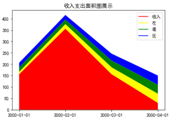
面积图
from matplotlib import pyplot as plt
import numpy as np
# 导入3D模块
from mpl_toolkits.mplot3d.axes3d import Axes3D
import matplotlib
#指定默认字体
matplotlib.rcParams['font.sans-serif'] = ['SimHei']
# 面积图
def test_area():
    date = ['2000-01-01','2000-02-01','2000-03-01','2000-04-01']
    earn = [156,356,156,30]
    eat = [10,20,30,40]
    drink = [20,20,30,40]
    play = [20,20,30,40]
#     [20,20,30,40]]
    plt.stackplot(date,earn,eat,drink,play,colors=['red','yellow','green','blue'])
    plt.title('收入支出面积图展示')
    plt.plot([],[],color='red',label='收入')
    plt.plot([],[],color='yellow',label='吃')
    plt.plot([],[],color='green',label='喝')
    plt.plot([],[],color='blue',label='玩')
    # 展示图例
    plt.legend()
    plt.show()
test_area()
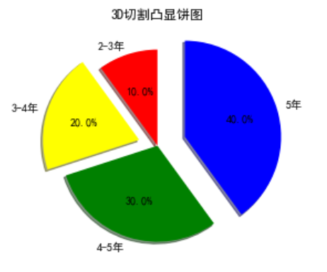
3D饼图突出展示
def test_pie():
    beijing = [10,20,30,40]
    label = ['2-3年','3-4年','4-5年','5年']
    color = ['red','yellow','green','blue']
    indict = []
    for index,item in enumerate(beijing):
        # 判断优先级
        if item == max(beijing):
            indict.append(0.3)
        elif index == 1:
            indict.append(0.2)
        else:
            indict.append(0)
    plt.pie(beijing,labels=label,colors=color,startangle=90,shadow=True,explode=tuple(indict),autopct='%1.1f%%')
    plt.title('3D切割凸显饼图')
    plt.show()
test_pie()
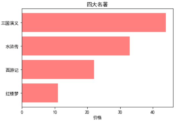
条形图
def test_barh():
    price = [11,22,33,44]
    plt.barh(range(4),price,align='center',color='red',alpha=0.5)
    plt.xlabel('价格')
    plt.yticks(range(4),['红楼梦','西游记','水浒传','三国演义'])
    plt.title('四大名著')
    plt.show()
test_barh()
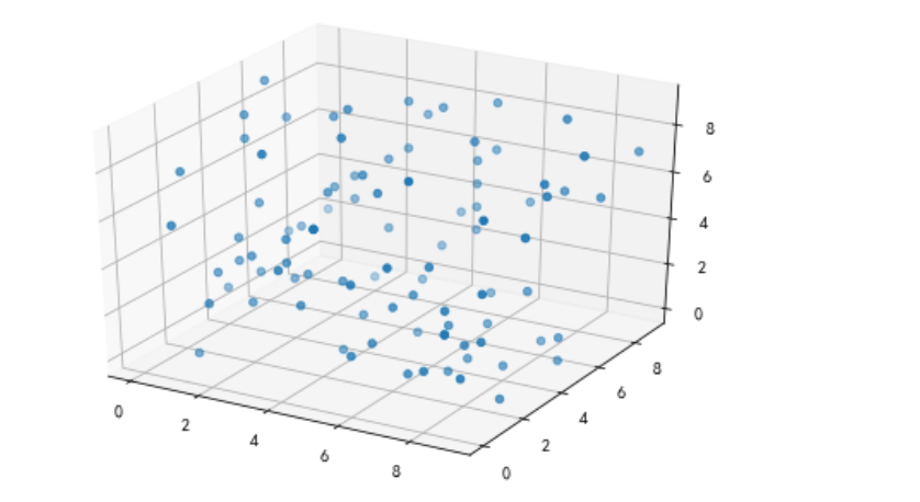
3D散点图
def test_scatter_3D():
    x = np.random.randint(0,10,size=100)
    y = np.random.randint(0,10,size=100)
    z = np.random.randint(0,10,size=100)
    # 创建二维对象
    fig = plt.figure()
    # 强转
    axes3d = Axes3D(fig)
    # 填充数据
    axes3d.scatter(x,y,z)
    plt.show()
test_scatter_3D()
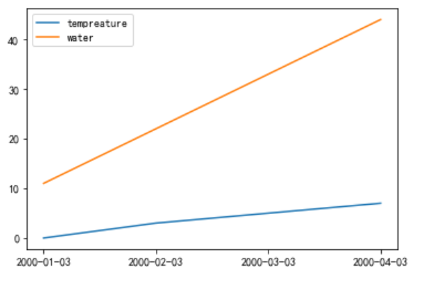
趋势图
def test_line():
    x = ['2000-01-03','2000-02-03','2000-03-03','2000-04-03']
    # 定义y轴数据
    y1 = [0,3,5,7]
    y2 = [11,22,33,44]
    plt.plot(x,y1,label='tempreature')
    plt.plot(x,y2,label='water')
    # 显示图例
    plt.legend()
    plt.show()
test_line()
箱型图
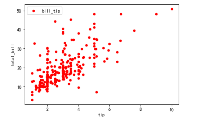
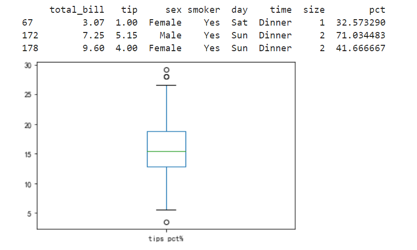
import pandas as pd
# 定义消费分析
def test_tips(pd):
    # 读取数据集
    df = pd.read_excel('tips.xlsx','sheet1')

    # 绘制散点图证明推论:小费随着总账单的递增而递增
    # df.plot(kind='scatter',x='tip',y='total_bill',c='red',label='bill_tip')


    # 绘制箱型图
    # 计算小费占总账单的比例
    df['pct'] = df.tip / df.total_bill * 100
    # print(df)
    # 过滤出小费占比比较高的人群,例如:30%以上
    print(df[df.pct > 30])
    # 删除异常数据,按照索引删除
    df = df.drop([67,172,178])
    # print(df)
    # 打印箱型图
    df.pct.plot(kind='box',label='tips pct%')
    # 绘制
    plt.show()
test_tips(pd)
散点图绘制如下:
箱型图绘制如下:
对比柱状图、小提琴图
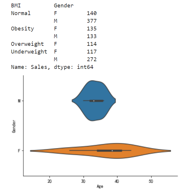
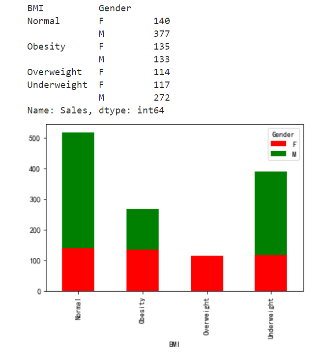
import seaborn as sns
# 定义数据分析方法
def test_excel():
    # 读取数据集
    df = pd.read_excel('test.xlsx','sheet1')
    # print(df)
    # 需求
    # 计算按性别和人体质量分组,求销售额
    # select sum(sales),gender,BMI from test group by gender,BMI
    myexcel = df.groupby(['BMI','Gender']).Sales.sum()
    print(myexcel)
    # 绘制对比柱状图unstack
    myexcel.unstack().plot(kind='bar',stacked=True,color=['red','green'])

#     # 利用seaborn绘制,小提琴图
#     sns.violinplot(df['Age'],df['Gender'])
#     # 初始化数据
#     sns.despine()
    # 绘制
    plt.show()
test_excel()
柱状图效果如下:
小提琴效果图如下: