zoukankan      html  css  js  c++  java
  • [css] 利用border制作三角型

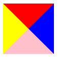
    1、利用border边框的特性,使加boder边框的元素宽高都为0,因为外边设置太宽里面太窄,所以呈现出三角形状。

    <html>
    <head>
    <style>
            .square{
                width: 0px;
                height: 0px;
                border: 50px solid transparent;
                border-color: red blue pink yellow;
            }
     </style>
    </head>
    <body>
        <div class="square"></div>
    </body>
    </html>

    2、如果只给上面的边框设置颜色,那么就会呈现出三角形状
    <style>
        {
                border: 50px solid transparent;
                border-top-color: red;
            }
     </style>
     3、也可以利用定位白色三角覆盖到红色三角上边制作出三角箭头
    <html>
    <head>
        <style>
            .box{
                position: relative;
            }
            .square{
                margin-top: 100px;
                width: 0;
                height: 0;
                border: 50px solid transparent;
                border-top-color: red;
            }
            .square::after{
                content: '';
                display: block;
                width: 0;
                height: 0;
                border: 50px solid transparent;
                border-top-color: white;
                position: absolute;
                left:0;
                top: -10px;
            }
        </style>
    </head>
    <body>
        <div class="box">
        <div class="square"></div>
        </div>
    </body>
    </html>
  • 相关阅读:
    第一次个人编程作业
    第一次结对编程作业
    第一次编程作业——地址簿
    我的第一次博客作业
    团队作业1
    作业一
    寒假作业四
    寒假作业三
    第二次寒假作业
    电梯
  • 原文地址:https://www.cnblogs.com/lv77/p/13855613.html
Copyright © 2011-2022 走看看