大家好,这里是「 从零开始学 Web 系列教程 」,并在下列地址同步更新......
- github:https://github.com/Daotin/Web
- 微信公众号:Web前端之巅
- 博客园:http://www.cnblogs.com/lvonve/
- CSDN:https://blog.csdn.net/lvonve/
在这里我会从 Web 前端零基础开始,一步步学习 Web 相关的知识点,期间也会分享一些好玩的项目。现在就让我们一起进入 Web 前端学习的冒险之旅吧!

一、动画
1、创建动画
好的前端工程师,会更注重用户的体验和交互。那么动画就是将我们的静态页面,变成具有灵动性,为我们的界面添加个性的一种方式。
一个动画至少需要两个属性:
animation-name :动画的名字(创建动画时起的名字,如下为 moveTest)
animation-duration :动画的耗时
animation-name: moveTest;
animation-duration: 2s;
如需在 CSS3 中创建动画,需要学习 @keyframes 规则。@keyframes 规则用于创建动画。在 @keyframes 中规定某项 CSS 样式,就能创建由当前样式逐渐改为新样式的动画效果。
使用 @keyframes 关键字来创建动画。
@keyframes moveTest {
  /*百分比是指整个动画耗时的百分比*/
  0% {
    transform: translate(0px, 0px);
  }
  50% {
    transform: translateY(200px);
  }
  100% {
    transform: translate(200px,200px);
  }
}
其中,百分比是指整个动画耗时的百分比。
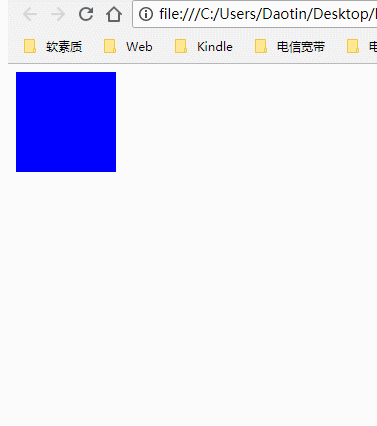
示例:
<!DOCTYPE html>
<html lang="en">
<head>
    <meta charset="UTF-8">
    <title>Document</title>
    <style>
        div {
             100px;
            height: 100px;
            background-color: blue;

            animation-name: moveTest;
            animation-duration: 2s;
        }

        @keyframes moveTest {
            0% {
                transform: translate(0px, 0px);
            }
            50% {
                transform: translateY(200px);
            }
            100% {
                transform: translate(200px,200px);
            }
        }
    </style>
</head>
<body>
    <div></div>
</body>
</html>
0%:动画起始位置,也可以写成 from
100%:动画终点位置,也可以写成 to。
2、动画的其他属性
animation-iteration-count:设置动画的播放次数,默认为1次
animation-direction:设置交替动画
animation-delay:设置动画的延迟
animation-fill-mode:设置动画结束时的状态:默认情况下,动画执行完毕之后,会回到原始状态
animation-timing-function:动画的时间函数(动画的效果,平滑?先快后慢等)
animation-play-state:设置动画的播放状态 paused:暂停 running:播放
/*3.设置动画的播放次数,默认为1次  可以指定具体的数值,也可以指定infinite(无限次)*/
animation-iteration-count: 1;
/*4.设置交替动画  alternate:来回交替*/
animation-direction: alternate;
/*5.设置动画的延迟*/
animation-delay: 2s;
/*5.设置动画结束时的状态:默认情况下,动画执行完毕之后,会回到原始状态
forwards:会保留动画结束时的状态,在有延迟的情况下,并不会立刻进行到动画的初始状态
backwards:不会保留动画结束时的状态,在添加了动画延迟的前提下,如果动画有初始状态,那么会立刻进行到初始状态
both:会保留动画的结束时状态,在有延迟的情况下也会立刻进入到动画的初始状态*/
animation-fill-mode: both;
/*6.动画的时间函数:linear,ease...*/
animation-timing-function: linear;
/*设置动画的播放状态  paused:暂停   running:播放*/
animation-play-state: running;
3、案例:无缝滚动
<!DOCTYPE html>
<html lang="en">
<head>
    <meta charset="UTF-8">
    <title>Document</title>
    <style>
        * {
            margin: 0;
            padding: 0;
        }
        div {
             600px;
            height: 100px;
            margin: 100px auto;
            background-color: #ccc;
            overflow: hidden;
        }
        ul {
             200%;
            animation: moveLeft 6s linear 0s infinite;
        }
        ul > li {
            float: left;
            list-style: none;
        }
        li > img {
             200px;
            height: 100px;
        }
        div:hover > ul {
            cursor: pointer;
            animation-play-state: paused;
        }
        @keyframes moveLeft {
            from {
                transform: translateX(0);
            }
            to {
                transform: translateX(-600px);
            }
        }
    </style>
</head>
<body>
    <div>
        <ul>
            <li><img src="images/img1.jpg" alt=""></li>
            <li><img src="images/img2.jpg" alt=""></li>
            <li><img src="images/img3.jpg" alt=""></li>
          	<!-- 复制的一份图片 -->
            <li><img src="images/img1.jpg" alt=""></li>
            <li><img src="images/img2.jpg" alt=""></li>
            <li><img src="images/img3.jpg" alt=""></li>
        </ul>
    </div>
</body>
</html>
1、将要显示的图片复制一份,以完成无缝滚动的需求。
2、然后让 ul 移动整个ul的宽度即可,并且无限循环,就实现无线轮播的效果。
3、然后在鼠标放上去的时候,使得动画暂停。

4、案例:时钟
<!DOCTYPE html>
<html lang="en">
<head>
    <meta charset="UTF-8">
    <title>Document</title>
    <style>
        * {
            padding: 0;
            margin: 0;
        }
        .clock {
             300px;
            height: 300px;
            margin: 100px auto;
            border: 10px solid #ccc;
            border-radius: 50%;
            position: relative;
        }
        .line {
             8px;
            height: 300px;
            background-color: #ccc;
            position: absolute;
            left: 50%;
            top: 50%;
            transform: translate(-50%, -50%);
        }
        .line2 {
            transform: translate(-50%, -50%) rotate(30deg);
        }
        .line3 {
            transform: translate(-50%, -50%) rotate(60deg);
        }
        .line4 {
             10px;
            transform: translate(-50%, -50%) rotate(90deg);
        }
        .line5 {
            transform: translate(-50%, -50%) rotate(120deg);
        }
        .line6 {
            transform: translate(-50%, -50%) rotate(150deg);
        }
        .cover {
             250px;
            height: 250px;
            background-color: #fff;
            border-radius: 50%;
            position: absolute;
            left: 50%;
            top: 50%;
            transform: translate(-50%, -50%);
        }
        .center {
             20px;
            height: 20px;
            background-color: #ccc;
            border-radius: 50%;
            position: absolute;
            left: 50%;
            top: 50%;
            transform: translate(-50%, -50%);
        }
        .hour {
             12px;
            height: 80px;
            background-color: red;
            position: absolute;
            left: 50%;
            top: 50%;
            transform: translate(-50%, -100%);
            transform-origin: center bottom;
            animation: clockMove 43200s linear infinite;
        }
        .minute {
             8px;
            height: 100px;
            background-color: blue;
            position: absolute;
            left: 50%;
            top: 50%;
            transform: translate(-50%, -100%);
            transform-origin: center bottom;
            animation: clockMove 3600s linear infinite;
        }
        .second {
             4px;
            height: 120px;
            background-color: green;
            position: absolute;
            left: 50%;
            top: 50%;
            transform: translate(-50%, -100%);
            transform-origin: center bottom;
            animation: clockMove 60s infinite steps(60);
        }

        @keyframes clockMove {
            from {
                transform: translate(-50%, -100%) rotate(0deg);
            }
            to {
                transform: translate(-50%, -100%) rotate(360deg);
            }
        }
    </style>
</head>
<body>
    <div class="clock">
        <div class="line line1"></div>
        <div class="line line2"></div>
        <div class="line line3"></div>
        <div class="line line4"></div>
        <div class="line line5"></div>
        <div class="line line6"></div>
        <div class="cover"></div>
        <div class="hour"></div>
        <div class="minute"></div>
        <div class="second"></div>
        <div class="center"></div>
    </div>
</body>
</html>
我们让秒针step(60)一步一步走,效果更好。

二、Web字体与图标
1、web字体
我们有些时候需要在网页上显示一些特殊的字体,如果这些特殊的字体在电脑上没有安装的话,就会显示系统默认的字体,而不是这些特殊的字体。
这时就有了 Web 字体。开发人员可以为自已的网页指定特殊的字体,无需考虑用户电脑上是否安装了此特殊字体,从此把特殊字体处理成图片的时代便成为了过去。它的支持程度比较好,甚至 IE 低版本浏览器也能支持。
2、字体格式
不同浏览器所支持的字体格式是不一样的,我们有必要了解一下有关字体格式的知识。
TureTpe(.ttf)格式
.ttf字体是Windows和Mac的最常见的字体,是一种RAW格式,支持这种字体的浏览器有IE9+、Firefox3.5+、Chrome4+、Safari3+、Opera10+、iOS Mobile、Safari4.2+;
OpenType(.otf)格式
.otf字体被认为是一种原始的字体格式,其内置在TureType的基础上,支持这种字体的浏览器有Firefox3.5+、Chrome4.0+、Safari3.1+、Opera10.0+、iOS Mobile、Safari4.2+;
Web Open Font Format(.woff)格式
woff字体是Web字体中最佳格式,他是一个开放的TrueType/OpenType的压缩版本,同时也支持元数据包的分离,支持这种字体的浏览器有IE9+、Firefox3.5+、Chrome6+、Safari3.6+、Opera11.1+;
Embedded Open Type(.eot)格式
.eot字体是IE专用字体,可以从TrueType创建此格式字体,支持这种字体的浏览器有IE4+;
SVG(.svg)格式
.svg字体是基于SVG字体渲染的一种格式,支持这种字体的浏览器有Chrome4+、Safari3.1+、Opera10.0+、iOS Mobile Safari3.2+
3、使用步骤
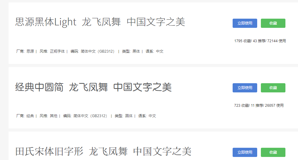
需要注意的是,我们在使用 Web 字体的时候,应该首先把需要用到特殊字体的这些字写好,然后在网络上生成这些字体对应的 Web 字体库,并将其下载下来。下图为一个网站生成和下载web字体的网站,点击立即使用就可以了:
下载下来之后,把下在下来的所有文件导入自己的项目,注意路径的匹配问题。
之后在我们css样式里面使用 @font-face关键字来自定义 Web 字体。
@font-face {
  font-family: 'shuangyuan';
  src: url('../fonts/webfont.eot'); /* IE9*/
  src: url('../fonts/webfont.eot?#iefix') format('embedded-opentype'), /* IE6-IE8 */
    url('../fonts/webfont.woff') format('woff'), /* chrome、firefox */
    url('../fonts/webfont.ttf') format('truetype'), /* chrome、firefox、opera、Safari, Android, iOS 4.2+*/
    url('../fonts/webfont.svg#webfont') format('svg'); /* iOS 4.1- */
}
最后在使用的时候:font-family: "shuangyuan"; 就可以使用 shuangyuan 这种字体了。
4、字体图标
字体图标就是我们常见的字体,不过这个字体的表现形式为一个图标。这样我们就可以使用这些特殊的字体来代替精灵图了。
常见的是把网页常用的一些小的图标,借助工具帮我们生成一个字体包,然后就可以像使用文字一样使用图标了。
优点:
- 将所有图标打包成字体库,减少请求;
- 具有矢量性,可保证清晰度;
- 使用灵活,便于维护
4.1、方法一
使用方法和Web字体一样。也是先下载需要的图标字体库文件,然后使用关键字 @font-face 生成自己的web图标字体。
示例:
<!DOCTYPE html>
<html lang="en">
<head>
<meta charset="UTF-8">
<title>Title</title>
<style>
@font-face {
font-family: 'iconfont';
src: url('../fonts/iconfont.eot'); /* IE9*/
src: url('../fonts/iconfont.eot?#iefix') format('embedded-opentype'), /* IE6-IE8 */
url('../fonts/iconfont.woff') format('woff'), /* chrome、firefox */
url('../fonts/iconfont.ttf') format('truetype'), /* chrome、firefox、opera、Safari, Android, iOS 4.2+*/
url('../fonts/iconfont.svg#iconfont') format('svg'); /* iOS 4.1- */
}
.myFont{
font-family: iconfont;
}
/*笑脸*/
.smile::before{
content: "e641";
color: red;
font-size: 50px;
}
/*输出*/
.output::before{
content: "e640";
color: blue;
font-size: 50px;
}
</style>
</head>
<body>
<!--使用字体图标的时候,得自己指定你想使用的图片-->
<span class="myFont smile"></span>
<span class="myFont output"></span>
<span class="myFont"></span>
</body>
</html>
4.2、方法二
直接在线调用网上web图标 css库
<link rel="stylesheet" href="https://cdn.bootcss.com/font-awesome/4.7.0/css/font-awesome.css">
使用的时候:和方法一一样,直接使用类属性 class='fa fa-play 的方式,fa-play是一个播放的图标,不同的图标的名字含义不同,只需要到 font-awesome 官网(http://www.fontawesome.com.cn/)找到对应的图标的名称即可。
示例:
<a href="javascript:void(0);" class="fa fa-play"></a>  <!--播放图标-->
<a href="javascript:void(0);" class="fa fa-arrows-alt"></a>   <!--全屏图标-->
注意:class 样式的 第一个 fa 是必写的,表示的是用的 font-awesome 的字体图标。