在今日头条中看到炫酷的 CSS 形状,就记录一下:
1.圆形
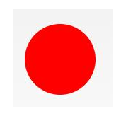
#circle {
 width: 100px;
 height: 100px;
 background: red;
 border-radius: 50%
}
2.椭圆形
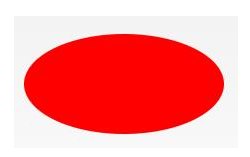
#oval {

width: 200px;

height: 100px;

background: red;

border-radius: 100px / 50px;

}
3.上三角

#triangle-up {
 width: 0;
 height: 0;
 border-left: 50px solid transparent;
 border-right: 50px solid transparent;
 border-bottom: 100px solid red;
}
4.星星 (5角)
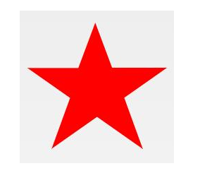
#star-five {

margin: 50px 0;

position: relative;

display: block;

color: red;

width: 0px;

height: 0px;

border-right: 100px solid transparent;

border-bottom: 70px solid red;

border-left: 100px solid transparent;

transform: rotate(35deg);

}

#star-five:before {

border-bottom: 80px solid red;

border-left: 30px solid transparent;

border-right: 30px solid transparent;

position: absolute;

height: 0;

width: 0;

top: -45px;

left: -65px;

display: block;

content: '';

transform: rotate(-35deg);

}

#star-five:after {

position: absolute;

display: block;

color: red;

top: 3px;

left: -105px;

width: 0px;

height: 0px;

border-right: 100px solid transparent;

border-bottom: 70px solid red;

border-left: 100px solid transparent;

transform: rotate(-70deg);

content: '';

}
5.爱心

#heart {

position: relative;

width: 100px;

height: 90px;

}

#heart:before,

#heart:after {

position: absolute;

content: "";

left: 50px;

top: 0;

width: 50px;

height: 80px;

background: red;

border-radius: 50px 50px 0 0;

transform: rotate(-45deg);

transform-origin: 0 100%;

}

#heart:after {

left: 0;

transform: rotate(45deg);

transform-origin: 100% 100%;

}
6.对话泡泡
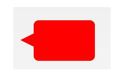
#talkbubble {
 width: 120px;
 height: 80px;
 background: red;
 position: relative;
 -moz-border-radius: 10px;
 -webkit-border-radius: 10px;
 border-radius: 10px;
}
#talkbubble:before {
 content: "";
 position: absolute;
 right: 100%;
 top: 26px;
 width: 0;
 height: 0;
 border-top: 13px solid transparent;
 border-right: 26px solid red;
 border-bottom: 13px solid transparent;
}
7.徽章丝带

#badge-ribbon {
 position: relative;
 background: red;
 height: 100px;
 width: 100px;
 border-radius: 50px;
}
#badge-ribbon:before,
#badge-ribbon:after {
 content: '';
 position: absolute;
 border-bottom: 70px solid red;
 border-left: 40px solid transparent;
 border-right: 40px solid transparent;
 top: 70px;
 left: -10px;
 transform: rotate(-140deg);
}
#badge-ribbon:after {
 left: auto;
 right: -10px;
 transform: rotate(140deg);
}
8.放大镜
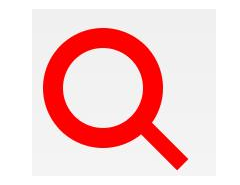
#magnifying-glass {
 font-size: 10em;
 display: inline-block;
 width: 0.4em;
 box-sizing: content-box;
 height: 0.4em;
 border: 0.1em solid red;
 position: relative;
 border-radius: 0.35em;
}
#magnifying-glass:before {
 content: "";
 display: inline-block;
 position: absolute;
 right: -0.25em;
 bottom: -0.1em;
 border-width: 0;
 background: red;
 width: 0.35em;
 height: 0.08em;
 transform: rotate(45deg);
}
9.锁

#lock {
 font-size: 8px;
 position: relative;
 width: 18em;
 height: 13em;
 border-radius: 2em;
 top: 10em;
 box-sizing: border-box;
 border: 3.5em solid red;
 border-right-width: 7.5em;
 border-left-width: 7.5em;
 margin: 0 0 6rem 0;
}
#lock:before {
 content: "";
 box-sizing: border-box;
 position: absolute;
 border: 2.5em solid red;
 width: 14em;
 height: 12em;
 left: 50%;
 margin-left: -7em;
 top: -12em;
 border-top-left-radius: 7em;
 border-top-right-radius: 7em;
}
#lock:after {
 content: "";
 box-sizing: border-box;
 position: absolute;
 border: 1em solid red;
 width: 5em;
 height: 8em;
 border-radius: 2.5em;
 left: 50%;
 top: -1em;
 margin-left: -2.5em;
}
更多炫酷的 CSS 形状的原链接:https://www.toutiao.com/i6693373488746463747/