rem是什么?
rem(font size of the root element)是指相对于根元素的字体大小的单位。简单的说它就是一个相对单位。看到rem大家一定会想起em单位,em(font size of the element)是指相对于父元素的字体大小的单位。它们之间其实很相似,只不过一个计算的规则是依赖根元素一个是依赖父元素计算;
为什么web app要使用rem?
这里我特别强调web app,web page就不能使用rem吗,其实也当然可以,不过出于兼容性的考虑在web app下使用更加能突显这个单位的价值和能力。
rem示例(代码):
<!doctype html>
<html>
<head>
<meta charset="utf-8">
<title>无标题文档</title>
<--!设置缩放!-->
     <meta name="viewport" content="width=device-width, initial-scale=1.0, maximum-scale=1.0, minimum-scale=1.0, user-scalable=no">
<style>
        .divs{
            background-color: #e55058;
            width: 1rem;
            height: 1rem;
            margin: 0 auto;
        }
    </style>
</head>
<script>
//获取屏幕当前尺寸并将其平分
    window.onload = function(){
        document.documentElement.style.fontSize = (document.documentElement.clientWidth/750)*100+'px';
    }
</script>
<body>
    <div style=" 100%;height: 1rem;background-color: black">
        <div class="divs" style="background-color: #0A9800;float: left">
        </div>
        <div style=" 5rem;height: 1rem;background-color: #0FC9B5;float: left">

        </div>
        <div class="divs" style="float: right">
        </div>
    </div>
</body>
</html>
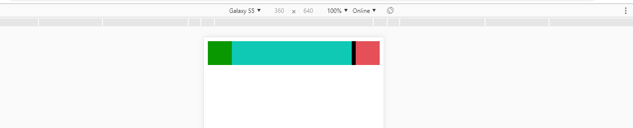
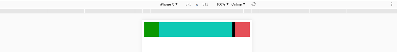
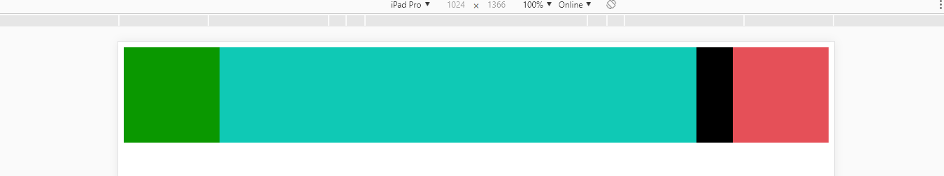
实现效果图:
(1)pc端正常:

(2)不同分辨率移动端的显示效果: