一,概述
- 由于Flutter是跨平台的,所以有适用于Android和iOS的两种风格的组件。一套是Google极力推崇的Material,一套是iOS的Cupertino风格的组件。无论哪种风格,都是通用的。
- 概述Flutter 里有很多的 Button 组件很多,常见的按钮组件有:RaisedButton、FlatButton、IconButton、OutlineButton、ButtonBar、FloatingActionButton 等。
-
- RaisedButton :凸起的按钮,其实就是 Material Design 风格的 Button
- FlatButton : 扁平化的按钮
- OutlineButton:线框按钮
- IconButton : 图标按钮
- ButtonBar: 按钮组
- FloatingActionButton:浮动按钮
二,常用属性
在flutter中,按钮组件有以下常用属性:
- onPressed :
必填参数,按下按钮时触发的回调,接收一个方法,传 null 表示按钮禁用,会显示禁用相关样式
- child :文本控件
- textColor :文本颜色
- color :文本颜色
- disabledColor :按钮禁用时的颜色
- disabledTextColor :按钮禁用时的文本颜色
- splashColor :点击按钮时水波纹的颜色
- highlightColor :点击(长按)按钮后按钮的颜色
- elevation :阴影的范围,值越大阴影范围越大
- padding :内边距
- shape :设置按钮的形状
三,基本使用
- RaisedButton :凸起的按钮,其实就是 Material Design 风格的 Button
- 构造函数
RaisedButton({
    Key key,
  //点击按钮的回调出发事件
    @required VoidCallback onPressed,
  //水波纹高亮变化回调
    ValueChanged<bool> onHighlightChanged,
  //按钮的样式(文字颜色、按钮的最小大小,内边距以及shape)[ Used with [ButtonTheme] and [ButtonThemeData] to define a button's base
//colors, and the defaults for the button's minimum size, internal padding,and shape.]
    ButtonTextTheme textTheme,
    //文字颜色
    Color textColor,
    //按钮被禁用时的文字颜色
    Color disabledTextColor,
    //按钮的颜色
    Color color,
    //按钮被禁用时的颜色
    Color disabledColor,
    //按钮的水波纹亮起的颜色
    Color highlightColor,
    //水波纹的颜色
    Color splashColor,
    //按钮主题高亮
    Brightness colorBrightness,
    //按钮下面的阴影长度
    double elevation,
    //按钮高亮时的下面的阴影长度
    double highlightElevation,
    double disabledElevation,
    EdgeInsetsGeometry padding,
    ShapeBorder shape,
    Clip clipBehavior = Clip.none,
    MaterialTapTargetSize materialTapTargetSize,
    Duration animationDuration,
    Widget child,
  }
- code
RaisedButton(
            textTheme: ButtonTextTheme.accent,
            color: Colors.teal,
            highlightColor: Colors.deepPurpleAccent,
            splashColor: Colors.deepOrangeAccent,
            colorBrightness: Brightness.dark,
            elevation: 50.0,
            highlightElevation: 100.0,
            disabledElevation: 20.0,
            onPressed: () {
              //TODO
            },
            child: Text(
              'RaisedButton',
              style: TextStyle(color: Colors.white, fontSize: 40),
            ),
          )
- 效果

- 构造函数
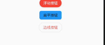
- FlatButton : 扁平化的Material按钮
- 构造函数
FlatButton({
    Key key,
    @required VoidCallback onPressed,
    ValueChanged<bool> onHighlightChanged,
    ButtonTextTheme textTheme,
    Color textColor,
    Color disabledTextColor,
    Color color,
    Color disabledColor,
    Color highlightColor,
    Color splashColor,
    Brightness colorBrightness,
    EdgeInsetsGeometry padding,
    ShapeBorder shape,
    Clip clipBehavior = Clip.none,
    MaterialTapTargetSize materialTapTargetSize,
    @required Widget child,
  })
- code
FlatButton(
        onPressed: () {},
        child: Text(
          "FlatBtn",
          style: TextStyle(fontSize: 20, color: Colors.deepPurple),
 ));
- 效果

- 构造函数
- OutlineButton:线框按钮(OutlineButton是一个有默认边线且背景透明的按钮,也就是说我们设置其边线和颜色是无效的,其他属性跟MaterialButton中属性基本一致)
- 构造函数
const OutlineButton({
    Key key,
    @required VoidCallback onPressed,
    ButtonTextTheme textTheme,
    Color textColor,
    Color disabledTextColor,
    Color color,
    Color focusColor,
    Color hoverColor,
    Color highlightColor,
    Color splashColor,
    double highlightElevation,
    this.borderSide,
    this.disabledBorderColor,
    this.highlightedBorderColor,
    EdgeInsetsGeometry padding,
    ShapeBorder shape,
    Clip clipBehavior,
    FocusNode focusNode,
    Widget child,
  }) : assert(highlightElevation == null || highlightElevation >= 0.0),
       super(
         key: key,
         onPressed: onPressed,
         textTheme: textTheme,
         textColor: textColor,
         disabledTextColor: disabledTextColor,
         color: color,
         focusColor: focusColor,
         hoverColor: hoverColor,
         highlightColor: highlightColor,
         splashColor: splashColor,
         highlightElevation: highlightElevation,
         padding: padding,
         shape: shape,
         clipBehavior: clipBehavior,
         focusNode: focusNode,
         child: child,
       );
- code
/*带边线的按钮*/
class outlineBtn extends StatelessWidget {
  _log() {
    print("点击了边线按钮");
  }

  @override
  Widget build(BuildContext context) {
    // TODO: implement build
    return OutlineButton(
      onPressed: _log,
      child: Text("边线按钮"),
      textColor: Colors.red,
      splashColor: Colors.green,
      highlightColor: Colors.black,
      shape: BeveledRectangleBorder(
        side: BorderSide(
          color: Colors.red,
           1,
        ),
        borderRadius: BorderRadius.circular(10),
      ),
    );
  }
}
- 效果
- 构造函数
- IconButton : 图标按钮(图标按钮,按下时会产生水波纹效果)
- 构造函数
IconButton({
//这几个属性跟前面讲的几个差不多,这里就不再讲了。如有疑问,请留言。
    Key key,
    this.iconSize = 24.0,
    this.padding = const EdgeInsets.all(8.0),
    this.alignment = Alignment.center,
    @required this.icon,
    this.color,
    this.highlightColor,
    this.splashColor,
    this.disabledColor,
    @required this.onPressed,
    this.tooltip
  })
- 示例图
- 效果

- 构造函数
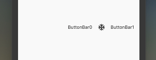
- ButtonBar: 按钮组(水平排列的按钮组)
- 构造函数
const ButtonBar({
    Key key,
//子组件的间隔样式
    this.alignment = MainAxisAlignment.end,
    this.mainAxisSize = MainAxisSize.max,
//子children
    this.children = const <Widget>[],
  })
-
code
class FlutterButtonBar extends StatelessWidget {
  @override
  Widget build(BuildContext context) {
    return ButtonBar(children: <Widget>[
      Text("ButtonBar0"),
      Icon(Icons.ac_unit),
      Text("ButtonBar1")
    ], );
  }
}
-
效果
- 构造函数
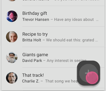
- FloatingActionButton:浮动按钮
- 构造函数
FloatingActionButton({
    Key key,
    //  按钮上的组件,可以是Text、icon, etc.
    this.child,
    //长按提示
    this.tooltip,
    // child的颜色(尽在child没有设置颜色时生效)
    this.foregroundColor,
    //背景色,也就是悬浮按键的颜色
    this.backgroundColor,
    this.heroTag = const _DefaultHeroTag(),
    //阴影长度
    this.elevation = 6.0,
    //高亮时阴影长度
    this.highlightElevation = 12.0,
    //按下事件回调
    @required this.onPressed,
    //是小图标还是大图标
    this.mini = false,
    //按钮的形状(例如:矩形Border,圆形图标CircleBorder)
    this.shape = const CircleBorder(),
    this.clipBehavior = Clip.none,
    this.materialTapTargetSize,
    this.isExtended = false,
  })
- code
FloatingActionButton(
      child: Icon(Icons.access_alarm),
      tooltip: "ToolTip",
      foregroundColor: Colors.white,
      backgroundColor: Colors.deepPurple,
      shape: const Border(),
      onPressed: () {
        //click callback
      },
    )
- 效果
- 构造函数