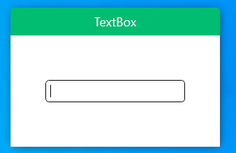
一、查看TextBox原样式
通过Blend查看TextBox原有样式
  <Window.Resources>
        <SolidColorBrush x:Key="TextBox.Static.Border" Color="#FFABAdB3"/>
        <SolidColorBrush x:Key="TextBox.MouseOver.Border" Color="#FF7EB4EA"/>
        <SolidColorBrush x:Key="TextBox.Focus.Border" Color="#FF569DE5"/>
        <Style x:Key="TextBoxStyle1" TargetType="{x:Type TextBox}">
            <Setter Property="Background" Value="{DynamicResource {x:Static SystemColors.WindowBrushKey}}"/>
            <Setter Property="BorderBrush" Value="{StaticResource TextBox.Static.Border}"/>
            <Setter Property="Foreground" Value="{DynamicResource {x:Static SystemColors.ControlTextBrushKey}}"/>
            <Setter Property="BorderThickness" Value="1"/>
            <Setter Property="KeyboardNavigation.TabNavigation" Value="None"/>
            <Setter Property="HorizontalContentAlignment" Value="Left"/>
            <Setter Property="FocusVisualStyle" Value="{x:Null}"/>
            <Setter Property="AllowDrop" Value="true"/>
            <Setter Property="ScrollViewer.PanningMode" Value="VerticalFirst"/>
            <Setter Property="Stylus.IsFlicksEnabled" Value="False"/>
            <Setter Property="Template">
                <Setter.Value>
                    <ControlTemplate TargetType="{x:Type TextBox}">
                        <Border x:Name="border" Background="{TemplateBinding Background}" BorderThickness="{TemplateBinding BorderThickness}" BorderBrush="{TemplateBinding BorderBrush}" SnapsToDevicePixels="True">
                            <ScrollViewer x:Name="PART_ContentHost" Focusable="false" HorizontalScrollBarVisibility="Hidden" VerticalScrollBarVisibility="Hidden"/>
                        </Border>
                        <ControlTemplate.Triggers>
                            <Trigger Property="IsEnabled" Value="false">
                                <Setter Property="Opacity" TargetName="border" Value="0.56"/>
                            </Trigger>
                            <Trigger Property="IsMouseOver" Value="true">
                                <Setter Property="BorderBrush" TargetName="border" Value="{StaticResource TextBox.MouseOver.Border}"/>
                            </Trigger>
                            <Trigger Property="IsKeyboardFocused" Value="true">
                                <Setter Property="BorderBrush" TargetName="border" Value="{StaticResource TextBox.Focus.Border}"/>
                            </Trigger>
                        </ControlTemplate.Triggers>
                    </ControlTemplate>
                </Setter.Value>
            </Setter>
            <Style.Triggers>
                <MultiTrigger>
                    <MultiTrigger.Conditions>
                        <Condition Property="IsInactiveSelectionHighlightEnabled" Value="true"/>
                        <Condition Property="IsSelectionActive" Value="false"/>
                    </MultiTrigger.Conditions>
                    <Setter Property="SelectionBrush" Value="{DynamicResource {x:Static SystemColors.InactiveSelectionHighlightBrushKey}}"/>
                </MultiTrigger>
            </Style.Triggers>
        </Style>
    </Window.Resources>
分析 ControlTemplate 可知 TextBox由 ScrollViewer 外加边框组成
 <Border x:Name="border" Background="{TemplateBinding Background}" BorderThickness="{TemplateBinding BorderThickness}" BorderBrush="{TemplateBinding BorderBrush}" SnapsToDevicePixels="True">
  <ScrollViewer x:Name="PART_ContentHost" Focusable="false" HorizontalScrollBarVisibility="Hidden" VerticalScrollBarVisibility="Hidden"/>
 </Border>
二、优化原有样式
1、增加圆角控制
如何控制Border圆角?我们知道TextBox的宽高都有依赖属性控制,但并没有控制Border圆角的依赖属性,因此我们需要为其增加控制圆角的依赖属性
        public static readonly DependencyProperty CornerRadiusProperty = DependencyProperty.Register("CornerRadius", typeof(CornerRadius), typeof(MTextBox),
            new PropertyMetadata(new CornerRadius(0)));

        /// <summary>
        /// CornerRadius 圆角
        /// </summary>
        public CornerRadius CornerRadius
        {
            get => (CornerRadius)GetValue(CornerRadiusProperty);
            set => SetValue(CornerRadiusProperty, value);
        }
Xaml中需要增加依赖属性绑定
<Border x:Name="PART_Border" CornerRadius="{TemplateBinding CornerRadius}"/>
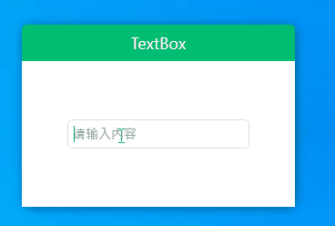
2、增加水印
增加水印可以在原有的 ScrollViewer 上增加一层文本遮罩可以使用TextBlock 调整样式代码如下
 <Border x:Name="PART_Border" CornerRadius="{TemplateBinding CornerRadius}" BorderBrush="{TemplateBinding BorderBrush}" BorderThickness="{TemplateBinding BorderThickness}" Background="{TemplateBinding Background}"
                                    SnapsToDevicePixels="true">
      <Grid>
         <ScrollViewer x:Name="PART_ContentHost" FontSize="{TemplateBinding FontSize}" Width="{TemplateBinding Width}" Height="{TemplateBinding Height}" BorderThickness="0" IsTabStop="False"
                                          HorizontalAlignment="{TemplateBinding HorizontalAlignment}" HorizontalContentAlignment="{TemplateBinding HorizontalContentAlignment}" VerticalAlignment="{TemplateBinding VerticalContentAlignment}" Margin="4,0"/>
           <!--水印-->
          <TextBlock x:Name="Part_Watermark" Text="请输入内容" FontSize="{TemplateBinding FontSize}" Visibility="Hidden" HorizontalAlignment="Left"
                                   Foreground="{DynamicResource ColorBrush.FontWatermarkColor}" IsHitTestVisible="False" VerticalAlignment="{TemplateBinding VerticalContentAlignment}" Margin="5,0"/>
      </Grid>
</Border>
此时遮罩已加好,但我们还要控制水印的显示,当有文本时不显示水印,当无文本时显示水印,此时需要使用触发器判断Text属性 如下
<!--显示水印-->
<Trigger Property="Text" Value="">
    <Setter TargetName="Part_Watermark" Property="Visibility" Value="Visible" />
</Trigger>
增加依赖属性Water
public static readonly DependencyProperty WatermarkProperty = DependencyProperty.Register("Watermark", typeof(string), typeof(MTextBox));

        /// <summary>
        /// Watermark 水印
        /// </summary>
public string Watermark
{
    get => (string)GetValue(WatermarkProperty);
    set => SetValue(WatermarkProperty, value);
}
xaml增加绑定
 <TextBlock x:Name="Part_Watermark" Text="{TemplateBinding Watermark}" FontSize="{TemplateBinding FontSize}" Visibility="Hidden" HorizontalAlignment="Left"
                                   Foreground="{DynamicResource ColorBrush.FontWatermarkColor}" IsHitTestVisible="False" VerticalAlignment="{TemplateBinding VerticalContentAlignment}" Margin="5,0"/>
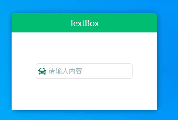
3、增加ICON
增加依赖属性Icon用于Image绑定
 public static readonly DependencyProperty IconProperty = DependencyProperty.Register("Icon", typeof(BitmapImage), typeof(MTextBox),
            new PropertyMetadata(null));

        /// <summary>
        /// Icon 图标
        /// </summary>
        public BitmapImage Icon
        {
            get => (BitmapImage)GetValue(IconProperty);
            set => SetValue(IconProperty, value);
        }
继续调整模板样式增加Image
<Grid VerticalAlignment="Center">
    <Border x:Name="PART_Border" CornerRadius="{TemplateBinding CornerRadius}" BorderBrush="{TemplateBinding BorderBrush}" BorderThickness="{TemplateBinding BorderThickness}" Background="{TemplateBinding Background}"
                                    SnapsToDevicePixels="true">
    </Border>
    <Grid>
        <Grid.ColumnDefinitions>
            <ColumnDefinition Width="auto"/>
            <ColumnDefinition Width="*"/>
        </Grid.ColumnDefinitions>
        <Grid Grid.Column="0">
            <!--Icon-->
            <Image HorizontalAlignment="Left" x:Name="PART_Icon" Height="16" Width="16" Margin="5,0,0,0" Source="{TemplateBinding Icon}"/>
        </Grid>
        <Grid Grid.Column="1">
            <ScrollViewer x:Name="PART_ContentHost" FontSize="{TemplateBinding FontSize}" Width="{TemplateBinding Width}" Height="{TemplateBinding Height}" BorderThickness="0" IsTabStop="False"
                                          HorizontalAlignment="{TemplateBinding HorizontalAlignment}" HorizontalContentAlignment="{TemplateBinding HorizontalContentAlignment}" VerticalAlignment="{TemplateBinding VerticalContentAlignment}" Margin="4,0"/>
            <!--水印-->
            <TextBlock x:Name="Part_Watermark" Text="{TemplateBinding Watermark}" FontSize="{TemplateBinding FontSize}" Visibility="Hidden" HorizontalAlignment="Left"
                                   Foreground="{DynamicResource ColorBrush.FontWatermarkColor}" IsHitTestVisible="False" VerticalAlignment="{TemplateBinding VerticalContentAlignment}" Margin="5,0"/>
        </Grid>
    </Grid>
</Grid>
当无Icon时应使图片不占用位置,故增加属性触发器处理
 <!--隐藏Icon-->
 <Trigger SourceName="PART_Icon" Property="Source" Value="{x:Null}">
     <Setter TargetName="PART_Icon" Property="Visibility" Value="Collapsed" />
 </Trigger>
4、增加选中效果
TextBox增加阴影处理,默认状态透明度为0
 <Border.Effect>
    <DropShadowEffect x:Name="PART_DropShadow" BlurRadius="5" ShadowDepth="0" Color="{TemplateBinding FocusedBrush}" Opacity="0"/>
 </Border.Effect>
增加属性触发器
当isFocused为True时使阴影Opacity为1,此处增加StoryBoard 使Opacity显示变化平滑一些
<Trigger Property="IsFocused" Value="True">
    <Trigger.EnterActions>
        <BeginStoryboard>
            <Storyboard>
                <DoubleAnimation Storyboard.TargetName="PART_DropShadow" Storyboard.TargetProperty="Opacity" To="1" Duration="0:0:0.15">
                    <DoubleAnimation.EasingFunction>
                        <BackEase EasingMode="EaseInOut" />
                    </DoubleAnimation.EasingFunction>
                </DoubleAnimation>
            </Storyboard>
        </BeginStoryboard>
    </Trigger.EnterActions>
    <Trigger.ExitActions>
        <BeginStoryboard>
            <Storyboard>
                <DoubleAnimation Storyboard.TargetName="PART_DropShadow" Storyboard.TargetProperty="Opacity" To="0" Duration="0:0:0.15">
                    <DoubleAnimation.EasingFunction>
                        <BackEase EasingMode="EaseInOut" />
                    </DoubleAnimation.EasingFunction>
                </DoubleAnimation>
            </Storyboard>
        </BeginStoryboard>
    </Trigger.ExitActions>
</Trigger>
三、源码地址
gitee地址:https://gitee.com/sirius_machao/Cys_Controls/tree/dev/