
老孟导读:大家好,这是【Flutter实战】系列文章的第二篇,这一篇讲解文本组件,文本组件包括文本展示组件(Text和RichText)和文本输入组件(TextField),基础用法和五个案例助你快速掌握。
第一篇链接:【Flutter实战】移动技术发展史
Text
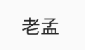
Text是显示文本的组件,最常用的组件,没有之一。基本用法如下:
Text('老孟')
注意:Text组件一定要包裹在Scaffold组件下,否则效果如下:

文本的样式在style中设置,类型为TextStyle,TextStyle中包含很多文本样式属性,下面介绍一些常用的。
设置文本大小和颜色:
Text('老孟',style: TextStyle(color: Colors.red,fontSize: 20),),
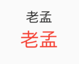
上面黑色的字体为没有设置的效果,作为对比。
设置字体粗细:
Text('老孟',style: TextStyle(fontWeight: FontWeight.bold))
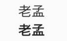
字体粗细共有9个级别,为w100至w900,FontWeight.bold是w700。
设置斜体:
Text('老孟',style: TextStyle(fontStyle: FontStyle.italic,))

设置自定义的字体:
- 首先下载字体库(比如中华字体库)
- 将字体文件拷贝的项目中,一般目录是:assets/fonts/,assets和fonts都需要手动创建,此目录不是必须的,而是约定俗成,资源一般都放在assets目录下。
- 配置
pubspec.yaml:
fonts:
  - family: maobi
    fonts:
      - asset: assets/fonts/maobi.ttf
maobi:是自己对当前字体的命名,有意义即可。
asset:字体文件的目录。
使用:
Text('老孟', style: TextStyle(fontFamily: 'maobi',)),

设置对齐方式:
Container(
  height: 100,
   200,
  color: Colors.blue.withOpacity(.4),
  child: Text('老孟', textAlign: TextAlign.center),
),

textAlign只是控制水平方向的对齐方式,值说明如下:
- left:左对齐
- right:右对齐
- center:居中
- justify:两端对齐,此属性中文存在bug(Flutter版本:1.17.3)也可以在官方issue中关注此问题
- start:前端对齐,和
TextDirection属性有关,如果设置TextDirection.ltr,则左对齐,设置TextDirection.rtl则右对齐。 - end:末端对齐,和
TextDirection属性有关,如果设置TextDirection.ltr,则右对齐,设置TextDirection.rtl则左对齐。
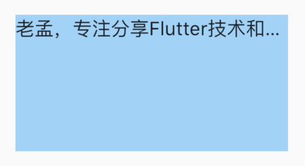
设置文本自动换行:
Container(
  height: 100,
   200,
  color: Colors.blue.withOpacity(.4),
  child: Text('老孟,专注分享Flutter技术和应用实战',softWrap: true,),
)

文本超出范围时的处理:
Container(
  height: 100,
   200,
  color: Colors.blue.withOpacity(.4),
  child: Text('老孟,专注分享Flutter技术和应用实战',overflow: TextOverflow.ellipsis,),
)
溢出的处理方式:
- clip:直接裁剪。
- fade:越来越透明。
- ellipsis:省略号结尾。
- visible:依然显示,此时将会溢出父组件。
设置全局字体样式:
在MaterialApp的theme中设置如下
MaterialApp(
  title: 'Flutter Demo',
  theme: ThemeData(
   ...
    textTheme: TextTheme(
        bodyText2: TextStyle(color: Colors.red,fontSize: 24),
    )
  ),
  home: Scaffold(
    body: TextDemo(),
  ),
)
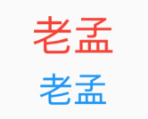
Text组件默认为红色,
Text('老孟'),

Text('老孟',style: TextStyle(color: Colors.blue,fontSize: 20),),
RichText
RichText的属性和Text基本一样,使用如下:
RichText(
  text: TextSpan(
      style: DefaultTextStyle.of(context).style,
      children: <InlineSpan>[
        TextSpan(text: '老孟', style: TextStyle(color: Colors.red)),
        TextSpan(text: ','),
        TextSpan(text: '专注分享Flutter技术和应用实战'),
      ]),
)

TextField
TextField是文本输入组件,即输入框,常用组件之一。基本用法:
TextField()
不需要任何参数,一个最简单的文本输入组件就出来了,效果如下:
decoration是TextField组件的装饰(外观)参数,类型是InputDecoration。
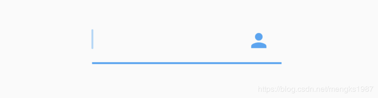
icon显示在输入框的前面,用法如下:
TextField(
  decoration: InputDecoration(
    icon: Icon(Icons.person),
  ),
)

当输入框是空而且没有焦点时,labelText显示在输入框上边,当获取焦点或者不为空时labelText往上移动一点,labelStyle参数表示文本样式,具体参考TextStyle, 用法如下:
TextField(
  decoration: InputDecoration(
    labelText: '姓名:',
    labelStyle: TextStyle(color:Colors.red)
  ),
)
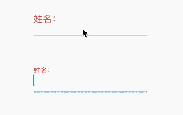
hasFloatingPlaceholder参数控制当输入框获取焦点或者不为空时是否还显示labelText,默认为true,显示。
helperText显示在输入框的左下部,用于提示用户,helperStyle参数表示文本样式,具体参考TextStyle用法如下:
TextField(
  decoration: InputDecoration(
    helperText: '用户名长度为6-10个字母',
    helperStyle: TextStyle(color: Colors.blue),
    helperMaxLines: 1
  ),
)

hintText是当输入框为空时的提示,不为空时不在显示,用法如下:
TextField(
  decoration: InputDecoration(
    hintText: '请输入用户名',
    hintStyle: TextStyle(color: Colors.grey),
    hintMaxLines: 1
  ),
)

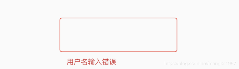
errorText显示在输入框的左下部,默认字体为红色,用法如下:
TextField(
  decoration: InputDecoration(
    errorText: '用户名输入错误',
    errorStyle: TextStyle(fontSize: 12),
    errorMaxLines: 1,
    errorBorder: OutlineInputBorder(borderSide: BorderSide(color: Colors.red)),
  ),
)
prefix系列的组件是输入框前面的部分,用法如下:
TextField(
  decoration: InputDecoration(
    prefixIcon: Icon(Icons.person)
  ),
)

注意prefix和icon的区别,icon是在输入框边框的外部,而prefix在里面。
suffix和prefix相反,suffix在输入框的尾部,用法如下:
TextField(
  decoration: InputDecoration(
      suffixIcon: Icon(Icons.person)
  ),
)
counter组件统计输入框文字的个数,counter仅仅是展示效果,不具备自动统计字数的功能, 自动统计字数代码如下:
var _textFieldValue = '';
TextField(
  onChanged: (value){
    setState(() {
      _textFieldValue = value;
    });
  },
  decoration: InputDecoration(
    counterText: '${_textFieldValue.length}/32'
  ),
)

filled为true时,输入框将会被fillColor填充,仿QQ登录输入框代码如下:
Container(
  height: 60,
   250,
  child: TextField(
    decoration: InputDecoration(
      fillColor: Color(0x30cccccc),
      filled: true,
      enabledBorder: OutlineInputBorder(
          borderSide: BorderSide(color: Color(0x00FF0000)),
          borderRadius: BorderRadius.all(Radius.circular(100))),
      hintText: 'QQ号/手机号/邮箱',
      focusedBorder: OutlineInputBorder(
          borderSide: BorderSide(color: Color(0x00000000)),
          borderRadius: BorderRadius.all(Radius.circular(100))),
    ),
  ),
)

controller是输入框文本编辑的控制器,可以获取TextField的内容、设置TextField的内容,下面将输入的英文变为大写:
TextEditingController _controller;

@override
void initState() {
  super.initState();
  _controller = TextEditingController()
    ..addListener(() {
      //获取输入框的内容,变为大写
      _controller.text = _controller.text.toUpperCase();

    });
}

@override
Widget build(BuildContext context) {
  return TextField(
    controller: _controller,
  );
}

@override
dispose() {
  super.dispose();
  _controller.dispose();
}
有时输入框后面带有“清除”功能,需要controller来实现。如果需要2个TextField的内容进行同步,只需要给2个TextField设置同一个controller即可实现。
keyboardType参数控制软键盘的类型,说明如下:
- text:通用键盘。
- multiline:当TextField为多行时(maxLines设置大于1),右下角的为“换行” 按键。
- number:数字键盘。
- phone:手机键盘,比数字键盘多"*"和 "#"。
- datetime:在ios上和text一样,在android上出现数字键盘、":"和 "-"。
- emailAddress:邮箱键盘,有"@" 和 "."按键。
- url:url键盘,有"/" 和 "."按键。
- visiblePassword:既有字幕又有数字的键盘。
textInputAction参数控制软键盘右下角的按键,说明如下:
- none:android上显示返回键,ios不支持。
- unspecified:让操作系统自己决定哪个合适,一般情况下,android显示“完成”或者“返回”。
- done:android显示代表“完成”的按钮,ios显示“Done”(中文:完成)。
- go:android显示表达用户去向目的地的图标,比如向右的箭头,ios显示“Go”(中文:前往)。
- search:android显示表达搜索的按钮,ios显示"Search"(中文:搜索)。
- send:android显示表达发送意思的按钮,比如“纸飞机”按钮,ios显示"Send"(中文:发送)。
- next:android显示表达“前进”的按钮,比如“向右的箭头”,ios显示"Next"(中文:下一项)。
- previous:android显示表达“后退”的按钮,比如“向左的箭头”,ios不支持。
- continueAction:android 不支持,ios仅在ios9.0+显示"Continue"(中文:继续)。
- join:Android和ios显示"Join"(中文:加入)。
- route:android 不支持,ios显示"Route"(中文:路线)。
- emergencyCall:android 不支持,ios显示"Emergency Call"(中文:紧急电话)。
- newline:android显示表达“换行”的按钮,ios显示”换行“。
大家可能发现了,Android上显示的按钮大部分是不确定的,比如next有的显示向右的箭头,有的显示前进,这是因为各大厂商对Android ROM定制引发的。
textCapitalization参数是配置键盘是大写还是小写,仅支持键盘模式为text,其他模式下忽略此配置,说明如下:
- words:每一个单词的首字母大写。
- sentences:每一句话的首字母大写。
- characters:每个字母都大写
- none:都小写
这里仅仅是控制软键盘是大写模式还是小写模式,你也可以切换大小写,系统并不会改变输入框内的内容。
textAlignVertical表示垂直方向的对齐方式,textDirection表示文本方向,用法如下:
TextField(
  textAlignVertical: TextAlignVertical.center,
  textDirection: TextDirection.rtl,
)
toolbarOptions表示长按时弹出的菜单,有copy、cut、paste、selectAll,用法如下:
TextField(
  toolbarOptions: ToolbarOptions(
    copy: true,
    cut: true,
    paste: true,
    selectAll: true
  ),
)
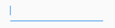
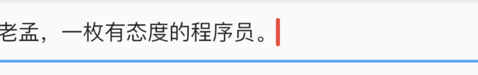
cursor表示光标,用法如下:
TextField(
  showCursor: true,
  cursorWidth: 3,
  cursorRadius: Radius.circular(10),
  cursorColor: Colors.red,
)
效果如下:
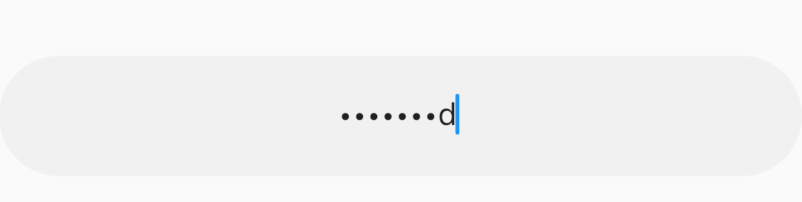
将输入框设置为密码框,只需obscureText属性设置true即可,用法如下:
TextField(
  obscureText: true,
)
通过inputFormatters可以限制用户输入的内容,比如只想让用户输入字符,设置如下:
TextField(
  inputFormatters: [
    WhitelistingTextInputFormatter(RegExp("[a-zA-Z]")),
  ],
)
这时用户是无法输入数字的。
onChanged是当内容发生变化时回调,onSubmitted是点击回车或者点击软键盘上的完成回调,onTap点击输入框时回调,用法如下:
TextField(
  onChanged: (value){
    print('onChanged:$value');
  },
  onEditingComplete: (){
    print('onEditingComplete');
  },

  onTap: (){
    print('onTap');
  },
)
输入框右下角经常需要字数统计,除了使用上面介绍的方法外,还可以使用buildCounter,建议使用此方法,用法如下:
TextField(
  maxLength: 100,
  buildCounter: (
    BuildContext context, {
    int currentLength,
    int maxLength,
    bool isFocused,
  }) {
    return Text(
      '$currentLength/$maxLength',
    );
  },
)
动态获取焦点
FocusScope.of(context).requestFocus(_focusNode);
_focusNode为TextField的focusNode:
_focusNode = FocusNode();

TextField(
	focusNode: _focusNode,
	...
)
动态失去焦点
_focusNode.unfocus();
过渡颜色的文字
Builder(
  builder: (BuildContext context) {
    RenderBox box = context.findRenderObject();
    final Shader linearGradient = LinearGradient(
      colors: <Color>[Colors.purple, Colors.blue],
    ).createShader(
        Rect.fromLTWH(0.0, 0.0, box?.size?.width, box?.size?.height));

    return Text(
      '老孟,专注分享Flutter技术和应用实战',
      style: new TextStyle(
          fontSize: 18.0,
          fontWeight: FontWeight.bold,
          foreground: Paint()..shader = linearGradient),
    );
  },
)

Builder组件是为了计算当前Text组件大小,生成LinearGradient。
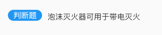
带前后置标签的文本
RichText(
  text: TextSpan(
      style: DefaultTextStyle.of(context).style,
      children: <InlineSpan>[
        WidgetSpan(
            child: Container(
              margin: EdgeInsets.only(right: 10),
              padding: EdgeInsets.symmetric(horizontal: 10),
              decoration: BoxDecoration(
                  shape: BoxShape.rectangle,
                  borderRadius: BorderRadius.all(Radius.circular(20)),
                  color: Colors.blue),
              child: Text(
                '判断题',
                style: TextStyle(color: Colors.white),
              ),
            )),
        TextSpan(text: '泡沫灭火器可用于带电灭火'),

      ]),
)
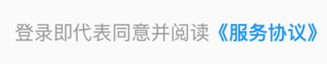
“服务协议”
通常在登录页面的底部会出现登录即代表同意并阅读 《服务协议》,其中《服务协议》为蓝色且可点击:
Text.rich(
  TextSpan(
      text: '登录即代表同意并阅读',
      style: TextStyle(fontSize: 11, color: Color(0xFF999999)),
      children: [
        TextSpan(
          text: '《服务协议》',
          style: TextStyle(color: Colors.blue, fontWeight: FontWeight.bold),
          recognizer: TapGestureRecognizer()
            ..onTap = () {
              print('onTap');
            },
        ),
      ]),
)
登录密码输入框
TextField(
  decoration: InputDecoration(
    fillColor: Color(0x30cccccc),
    filled: true,
    enabledBorder: OutlineInputBorder(
        borderSide: BorderSide(color: Color(0x00FF0000)),
        borderRadius: BorderRadius.all(Radius.circular(100))),
    hintText: '输入密码',
    focusedBorder: OutlineInputBorder(
        borderSide: BorderSide(color: Color(0x00000000)),
        borderRadius: BorderRadius.all(Radius.circular(100))),

  ),
  textAlign: TextAlign.center,
  obscureText: true,
  onChanged: (value) {

  },
)
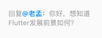
评论回复
Text.rich(
  TextSpan(
      text: '回复',
      style: TextStyle(fontSize: 11, color: Color(0xFF999999)),
      children: [
        TextSpan(
          text: '@老孟:',
          style: TextStyle(color: Colors.blue, fontWeight: FontWeight.bold),
          recognizer: TapGestureRecognizer()
            ..onTap = () {
              print('onTap');
            },
        ),
        TextSpan(
          text: '你好,想知道Flutter发展前景如何?',
        ),
      ]),
)
交流
老孟Flutter博客地址(330个控件用法):http://laomengit.com
欢迎加入Flutter交流群(微信:laomengit)、关注公众号【老孟Flutter】:
 |
 |