Overview:
Layout is the critcal component of an application's usability on a wide range of devices.
Layout process:
WPF layout takes place in two stages: a measure stage and an arrange stage. In the measure stage, the container loops through its child elements and asks them to provide their preferred size. In the arrange stage, the container places the child elements in the appropriate position.
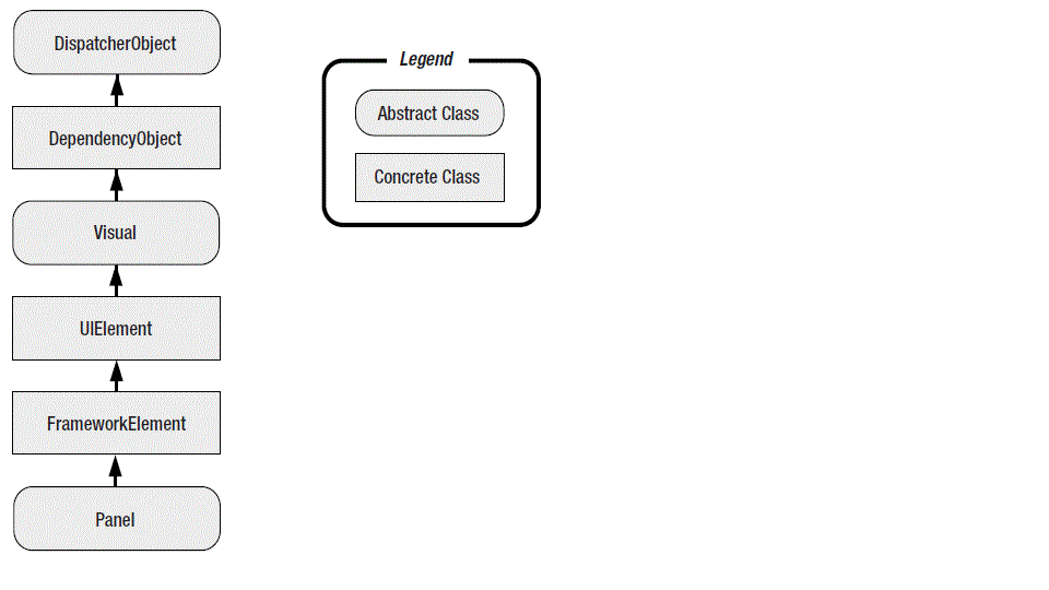
All the WPF layout containers are panels that derived from the abstract System.Windows.Controls.Panel class. There are small set of members in the Panel class, Including the three public properties:
Background: the brush that's used to paint the panel background. You must set this property to a non-null value if you want to receive mouse events.(Transparent is aslo OK)
Children: the collection of items that's stored in the panel.
IsItemsHost: that's true if the panel is being used to show the items that are assosicated with an ItemsControl (such as the nodes in a TreeView or the list entries in a ListBox) [I am not sure about this]
Canvas
1.Canvas position: Canvas can't use more than two of the Canvas attached properties. if you set the Canvas.Top and Canvas.Bottom simultaneously, Canvas.Bottom gets ignored.
<Canvas>
     <Button Background="Red"> Left= 0, Top = 0</Button>
     <Button Canvas.Left = "18" Canvas.Bottom="18" Background = "Orange">Left= 18, Top = 18</Button>
     <Button Canvas.Right = "18" Canvas.Bottom="18" Background = "Yellow">Right= 18, Top = 18</Button>
     <Button Canvas.Right = "0" Canvas.Bottom="0" Background = "Lime">Right= 0, Bottom = 0</Button>
     <Button Canvas.Right = "0" Canvas.Top="0" Background = "Aqua">Right= 0, Top = 0</Button>
     <Button Canvas.Left = "0" Canvas.Bottom="0" Background = "Magenta">Left= 0, Bottom = 0</Button>
  </Canvas>
2. Margin:"Partially, on the two sides used to position the element(Top and Left by default), the relevant two out of four margin values are added to the attached property values". Margin有4个值,只有两个相关的值(默认是Left, Top, 也可以是 Left, Bottom, 根据你的设置)被应用进来。
Stack Panel:
Basic code: If 'B' represents the button, and 'T' Represents the Label, the result will be like this: T B1 B2 B3 B4
<StackPanel Orientation="Horizontal">
<Label>A Button Stack</Label>
<Button>Button 1</Button>
<Button>Button 2</Button>
<Button>Button 3</Button>
<Button>Button 4</Button>
</StackPanel>
Properties:
HorizontalAlignment and VerticalAlignment: Partially, because the alignment is effectively ignored in the direction of stacking. For Oritentation= "Vertical". VerticalAlignment is meanless.
There are some code we can run to test:
<StackPanel>
     <Label HorizontalAlignment="Center">A Button Stack</Label>
     <Button HorizontalAlignment="Left">Button 1</Button>
     <Button HorizontalAlignment="Right">Button 2</Button>
     <Button>Button 3</Button>
     <Button>Button 4</Button>
  </StackPanel>
Margins:
Set a single value for all sides: <Button Margin="5">Button 3</Button>
Set a different value for each sides(left, top, right, bottom): <Button Margin="5,10,5,10">Button 3</Button>
Set a single value by code: cmd.Margin = new Thickness(5);
<StackPanel Margin="3">
<Label Margin="3" HorizontalAlignment="Center">A Button Stack</Label>
<Button Margin="3" HorizontalAlignment="Left">Button 1</Button>
<Button Margin="3" HorizontalAlignment="Right">Button 2</Button>
<Button Margin="3">Button 3</Button>
<Button Margin="3">Button 4</Button>
</StackPanel>
Minmum and Maximum, and Explicit sizes:
TIP: Think twice before setting an explicit size in WPF. In a well-designed layout, it shouldn’t be necessary. If
you do add size information, you risk creating a more brittle(易碎的) layout that can’t adapt to changes (such as different
languages and window sizes) and truncates your content.
WrapPanel:
<WrapPanel Margin="3">
<Button VerticalAlignment="Top">Top Button</Button>
<Button MinHeight="60">Tall Button 2</Button>
<Button VerticalAlignment="Bottom">Bottom Button</Button>
<Button>Stretch Button</Button>
<Button VerticalAlignment="Center">Centered Button</Button>
</WrapPanel>
HorizontalAlignment and VerticalAlignment:
Partially, Alignment can be used in the opposite direction of stacking, just like with StackPanel. But alignment can also be useful in the direction of stacking
DockPanel:
This example also sets teh LastChildFill to true, which tells the DockPanel to give the remaining space to the last element.
<DockPanel LastChildFill="True">
<Button DockPanel.Dock="Top">Top Button</Button>
<Button DockPanel.Dock="Bottom">Bottom Button</Button>
<Button DockPanel.Dock="Left">Left Button</Button>
<Button DockPanel.Dock="Right">Right Button</Button>
<Button>Remaining Space</Button>
</DockPanel>
You can dock several elements against the same siad, In this case, the elements simply stack up against the side in the order they're declared in your mackup.
<DockPanel LastChildFill="True">
<Button DockPanel.Dock="Top">A Stretched Top Button</Button>
<Button DockPanel.Dock="Top" HorizontalAlignment="Center">
A Centered Top Button</Button>
<Button DockPanel.Dock="Top" HorizontalAlignment="Left">
A Left-Aligned Top Button</Button>
<Button DockPanel.Dock="Bottom">Bottom Button</Button>
<Button DockPanel.Dock="Left">Left Button</Button>
<Button DockPanel.Dock="Right">Right Button</Button>
<Button>Remaining Space</Button>
</DockPanel>
Grid:
basic,
<Grid ShowGridLines="True">
 <Grid.RowDefinitions>
  <RowDefinition></RowDefinition>
  <RowDefinition></RowDefinition>
 </Grid.RowDefinitions>
 <Grid.ColumnDefinitions>
  <ColumnDefinition></ColumnDefinition>
  <ColumnDefinition></ColumnDefinition>
 <ColumnDefinition></ColumnDefinition>
 </Grid.ColumnDefinitions>
</Grid>
span,
<Grid ShowGridLines="True">
 <Grid.RowDefinitions>
  <RowDefinition Height="*"></RowDefinition>
  <RowDefinition Height="Auto"></RowDefinition>
 </Grid.RowDefinitions>
 <Grid.ColumnDefinitions>
  <ColumnDefinition Width="*"></ColumnDefinition>
  <ColumnDefinition Width="Auto"></ColumnDefinition>
  <ColumnDefinition Width="Auto"></ColumnDefinition>
 </Grid.ColumnDefinitions>
 <TextBox Margin="10" Grid.Row="0" Grid.Column="0" Grid.ColumnSpan="3">This is a test.</TextBox>
 <Button Margin="10,10,2,10" Padding="3"Grid.Row="1" Grid.Column="1">OK</Button>
<Button Margin="2,10,10,10" Padding="3" Grid.Row="1" Grid.Column="2">Cancel</Button>
</Grid>
spliter:
<Grid>
 <Grid.RowDefinitions>
  <RowDefinition></RowDefinition>
  <RowDefinition></RowDefinition>
 </Grid.RowDefinitions>
 <Grid.ColumnDefinitions>
  <ColumnDefinition MinWidth="100"></ColumnDefinition>
  <ColumnDefinition Width="Auto"></ColumnDefinition>
  <ColumnDefinition MinWidth="50"></ColumnDefinition>
 </Grid.ColumnDefinitions>
 <Button Grid.Row="0" Grid.Column="0" Margin="3">Left</Button>
 <Button Grid.Row="0" Grid.Column="2" Margin="3">Right</Button>
 <Button Grid.Row="1" Grid.Column="0" Margin="3">Left</Button>
 <Button Grid.Row="1" Grid.Column="2" Margin="3">Right</Button>
 <GridSplitter Grid.Row="0" Grid.Column="1" Grid.RowSpan="2" Width="3" VerticalAlignment="Stretch" HorizontalAlignment="Center" ShowsPreview="False"></GridSplitter>
</Grid>
the ShowsPreview property is set to false. As a result, when the splitter bar is dragged from one side to another, the columns are resized immediately. But if you set ShowsPreview to true, when you drag, you’ll see a gray shadow follow your mouse pointer to show you where the split will be. The columns won’t be resized until you release the mouse button. It’s also possible to use the arrow keys to resize a GridSplitter once it receives focus.
complex splitter:
<Grid>
<Grid.ColumnDefinitions>
<ColumnDefinition></ColumnDefinition>
<ColumnDefinition Width="Auto"></ColumnDefinition>
<ColumnDefinition></ColumnDefinition>
</Grid.ColumnDefinitions>
<!-- This is the nested Grid on the left.
It isn't subdivided further with a splitter. -->
<Grid Grid.Column="0" VerticalAlignment="Stretch">
<Grid.RowDefinitions>
<RowDefinition></RowDefinition>
<RowDefinition></RowDefinition>
</Grid.RowDefinitions>
<Button Margin="3" Grid.Row="0">Top Left</Button>
<Button Margin="3" Grid.Row="1">Bottom Left</Button>
</Grid>
<!-- This is the vertical splitter that sits between the two nested
(left and right) grids. -->
<GridSplitter Grid.Column="1"
Width="3" HorizontalAlignment="Center" VerticalAlignment="Stretch"
ShowsPreview="False"></GridSplitter>
<!-- This is the nested Grid on the right. -->
<Grid Grid.Column="2">
<Grid.RowDefinitions>
<RowDefinition></RowDefinition>
<RowDefinition Height="Auto"></RowDefinition>
<RowDefinition></RowDefinition>
</Grid.RowDefinitions>
<Button Grid.Row="0" Margin="3">Top Right</Button>
<Button Grid.Row="2" Margin="3">Bottom Right</Button>
<!-- This is the horizontal splitter that subdivides it into
a top and bottom region.. -->
<GridSplitter Grid.Row="1"
Height="3" VerticalAlignment="Center" HorizontalAlignment="Stretch"
ShowsPreview="False"></GridSplitter>
</Grid>
</Grid>
Shared sized group:
IsSharedSizeScope: You could use a shared size group to synchronize a separate Grid with column headers.
<Grid Margin="3" Background="LightYellow" ShowGridLines="True">
 <Grid.ColumnDefinitions>
  <ColumnDefinition Width="Auto" SharedSizeGroup="TextLabel"></ColumnDefinition>
  <ColumnDefinition Width="Auto"></ColumnDefinition>
  <ColumnDefinition></ColumnDefinition>
 </Grid.ColumnDefinitions>
 <Label Margin="5">A very long bit of text</Label>
 <Label Grid.Column="1" Margin="5">More text</Label>
 <TextBox Grid.Column="2" Margin="5">A text box</TextBox>
</Grid>
UniformGrid:
There is a grid that breaks all the rules you’ve learned about so far: the UniformGrid. Unlike the Grid, the
UniformGrid doesn’t require (or even support) predefined columns and rows. Instead, you simply set
the Rows and Columns properties to set its size. Each cell is always the same size because the available
space is divided equally. Finally, elements are placed into the appropriate cell based on the order in
which you define them. There are no attached Row and Column properties, and no blank cells.
<UniformGrid Rows="2" Columns="2">
<Button>Top Left</Button>
<Button>Top Right</Button>
<Button>Bottom Left</Button>
<Button>Bottom Right</Button>
</UniformGrid>
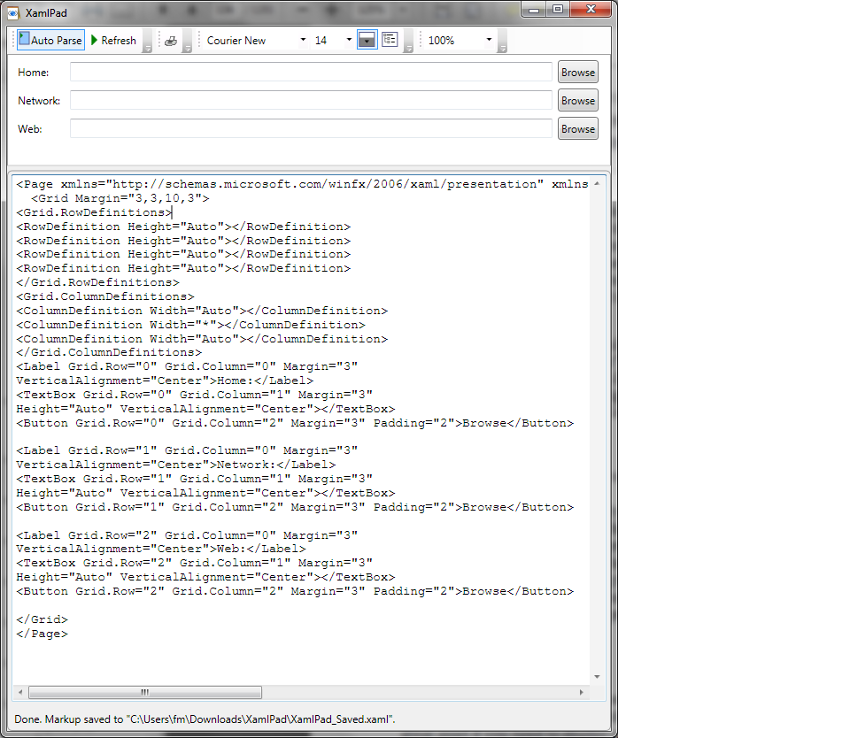
Layout Example: