1:web页面布局(topbar + main + footbar)
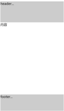
html代码:
<div class="container">
     <header>header...</header>
     <main>内容</main>
     <footer>footer...</footer>
   </div>
css代码
header{
  height:100px;
  background:#ccc;
}
footer{
  height:100px;
  background:#ccc;
}
.container{
  display:flex;
  flex-direction:column;
  height:100vh;
}
main{
  flex-grow:1;
}
1:使用flex-direction使整体布局从上向下布局
2:flex-grow:1使得main自动填充剩余的空间
2:每行的项目数固定并自动换行的列表项
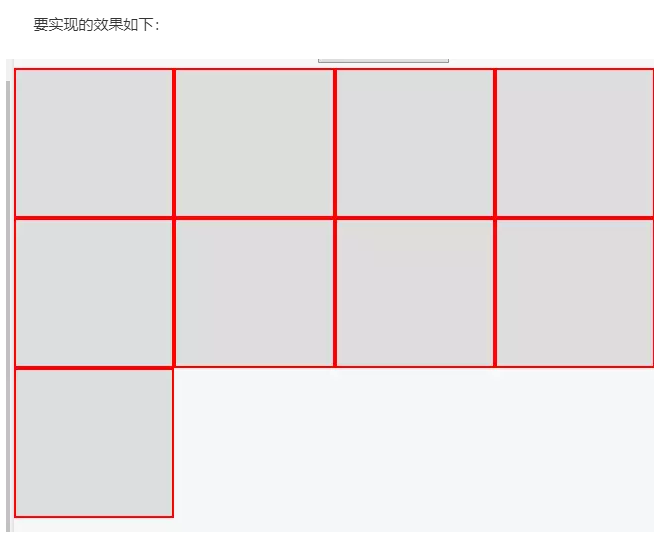
css代码
ul{
  display:flex;
  flex-wrap:wrap;
}
li{
  list-style:none;
  flex:0 0 25%;
  background:#ddd;
  height:100px;
  border:1px solid red;
}
1:flex:0 0 25%,相当于flex-basis:25%,使得每一个列表项的宽度占外层容器(本例中的ul元素)的25%,因此每行最多能够排开四个列表项。
2:flex-wrap:wrap,使得每行填满时会自动换行
3:实现自动划分多余空间的列表项
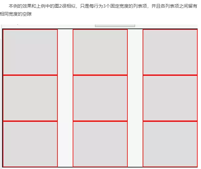
css代码
ul{
  display:flex;
  flex-wrap:wrap;
  justify-content:space-between;
  border:1px solid black;
}
li{
  list-style:none;
  120px;
  background:#ddd;
  height:100px;
  border:1px solid red;
}
1:justify-content:space-between;使主轴方向的多余空间平均分配在两两item之间
4:平均分配空间的栅格布局
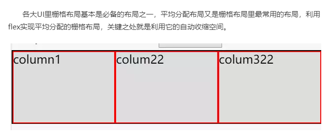
html代码
<div class="row">
         <div class="column">column1</div>
         <div  class="column">colum22</div>
         <div  class="column">colum322</div>
</div>
css代码
.row{
  display:flex;
  flex-wrap:wrap;
  border:1px solid black;
}
.column{
  list-style:none;
  background:#ddd;
  flex:1;
  height:100px;
  border:1px solid red;
}
flex:1 这里针对item应用了flex:1,相当于flex:1 1 0%,而之所以不管各个column元素内容的宽度为多大,都能均分到相等的空间,正式因为相当于在设置了flex-grow:1使得剩余空间按相等比例自动分配的同时又设置了flex-basis:0%,才使得整个空间都平均分配了(更详细的关于[flex]缩写属性,请戳重新认识flex缩写属性—[flex])。
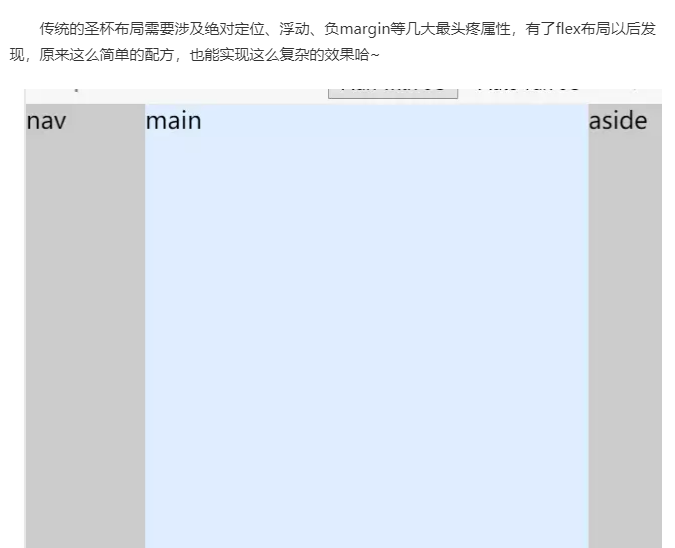
5:圣杯布局
html代码
<div class="container">
       <main>main</main>
       <aside>aside</aside>

       <nav>nav</nav>
</div>
css代码
.container{
  display:flex;
  height:100vh;
}
aside{
  50px;
  background:#ccc;
}
main{
  flex-grow:1;
  background:#def;
}
nav{
  80px;
  background:#ccc;
  order:-1;
}
- 对main用flex-grow:1,使得中间主元素空间自动扩充
- 对nav应用order:-1,使得order处于最左侧(html中main写在了最前,以利于优先加载主内容区)
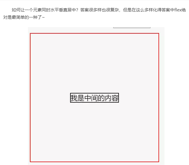
6:元素水平垂直居中
html代码
 <div class="container">
       <div class="inner">我是中间的内容</div>
 </div>
css代码
.container{
  height:300px;
  300px;
  border:1px solid red;
  display:flex;
  justify-content:center;
  align-items:center;
}

.inner{
  border:1px solid black;
}
- justify-content:center;使item元素水平居中
- align-items:center;使item元素垂直居中
这么多场景都难不倒flex有木有,果然名不虚传~( 想更详细的了解flex相关属性的话,请戳flex入门—了解这些flex属性~)