导航栏
熟练使用导航栏,对于任何网站都非常重要。
使用CSS你可以转换成好看的导航栏而不是枯燥的HTML菜单。
导航栏=链接列表
作为标准的HTML基础一个导航栏是必须的
。在我们的例子中我们将建立一个标准的HTML列表导航栏。
导航条基本上是一个链接列表,所以使用 <ul> 和 <li>元素非常有意义:
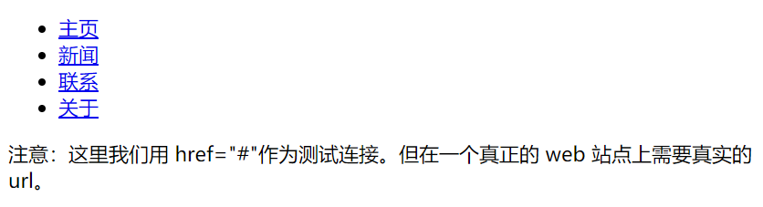
<!DOCTYPE html>
<html>
<head>
<meta charset="utf-8">
<title>1</title>
</head>
<body>
<ul>
<li><a href="#home">主页</a></li>
<li><a href="#news">新闻</a></li>
<li><a href="#contact">联系</a></li>
<li><a href="#about">关于</a></li>
</ul>

<p>注意:这里我们用 href="#"作为测试连接。但在一个真正的 web 站点上需要真实的 url。</p>

</body>
</html>
现在,让我们从列表中删除边距和填充:
<!DOCTYPE html>
<html>
<head>
<meta charset="utf-8">
<title>1</title>
<style>
ul
{
    list-style-type:none;
    margin:0;
    padding:0;
}
</style>
</head>
<body>
<ul>
<li><a href="#home">主页</a></li>
<li><a href="#news">新闻</a></li>
<li><a href="#contact">联系</a></li>
<li><a href="#about">关于</a></li>
</ul>
</body>
</html>

垂直导航栏
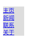
上面的代码,我们只需要 <a>元素的样式,建立一个垂直的导航栏:
<!DOCTYPE html>
<html>
<head>
<meta charset="utf-8">
<title>1</title>
<style>
ul {
  list-style-type: none;
  margin: 0;
  padding: 0;
}

li a {
  display: block;
  width: 60px;
  background-color: #dddddd;
}
</style>
</head>
<body>

<ul>
    <li><a href="#home">主页</a></li>
    <li><a href="#news">新闻</a></li>
    <li><a href="#contact">联系</a></li>
    <li><a href="#about">关于</a></li>
</ul>

<p>背景颜色添加到链接中显示链接的区域。</p>
<p>注意,整个区域是可点击的链接,而不仅仅是文本。</p>

</body>
</html>
示例说明:
- display:block - 显示块元素的链接,让整体变为可点击链接区域(不只是文本),它允许我们指定宽度
- 60px - 块元素默认情况下是最大宽度。我们要指定一个60像素的宽度
注意: 请务必指定 <a>元素在垂直导航栏的的宽度。如果省略宽度,IE6可能产生意想不到的效果。
垂直导航条实例
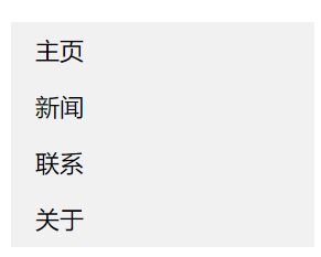
创建一个简单的垂直导航条实例,在鼠标移动到选项时,修改背景颜色:
<!DOCTYPE html>
<html>
<head>
<meta charset="utf-8">
<title>1</title>
<style>
ul {
    list-style-type: none;
    margin: 0;
    padding: 0;
    width: 200px;
    background-color: #f1f1f1;
}

li a {
    display: block;
    color: #000;
    padding: 8px 16px;
    text-decoration: none;
}

/* 鼠标移动到选项上修改背景颜色 */
li a:hover {
    background-color: #555;
    color: white;
}
</style>
</head>

<body>
<ul>
<li><a href="#home">主页</a></li>
<li><a href="#news">新闻</a></li>
<li><a href="#contact">联系</a></li>
<li><a href="#about">关于</a></li>
</ul>

<p>背景颜色添加到链接中显示链接的区域</p>
<p>注意,整个区域是可点击的链接,而不仅仅是文本。</p>
</body>
</html>
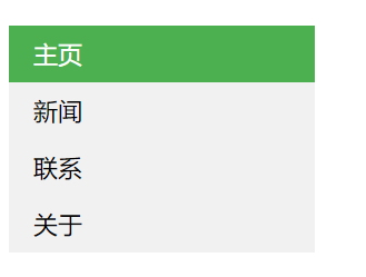
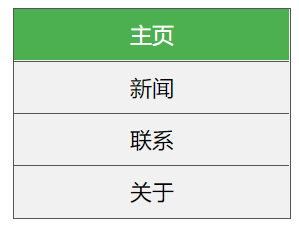
激活/当前导航条实例
<!DOCTYPE html>
<html>
<head>
<meta charset="utf-8">
<title>1</title>
<style>
ul {
    list-style-type: none;
    margin: 0;
    padding: 0;
    width: 200px;
    background-color: #f1f1f1;
}

li a {
    display: block;
    color: #000;
    padding: 8px 16px;
    text-decoration: none;
}

li a.active {
    background-color: #4CAF50;
    color: white;
}

li a:hover:not(.active) {
    background-color: #555;
    color: white;
}
</style>
</head>
<body>

<h2>垂直导航条</h2>
<p>在点击了选项后,我们可以添加 "active" 类来标准哪个选项被选中。</p>

<ul>
  <li><a class="active" href="#home">主页</a></li>
  <li><a href="#news">新闻</a></li>
  <li><a href="#contact">联系</a></li>
  <li><a href="#about">关于</a></li>
</ul>

</body>
</html>
<!DOCTYPE html>
<html>
<head>
<meta charset="utf-8">
<title>1</title>
<style>
ul {
    list-style-type: none;
    margin: 0;
    padding: 0;
    width: 200px;
    background-color: #f1f1f1;
    border: 1px solid #555;
}

li a {
    display: block;
    color: #000;
    padding: 8px 16px;
    text-decoration: none;
}

li {
    text-align: center;
    border-bottom: 1px solid #555;
}

li:last-child {
    border-bottom: none;
}

li a.active {
    background-color: #4CAF50;
    color: white;
}

li a:hover:not(.active) {
    background-color: #555;
    color: white;
}
</style>
</head>
<body>

<h2>垂直导航条</h2>
<p>以下实例让每个链接居中,并给每个列表选项添加边框。</p>

<ul>
  <li><a class="active" href="#home">主页</a></li>
  <li><a href="#news">新闻</a></li>
  <li><a href="#contact">联系</a></li>
  <li><a href="#about">关于</a></li>
</ul>

</body>
</html>
可以在 <li> or <a> 上添加text-align:center 样式来让链接居中。
可以在 border <ul> 上添加 border 属性来让导航栏有边框。如果要在每个选项上添加边框,可以在每个 <li> 元素上添加border-bottom
全屏高度的固定导航条
接下来我们创建一个左边是全屏高度的固定导航条,右边是可滚动的内容。
<!DOCTYPE html>
<html>
<head>
<meta charset="utf-8">
<title>1</title>
<style>
body {
    margin: 0;
}

ul {
    list-style-type: none;
    margin: 0;
    padding: 0;
    width: 25%;
    background-color: #f1f1f1;
    position: fixed;
    height: 100%;
    overflow: auto;
}

li a {
    display: block;
    color: #000;
    padding: 8px 16px;
    text-decoration: none;
}

li a.active {
    background-color: #4CAF50;
    color: white;
}

li a:hover:not(.active) {
    background-color: #555;
    color: white;
}
</style>
</head>
<body>

<ul>
  <li><a class="active" href="#home">主页</a></li>
  <li><a href="#news">新闻</a></li>
  <li><a href="#contact">联系</a></li>
  <li><a href="#about">关于</a></li>
</ul>

<div style="margin-left:25%;padding:1px 16px;height:1000px;">
  <h2>Fixed Full-height Side Nav</h2>
  <h3>Try to scroll this area, and see how the sidenav sticks to the page</h3>
  <p>Notice that this div element has a left margin of 25%. This is because the side navigation is set to 25% width. If you remove the margin, the sidenav will overlay/sit on top of this div.</p>
  <p>Also notice that we have set overflow:auto to sidenav. This will add a scrollbar when the sidenav is too long (for example if it has over 50 links inside of it).</p>
  <p>Some text..</p>
  <p>Some text..</p>
  <p>Some text..</p>
  <p>Some text..</p>
  <p>Some text..</p>
  <p>Some text..</p>
  <p>Some text..</p>
</div>

</body>
</html>
