一丶numpy和matplotlib学习笔记
1.

NumPy是Python语言的一个扩充程序库。支持高级大量的维度数组与矩阵运算,此外也针对数组运算提供大量的数学函数库。Numpy内部解除了Python的PIL(全局解释器锁),运算效率极好,是大量机器学习框架的基础库!
接下来让我们看看Numpy的简单应用
Numpy简单创建数组
import numpy as np
# 创建简单的列表
a = [1, 2, 3, 4]
# 将列表转换为数组
b = np.array(b)
Numpy查看数组属性
数组元素个数
b.size
数组形状
b.shape
数组维度
b.ndim
数组元素类型
b.dtype
快速创建N维数组的api函数
- 创建10行10列的数值为浮点1的矩阵
array_one = np.ones([10, 10])
- 创建10行10列的数值为浮点0的矩阵
array_zero = np.zeros([10, 10])
- 从现有的数据创建数组
- array(深拷贝)
- asarray(浅拷贝)
Numpy创建随机数组np.random
-
均匀分布
np.random.rand(10, 10)创建指定形状(示例为10行10列)的数组(范围在0至1之间)np.random.uniform(0, 100)创建指定范围内的一个数np.random.randint(0, 100)创建指定范围内的一个整数
-
正态分布
给定均值/标准差/维度的正态分布
np.random.normal(1.75, 0.1, (2, 3))
- 数组的索引, 切片
# 正态生成4行5列的二维数组
arr = np.random.normal(1.75, 0.1, (4, 5))
print(arr)
# 截取第1至2行的第2至3列(从第0行算起)
after_arr = arr[1:3, 2:4]
print(after_arr)
数组索引

- 改变数组形状(要求前后元素个数匹配)
改变数组形状

print("reshape函数的使用!")
one_20 = np.ones([20])
print("-->1行20列<--")
print (one_20)

one_4_5 = one_20.reshape([4, 5])
print("-->4行5列<--")
print (one_4_5)
Numpy计算(重要)
条件运算
原始数据

条件判断

import numpy as np
stus_score = np.array([[80, 88], [82, 81], [84, 75], [86, 83], [75, 81]])
stus_score > 80
三目运算

import numpy as np
stus_score = np.array([[80, 88], [82, 81], [84, 75], [86, 83], [75, 81]])
np.where(stus_score < 80, 0, 90)
统计运算
-
指定轴最大值
amax(参数1: 数组; 参数2: axis=0/1; 0表示列1表示行)
求最大值

stus_score = np.array([[80, 88], [82, 81], [84, 75], [86, 83], [75, 81]])
# 求每一列的最大值(0表示列)
print("每一列的最大值为:")
result = np.amax(stus_score, axis=0)
print(result)

print("每一行的最大值为:")
result = np.amax(stus_score, axis=1)
print(result)
-
指定轴最小值
amin
求最小值

stus_score = np.array([[80, 88], [82, 81], [84, 75], [86, 83], [75, 81]])
# 求每一行的最小值(0表示列)
print("每一列的最小值为:")
result = np.amin(stus_score, axis=0)
print(result)

# 求每一行的最小值(1表示行)
print("每一行的最小值为:")
result = np.amin(stus_score, axis=1)
print(result)
-
指定轴平均值
mean
求平均值

stus_score = np.array([[80, 88], [82, 81], [84, 75], [86, 83], [75, 81]])
# 求每一行的平均值(0表示列)
print("每一列的平均值:")
result = np.mean(stus_score, axis=0)
print(result)

# 求每一行的平均值(1表示行)
print("每一行的平均值:")
result = np.mean(stus_score, axis=1)
print(result)
-
方差
std
求方差

stus_score = np.array([[80, 88], [82, 81], [84, 75], [86, 83], [75, 81]])
# 求每一行的方差(0表示列)
print("每一列的方差:")
result = np.std(stus_score, axis=0)
print(result)

# 求每一行的方差(1表示行)
print("每一行的方差:")
result = np.std(stus_score, axis=1)
print(result)
数组运算
-
数组与数的运算
加法

stus_score = np.array([[80, 88], [82, 81], [84, 75], [86, 83], [75, 81]])
print("加分前:")
print(stus_score)

# 为所有平时成绩都加5分
stus_score[:, 0] = stus_score[:, 0]+5
print("加分后:")
print(stus_score)
乘法

stus_score = np.array([[80, 88], [82, 81], [84, 75], [86, 83], [75, 81]])
print("减半前:")
print(stus_score)

# 平时成绩减半
stus_score[:, 0] = stus_score[:, 0]*0.5
print("减半后:")
print(stus_score)
-
数组间也支持加减乘除运算,但基本用不到
image.png

a = np.array([1, 2, 3, 4])
b = np.array([10, 20, 30, 40])
c = a + b
d = a - b
e = a * b
f = a / b
print("a+b为", c)
print("a-b为", d)
print("a*b为", e)
print("a/b为", f)
矩阵运算np.dot()(非常重要)
根据权重计算成绩

-
计算规则
(M行, N列) * (N行, Z列) = (M行, Z列)
矩阵计算总成绩

stus_score = np.array([[80, 88], [82, 81], [84, 75], [86, 83], [75, 81]])
# 平时成绩占40% 期末成绩占60%, 计算结果
q = np.array([[0.4], [0.6]])
result = np.dot(stus_score, q)
print("最终结果为:")
print(result)
-
矩阵拼接
- 矩阵垂直拼接
垂直拼接

print("v1为:")
v1 = [[0, 1, 2, 3, 4, 5],
      [6, 7, 8, 9, 10, 11]]
print(v1)
print("v2为:")
v2 = [[12, 13, 14, 15, 16, 17],
      [18, 19, 20, 21, 22, 23]]
print(v2)
# 垂直拼接
result = np.vstack((v1, v2))
print("v1和v2垂直拼接的结果为")
print(result)
- 矩阵水平拼接
水平拼接

print("v1为:")
v1 = [[0, 1, 2, 3, 4, 5],
      [6, 7, 8, 9, 10, 11]]
print(v1)
print("v2为:")
v2 = [[12, 13, 14, 15, 16, 17],
      [18, 19, 20, 21, 22, 23]]
print(v2)
# 垂直拼接
result = np.hstack((v1, v2))
print("v1和v2水平拼接的结果为")
print(result)
Numpy读取数据np.genfromtxt
csv文件以逗号分隔数据

读取csv格式的文件

如果数值据有无法识别的值出现,会以
nan显示,nan相当于np.nan,为float类型.
Matplotlib 是Python中类似 MATLAB 的绘图工具,熟悉 MATLAB 也可以很快的上手 Matplotlib。
1. 认识Matploblib
1.1 Figure
在任何绘图之前,我们需要一个Figure对象,可以理解成我们需要一张画板才能开始绘图。
import matplotlib.pyplot as plt
fig = plt.figure()
1.2 Axes
在拥有Figure对象之后,在作画前我们还需要轴,没有轴的话就没有绘图基准,所以需要添加Axes。也可以理解成为真正可以作画的纸。
fig = plt.figure()
ax = fig.add_subplot(111)
ax.set(xlim=[0.5, 4.5], ylim=[-2, 8], title='An Example Axes',
ylabel='Y-Axis', xlabel='X-Axis')
plt.show()
上的代码,在一幅图上添加了一个Axes,然后设置了这个Axes的X轴以及Y轴的取值范围(这些设置并不是强制的,后面会再谈到关于这些设置),效果如下图:
对于上面的fig.add_subplot(111)就是添加Axes的,参数的解释的在画板的第1行第1列的第一个位置生成一个Axes对象来准备作画。也可以通过fig.add_subplot(2, 2, 1)的方式生成Axes,前面两个参数确定了面板的划分,例如 2, 2会将整个面板划分成 2 * 2 的方格,第三个参数取值范围是 [1, 2*2] 表示第几个Axes。如下面的例子:
fig = plt.figure()
ax1 = fig.add_subplot(221)
ax2 = fig.add_subplot(222)
ax3 = fig.add_subplot(224)
1.3 Multiple Axes
可以发现我们上面添加 Axes 似乎有点弱鸡,所以提供了下面的方式一次性生成所有 Axes:
fig, axes = plt.subplots(nrows=2, ncols=2)
axes[0,0].set(title='Upper Left')
axes[0,1].set(title='Upper Right')
axes[1,0].set(title='Lower Left')
axes[1,1].set(title='Lower Right')
fig 还是我们熟悉的画板, axes 成了我们常用二维数组的形式访问,这在循环绘图时,额外好用。
1.4 Axes Vs .pyplot
相信不少人看过下面的代码,很简单并易懂,但是下面的作画方式只适合简单的绘图,快速的将图绘出。在处理复杂的绘图工作时,我们还是需要使用 Axes 来完成作画的。
plt.plot([1, 2, 3, 4], [10, 20, 25, 30], color='lightblue', linewidth=3)
plt.xlim(0.5, 4.5)
plt.show()
2. 基本绘图2D
2.1 线
plot()函数画出一系列的点,并且用线将它们连接起来。看下例子:
x = np.linspace(0, np.pi)
y_sin = np.sin(x)
y_cos = np.cos(x)
ax1.plot(x, y_sin)
ax2.plot(x, y_sin, 'go--', linewidth=2, markersize=12)
ax3.plot(x, y_cos, color='red', marker='+', linestyle='dashed')
在上面的三个Axes上作画。plot,前面两个参数为x轴、y轴数据。ax2的第三个参数是 MATLAB风格的绘图,对应ax3上的颜色,marker,线型。
另外,我们可以通过关键字参数的方式绘图,如下例:
x = np.linspace(0, 10, 200)
data_obj = {'x': x,
'y1': 2 * x + 1,
'y2': 3 * x + 1.2,
'mean': 0.5 * x * np.cos(2*x) + 2.5 * x + 1.1}
fig, ax = plt.subplots()
#填充两条线之间的颜色
ax.fill_between('x', 'y1', 'y2', color='yellow', data=data_obj)
# Plot the "centerline" with `plot`
ax.plot('x', 'mean', color='black', data=data_obj)
plt.show()
发现上面的作图,在数据部分只传入了字符串,这些字符串对一个这 data_obj 中的关键字,当以这种方式作画时,将会在传入给 data 中寻找对应关键字的数据来绘图。
2.2 散点图
只画点,但是不用线连接起来。
x = np.arange(10)
y = np.random.randn(10)
plt.scatter(x, y, color='red', marker='+')
plt.show()
2.3 条形图
条形图分两种,一种是水平的,一种是垂直的,见下例子:
np.random.seed(1)
x = np.arange(5)
y = np.random.randn(5)
fig, axes = plt.subplots(ncols=2, figsize=plt.figaspect(1./2))
vert_bars = axes[0].bar(x, y, color='lightblue', align='center')
horiz_bars = axes[1].barh(x, y, color='lightblue', align='center')
#在水平或者垂直方向上画线
axes[0].axhline(0, color='gray', linewidth=2)
axes[1].axvline(0, color='gray', linewidth=2)
plt.show()
条形图还返回了一个Artists 数组,对应着每个条形,例如上图 Artists 数组的大小为5,我们可以通过这些 Artists 对条形图的样式进行更改,如下例:
fig, ax = plt.subplots()
vert_bars = ax.bar(x, y, color='lightblue', align='center')
# We could have also done this with two separate calls to `ax.bar` and numpy boolean indexing.
for bar, height in zip(vert_bars, y):
if height < 0:
bar.set(edgecolor='darkred', color='salmon', linewidth=3)
plt.show()
2.4 直方图
直方图用于统计数据出现的次数或者频率,有多种参数可以调整,见下例:
np.random.seed(19680801)
n_bins = 10
x = np.random.randn(1000, 3)
fig, axes = plt.subplots(nrows=2, ncols=2)
ax0, ax1, ax2, ax3 = axes.flatten()
colors = ['red', 'tan', 'lime']
ax0.hist(x, n_bins, density=True, histtype='bar', color=colors, label=colors)
ax0.legend(prop={'size': 10})
ax0.set_title('bars with legend')
ax1.hist(x, n_bins, density=True, histtype='barstacked')
ax1.set_title('stacked bar')
ax2.hist(x, histtype='barstacked', rwidth=0.9)
ax3.hist(x[:, 0], rwidth=0.9)
ax3.set_title('different sample sizes')
fig.tight_layout()
plt.show()
参数中density控制Y轴是概率还是数量,与返回的第一个的变量对应。histtype控制着直方图的样式,默认是 ‘bar’,对于多个条形时就相邻的方式呈现如子图1, ‘barstacked’ 就是叠在一起,如子图2、3。 rwidth 控制着宽度,这样可以空出一些间隙,比较图2、3. 图4是只有一条数据时。
2.5 饼图
labels = 'Frogs', 'Hogs', 'Dogs', 'Logs'
sizes = [15, 30, 45, 10]
explode = (0, 0.1, 0, 0) # only "explode" the 2nd slice (i.e. 'Hogs')
fig1, (ax1, ax2) = plt.subplots(2)
ax1.pie(sizes, labels=labels, autopct='%1.1f%%', shadow=True)
ax1.axis('equal')
ax2.pie(sizes, autopct='%1.2f%%', shadow=True, startangle=90, explode=explode,
pctdistance=1.12)
ax2.axis('equal')
ax2.legend(labels=labels, loc='upper right')
plt.show()
饼图自动根据数据的百分比画饼.。labels是各个块的标签,如子图一。autopct=%1.1f%%表示格式化百分比精确输出,explode,突出某些块,不同的值突出的效果不一样。pctdistance=1.12百分比距离圆心的距离,默认是0.6.
2.6 箱形图
为了专注于如何画图,省去数据的处理部分。 data 的 shape 为 (n, ), data2 的 shape 为 (n, 3)。
fig, (ax1, ax2) = plt.subplots(2)
ax1.boxplot(data)
ax2.boxplot(data2, vert=False) #控制方向
2.7 泡泡图
散点图的一种,加入了第三个值 s 可以理解成普通散点,画的是二维,泡泡图体现了Z的大小,如下例:
np.random.seed(19680801)
N = 50
x = np.random.rand(N)
y = np.random.rand(N)
colors = np.random.rand(N)
area = (30 * np.random.rand(N))**2 # 0 to 15 point radii
plt.scatter(x, y, s=area, c=colors, alpha=0.5)
plt.show()
2.8 等高线(轮廓图)
有时候需要描绘边界的时候,就会用到轮廓图,机器学习用的决策边界也常用轮廓图来绘画,见下例:
fig, (ax1, ax2) = plt.subplots(2)
x = np.arange(-5, 5, 0.1)
y = np.arange(-5, 5, 0.1)
xx, yy = np.meshgrid(x, y, sparse=True)
z = np.sin(xx**2 + yy**2) / (xx**2 + yy**2)
ax1.contourf(x, y, z)
ax2.contour(x, y, z)
上面画了两个一样的轮廓图,contourf会填充轮廓线之间的颜色。数据x, y, z通常是具有相同 shape 的二维矩阵。x, y 可以为一维向量,但是必需有 z.shape = (y.n, x.n) ,这里 y.n 和 x.n 分别表示x、y的长度。Z通常表示的是距离X-Y平面的距离,传入X、Y则是控制了绘制等高线的范围。
3 布局、图例说明、边界等
3.1区间上下限
当绘画完成后,会发现X、Y轴的区间是会自动调整的,并不是跟我们传入的X、Y轴数据中的最值相同。为了调整区间我们使用下面的方式:
ax.set_xlim([xmin, xmax]) #设置X轴的区间
ax.set_ylim([ymin, ymax]) #Y轴区间
ax.axis([xmin, xmax, ymin, ymax]) #X、Y轴区间
ax.set_ylim(bottom=-10) #Y轴下限
ax.set_xlim(right=25) #X轴上限
具体效果见下例:
x = np.linspace(0, 2*np.pi)
y = np.sin(x)
fig, (ax1, ax2) = plt.subplots(2)
ax1.plot(x, y)
ax2.plot(x, y)
ax2.set_xlim([-1, 6])
ax2.set_ylim([-1, 3])
plt.show()
可以看出修改了区间之后影响了图片显示的效果。
3.2 图例说明
我们如果我们在一个Axes上做多次绘画,那么可能出现分不清哪条线或点所代表的意思。这个时间添加图例说明,就可以解决这个问题了,见下例:
fig, ax = plt.subplots()
ax.plot([1, 2, 3, 4], [10, 20, 25, 30], label='Philadelphia')
ax.plot([1, 2, 3, 4], [30, 23, 13, 4], label='Boston')
ax.scatter([1, 2, 3, 4], [20, 10, 30, 15], label='Point')
ax.set(ylabel='Temperature (deg C)', xlabel='Time', title='A tale of two cities')
ax.legend()
plt.show()
在绘图时传入 label 参数,并最后调用ax.legend()显示体力说明,对于 legend 还是传入参数,控制图例说明显示的位置:
Location String Location Code
‘best’ 0
‘upper right’ 1
‘upper left’ 2
‘lower left’ 3
‘lower right’ 4
‘right’ 5
‘center left’ 6
‘center right’ 7
‘lower center’ 8
‘upper center’ 9
‘center’ 10
3.3 区间分段
默认情况下,绘图结束之后,Axes 会自动的控制区间的分段。见下例:
data = [('apples', 2), ('oranges', 3), ('peaches', 1)]
fruit, value = zip(*data)
fig, (ax1, ax2) = plt.subplots(2)
x = np.arange(len(fruit))
ax1.bar(x, value, align='center', color='gray')
ax2.bar(x, value, align='center', color='gray')
ax2.set(xticks=x, xticklabels=fruit)
#ax.tick_params(axis='y', direction='inout', length=10) #修改 ticks 的方向以及长度
plt.show()
上面不仅修改了X轴的区间段,并且修改了显示的信息为文本。
3.4 布局
当我们绘画多个子图时,就会有一些美观的问题存在,例如子图之间的间隔,子图与画板的外边间距以及子图的内边距,下面说明这个问题:
fig, axes = plt.subplots(2, 2, figsize=(9, 9))
fig.subplots_adjust(wspace=0.5, hspace=0.3,
left=0.125, right=0.9,
top=0.9, bottom=0.1)
#fig.tight_layout() #自动调整布局,使标题之间不重叠
plt.show()
通过fig.subplots_adjust()我们修改了子图水平之间的间隔wspace=0.5,垂直方向上的间距hspace=0.3,左边距left=0.125 等等,这里数值都是百分比的。以 [0, 1] 为区间,选择left、right、bottom、top 注意 top 和 right 是 0.9 表示上、右边距为百分之10。不确定如果调整的时候,fig.tight_layout()是一个很好的选择。之前说到了内边距,内边距是子图的,也就是 Axes 对象,所以这样使用 ax.margins(x=0.1, y=0.1),当值传入一个值时,表示同时修改水平和垂直方向的内边距。
观察上面的四个子图,可以发现他们的X、Y的区间是一致的,而且这样显示并不美观,所以可以调整使他们使用一样的X、Y轴:
fig, (ax1, ax2) = plt.subplots(1, 2, sharex=True, sharey=True)
ax1.plot([1, 2, 3, 4], [1, 2, 3, 4])
ax2.plot([3, 4, 5, 6], [6, 5, 4, 3])
plt.show()
3.5 轴相关
改变边界的位置,去掉四周的边框:
fig, ax = plt.subplots()
ax.plot([-2, 2, 3, 4], [-10, 20, 25, 5])
ax.spines['top'].set_visible(False) #顶边界不可见
ax.xaxis.set_ticks_position('bottom') # ticks 的位置为下方,分上下的。
ax.spines['right'].set_visible(False) #右边界不可见
ax.yaxis.set_ticks_position('left')
# "outward"
# 移动左、下边界离 Axes 10 个距离
#ax.spines['bottom'].set_position(('outward', 10))
#ax.spines['left'].set_position(('outward', 10))
# "data"
# 移动左、下边界到 (0, 0) 处相交
ax.spines['bottom'].set_position(('data', 0))
ax.spines['left'].set_position(('data', 0))
# "axes"
# 移动边界,按 Axes 的百分比位置
#ax.spines['bottom'].set_position(('axes', 0.75))
#ax.spines['left'].set_position(('axes', 0.3))
plt.show()
-
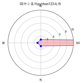
二.pands,numpy,matplotlib的应用(雷达图)
# encoding: utf-8
import pandas as pd
import numpy as np
import matplotlib.pyplot as plt

plt.rcParams['font.sans-serif'] = ['KaiTi']  # 显示中文
labels = np.array([u'100', u'90', u'80',u'70']) # 标签
dataLenth = 4  # 数据长度
data_radar = np.array([70, 1, 1, 1]) # 数据
angles = np.linspace(0, 2*np.pi, dataLenth, endpoint=False)  # 分割圆周长
data_radar = np.concatenate((data_radar, [data_radar[0]]))  # 闭合
angles = np.concatenate((angles, [angles[0]]))  # 闭合
plt.polar(angles, data_radar, 'bo-', linewidth=1)  # 做极坐标系
plt.thetagrids(angles * 180/np.pi, labels)  # 做标签
plt.fill(angles, data_radar, facecolor='r', alpha=0.25)# 填充
plt.ylim(0, 10)
plt.title(u'03帅小莫的python123成绩')
plt.show()
效果如下
三.Python自定义手绘风
1.在命令行安装Pillow及numpy库
pip install Pillow
pip install numpy
2.代码
# encoding: utf-8
from PIL import Image
import numpy as np

a = np.asarray(Image.open(r'C:Userswg-2Desktop	img.jpg').convert('L')).astype('float')

depth = 10.  # (0-100)
grad = np.gradient(a)  # 取图像灰度的梯度值
grad_x, grad_y = grad  # 分别取横纵图像梯度值
grad_x = grad_x * depth / 100.
grad_y = grad_y * depth / 100.
A = np.sqrt(grad_x ** 2 + grad_y ** 2 + 1.)
uni_x = grad_x / A
uni_y = grad_y / A
uni_z = 1. / A

vec_el = np.pi / 2.2  # 光源的俯视角度,弧度值
vec_az = np.pi / 4.  # 光源的方位角度,弧度值
dx = np.cos(vec_el) * np.cos(vec_az)  # 光源对x 轴的影响
dy = np.cos(vec_el) * np.sin(vec_az)  # 光源对y 轴的影响
dz = np.sin(vec_el)  # 光源对z 轴的影响

b = 255 * (dx * uni_x + dy * uni_y + dz * uni_z)  # 光源归一化
b = b.clip(0, 255)

im = Image.fromarray(b.astype('uint8'))  # 重构图像
im.save(r'C:Userswg-2Desktop1.jpg')
3.效果如下
原图:

手绘图:

ps :是不是很美呢?你还可以根据自己爱好修改各种数值使手绘风更加贴近个人哦~
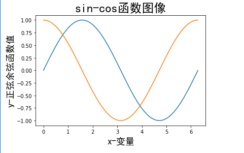
四.Python绘制数学或物理规律曲线
我们大家都学过正弦余弦的公式,也画过它的图像,现在我们通过python的numpy以及matplotlib库将它画出来,
直接上代码,不懂的往回翻。
代码:
import numpy as np
import pylab as pl
import matplotlib.font_manager as fm
import matplotlib
t=np.arange(0.0,2.0*np.pi,0.01)
s=np.sin(t)
z=np.cos(t)
pl.plot(t,s,label='正弦')
pl.plot(t,z,label='余弦')
pl.xlabel('x-变量',fontproperties='SimHei',fontsize=18)
pl.ylabel('y-正弦余弦函数值',fontproperties='SimHei',fontsize=18)
pl.title('sin-cos函数图像',fontproperties='SimHei',fontsize=24)
pl.show()
效果如下:
当然利用这个可以画其他的更多的更复杂数学公式及物理公式,这就要看你们是否想要去实现了~