以下是从张鑫旭的博客中摘过来的
1.修改图标颜色的方法 (原文:https://www.zhangxinxu.com/wordpress/2018/11/css-change-icon-color/)
css:
.colorful {
    display: inline-block;
    width: 32px; height: 32px;
    background-color: #f4615c;
    -webkit-mask: url('http://static.fdc.com.cn/homem/images/tpl/location.svg') no-repeat;
    mask: url('http://static.fdc.com.cn/homem/images/tpl/location.svg') no-repeat;
    -webkit-mask-size: 100% 100%;
    mask-size: 100% 100%;
}
html:<span class="colorful" ></span>
使图标变成黑色或白色的css代码为:黑filter: brightness(0); 白 filter: brightness(1);
2.关于页面平滑滚动的 https://www.zhangxinxu.com/wordpress/2018/10/scroll-behavior-scrollintoview-%E5%B9%B3%E6%BB%91%E6%BB%9A%E5%8A%A8/
2.1 tab内平滑滚动
scss:
.img-wraper{
  width:100%;
  margin:0 auto;
  height:200px;
  scroll-behavior: smooth;
  overflow: hidden;
}
.img-item{
  width:100%;
  height:100%;
  position: relative;
  overflow: hidden;
  input{
    position: absolute;
    top:0;
    height: 100%; width: 1px;
  }
  img{
    width:100%;
    height:100%;
  }
}
html:
 <div class="label-wraper">
    <label class="label" for="jp1">选项卡1</label>
    <label class="label" for="jp2">选项卡2</label>
    <label class="label" for="jp3">选项卡3</label>
  </div>
  <ul class="img-wraper">
    <li class="img-item" >
      <input id="jp1">
      <img src="./images/bg1.jpg">
    </li>
    <li class="img-item" >
      <input id="jp2">
      <img src="./images/bg2.jpg">
    </li>
    <li class="img-item" >
      <input id="jp3">
      <img src="./images/bg3.jpg">
    </li>
  </ul>
获取段落里的第一个字符可使用::first-letter
3、用右至左,从上至下的文本排列方式,css代码如下
.verticle-mode {
    writing-mode: tb-rl;
    -webkit-writing-mode: vertical-rl;
    writing-mode: vertical-rl;
    *writing-mode: tb-rl;
}
4、 https://www.zhangxinxu.com/wordpress/2018/12/css-position-sticky/
postion:sticky 可以看作是position:relative和position:fixed的结合体——当元素在屏幕内,表现为relative,就要滚出显示器屏幕的时候,表现为fixed
两个关键点:
- 定位用的
bottom,效果和top正好是对立的。设置top粘滞的元素随着往下滚动,是先滚动后固定;而设置bottom粘滞的元素则是先固定,后滚动;(设置bottom时,bottom的值是相对于浏览器窗口的。若值较小,在本该文档流竖排下来的下方时此值失效,按照文档流来。) z-index:-1让网友评论footer元素藏在了content的后面,于是才有了“犹抱琵琶半遮面”的效果。
5、不定高的标签展示与隐藏添加动画
.parent{
    &.open{
            .chapter_list_box{
                transform:scaleY(1);
                height: auto;
                transition: all 0.5s ease;
            }
        }
}
.chapter_list_box{
            transform:scaleY(0);
            height: 0;
            overflow: hidden;
            transition: all 0.5s ease;
        }
若只想利用高度来做动画,height值不能为auto,需要是一个固定的值才能生效。
6、scroll-snap场景—— 滑动依次显示人物角色
ul {
    width: 375px; height: 667px;
    scroll-snap-type: x mandatory;
    -webkit-overflow-scrolling: touch;
    white-space: nowrap;
    overflow-y: hidden;
}
li {
    display: inline-block;
    width: 100%; height: 100%;
    scroll-snap-align: center;
}
7、当浮动元素与他兄弟元素(无浮动)两者任一一个元素添加margin-top,两者都一起往下移。
8、clip-path 用法详解请移步https://www.cnblogs.com/liangdecha/p/9629150.html 生成clip-path工具网址https://www.html.cn/tool/css-clip-path/
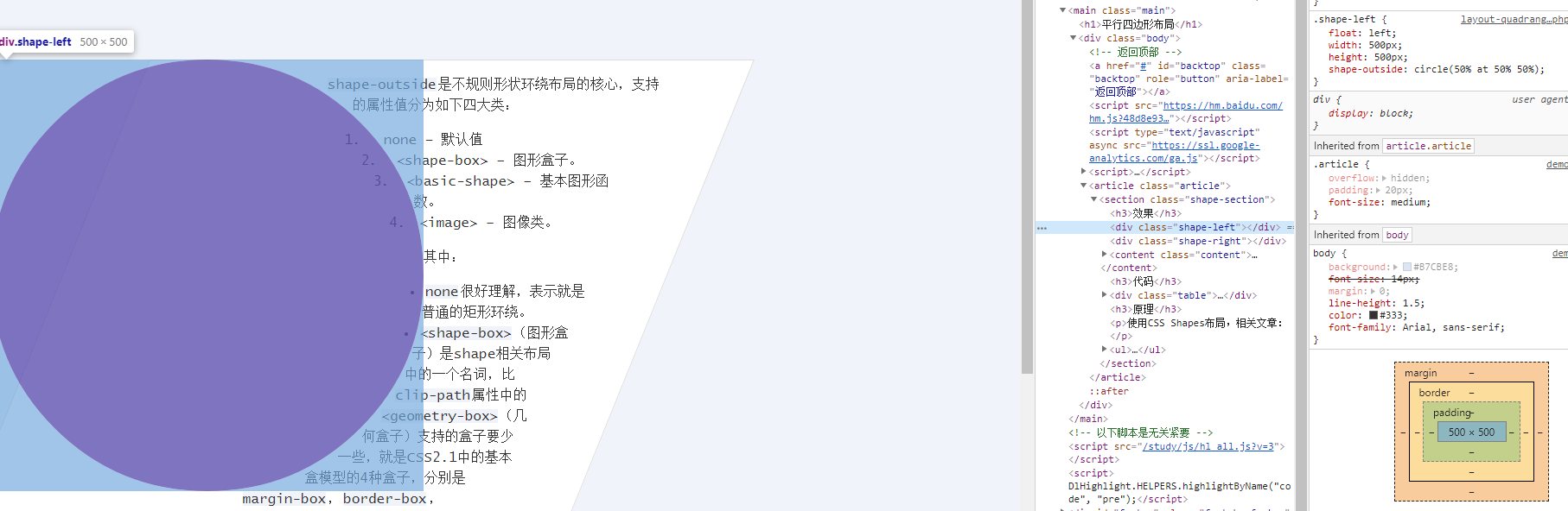
9、写不规则布局可以使用shape-outside,其值的设置跟clip-path大致相同。
shape-outside的css属性定义了一个可以是非矩形的形状,相邻的内联内容应围绕该形状进行包装。 默认情况下,内联内容包围其边距框; shape-outside提供了一种自定义此包装的方法,可以将文本包装在复杂对象周围而不是简单的框中。