transform:动画 在元素上各种方向偏移,而position 适用布局而来
position 是为页面布局而生的。
transform 是为动画而生的。
A.transform


 1 <!DOCTYPE html>
 2 <html lang="en">
 3 <head>
 4     <meta charset="UTF-8">
 5     <title>Document</title>
 6     <style>
 7     div{
 8         height: 60px;overflow: hidden; border: 1px solid black
 9     }
10 li{
11     width: 100px;height: 30px;background-color: red;
12     transform: translateY(50px);opacity: 0.9;transition: transform 0.5s;z-index: -1;position: relative;left: -20px;top: -9px;border-radius: 10px;  }
13 div:hover li{
14     transform: translateY(-50px)
15 }
16 h1{ z-index: 1;position: relative; }
17 </style>
18 </head>
19 <body>
20     <div>
21
22      <h1>asdasdasd</h1>
23      <ul>
24         <li></li>
25
26      </ul>
27
28     </div>
29 </body>
30 </html>
B.position
<!DOCTYPE html>
<html lang="en">
<head>
    <meta charset="UTF-8">
    <title>Document</title>
    <style>
    div{
        height: 60px;overflow: hidden; border: 1px solid black
    }
li{
    width: 100px;height: 30px;background-color: red;
    /*transform: translateY(50px);*/opacity: 0.9;transition: top 0.5s;z-index: -1;position: relative;left: -20px;top: -9px;border-radius: 10px;  }
div:hover li{
    top: -59px;
}
h1{ z-index: 1;position: relative; }
</style>
</head>
<body>
    <div>

     <h1>asdasdasd</h1>
     <ul>
        <li></li>

     </ul>

    </div>
</body>
</html>
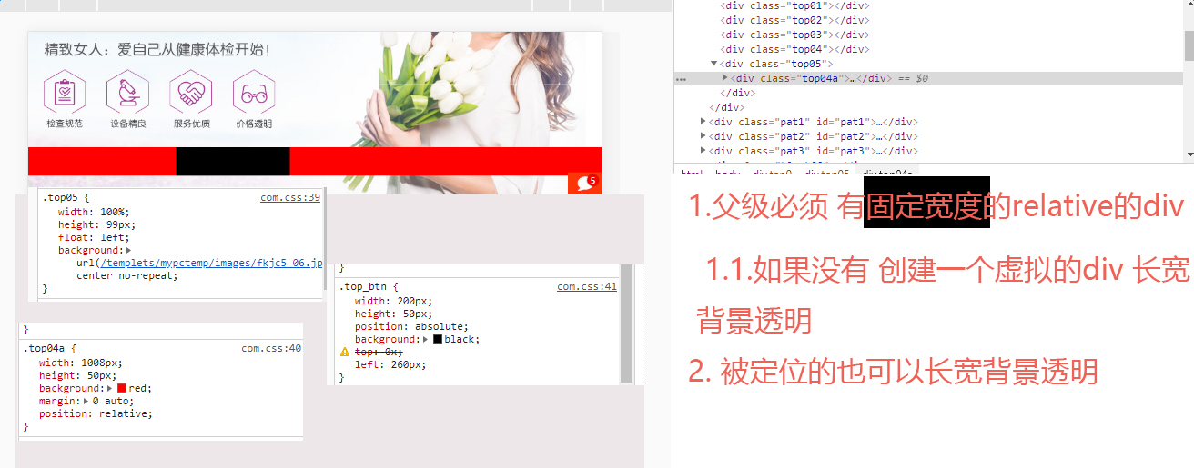
C.多列导航效果应用
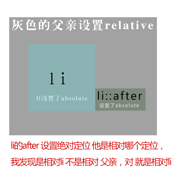
相对定位绝对定位的bug