目录
CSS参考手册:http://css.doyoe.com/
1、字体简写:font:font-style || font-variant || font-weight || font-size || /line-height || font-family
2、字体分样式
字体倾斜:font-style:"normal | italic | oblique";
小型大写字母:font-variant:"normal | small-caps | inherit";
字体粗细:font-weight:"normal | bold | bolder | lighter | [100-900]";
字体大小:font-size:"length | percentage";
文本行高:line-height:"normal | number | length | % | inherit"
字体名称:font-family:"font-name";
引入自定义字体:@font-face:font-family:"";src:url("URL.ttf") format("truetype");
字体颜色:color:"inherit | color_name | hex_number | rgb_number | transparent";
3、文本样式
文本缩进:text-indent:"length";
文本水平对齐方式:text-align:"left | right | center | justify | inherit";
文本垂直对齐方式:vertical-align:"baseline | sub | super | top | text-top | middle | bottom | text-bottom | length | % | inherit ";
文本装饰线:text-decoration:"none | underline | blink | overline | line-through";
文本阴影:test-shadow:"h-shadow v-shadow blur color";
文本转大小写:text-transform:"none | capitalize | uppercase | lowercase | inherit";
文本间空格换行:white-space:"normal | pre | nowrap | pre-warp | pre-line | inherit";
文本溢出:overflow-warp:"normal | break-word";
文本溢出显示:text-overflow:"clip | eliellipsis | string";
文本单词间距:word-spacing:"normal | length | inherit";
文本字符间距:letter-spacing:"normal | length | inherit";
文字颜色填充:-webkit-text-fill-color:"transparent";
文字描边:-webkit-text-stroke:"width | color";
4、背景图简写:background:"color | image | position | /size | repeat | attachment | clip | origin";
5、背景图分样式
背景色:background-color:"transparent | color_name | hex_number | rgb_number | inherit";
背景图:background-image:"url(URL)";
背景图定位:background-position:position_value | x% y% | xpos ypos;
背景图大小:background-size:length | % | cover | contain;
是否重复:background-repeat:"repeat | repeat-x | repeat-y | no-repeat | inherit ";
是否固定:background-attachment:scroll | fixed | inherit ;
背景的绘制区域:background-clip:padding-box | border-box | content-box;
background-position 属性相对于什么位置来定位:background-orign:padding-box | border-box | content-box;
内容
1、字体简写
 1 p{
 2    font-style:italic;
 3    font-weight:bold;
 4    font-size:14px;
 5    line-height:22px;
 6    font-family:宋体;
 7 }
 8 简化:
 9 p{
10    font:italic bold 14px/22px 宋体
11 }
2、字体分样式
2.1字体倾斜:font-style:"normal | italic | oblique";(正常 | 斜体 | 倾斜的文字)
italic与oblique的区别:字体有粗体、斜体、下划线、删除线等诸多属性,有些字体本身具有斜体,可以使用italic,有些字体本身没有斜体,需要使用oblique。
CSS部分:
1 .normal{
2 font-style: normal;
3 }
4 .italic{
5 font-style: italic;
6 }
7 .oblique{
8 font-style: oblique;
9 }
HTML部分:
<p class="normal">正常文字</p>
<p class="italic">斜体文字</p>
<p class="oblique">倾斜文字</p>
展示效果:

2.2 小型大写字母:font-variant:"normal | small-caps | inherit";(正常 | 小型大写 | 继承父级)
CSS部分:
1 .normal{
2 font-variant: normal;
3 }
4 .small{
5 font-variant: small-caps;
6 }
HTML部分:
1 <p class="normal">Ahjdk</p>
2 <p class="small">Ahjdk</p>
展示效果:

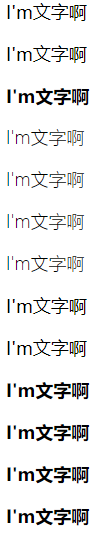
2.3字体粗细:font-weight:"normal | bold | bolder | lighter | [100-900]";(正常 | 粗 | 更粗 | 更细 | 100-900)
CSS部分:
 1 .normal{font-weight: normal;}
 2 .bld{font-weight: bold;}
 3 .bolder{font-weight: bolder;}
 4 .lighter{font-weight: lighter;}
 5 .fw100{font-weight: 100;}
 6 .fw200{font-weight: 200;}
 7 .fw300{font-weight: 300;}
 8 .fw400{font-weight: 400;}
 9 .fw500{font-weight: 500;}
10 .fw600{font-weight: 600;}
11 .fw700{font-weight: 700;}
12 .fw800{font-weight: 800;}
13 .fw900{font-weight: 900;}
HTML部分:
    <p class="normal">I'm文字啊</p>
    <p class="bold">I'm文字啊</p>
    <p class="bolder">I'm文字啊</p>
    <p class="lighter">I'm文字啊</p>
    <p class="fw100">I'm文字啊</p>
    <p class="fw200">I'm文字啊</p>
    <p class="fw300">I'm文字啊</p>
    <p class="fw400">I'm文字啊</p>
    <p class="fw500">I'm文字啊</p>
    <p class="fw600">I'm文字啊</p>
    <p class="fw700">I'm文字啊</p>
    <p class="fw800">I'm文字啊</p>
    <p class="fw900">I'm文字啊</p>
展示效果:
2.4字体大小:font-size:"length | percentage";(长度 | %)
2.5文本行高:line-height:"normal | number | length | % | inherit"(正常 | 数值 | 长度 | % | 继承父级)
2.6字体名称:font-family:"font-name";(字体名)
2.7引入自定义字体:@font-face:font-family:"myfont";src:url("URL.ttf") format("truetype");
@font-face {
font-family : “自定义字体名称”;
src : url(“字体文件在服务器上的相对或绝对路径”)  format(“字体类型”);
}
例如:
@font-face {/*该写法是兼容所有的浏览器*/
font-family : bgg;
src:  url('fonts/fontawesome-webfont.eot'), /* IE9+ */
      url('fonts/fontawesome-webfont.eot?#iefix') format('embedded-opentype'), /* IE6-IE8 */
      url('fonts/fontawesome-webfont.woff') format('woff'), /* chrome、firefox */
      url('fonts/fontawesome-webfont.ttf') format('truetype'), /* chrome、firefox、opera、Safari,Android, iOS 4.2+*/
      url('fonts/fontawesome-webfont.svg') format('svg'); /* iOS 4.1+ */
}
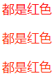
2.8字体颜色:color:"inherit | color_name | hex_number | rgb_number | transparent";(继承 | 颜色名称 | 十六进制 | RGB | 透明)
CSS部分:
1 .color{color: red;}
2 .hex{color: #ff2200}
3 .rgb{color: rgb(255,34,0)}
HTML部分:
1 <p class="color">都是红色</p>
2 <p class="hex">都是红色</p>
3 <p class="rgb">都是红色</p>
展示效果:
3、文本样式
3.1文本缩进:text-indent:"length";(块元素使用)
3.2文本水平对齐方式:text-align:"left | right | center | justify | inherit";(居左 | 居右 | 居中 | 两端对齐 | 继承父级)(块元素使用)
3.3文本垂直对齐方式:vertical-align:"baseline | sub | super | top | text-top | middle | bottom | text-bottom | length | % | inherit ";(基线 | 下标 | 上标 | 顶部 | 文本顶部 | 中间 | 底部 | 文本底部 | 长度 | % | 继承父级)(行内元素使用)
3.4文本装饰线:text-decoration:"none | underline | overline | line-through";(没有 |下划线 | 上划线 | 贯穿线 )
CSS部分:
1 h1 {text-decoration: overline}
2 h2 {text-decoration: line-through}
3 h3 {text-decoration: underline}
4 h4 {text-decoration:blink}
5 a {text-decoration: none}
HTML部分:
1 <h1>这是标题 1</h1>
2 <h2>这是标题 2</h2>
3 <h3>这是标题 3</h3>
4 <h4>这是标题 4</h4>
5 <p><a href="http://www.w3school.com.cn/index.html">这是一个链接</a></p>
效果展示:

3.5文本阴影:test-shadow:"h-shadow v-shadow blur color";(水平阴影,可负值 | 垂直阴影,可负值 | 模糊的距离 | 阴影的颜色 )
参考文献:https://www.cnblogs.com/gaoxue/articles/2287314.html?tdsourcetag=s_pcqq_aiomsg
https://www.jb51.net/css/497917.html?tdsourcetag=s_pcqq_aiomsg
3.6文本转大小写:text-transform:"none | capitalize | uppercase | lowercase | inherit";(正常 | 首字母大写 | 仅有大写 | 仅有小写 | 继承父级)
3.7文本间空格换行:white-space:"normal | pre | nowrap | pre-warp | pre-line | inherit";(忽略空白 | 类<pre>标签|不换行,直到遇到 <br> 标签为止|保留空白符序列,但是正常地进行换行 | 合并空白符序列,但是保留换行符|父级继承)
3.8文本溢出:overflow-warp:"normal | break-word";(允许内容顶开或溢出指定的容器边界 | 内容在边界内换行。如果需要,单词内部允许断行)
3.9文本溢出显示:text-overflow:"clip | eliellipsis | string";(裁剪 | 省略号 | 字符串)
overflow: hidden;    /*条件1:超出部分隐藏*/
white-space: nowrap;/*条件2:强制在同一行内显示所有文本*/
text-overflow: ellipsis;/*超出部分显示...*/
3.0文本单词间距:word-spacing:"normal | length | inherit";(没有额外的空间|固定空间,允许负值 | 继承父级)
3.11文本字符间距:letter-spacing:"normal | length | inherit"; (没有额外的空间|固定空间,允许负值 | 继承父级)
3.12文字颜色填充:-webkit-text-fill-color:"transparent";
-webkit-text-fill-color会覆盖color定义的字体颜色,目前仅wekit内核浏览器支持,可用于制作镂空字体与渐变字体;
1 -webkit-text-fill-color:transparent;(亦可使用color,必须将文本颜色设为透明,不然不能覆盖)
2 -webkit-text-stroke:1px #000;
1 background-image:-webkit-linear-gradient(#eee,#000);
2 -webkit-background-clip:text;
3 -webkit-text-fill-color:transparent;(亦可使用color,必须将文本颜色设为透明,不然不能覆盖)
4 /*使其更加柔和*/
5 -webkit-text-stroke:1px transparent;
3.13文字描边:-webkit-text-stroke:"width | color";
CSS部分:
 1 .p2 {
 2     -webkit-text-stroke: 2px red;
 3 }
 4 .p3 {
 5     position: relative;
 6     z-index: 0;
 7 }
 8 .p3::before {
 9     content: attr(data-text);
10     position: absolute;
11     -webkit-text-stroke: 2px red;
12     z-index: -1;
13 }
HTML部分:
<p class="p2">有描边</p>
<p class="p3">重叠描边</p>
展示效果:

参考文献:https://www.zhangxinxu.com/study/201705/text-stroke-position.html
4、背景图简写
background:"color | image | position | /size | repeat | attachment | clip | origin";
background:
url(test1.jpg) no-repeat scroll 10px 20px/50px 60px content-box padding-box,
url(test2.jpg) no-repeat scroll 10px 20px/70px 90px content-box padding-box,
url(test3.jpg) no-repeat scroll 10px 20px/110px 130px content-box padding-box #aaa;
拆分为:
background-image: url(test1.jpg), url(test2.jpg), url(test3.jpg);
background-repeat: no-repeat, no-repeat, no-repeat;
background-attachment: scroll, scroll, scroll;
background-position: 10px 20px, 10px 20px, 10px 20px;
background-size: 50px 60px, 70px 90px, 110px 130px;
background-origin: content-box, content-box, content-box;
background-clip: padding-box, padding-box, padding-box;
background-color: #aaa;
5、背景图分样式
5.1背景色:background-color:"transparent | color_name | hex_number | rgb_number | inherit";(透明 | 颜色名称 | 十六进制 | RGB | 继承)
5.2背景图:background-image:"url()";
5.3背景图定位:background-position:"position_value | x% y% | xpos ypos";(方位值 | % | 水平值,垂直值)
默认值:0% 0%;仅规定了一个关键词,那么第二个值将是"center | 50%";可混合使用 % 和 position 值
5.4背景图大小:background-size:"length | % | cover | contain";(长度 | % | 完全覆盖 | 扩展至其宽度和高度的任意一边完全适应内容区域)
5.4.1仅规定了一个关键词,那么第二个值将是"auto";
5.4.2100% 100%与cover与contain区别
100% 100%:图片完全覆盖,不留空白,不被隐藏
cover:等比例铺满,可能有被隐藏部分
contain:等比例缩放,可能有部分留白
5.5是否重复:background-repeat:"repeat | repeat-x | repeat-y | no-repeat | inherit ";(垂直水平重复 | 水平重复 | 垂直重复 | 不重复 |继承父级)
5.6是否固定:background-attachment:"scroll | fixed | inherit ";(随着页面其余部分的滚动而移动 | 当页面的其余部分滚动时,背景图像不会移动 | 继承父级)
5.7背景的绘制区域:background-clip:"padding-box | border-box | content-box";(内边距 | 边框盒 | 内容框)
5.8background-position 属性相对于什么位置来定位:background-orign:"padding-box | border-box | content-box";(内边距 | 边框盒 | 内容框)
必须保证背景是background-repeat:"no-repeat" 才会生效;
5.9背景渐变:gradient:"linear-gradient | radial-gradient | repeating-linear-gradient | repeating-radial-gradient"(线性渐变 | 径向渐变 | 重复线性渐变 | 重复径向渐变)
5.9.1线性渐变:background: linear-gradient(direction, color-stop1, color-stop2, ...);background: linear-gradient(angle, color-stop1, color-stop2);
5.9.2径向渐变:background: radial-gradient(center, shape size, start-color, ..., last-color);