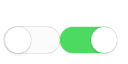
css3 iphone开关 移动端开关、按钮、input
<!DOCTYPE html>
<html>
<head>
    <meta charset="utf-8">
    <meta name="viewport" content="initial-scale=1.0, maximum-scale=1.0, user-scalable=no" />
    <title>hello world</title>
   <style>
		*{margin:0;padding:0;box-sizing:border-box;}
		.pub_switch_box{font-size: 0;display: inline-block;}
		.pub_switch { display: none;}
		.pub_switch + label {display: inline-block;position: relative; 56px;height: 26px;background-color: #fafbfa;border-radius: 50px;-webkit-transition: all 0.1s ease-in;transition: all 0.1s ease-in;}
		.pub_switch  + label:after {content: ' ';position: absolute;top: 0; 100%;height: 100%;-webkit-transition: box-shadow 0.1s ease-in;transition: box-shadow 0.1s ease-in;left: 0;border-radius: 100px;box-shadow: inset 0 0 0 0 #eee, 0 0 1px rgba(0,0,0,0.4);}
		.pub_switch  + label:before {content: ' ';position: absolute;top: 0px;left: 1px;z-index: 999999; 26px;height:26px;-webkit-transition: all 0.1s ease-in;transition: all 0.1s ease-in;border-radius: 100px;box-shadow: 0 3px 1px rgba(0,0,0,0.05), 0 0px 1px rgba(0,0,0,0.3);background: white;}
		.pub_switch:active + label:after {box-shadow: inset 0 0 0 20px #eee, 0 0 1px #eee;}
		.pub_switch:active + label:before { 37px;}
		.pub_switch:checked:active + label:before { 37px;left: 20px;}
		.pub_switch  + label:active {box-shadow: 0 1px 2px rgba(0,0,0,0.05), inset 0px 1px 3px rgba(0,0,0,0.1);}
		.pub_switch:checked + label:before {content: ' ';position: absolute;left: 31px;border-radius: 100px;}
		.pub_switch:checked + label:after {content: ' ';font-size: 1.5em;position: absolute;background: #4cda60;box-shadow: 0 0 1px #4cda60;}
   </style>
</head>
<body>
	<div class="pub_switch_box">
		<input type="checkbox" id="pub_switch_a1" class="pub_switch" />
		<label for="pub_switch_a1"></label>
		<input type="checkbox" id="pub_switch_a2" class="pub_switch" checked />
		<label for="pub_switch_a2"></label>
	</div>

</body>
</html>