上节回顾:


day49

混乱即阶梯.

1. 前情回顾

    HTML
        HTTP和HTML
        文档机构
            <!Doctype html>
            HTML
            head
                <meta>
                <title>
                <link>    icon
                <style>   直接写CSS样式
                <link>    CSS文件
                <script>  JS文件
            body
                常用标签:
                    div
                    span

                    h1~h6
                    a
                    p
                    img
                    form
                        input
                            text
                            password
                            number
                            email
                            radio
                            checkbox

                            sumbit
                            button
                            reset
                        select
                        textarea
                        label
                    ul
                    ol
                    dl
                    table
                标签属性
                    id
                    class
                    style

                    input
                        name
                        value
                        type
                    form
                        上传文件的话
                        都记不住,但是都能想起来的那个(课后自己补上)
                    select
                        mutiple 多选
                        selected 默认选中
                        optgroup 分组显示(label属性=分组名)
                    checkbox
                        checked 默认选中
                    hidden 隐藏

                    input
                        disabled
                    input type=text/password
                        readonly      --> 只读
                        placeholder   --> 提示信息


    CSS:
        找到标签 修改样式

        选择器(找标签):
            基本选择器
                标签选择器
                #ID选择器
                .class选择器
                *(大包大揽)选择器
            层级选择器
                后代选择器(空格)
                子选择器(>)
                毗邻选择器(+)/(label+input)
                弟弟选择器(~)
                组合选择器(,)
            属性选择器
                标签可以自定义属性
                [egon]
                [egon=""]/input[type="button"]

            伪类选择器
                a:hover(浏览器怎么看)

            选择器的优先级:
                1.!important                      不讲道理
                2.内联(直接在标签上写style属性)   1000
                3.ID选择器                        100
                4.class选择器                     10
                5.标签选择器                      1
                6.继承的
        CSS属性:

            color       文本颜色

            background  背景
                background-color
                background-img
                background-position(具体数值)

            font        字体
                font-family
                font-size
                font-weight
                line-height  (垂直居中)
                text-aligin  (水平居中)

            border       边框
                border-color
                border-style
                borfer-width

                border: 1px solid red;
                border-radius


            CSS盒子模型:

                content (内容)

                padding (内填充)

                border  (边框)

                magin   (外边距)
                    margin:0 auto; (块标签的居中)

            a
                text-decoration=none (去掉下划线)


            float(浮动)
                left
                right
                none

            浮动规则:
                浮动只控制自己
                如果前面的标签也是浮动的,就挨着放
                如果前面的标签不是浮动的,在下一行开始摆放


            清除浮动:
                clear:
                    left
                    right
                    both
                    none

            .clearfix:after {
                content: "";
                display: block;
                clear: "both";
            }

            :after和:before

            display:
                块级标签特点: 独占一行, 可以设置长和宽
                内联标签特点: 可以放在一行,不可以设置长和宽,根据内容自适应长和宽

                none   --> 不显示

                block  --> 块级

                inline --> 内联

                inline-block  --> 既在一行显示,又能设置长和宽

        定位:
            relative  (相对定位)

                根据自己原来的位置来做定位 ()

            absolute  (绝对定位)
                根据 往上找已经相对定位的元素的左上角 来做定位
                (通常配合相对定位使用)

            fixed     (固定定位)


        z-index

            模态弹出框

            z-index: 999
            z-index: 1000
今日内容
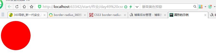
一、圆形
<!DOCTYPE html>
<html lang="zh-CN">
<head>
    <meta charset="UTF-8">
    <meta http-equiv="x-ua-compatible" content="IE=edge">
    <title>圆形的示例</title>
    <style>
        .c1{
            height: 100px;
             100px;
            background-color: red;
            border-radius: 50px;
        }
    </style>
</head>
<body>
<div class="c1"></div>
</body>
</html>
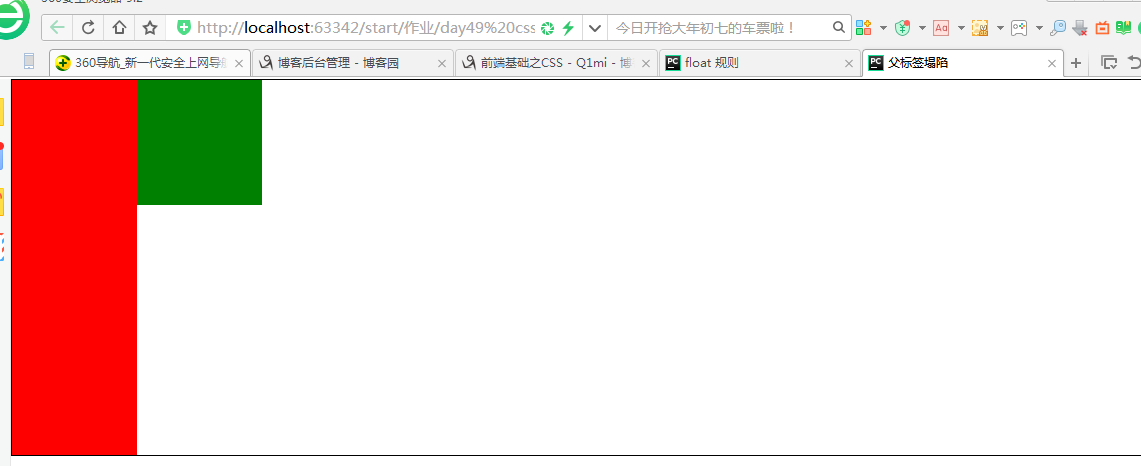
二、父标签塌陷
<!DOCTYPE html>
<html lang="zh-CN">
<head>
    <meta charset="UTF-8">
    <meta http-equiv="x-ua-compatible" content="IE=edge">
    <title>父标签塌陷</title>
    <style>
        *{
            margin: 0;
            padding: 0;
        }
        .c{
            border: 1px solid black;
        }
        .c1,
        .c2{
             100px;
            float: left;
        }
        .c1{
            height: 300px;
            background-color: red;
        }
        .c2{
            height: 100px;
            background-color: green;
        }
        .clearfix:after{
            content: "";
            display: block;
            clear: left;
        }
    </style>
</head>
<body>
<div class="c clearfix">
    <div class="c1"></div>
    <div class="c2"></div>
    <!--<div style="clear: left"></div>-->
</div>
</body>
</html>
CSS盒子模型
- margin: 用于控制元素与元素之间的距离;margin的最基本用途就是控制元素周围空间的间隔,从视觉角度上达到相互隔开的目的。
- padding: 用于控制内容与边框之间的距离;
- Border(边框): 围绕在内边距和内容外的边框。
- Content(内容): 盒子的内容,显示文本和图像。
1、margin外边距
.margin-test {
  margin-top:100px;
  margin-bottom:100px;
  margin-right:50px;
  margin-left:50px;
}
推荐使用简写:
.margin-test {
  margin: 5px 10px 15px 20px;
}
顺序:上右下左
常见居中:
.mycenter {
  margin: 0 auto;
}
2、padding内填充
.padding-test {
  padding-top: 5px;
  padding-right: 10px;
  padding-bottom: 15px;
  padding-left: 20px;
}
推荐使用简写:
.padding-test {
  padding: 5px 10px 15px 20px;
}
顺序:上右下左
补充:
- 提供一个,用于四边;
- 提供两个,第一个用于上-下,第二个用于左-右;
- 如果提供三个,第一个用于上,第二个用于左-右,第三个用于下;
- 提供四个参数值,将按上-右-下-左的顺序作用于四边;
三、float 规则
<!DOCTYPE html>
<html lang="zh-CN">
<head>
    <meta charset="UTF-8">
    <meta http-equiv="x-ua-compatible" content="IE=edge">
    <title>浮动规则</title>
    <style>
        .c1,
        .c2,
        .c3{
            height: 100px;
             100px;
            text-align: center;
            color: white;
            font-size: 36px;
        }
        .c1{
            height: 100px;
             100px;
            background-color: red;
            float: left;
        }
        .c2{
            height: 200px;
             200px;
            background-color: green;
            float: left;
            clear: left;/*不让左边有浮动元素*/
        }
        .c3{
            height: 300px;
             300px;
            background-color: blue;
            float: left;
            clear: left;
        }
    </style>
</head>
<body>
<div class="c1">c1</div>
<div class="c2">c2</div>
<div class="c3">c3</div>
</body>
</html>
<!DOCTYPE html>
<html lang="zh-CN">
<head>
    <meta charset="UTF-8">
    <meta http-equiv="x-ua-compatible" content="IE=edge">
    <title>向右float规则</title>
    <style>
        .c1,
        .c2,
        .c3{
            height: 100px;
             100px;
            text-align: center;
            color: white;
            font-size: 36px;
        }
        .c1{
            height: 100px;
             100px;
            background-color: red;
            float: right;
        }
        .c2{
            height: 200px;
             200px;
            background-color: green;
            float: right;
            clear: right;/*不让右边有浮动元素*/

        }
        .c3{
            height: 300px;
             300px;
            background-color: blue;
            float: right;
            clear: right;

        }
    </style>
</head>
<body>
<div class="c1">c1</div>
<div class="c2">c2</div>
<div class="c3">c3</div>
</body>
</html>
float属性
1、三种取值
left:向左浮动
right:向右浮动
none:默认值,不浮动
2、清除浮动
clear语法:
clear : none | left | right | both
取值:
none : 默认值。允许两边都可以有浮动对象
left : 不允许左边有浮动对象
right : 不允许右边有浮动对象
both : 不允许有浮动对象
但是需要注意的是:clear属性只会对自身起作用,而不会影响其他元素。
3、父标签塌陷问题
.clearfix:after {
  content: "";
  display: block;
  clear: both;
}
三、 after 和before
<!DOCTYPE html>
<html lang="zh-CN">
<head>
    <meta charset="UTF-8">
    <meta http-equiv="x-ua-compatible" content="IE=edge">
    <title>after和before</title>
    <style>
        p:after{
            content: 'hello';
            display: inline-block;
            color: red;
            background-color:green;
        }
        p:before{
            content: 'hello from other side';
            display:inline-block;
            color: red;
            background-color: greenyellow;
        }
    </style>
</head>
<body>
<p>这是P的标签</p>
</body>
</html>
/*在每个<p>元素之前插入内容*/
p:before {
  content:"hello";
  color:red;
  display: block;
}

/*在每个<p>元素之后插入内容*/
p:after {
  content:"bye";
  color:red;
  display: block;
}
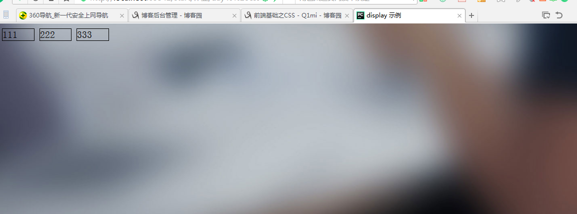
四、display 属性
<!DOCTYPE html>
<html lang="zh-CN">
<head>
    <meta charset="UTF-8">
    <meta http-equiv="x-ua-compatible" content="IE=edge">
    <title>display 示例</title>
    <style>
        span.c1{
            height: 1000px;
             1000px;
            background-color: red;
            padding: 100px;
            display: none;
        }
        div.c1{
            height: 1000px;
             600px;
            background-color: green;
            display: none;
        }
        div.c2>div{
            display: inline-block;
             50px;
            border: 1px solid black;
        }
        body{
            background: url("https://res.wx.qq.com/a/wx_fed/webwx/res/static/img/2zrdI1g.jpg") no-repeat 50%;
            background-size: cover;
        }
    </style>
</head>
<body>
<div class="c1">div</div>
<span class="c1">spanaaaaaaaaaaaaa</span>

<div class="c2">
    <div>111</div>
    <div>222</div>
    <div>333</div>
</div>

</body>
</html>
1、display="none"
隐藏标签
注意与visibility:hidden的区别:
visibility:hidden可以隐藏某个元素,但隐藏的元素仍需占用与未隐藏之前一样的空间。也就是说,该元素虽然被隐藏了,但仍然会影响布局。
display:none可以隐藏某个元素,且隐藏的元素不会占用任何空间。也就是说,该元素不但被隐藏了,而且该元素原本占用的空间也会从页面布局中消失
2、display="block"
将内联标签设置为块级标签
3、display="inline"
块级标签设置为内联标签
4、display="inline-block"
行内块元素
五、磨砂背景
<!DOCTYPE html>
<html lang="zh-CN">
<head>
    <meta charset="UTF-8">
    <meta http-equiv="x-ua-compatible" content="IE=edge">
    <title>磨砂背景</title>
    <style>
        body{
            background: url("http://imglf1.ph.126.net/8zfdeMOdpuaXYVO0UNLsWw==/6608838939119977909.jpg")no-repeat 50%;
            background-size: cover;
            height: 720px;
        }
        .cover{
            position: fixed;
            top: 0;
            right: 0;
            bottom: 0;
            left: 0;
            background-color: rgba(0,0,0, 0.5);
        }
    </style>
</head>
<body>
<div class="cover"></div>
</body>
</html>
六、定位
<!DOCTYPE html>
<html lang="zh-CN">
<head>
    <meta charset="UTF-8">
    <meta http-equiv="x-ua-compatible" content="IE=edge">
    <title>定位示例</title>
    <style>
        *{
            margin: 0;
            padding: 0;
        }
        .c1{
            height: 200px;
             200px;
            background-color: red;
        }
        .c2{
            height: 200px;
             200px;
            background-color: green;
            position: absolute;
            left: 200px;
            top: 200px;
        }
        .c3{
            height: 200px;
             200px;
            background-color: blue;
        }
        .c{
            height: 200px;
             200px;
            background-color: black;
            position: relative;
            top: 600px;
            left: 600px;
        }
        .returnTop{
             100px;
            height: 50px;
            background-color: darkgrey;
            text-align: center;
            line-height: 50px;
            position: fixed;
            right: 10px;
            bottom: 15px;
        }
    </style>
</head>
<body>
<div class="c1"></div>
<div class="c">
    <div class="c2"></div>
</div>
<div class="c3"></div>
<div class="returnTop"></div>
</body>
</html>
定位(position)
1、static
static 默认值,无定位,不能当作绝对定位的参照物,并且设置标签对象的left、top等值是不起作用的的。
2、relative(相对定位)
相对定位是相对于该元素在文档流中的原始位置,即以自己原始位置为参照物。有趣的是,即使设定了元素的相对定位以及偏移值,元素还占有着原来的位置,即占据文档流空间。对象遵循正常文档流,但将依据top,right,bottom,left等属性在正常文档流中偏移位置。而其层叠通过z-index属性定义。
注意:position:relative的一个主要用法:方便绝对定位元素找到参照物。
3、absolute(绝对定位)
定义:设置为绝对定位的元素框从文档流完全删除,并相对于最近的已定位祖先元素定位,如果元素没有已定位的祖先元素,那么它的位置相对于最初的包含块(即body元素)。元素原先在正常文档流中所占的空间会关闭,就好像该元素原来不存在一样。元素定位后生成一个块级框,而不论原来它在正常流中生成何种类型的框。
重点:如果父级设置了position属性,例如position:relative;,那么子元素就会以父级的左上角为原始点进行定位。这样能很好的解决自适应网站的标签偏离问题,即父级为自适应的,那我子元素就设置position:absolute;父元素设置position:relative;,然后Top、Right、Bottom、Left用百分比宽度表示。
另外,对象脱离正常文档流,使用top,right,bottom,left等属性进行绝对定位。而其层叠通过z-index属性定义。
4、fixed(固定)
fixed:对象脱离正常文档流,使用top,right,bottom,left等属性以窗口为参考点进行定位,当出现滚动条时,对象不会随着滚动。而其层叠通过z-index属性 定义。 注意点: 一个元素若设置了 position:absolute | fixed; 则该元素就不能设置float。这 是一个常识性的知识点,因为这是两个不同的流,一个是浮动流,另一个是“定位流”。但是 relative 却可以。因为它原本所占的空间仍然占据文档流。
在理论上,被设置为fixed的元素会被定位于浏览器窗口的一个指定坐标,不论窗口是否滚动,它都会固定在这个位置。
示例代码:
七、模态框示例
<!DOCTYPE html>
<html lang="zh-CN">
<head>
    <meta charset="UTF-8">
    <meta http-equiv="x-ua-compatible" content="IE=edge">
    <title>模态框示例</title>
    <style>
        .cover{
            position: fixed;
            top:0;
            right: 0;
            bottom: 0;
            left: 0;
            background-color: rgba(0,0,0, 0.5);
            z-index:999;
        }
        .modal{
            height: 400px;
             600px;
            position: fixed;
            top:50%;
            left: 50%;
            background-color: white;
            margin-left: -300px;
            margin-top: -200px;
            z-index: 1000;
        }
    </style>
</head>
<body>
<div class="cover"></div>
<div class="modal"></div>

</body>
</html>
z-index
#i2 {
  z-index: 999;
}
设置对象的层叠顺序,数值大的会覆盖在数值小的标签之上。