今日内容:


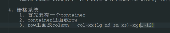
1.今日内容
    Bootstrap介绍
    https://v3.bootcss.com/
    1. Bootstrap下载
        https://v3.bootcss.com/ -> 起步 -> 下载 -> 用于生产环境的版本

    2. Bootstrap目录结构
        - css 样式文件 引用了下面的字体文件
            -Bootstrap.min.css

        - fonts 字体文件

        - js JS文件 依赖jQuery
            -Bootstrap.min.js

    3. viewport
        响应式开发必须在页面head中声明:
        <meta name="viewport" content="width=device-width, initial-scale=1">

    4. 栅格系统
        1. 首先要有一个container
        2. container里面放row
        3. row里面放column   col-xx(lg md sm xs)-xx(1~12)

        4. 同一个页面在不同显示设备上应用不同的样式
            给标签设置多个col-xx-xx 样式类

        5. 列偏移
            col-xx-offset-xx

        6. 列嵌套 --> 把某一列再分成12份(注意还要写一个row)

        7. 列排序
            col-xx-push-xx
            col-xx-pull-xx

        8. 表单样式

        9. 按钮

        10.图片
2. 今日作业
    1. 登录页面
        1. 布局使用的是col-xx-4和col-offset-4
        2. 表单样式

    2. 进阶作业
        给登录页面加上jQuery版的校验
Bootstrap是Twitter开源的基于HTML、CSS、JavaScript的前端框架。
一、
Bootstrap下载
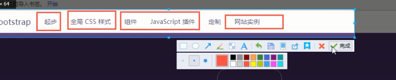
官方地址:https://getbootstrap.com
中文地址:http://www.bootcss.com/
我们使用V3版本的Bootstrap,我们下载的是用于生产环境的Bootstrap。
Bootstrap环境搭建
目录结构:

bootstrap-3.3.7-dist/
├── css  // CSS文件
│   ├── bootstrap-theme.css  // Bootstrap主题样式文件
│   ├── bootstrap-theme.css.map
│   ├── bootstrap-theme.min.css  // 主题相关样式压缩文件
│   ├── bootstrap-theme.min.css.map
│   ├── bootstrap.css
│   ├── bootstrap.css.map
│   ├── bootstrap.min.css  // 核心CSS样式压缩文件
│   └── bootstrap.min.css.map
├── fonts  // 字体文件
│   ├── glyphicons-halflings-regular.eot
│   ├── glyphicons-halflings-regular.svg
│   ├── glyphicons-halflings-regular.ttf
│   ├── glyphicons-halflings-regular.woff
│   └── glyphicons-halflings-regular.woff2
└── js  // JS文件
    ├── bootstrap.js
    ├── bootstrap.min.js  // 核心JS压缩文件
    └── npm.js
处理依赖
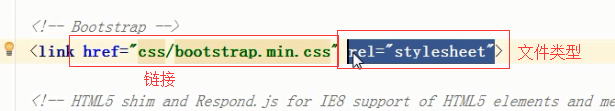
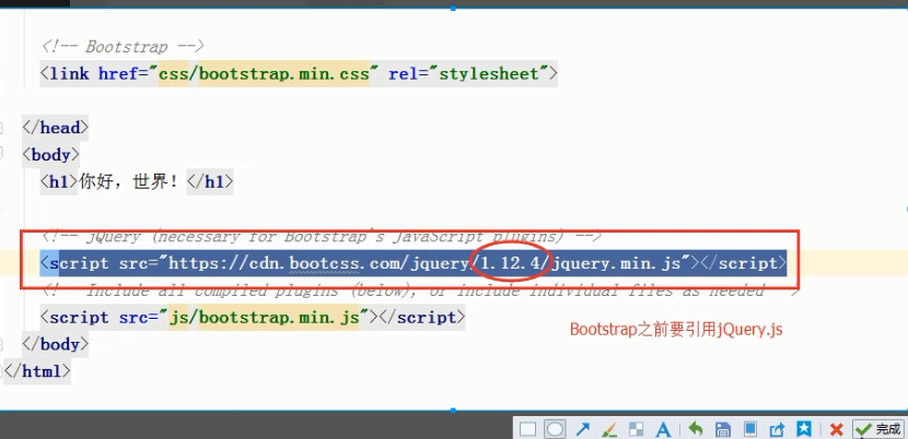
由于Bootstrap的某些组件依赖于jQuery,所以请确保下载对应版本的jQuery文件,来保证Bootstrap相关组件运行正常。
例子:
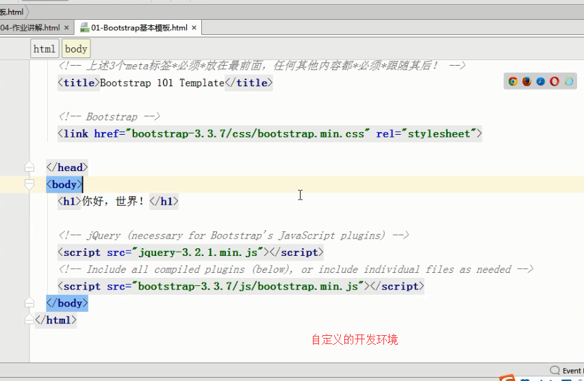
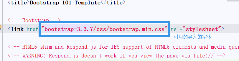
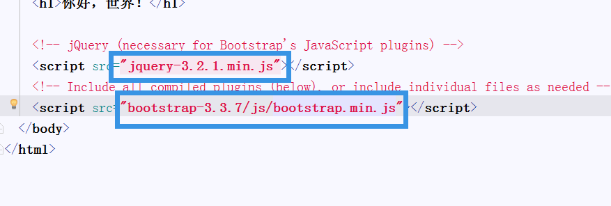
<!DOCTYPE html>
<html lang="zh-CN">
  <head>
    <meta charset="utf-8">
    <meta http-equiv="X-UA-Compatible" content="IE=edge">
    <meta name="viewport" content="width=device-width, initial-scale=1">
    <!-- 上述3个meta标签*必须*放在最前面,任何其他内容都*必须*跟随其后! -->
    <title>Bootstrap 101 Template</title>

    <!-- Bootstrap -->
    <link href="bootstrap-3.3.7/css/bootstrap.min.css" rel="stylesheet">

    <!-- HTML5 shim and Respond.js for IE8 support of HTML5 elements and media queries -->
    <!-- WARNING: Respond.js doesn't work if you view the page via file:// -->
    <!--[if lt IE 9]>
      <script src="https://cdn.bootcss.com/html5shiv/3.7.3/html5shiv.min.js"></script>
      <script src="https://cdn.bootcss.com/respond.js/1.4.2/respond.min.js"></script>
    <![endif]-->
  </head>
  <body>
    <h1>你好,世界!</h1>

    <!-- jQuery (necessary for Bootstrap's JavaScript plugins) -->
    <script src="jquery-3.2.1.min.js"></script>
    <!-- Include all compiled plugins (below), or include individual files as needed -->
    <script src="bootstrap-3.3.7/js/bootstrap.min.js"></script>
  </body>
</html>
2、移动设备优先
<!DOCTYPE html>
<html lang="en">
<head>
    <meta charset="UTF-8">
    <title>没用viewport时</title>
</head>
<body>
<img src="Bootstrap_i2.png" alt="前女友2号">
<script src="jquery-3.2.1.min.js"></script>
</body>
</html>
<!DOCTYPE html>
<html lang="zh-CN">
<head>
    <meta charset="UTF-8">
    <meta http-equiv="x-ua-compatible" content="IE=edge">
    <meta name="viewport" content="width=device-width, initial-scale=1">
    <title>3使用viewport </title>
</head>
<body>
<img src="Bootstrap_i2.png" alt="前女友2号">
<script src="jquery-3.2.1.min.js"></script>
</body>
</html>
3、栅格系统
4、布局容器
Bootstrap 需要为页面内容和栅格系统包裹一个 .container 容器。我们提供了两个作此用处的类。注意,由于 padding 等属性的原因,这两种 容器类不能互相嵌套。
.container 类用于固定宽度并支持响应式布局的容器。
<!DOCTYPE html> <html lang="en"> <head> <meta charset="UTF-8"> <meta http-equiv="X-UA-Compatible" content="IE=edge"> <meta name="viewport" content="width=device-width, initial-scale=1"> <title>container示例</title> <link rel="stylesheet" href="bootstrap-3.3.7/css/bootstrap.min.css"> <style> .row div { border: 1px solid red; } </style> </head> <body> <div class="container" style="background-color: #eeeeee"> <!--<div class="row">--> <!--<div class="col-md-6 col-xs-8">6</div>--> <!--<div class="col-md-6 col-xs-4">66</div>--> <!--</div>--> <!--<div class="row">--> <!--<div class="col-md-8">8</div>--> <!--<div class="col-md-4">4</div>--> <!--</div>--> <!--<!–超过12列–>--> <!--<div class="row">--> <!--<div class="col-md-8">8</div>--> <!--<div class="col-md-8">8</div>--> <!--</div>--> <!--<!–不够12列–>--> <!--<div class="row">--> <!--<div class="col-md-4">4</div>--> <!--<div class="col-md-4">4</div>--> <!--</div>--> <!--<!–offset 列偏移–>--> <!--<div class="row">--> <!--<div style="height: 100px" class="col-md-4 col-md-offset-4"></div>--> <!--</div>--> 列嵌套 <div class="row"> <div class="col-md-9"> <div class="row"> <div class="col-md-6">666</div> <div class="col-md-6">666</div> </div> </div> <div class="col-md-3"></div> </div> <!--列排序--> <!--<div class="row">--> <!--<div class="col-md-9 col-md-push-3">.col-md-9</div>--> <!--<div class="col-md-3 col-md-pull-9">.col-md-3</div>--> <!--</div>--> </div> <script src="jquery-3.2.1.min.js"></script> </body> </html>
5、媒体查询
<!DOCTYPE html>
<html lang="en">
<head>
    <meta charset="UTF-8">
    <meta http-equiv="X-UA-Compatible" content="IE=edge">
    <meta name="viewport" content="width=device-width, initial-scale=1">
    <title>媒体查询</title>
    <style>
        .c1 {
            background-color: red;
        }

        @media screen and (max- 600px) {
            .c1 {
                background-color: green;
            }
        }
    </style>

</head>
<body>
<div style="height: 200px; 200px" class="c1"></div>
</body>
</html>
6、
例子学习地址:https://v3.bootcss.com/css/
<!DOCTYPE html> <html lang="en"> <head> <meta charset="UTF-8"> <meta http-equiv="X-UA-Compatible" content="IE=edge"> <meta name="viewport" content="width=device-width, initial-scale=1"> <title>基本样式</title> <link rel="stylesheet" href="bootstrap-3.3.7/css/bootstrap.min.css"> </head> <body> <h1>h1. Bootstrap heading</h1> <h2>h2. Bootstrap heading</h2> <h3>h3. Bootstrap heading</h3> <h4>h4. Bootstrap heading</h4> <h5>h5. Bootstrap heading</h5> <h6>h6. Bootstrap heading</h6> <h3>h3. Bootstrap heading <small>我是small</small></h3> <p class="lead">海燕 在苍茫的大海上,狂风卷积着乌云。在乌云和大海之间,海燕像黑色的闪电,在高傲的飞翔。</p> You can use the mark tag to <mark>highlight</mark> text. <del>This line of text is meant to be treated as deleted text.</del> <s>This line of text is meant to be treated as no longer accurate.</s> <p>建超</p> <strong>建超</strong> <p>建超</p> <em>建超</em> <!--文本对齐--> <p class="text-left">Left aligned text.</p> <p class="text-center">Center aligned text.</p> <p class="text-right">Right aligned text.</p> <p class="text-lowercase">Lowercased text.</p> <p class="text-uppercase">Uppercased text.</p> <p class="text-capitalize">Capitalized text.</p> <p>Alex是个<abbr title="帅B">sb</abbr></p> <abbr title="HyperText Markup Language" class="initialism">HTML</abbr> <address> <strong>Twitter, Inc.</strong><br> 1355 Market Street, Suite 900<br> San Francisco, CA 94103<br> <abbr title="Phone">P:</abbr> (123) 456-7890 </address> <blockquote> <p>技术的提升只是量的积累,思想的提升才是质的飞跃。</p> <footer>老男孩语录</footer> </blockquote> <ul type="none"> <li>111</li> <li>222</li> <li>333</li> </ul> <ul style="list-style: none"> <li>111</li> <li>222</li> <li>333</li> </ul> <ul class="list-unstyled"> <li>111</li> <li>222</li> <li>333</li> </ul> <ul class="list-inline"> <li>111</li> <li>222</li> <li>333</li> </ul> <p> <code><div>萨安大大</div></code></p> <p><div>萨安大大</div></p> <p>按住<kbd>shift</kbd>可以进行批量操作</p> <div style="height: 200px"></div> </body> </html>
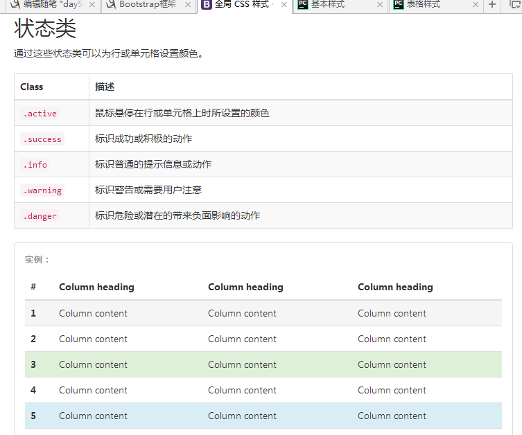
7、表格样式
表格
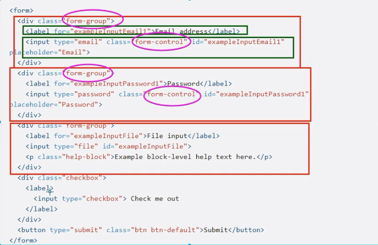
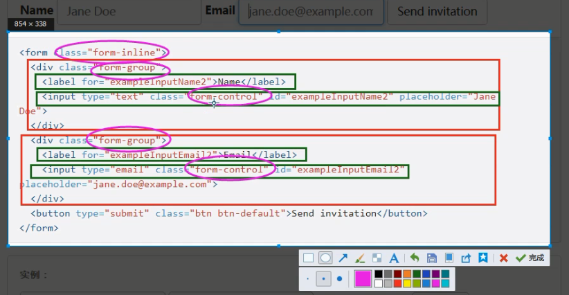
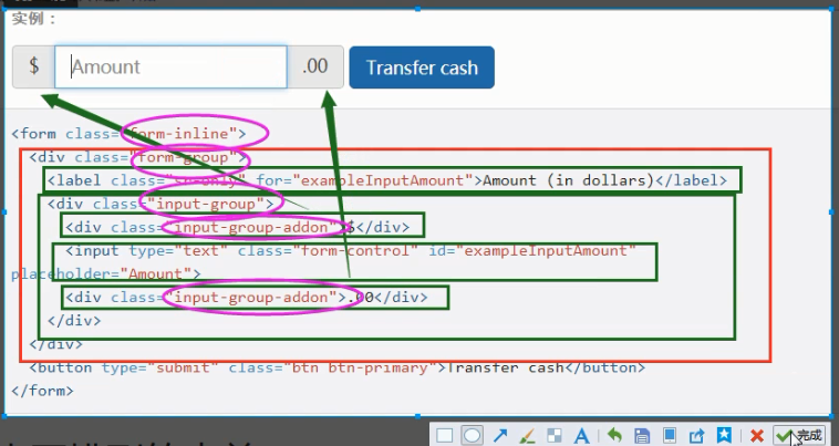
8、
表单
其他的例子请参考:https://v3.bootcss.com/css/