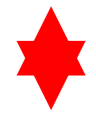
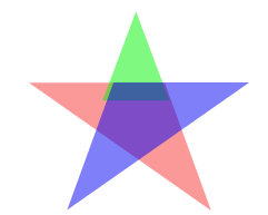
最终想要实现的效果


一、五角星
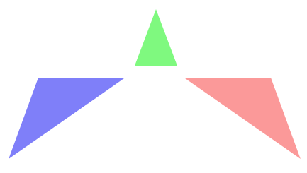
在画五角星之前首先分析这个五角星是如何实现,由哪几个部分构成的,示意图如下:
三个顶角向上的三角形,通过设置旋转和定位相互重叠和拼接实现最终的五角星效果。
为了语义化和代码更加简便,所以使用伪类来添加内容。
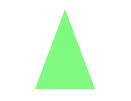
1、设置一个等腰三角形,并使用transform将其旋转到合适的角度 transform: rotate(35deg);
.star{
        width:0px;height:0px;
        border-bottom:70px solid rgba(244,0,0,0.4);
        border-left:100px solid transparent;
        border-right:100px solid transparent;
        margin:100px auto;
        /*到这一步为止,得到的是一个向上的等腰三角形*/
        -webkit-transform: rotate(35deg);
        -ms-transform: rotate(35deg);
        -o-transform: rotate(35deg);
        transform: rotate(35deg);
        /*顺时针旋转35deg*/
        position:relative;
    }
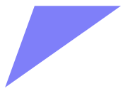
2、使用:before伪元素在div元素前面添加内容。
伪类所添加的内容继承 div的样式也发生了顺时针旋转,所以如果消除顺时针旋转的影响,可以 transform: rotate(-35deg);
设置定位,将内容调整到合适的位置 top:-45px; left:-65px;
.star:before{
        content:"";
        width:0px;
        height:0px;
        border-bottom:80px solid rgba(0,244,0,0.5);
        border-left:30px solid transparent;
        border-right:30px solid transparent;
        /*伪类所添加的内容继承原来的样式也发生了顺时针旋转*/
        -webkit-transform: rotate(-35deg);
        -ms-transform: rotate(-35deg);
        -o-transform: rotate(-35deg);
        transform: rotate(-35deg);
        /*设置负值,就会逆时针旋转*/
        position:absolute;
        top:-45px;left:-65px;
        /*定位调整位置*/
    }
3、使用 :after 伪类在div 元素后面添加内容
将内容旋转到合适的角度 transform: rotate(-35deg);
设置定位,放置在适当的位置 top:3px;left:105px;
.star:after{
        content:"";
        width:0px;
        height:0px;
        position:absolute;
        border-bottom:70px solid rgba(0,0,244,0.5);
        border-left:100px solid transparent;
        border-right:100px solid transparent;
        -webkit-transform: rotate(-70deg);
        -ms-transform: rotate(-70deg);
        -o-transform: rotate(-70deg);
        transform: rotate(-70deg);
        top:3px;left:-105px;
    }
实现效果和代码:
<!DOCTYPE html>
<html lang="en">
<head>
    <meta charset="UTF-8">
    <title>transform</title>
    <style>
    .star{
        width:0px;height:0px;
        border-bottom:70px solid red;
        /*rgba(244,0,0,0.4);*/
        border-left:100px solid transparent;
        border-right:100px solid transparent;
        margin:100px auto;
        /*到这一步为止,得到的是一个向上的等腰三角形*/
        -webkit-transform: rotate(35deg);
        -ms-transform: rotate(35deg);
        -o-transform: rotate(35deg);
        transform: rotate(35deg);
        /*顺时针旋转35deg*/
        position:relative;
    }
    .star:before{
        content:"";
        width:0px;
        height:0px;
        border-bottom:80px solid red;
        /*rgba(0,244,0,0.5);*/
        border-left:30px solid transparent;
        border-right:30px solid transparent;
        /*伪类所添加的内容继承原来的样式也发生了顺时针旋转*/
        -webkit-transform: rotate(-35deg);
        -ms-transform: rotate(-35deg);
        -o-transform: rotate(-35deg);
        transform: rotate(-35deg);
        /*设置负值,就会逆时针旋转*/
        position:absolute;
        top:-45px;
        left:-65px;
        /*定位调整位置*/
    }
    .star:after{
        content:"";
        width:0px;
        height:0px;
        position:absolute;
        border-bottom:70px solid red;
        /*rgba(0,0,244,0.5);*/
        border-left:100px solid transparent;
        border-right:100px solid transparent;
        -webkit-transform: rotate(-70deg);
        -ms-transform: rotate(-70deg);
        -o-transform: rotate(-70deg);
        transform: rotate(-70deg);
        top:3px;left:-105px;
    }
    </style>
</head>
<body>
    <div class="star"></div>
</body>
</html>

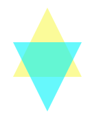
二、六角星
相比于五角星,六角星就简单的多了,来是先来分析它是如何构成的:
两个三角形交叠实现
注意两个三角形之间的位置关系,设置正确的定位。

代码:
<!DOCTYPE html>
<html lang="en">
<head>
    <meta charset="UTF-8">
    <title></title>
    <style>
    #star{
        width:0px;height:0px;
        border-bottom:100px solid red;
        /*rgba(244,244,0,0.4);*/
        border-left:50px solid transparent;
        border-right:50px solid transparent;
        margin:50px auto;
        position:relative;
    }
    #star:after{
        content:" ";
        width:0px;height:0px;
        border-top:100px solid red;
        /*rgba(0,244,250,0.6);*/
        border-left:50px solid transparent;
        border-right:50px solid transparent;
        position:absolute;
        top:50px;left:-50px;
    }
    </style>
</head>
<body>
    <div id="star"></div>
</body>
</html>